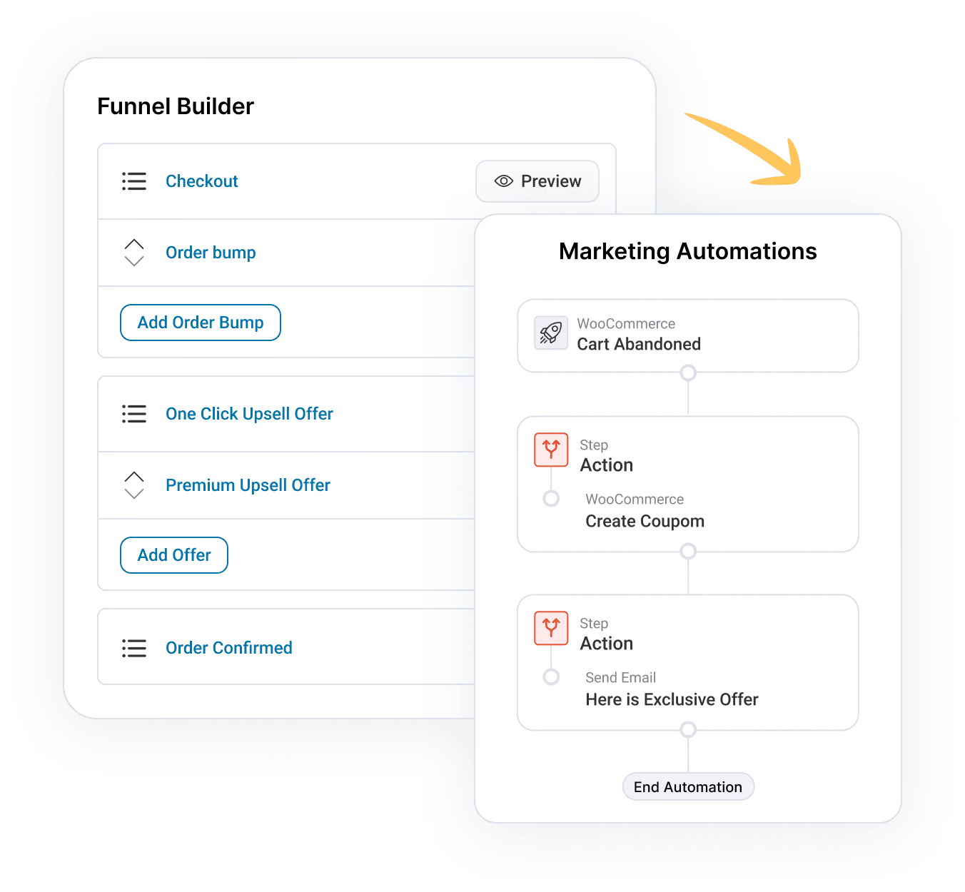
A/B Testing is a critical tool in your conversion arsenal.
You can perform split tests right inside FunnelKit's Funnel Builder.
Well, there are three things you need to know before you start:
#1: You can A/B test your Opt-ins, Opt-in thank you pages, Sales pages, Checkout pages, Order bumps, One-Click Upsells, and Thank you pages.
#2: You can test one item against the other, one page against the other, and so much more.
#3: You should only test one element at a time so that you know what to attribute the results to.
Note: Please exclude all the pages you're running the A/B test on from your caching plugin. This includes Opt-in pages, landing, upsell, and checkout pages.
But keep in mind these are our top 5 test cases. Pick the one that you feel will get you great results.
Test Case #1: Video-based Page vs Text-based Page
Video-based pages can convert higher because videos are captivating and conversational.
It also allows people to see a better demonstration of the product.
So you can put this hypothesis to the test.
In the design section, you can customize your sales landing page the way you want.
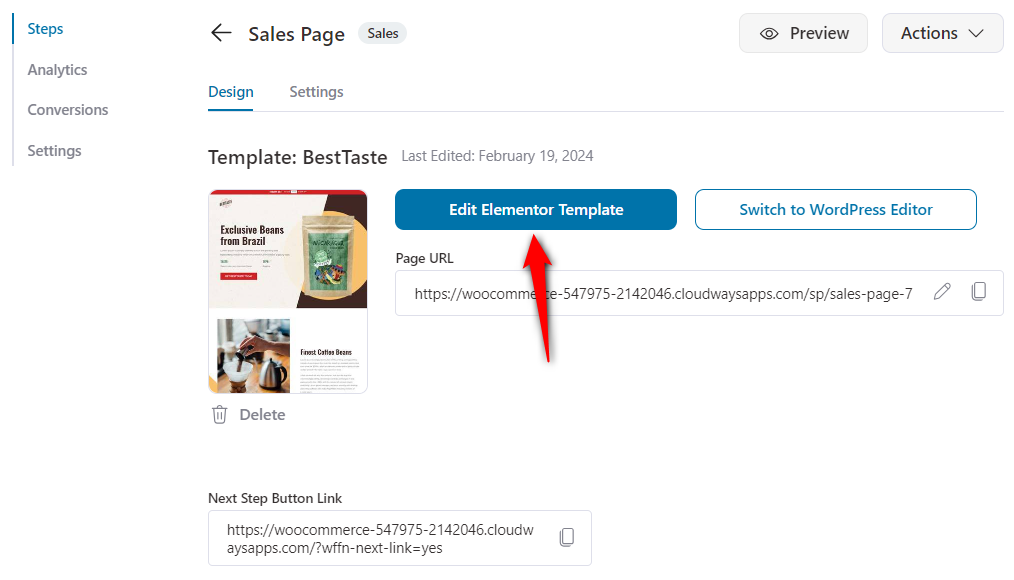
You can use your favorite page builders such as Elementor, Divi, Gutenberg, Oxygen, Customizer, or any third-party page builders to edit your templates.
Test Case #2: The Sequence of Upsell Offers
With the in-built A/B testing feature with the Funnel Builder, you can easily be able to find out which sequence converts better.
Set up an experiment to find out in which order you should be upselling the items.
Take a look:
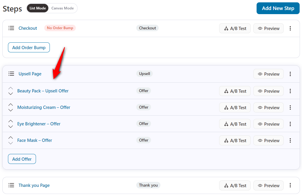
Setting up a sequence-based test is as simple as dragging and dropping one offer next to another.
Test Case #3: The Number of Upsell Offers
Do you want to present more than one post-purchase upsell offer? But don't know how your audience would respond?
Set up an experiment and find out.
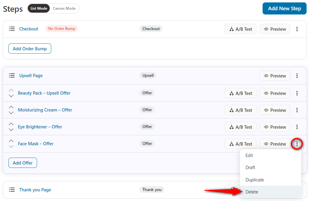
Duplicate the original variant and delete the extra offers.
Test Case #4: Multiple Offers vs Single Offer on an Upsell Page
When you offer people a choice between 2 or 3 offers on the same page, the probability of your conversion increases.
People are more likely to pick one option laid on the table when they have a choice as compared to when they don't.
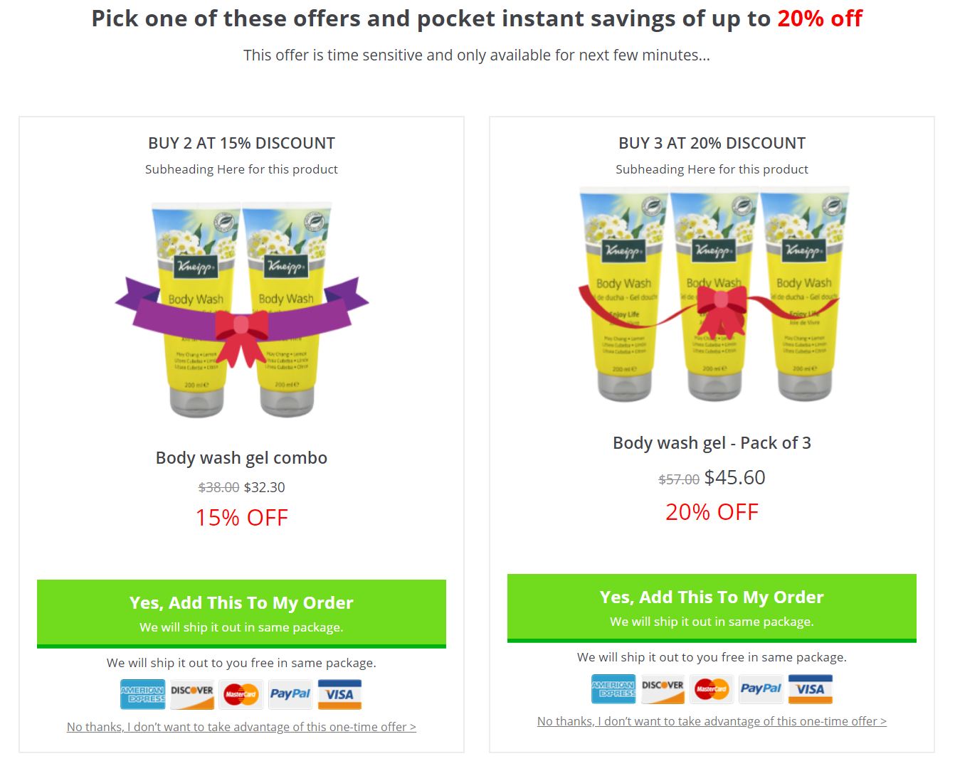
So the multi-product template allows you to present many upsell offers on one page.
You can present two or more offers in grid or list format:
Here's the version of the same page with one single item:
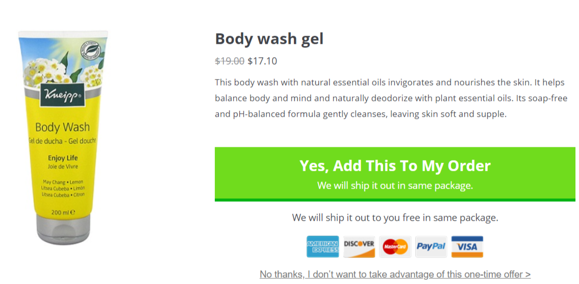
When you start the A/B test - some of your buyers will have the choice, others will not.
After the numbers roll in - you'll get a clear winner.
This will also give a lot of insights into your buyers' psychology.
Test Case #5: Multiple Order Bumps vs A Single Order Bump
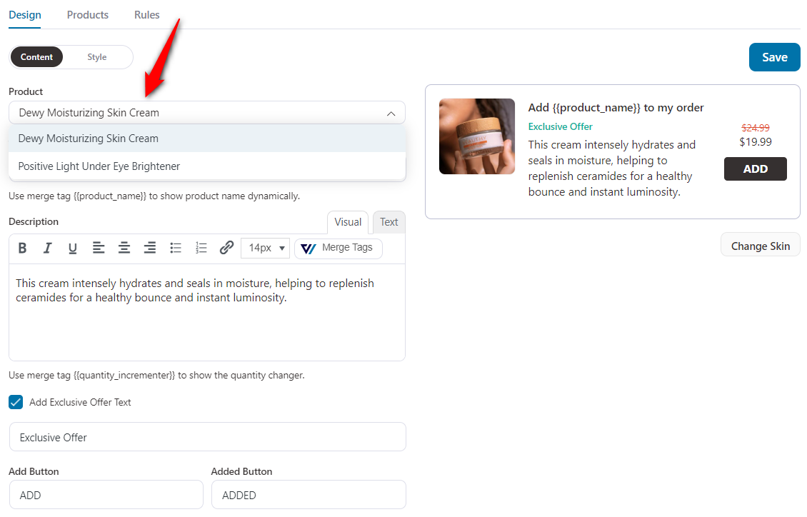
Order bump users, who are getting phenomenal results with the bumps, offer multiple choices on the checkout.
Their buyers can choose one of the given bumps or all of them and add them to their order.
The order total gets instantly updated based on what they choose.
So this A/B testing strategy helps you whether multiple order bumps work better for you or not.
Let's find out here:
Here's just one single order bump on the checkout page:
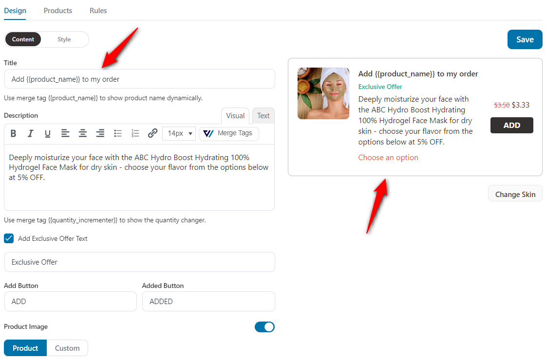
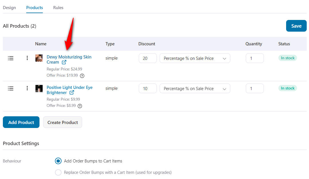
Also, you can test different products against each other and discount amounts. Here's how:
Conclusion
These are just the top 5 experiments that we showed above. But there's no limit on how you want to split-test the components of your sales funnels.
You can A/B test your opt-in, opt-in confirmation, sales, checkout pages, order bumps, one-click upsells, and thank you pages pretty effectively.
It's quite flexible and allows you to A/B test any element and improve conversions.
