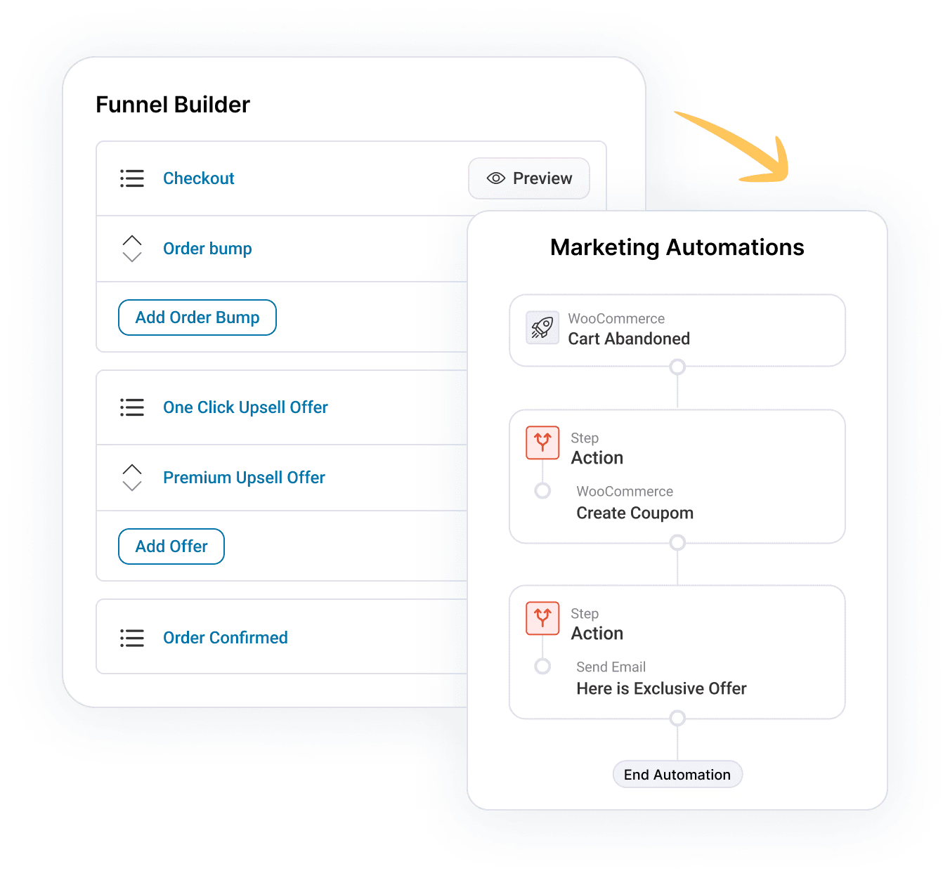
In today's post we're talking about the three building blocks of a sales funnel that sell like a human.
We have with us Marvin Coffman who runs an agency and serves WooCommerce store owners from a variety of niches.
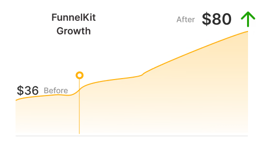
Marvin's got the exclusive offer bundle and told us that he's yet to set up FunnelKit (formerly WooFunnels) on a store where he's not got the ROI.
His results are impressive and therefore we brought him to show us how he's got them.
So we'll go behind-the-scenes and look at his actual pages and the entire funnel.
First up, watch this video to get some golden insights:
I have broken the conversations down into specific insights and key takeaways.
So let's dive right in...
Table of Contents
Sales Funnels In The Real World
Sales Funnel draws inspiration from the behaviour of shoppers in the real world. People have an innate desire to buy items that compliment the main purchase.
And here's the thing - there's a limited time window of interest. This desire only lasts for about 30 minutes or so after the initial purchase.
A day of two later, the purchase is old and they've moved on. Businesses that understand this psychological effect, also called the Diderot effect capitalise it well.
Real World Example #1: McDonald's Leads With A Simple Question
Do you know what? A 50-pound bag of potatoes costs less than $10. So when you buy those fries it literally costs the store pennies.
McDonalds doesn't make money selling the burger but the fries and drink that go with it and you always pay 20-30% more to get the meal.
It all starts with a humble question -'Would you like fries with that?' Or 'Do you want the drink to go with your burger?'

The staff is actually trained to ask these simple questions.
Real World Example #2: Disney Encourages Passion Purchases With Magic Arm Bands
Disney came up with an innovative way to increase its average order value.
They realised that having people to take their wallets out and physically pull cash out is actually a deterrent and prevents them from making passion purchases.
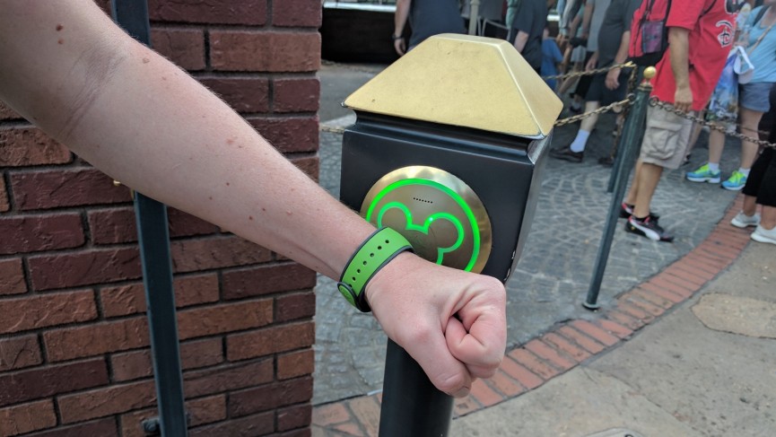
Therefore they come up with this ingenious idea of magic armbands. The visitors can wear them on their wrist and flash the band whenever they need to spend money.
Disney date with Jasmin? Flash the band.
Want the Pirates of Caribbean merchandise? Flash the band.
Note, there's transaction happening at each step but people don't even realize it.
Building Blocks of Marvin's Sales Funnel That Sells Like A Human
Now that you know what a sales funnel is in real life, let's look at its building blocks.
We'll also shed some spotlight on the results that Marvin Coffman got by implementing those in his business and that of his clients.
Building Block #1: Fast-Loading One-Page Checkout
Here's the conventional flow through a WooCommerce store:
Product Page --> Add To Cart ---> Proceed To Checkout ---> Place Order
As you can notice there are 3 steps involved before a user can finally make the purchase.
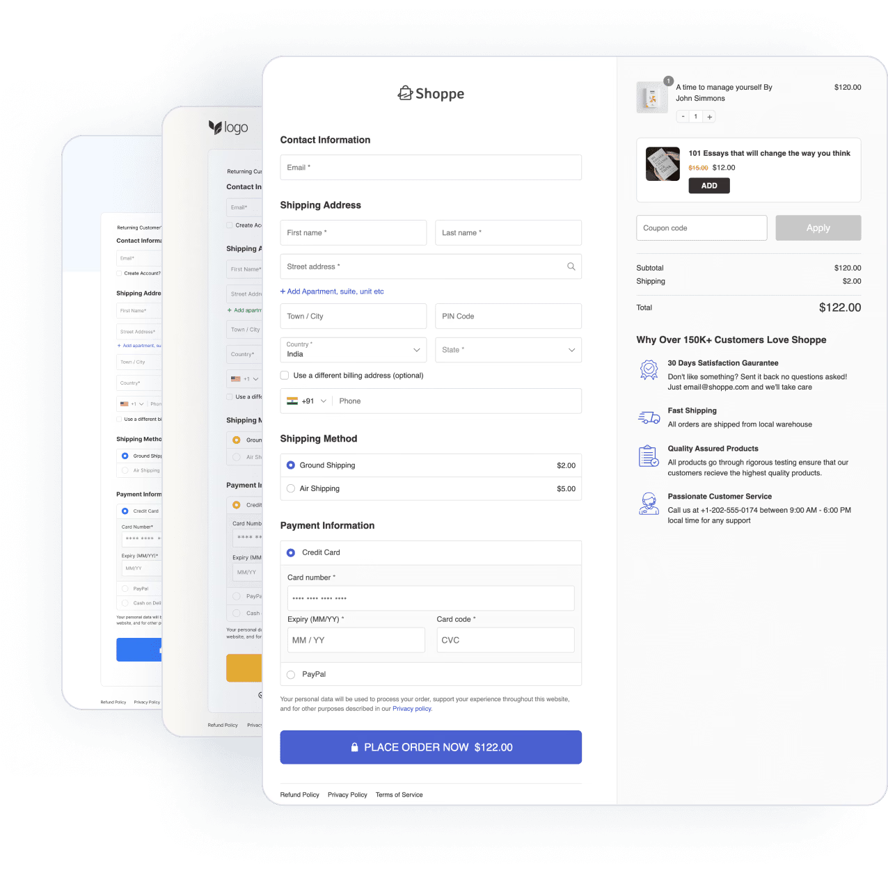
But Aero allows you to map the product with the checkout pages and you can even use the CartHopper add-on to direct users straight to the checkout page, hence eliminating all the intermediary steps.
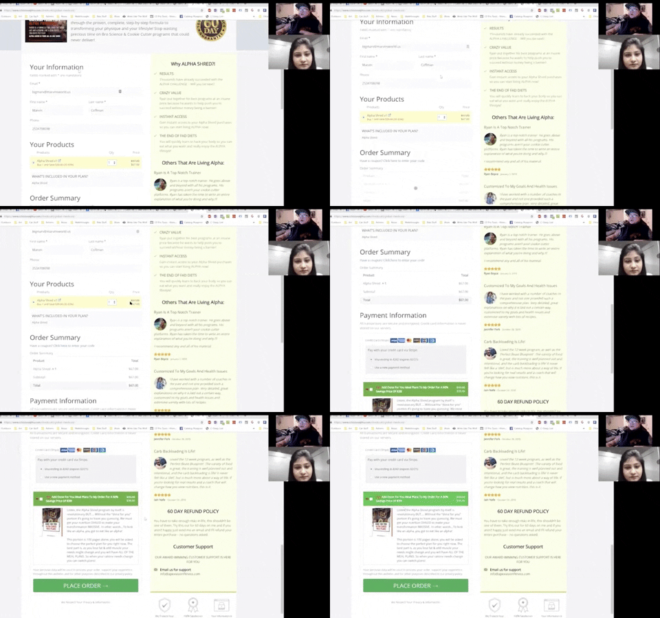
Marvin implemented one-page checkout, take a look at his product-specific checkout page:
Notice a few key elements of this product-specific checkout page:
- The Value Prop is reinforced at the top - They remind people why it's the right program to invest in and subtly nudge them to go ahead and buy. For example, here they're saying - "Stop wasting time in bro science and cookie cutter programs"
- Social Proof in the sidebar - In 'why buy' this product section, they've listed down specific and desirable bullets.
- Customer testimonials - Adding testimonials to the checkout page is a great way to handle fears and unspoken objections. Your own sales copy can only take the sale so far but honest reviews and testimonials close the deal.
Building Block #2: Value-Enhancing Order Bump
The order bump is a pre-checkout offer on the checkout page. Users can add it to their order with a single tick on the checkbox. Again it draws inspiration from the real life.
When you go to the counter of a grocery store, you see all the candies, the chargers, batteries, gums etc. lying right there. You can add them to your order just before the guy at the counter prints your bill.
They in fact wait for you to add the extras!
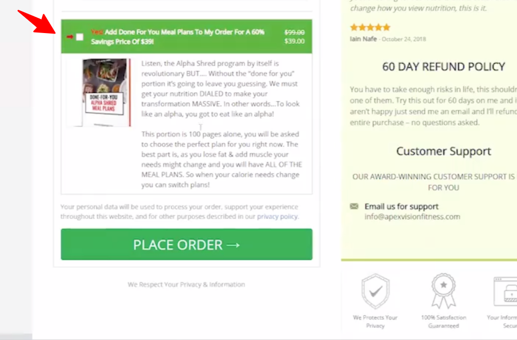
In this example, Marvin created an order bump too - that's done for you meal plans to go with the program and offered it at a 60% off:
In just one month, Marv got 26 people accept the $39 worth offer - so that's $1014 extra added to the bank with just that little box and a tick!
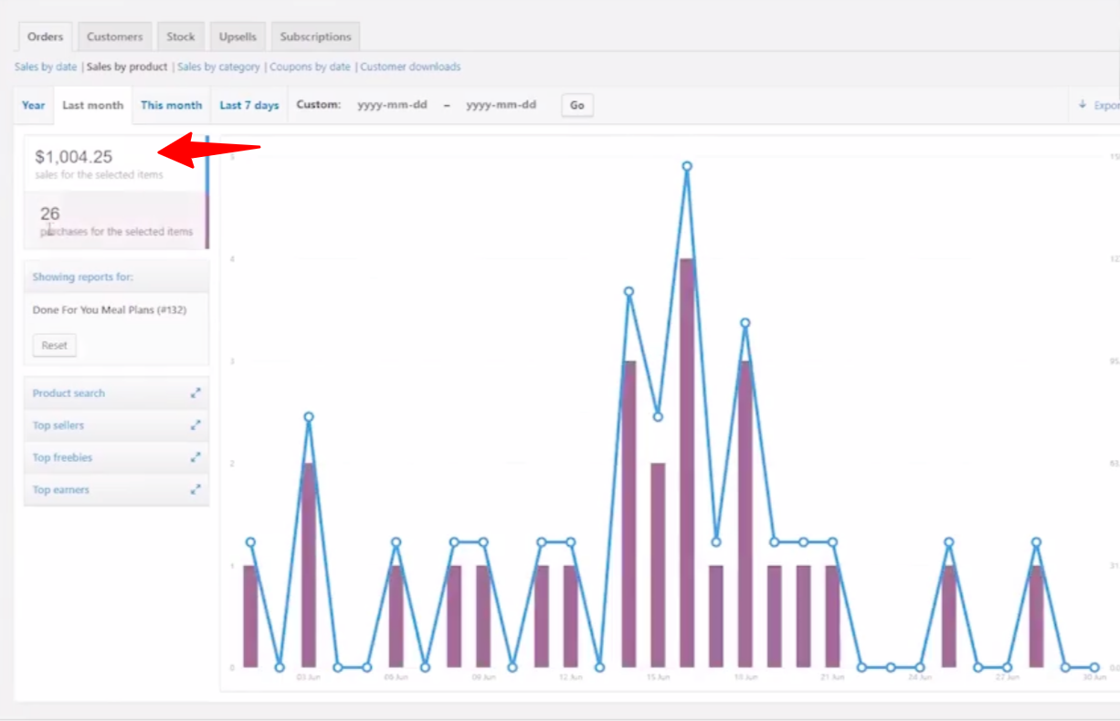
So why does the order bump convert so well? Here are a few reasons why:
- It's a done for you offer - Gives a feeling that one doesn't have to put in any work
- There's massive value to be unlocked - For example, the copy says it's a 100-page book so you know that you're paying for something real
- The price i.e. $39 and a 60% discount is exclusive (not available elsewhere)
Building Block #3: Result-Accelerating One-Click Upsell
The next building block of a sales funnel that sells like a human is the one-click upsell page.
Since people are spending money to get an intended result or outcome, they'll be happy to get there faster with an additional purchase.
Marv capitalised on this willingness of the buyers to achieve the outcome faster. The upsell page sells a bundle for $19, that's a $30 discount on the original price.
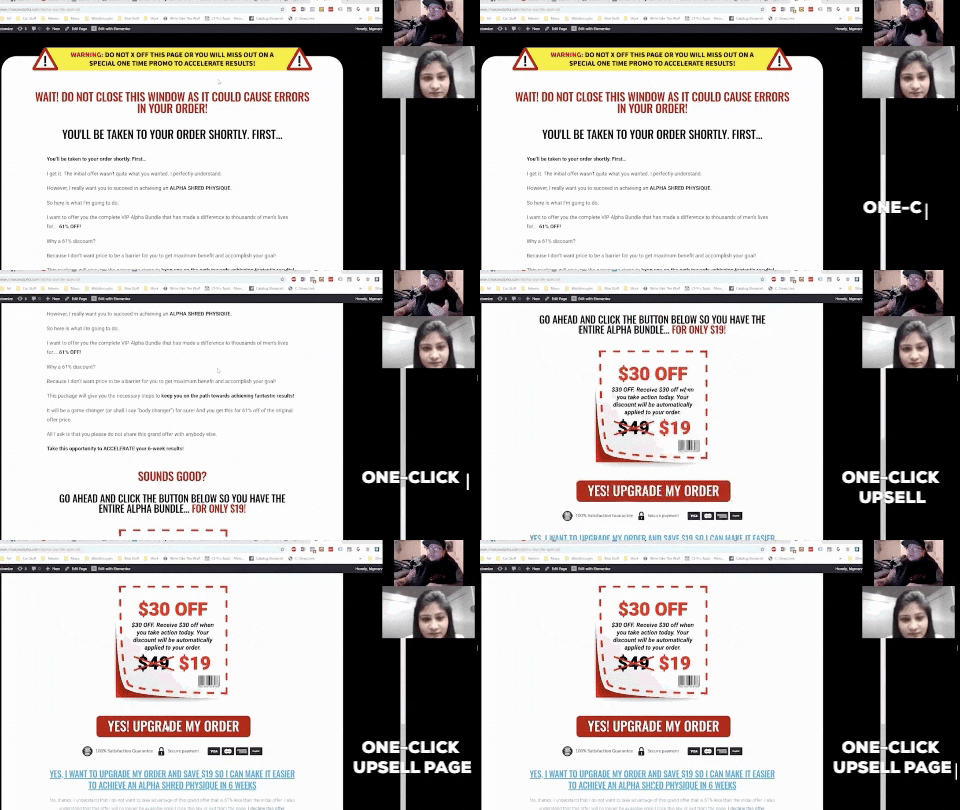
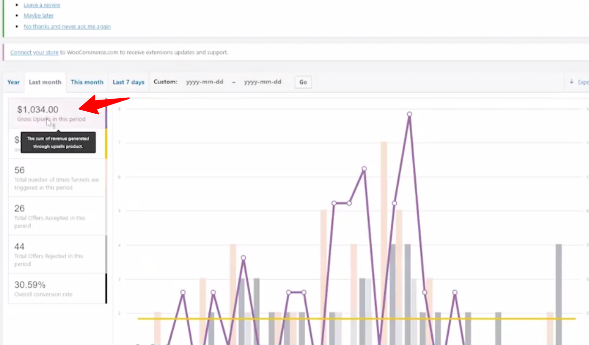
Marv made $1034 extra in a month and had an upsell conversion rate of 30.59% which by the way is 18% of their monthly sales ($5740).
UpStroke lets you create one-click upsell page in three ways:
- The in-built Customizer
- Pre-built Elementor Templates
- Custom Page
Marv created a custom page using Elementor pro. But you can even use our pre-made Elementor templates and edit them to roll out gorgeous upsell pages.
This was one of the important updates in UpStroke 2.0.
What's Your Funnel Story?
That's all we have today. Did you see the video yet?
Do give it a watch right away. If you don't have the bundle or wish to upgrade, get FunnelKit today!
And one more thing:
Do you have a story to share? If you've used one of our tools and got some brag-worthy & confidence-boosting results with it, then please leave a comment. And I'll follow up.

I am looking for ya!
Editorial Team
May 8, 2026A WooCommerce Shopify checkout is a redesigned WooCommerce checkout page built around the design principles that make Shopify's checkout convert. It includes a clean layout, express payment options at the...
Editorial Team
May 8, 2026Quick summary: Do you want to create a webinar funnel to increase conversions and boost your sales? The article is a step-by-step no-code guide to building a webinar funnel, covering...
Editorial Team
May 6, 2026Quick Summary: A WooCommerce one page checkout cuts the friction that kills conversions on default multi-page checkouts. We tested 7 plugins on live stores, ranked the best free and paid...

