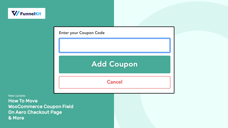
I am thrilled to share with you that we've released the latest version of Aero (1.7). ??
In this post, I am going to be covering some of the highlights from the release that matter most to you.
Firstly, we'll discuss how you can change the position of the WooCommerce coupon field and the limitation in the previous version.
Next, we'll look at some of the other updates.
Let's get started.
Table of Contents
- 1 Changes To The WooCommerce Coupon Code Field in Aero Checkout
- 1.1 #1: Drag & Drop the Coupon Code Field into a Specific Section
- 1.2 #2: Edit the Coupon Field Label To Let Users Know It's An Optional Field
- 1.3 #3: Show a Persuasive Success Message To Nudge Code Users To The Finish Line
- 1.4 #4: Make the Coupon Field Collapsible To Substantially Lower Checkout Abandonment
- 2 Coupon Code Field on Some High-Converting Checkout Pages
- 3 Other Updates In The Latest Release Of Aero Checkout
Changes To The WooCommerce Coupon Code Field in Aero Checkout
There are 4 major updates to the coupon code field in Aero Checkout. All of these changes will help you:
- Prevent the users without a coupon code from abandoning the checkout page
- Encourage users with the code to complete the process
These updates matter a lot because 8 out of every 100 users cite not being able to find a coupon code as a primary reason for abandonment.
According to Statista, a full 8% of customers cite not being able to find a coupon code as the primary reason for abandoning their cart - opting instead to wait until one shows up and try and find a better deal elsewhere.
Unfortunately, some checkout processes encourage the feeling of missing out. This happens most often when a coupon code search bar is near the checkout. The presence of this field promotes the idea that they are paying too much.
Let's explore the changes.
#1: Drag & Drop the Coupon Code Field into a Specific Section
You can drag the coupon field from the panel on the right to any of the sections you want.
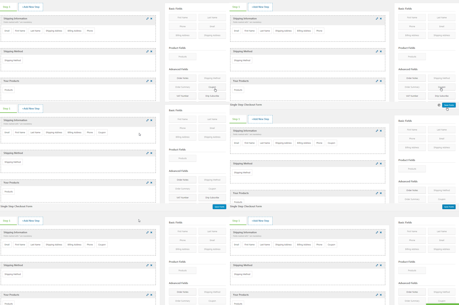
Earlier you only had the option to enable or disable the coupon field. But it always appeared in the cart section.
The biggest disadvantage of being right up there in the cart section was that it was one the first few empty fields that people saw. With the new update, you can put it where it's most optimized for conversions.
Take a look - the coupon field is now placed between the order summary and payment information section:
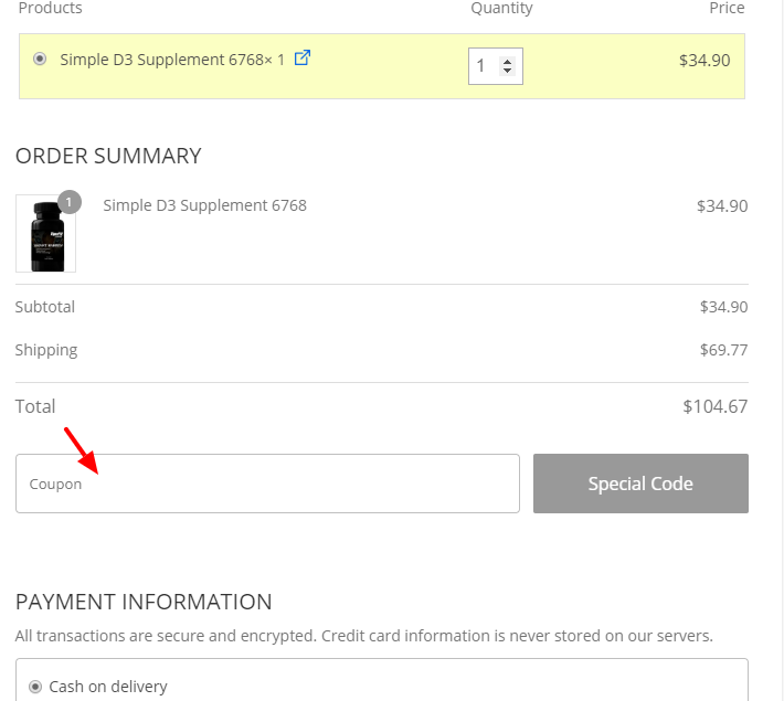
People will only see this field when they have filled out other details like name, email, shipping etc. They are already in momentum and are much less likely to leave the page on realizing they don't have a coupon.
#2: Edit the Coupon Field Label To Let Users Know It's An Optional Field
You can now edit the coupon label and add custom text in the label section.
Now let's understand why you would like to do that.
There will be a high percentage of users on the checkout page who do not have the coupon code.
But on seeing the empty field, they'll feel the need to hunt for it. This thought can drive them away from the page.
But if you specify that it's an optional field, you're basically telling them it's okay to not have the code: Not everyone has it and not every order qualifies for it.
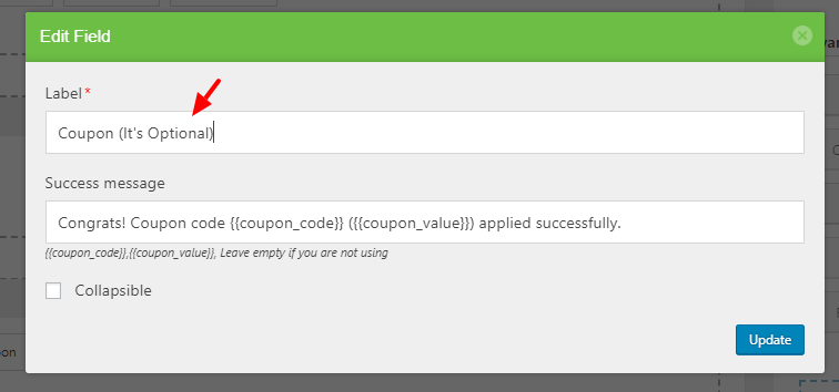
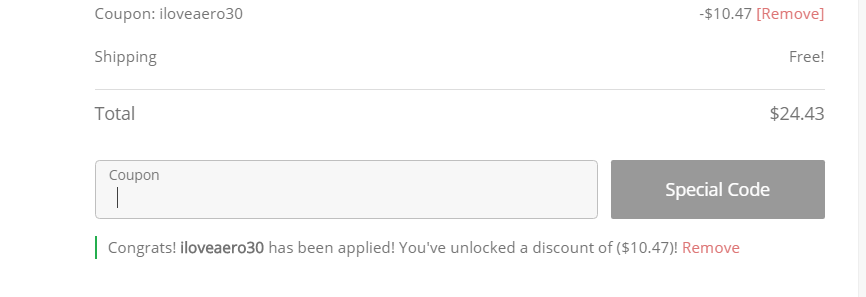
#3: Show a Persuasive Success Message To Nudge Code Users To The Finish Line
Aero now gives you dynamic merge tags to print the coupon code and coupon value.
You can use these dynamic merge tags to create the display message on success.
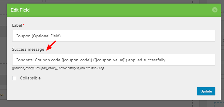
Here are a few examples of coupon success message text:
- There you go! {{coupon_code}} has been applied successfully. You've saved ({{coupon_value}}) on your order!
- Congrats! {{coupon_code}} has been applied successfully. Your order qualifies for ({{coupon_value}}) off!
- Congratulations! You've unlocked money-saving offers on your order. You've got ({{coupon_value}}) discount!
The biggest reason why you should write persuasive success messages is so that people feel compelled to move forward and complete the purchase.
#4: Make the Coupon Field Collapsible To Substantially Lower Checkout Abandonment
Aero now lets you make the coupon field collapsible. This means only when they click on the blue link, the coupon field will appear in a simple drop down.
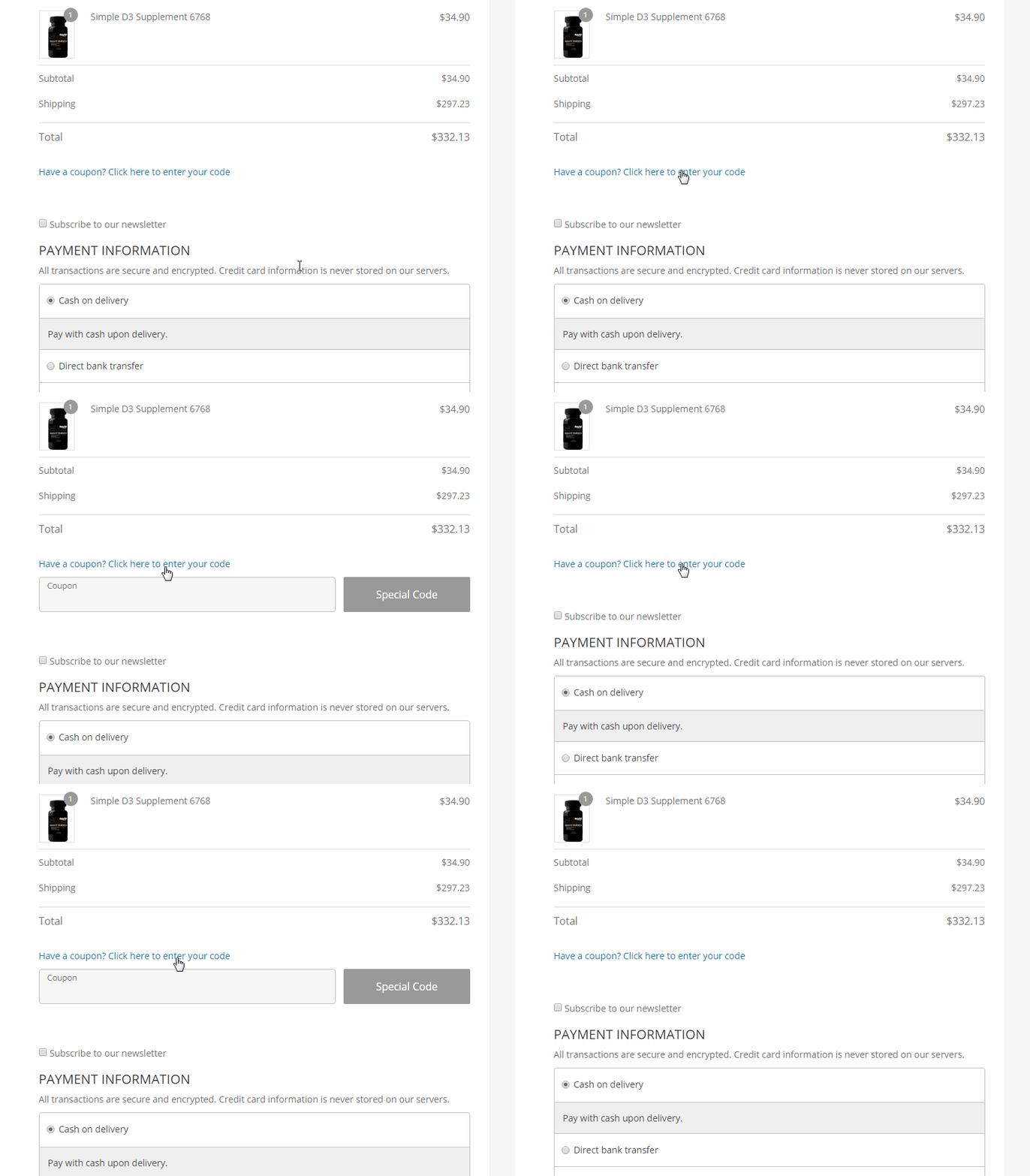
This is your way of showing them that it's a completely optional field. The coupon code is an added bonus but it's not a critical component of the purchase.
This is especially useful for price-sensitive, deal-hunting users who don't have a coupon code for your website. You can smartly tuck the empty field so they don't feel they're missing out.
Coupon Code Field on Some High-Converting Checkout Pages
Let's take a look at how high converting websites do it.
Zappos & Their Coupon Field
Zappos has a multi-step checkout form and the first step is dedicated to the basic details.
After the user has filled out their basic details i.e. name, email, shipping address - the next step is the payment details section.
The empty coupon field is shown at the second step, right below the payment details: 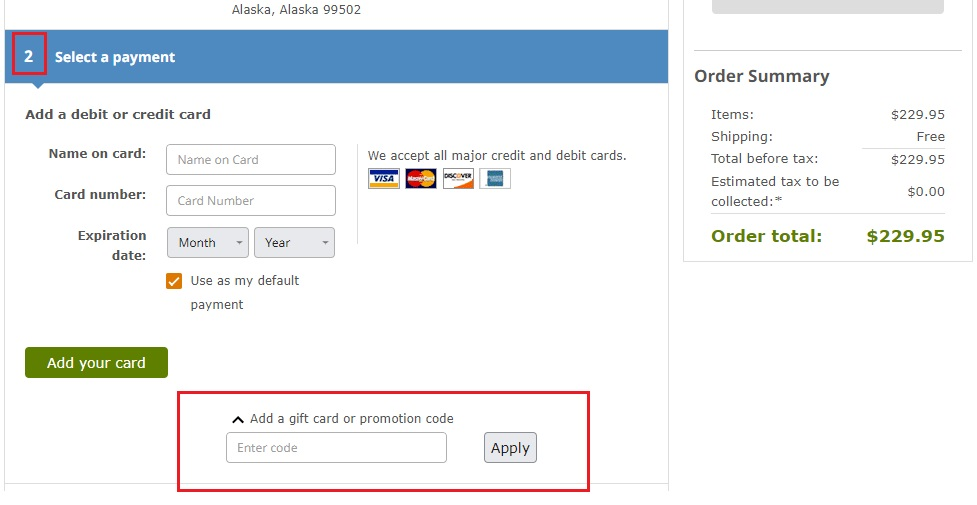
By this time in the purchase journey, the user has entered most of their details and even attached the card for payment. So he has punched in his commitment.
Office Depot's Coupon Field
Another brilliant example is from US's top retailer, Office Depot. It comes after the billing details section, take a look:
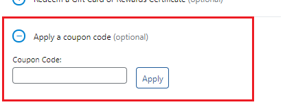
Notice two conversion-focussed tactics Office Depot has deployed here:
1. They clearly specify the coupon field is optional - They are acknowledging the fact that not everyone has a coupon code and that's okay. It's not a critical component of the purchase.
2. They've made the field collapsible- The user experience backs the micro-copy. Making it collapsible further reinforces that it's an optional field - the field they'll only see when they make some effort. It's definitely not right up there - triggering the fear of missing out.
Other Updates In The Latest Release Of Aero Checkout
That's just one of the updates in the latest release of Aero Checkout. Here are a few others:
- Compatibility with ‘Aelia EU Vat assistant’ plugin, allowing conditional VAT field based on a country selection. It's a powerful plugin that lets you deal with complex EU VAT regulations. The EU VAT Assistant plugin extends the standard WooCommerce sale process and calculates the VAT due under the new regime.
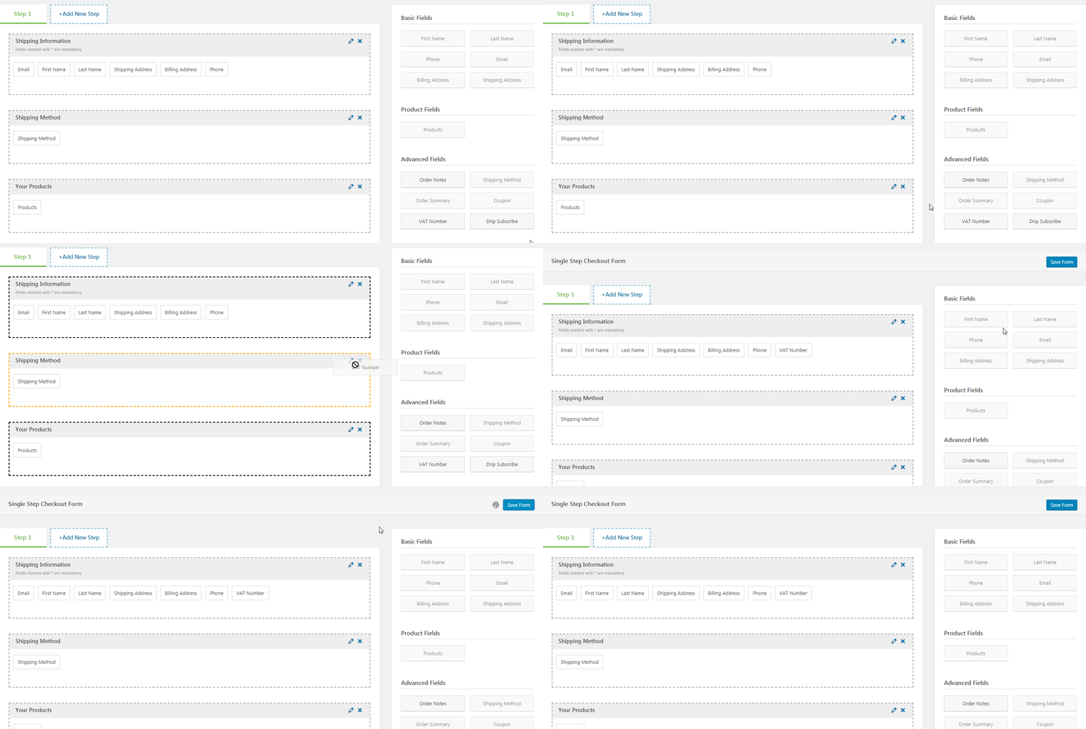
- Compatibility with ‘Klaviyo’ plugin. Added Subscribe option in the checkout form so that you can send emails with permission.
- Compatibility with ‘EU Vat Premium Field’ plugin (Author: David Anderson).
Read more about these in our changelog here.
If you're using one of the older versions of Aero, then please update to the latest and enjoy the benefit of all the compatibility and features that we've rolled out.
If there's any new feature request that you have, please feel free to raise a support ticket.
We do have a very friendly and helpful support staff that's always rooting for you.

Editorial Team
May 1, 2026If you sell products online, you need to build an Elementor sales funnel to maximize sales. A sales funnel guide helps you convert visitors into buyers through a well-charted course/well-defined...
Editorial Team
May 1, 2026Are you looking for WooCommerce checkout optimization hacks to streamline your users' shopping experience? Your WooCommerce store may have an attractive layout with a user-friendly interface. You may even have...
Editorial Team
April 22, 2026WooCommerce upsells are product recommendations shown to customers to encourage them to purchase a higher-value item or add related products to their order. When placed at the right moment in...

