Are you looking for WooCommerce checkout optimization hacks to streamline your users' shopping experience?
7 out of 10 shoppers who reach a WooCommerce checkout leave without paying; according to Baymard Institute’s running average, documented cart abandonment is roughly 70%.
The fastest fixes include cutting the form to essential fields, enabling guest checkout, placing express payments (Apple Pay, Google Pay) above the form, showing all costs before the payment step, and ensuring the page loads in under two seconds.
In this playbook, we'll cover those five first, then 26 more fixes across form design, speed, the new block checkout, trust, mobile, and recovery.
Each optimization covers a plugin and a no-plugin route, labeled by impact and effort, so you can triage rather than reading 31 items cold.
Watch this video to learn about checkout customization and optimization tips to speed up conversions:
Table of Contents
- 1 The 5 Quick Wins (Do These First)
- 2 First, Find Your Checkout Conversion Rate (5-Minute Baseline)
- 3 Category 1: Checkout Form Fields and Design Optimization
- 4 Category 2: Speed Up WooCommerce Checkout
- 4.1 7. Configure caching correctly (and exclude the checkout page)
- 4.2 8. Replace WP-Cron with a real server Cron
- 4.3 9. Enable High-Performance Order Storage (HPOS)
- 4.4 10. Add Redis (or Memcached) object caching
- 4.5 11. Cut third-party scripts and cart fragments from checkout
- 4.6 12. Defer transactional emails
- 4.7 13. Disable order attribution if you don't use it
- 4.8 14. Run query monitor on the checkout page
- 5 Category 3: Get the New WooCommerce Checkout Right
- 6 Category 4: Optimize Payments
- 7 Category 5: Build Trust and Kill Surprises
- 8 Category 6: Fix Mobile Checkout
- 9 Category 7: Streamline the Flow
- 10 Category 8: Raise Order Value and Recover the Rest
- 11 Frequently Asked Questions
- 12 Start Your WooCommerce Checkout Optimization With the Quick Wins
The 5 Quick Wins (Do These First)
| # | Fix | Impact | Effort |
|---|---|---|---|
| 1 | Trim the form to essential fields | High | 2 minutes |
| 2 | Enable guest checkout | High | 2 minutes |
| 3 | Put express payments above the form | High | 5 minutes |
| 4 | Show every cost before the payment step | High | 5 minutes |
| 5 | Defer emails + drop cart fragments | High | 10 minutes |
First, Find Your Checkout Conversion Rate (5-Minute Baseline)
We recommend you measure before you actually fix your checkout. Otherwise, you can’t tell which of these changes below moved the number.
In GA4 (with the WooCommerce Google Analytics integration or GTM firing ecommerce events), build a funnel exploration with four steps: begin_checkout → add_shipping_info → add_payment_info → purchase.
Your checkout conversion rate is purchase ÷ begin_checkout.
Anything under 40% for a typical store means the tactics below will pay for themselves; the step with the steepest drop-off tells you which category to start with (form fixes for shipping-step drop-off, payment fixes for the last step).
If you run FunnelKit, the built-in analytics show this per-checkout without GA4 setup.
Either way, take a screenshot of your baseline today. You’ll want it for the before/after comparison later in this guide.
Category 1: Checkout Form Fields and Design Optimization
The form is where most abandonment happens, and it’s the cheapest layer to fix.
1. Cut the checkout form to essential fields
Impact: High, Effort: 5 minutes
Baymard’s checkout research found the average checkout asks for more than 11 form fields, while most orders can be completed with 6-8.
Every extra field, such as company name, address line 2, and order notes, is a measurable tax on completion; make phone optional unless your shipping carrier truly requires it.
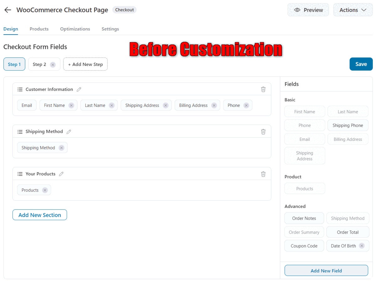
- With FunnelKit: Add, edit, remove, and reorder fields with the drag-and-drop visual checkout field editor.
- Without a plugin: Use the woocommerce_checkout_fields filter in your child theme’s functions.php:
add_filter( 'woocommerce_checkout_fields', function( $fields ) {
	unset( $fields['billing']['billing_company'] );
	unset( $fields['billing']['billing_address_2'] );
	unset( $fields['order']['order_comments'] );
	$fields['billing']['billing_phone']['required'] = false;
	return $fields;
} );
For developers, the full hook reference for reordering, relabeling, and conditionally showing fields is in our WooCommerce checkout hooks guide.
2. Enable guest checkout
Impact: High, Effort: 2 minutes
Forced account creation is one of the most-cited reasons for cart abandonment after price. About 1 in 4 shoppers will abandon if they're forced to create an account.
Go to WooCommerce ⇨ Settings ⇨ Accounts & Privacy and:
- Enable the 'Allow customers to place orders without an account' option
- Check the 'Allow customers to create an account during checkout' option
- Disable any toggle that says require account
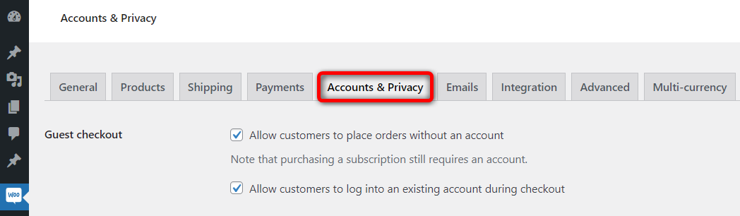
Or, invite account creation on the thank-you page, where it costs nothing. No plugin is needed to allow guest checkout in your WooCommerce store.
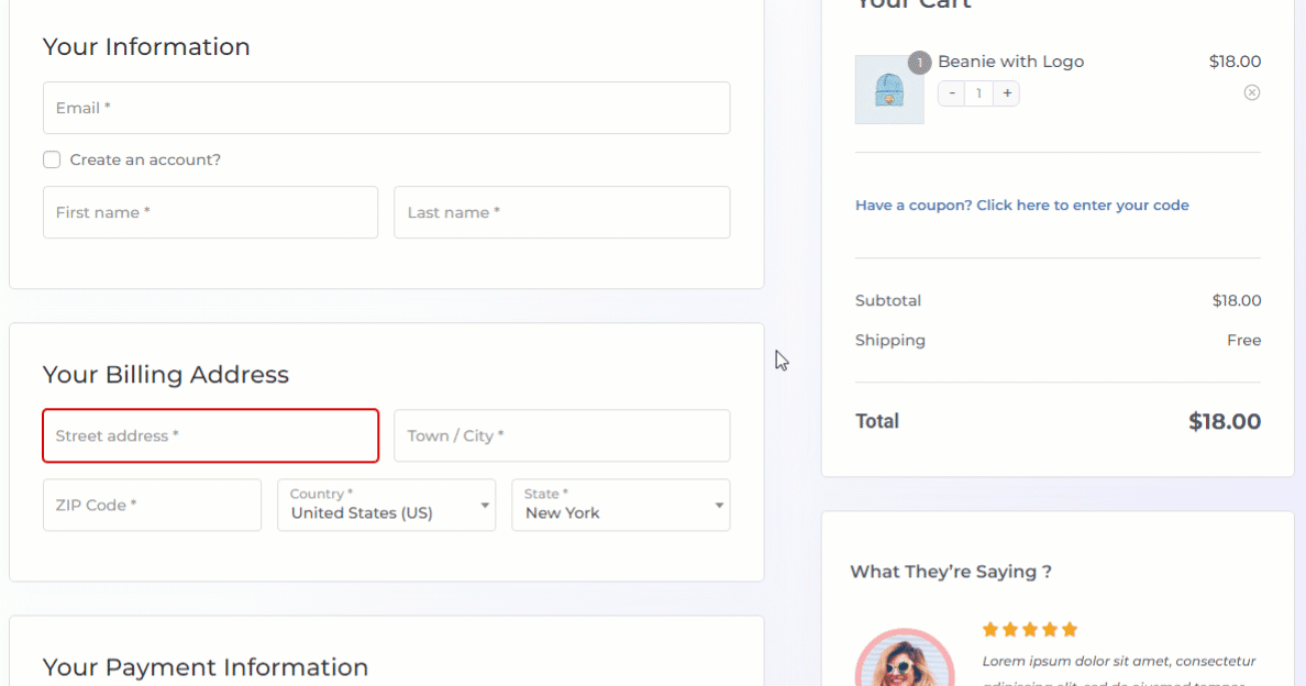
3. Add address autocomplete
Impact: Medium, Effort: 15 minutes
Typing a full address is the slowest part of any checkout, especially on a phone. Google Address Autocomplete suggests the full address after a few keystrokes and fills the street, city, state, and postcode fields in one tap.
You will need a Google Maps Platform API key with the Places API enabled.
Several free and premium plugins connect the API to WooCommerce address fields, and most checkout optimization suites natively include the integration.
- With FunnelKit: Enable Google Address Autocomplete in the optimizations settings and paste your API key.
- Without a plugin: Any free address-autocomplete plugin that supports the Google Places API will do the job. Make sure to set billing-as-default to WooCommerce's native behavior when “Force shipping to the customer billing address” is intact or the default theme settings are in effect.
4. Turn on inline field validation
Impact: Medium, Effort: 2 minutes
Nothing frustrates a buyer like submitting a form and getting bounced back to a wall of red errors. Inline validation highlights a problem the moment the shopper leaves a field, while the mistake is still easy to fix.
- With FunnelKit: Make sure to turn on the inline field validation in the checkout templates.
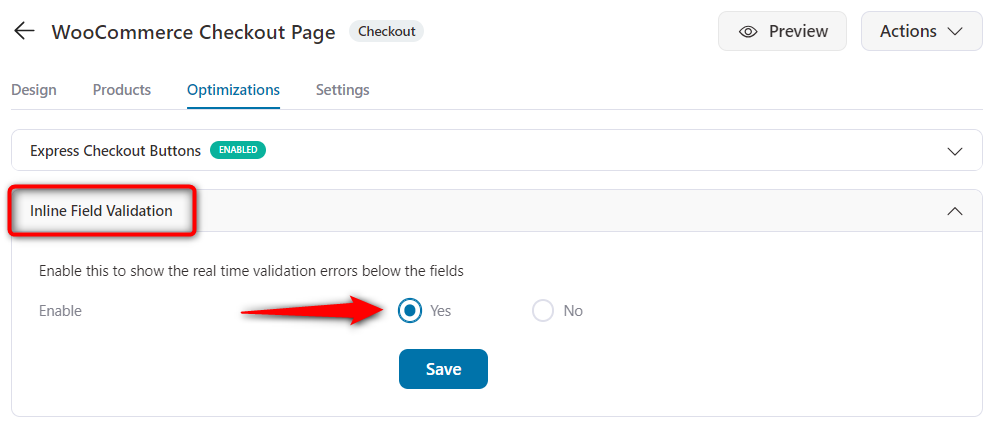
- Without a plugin: The block checkout (see tactic 17) validates inline natively. On the classic checkout, a lightweight validation snippet on checkout_error or a free inline-validation plugin covers it.
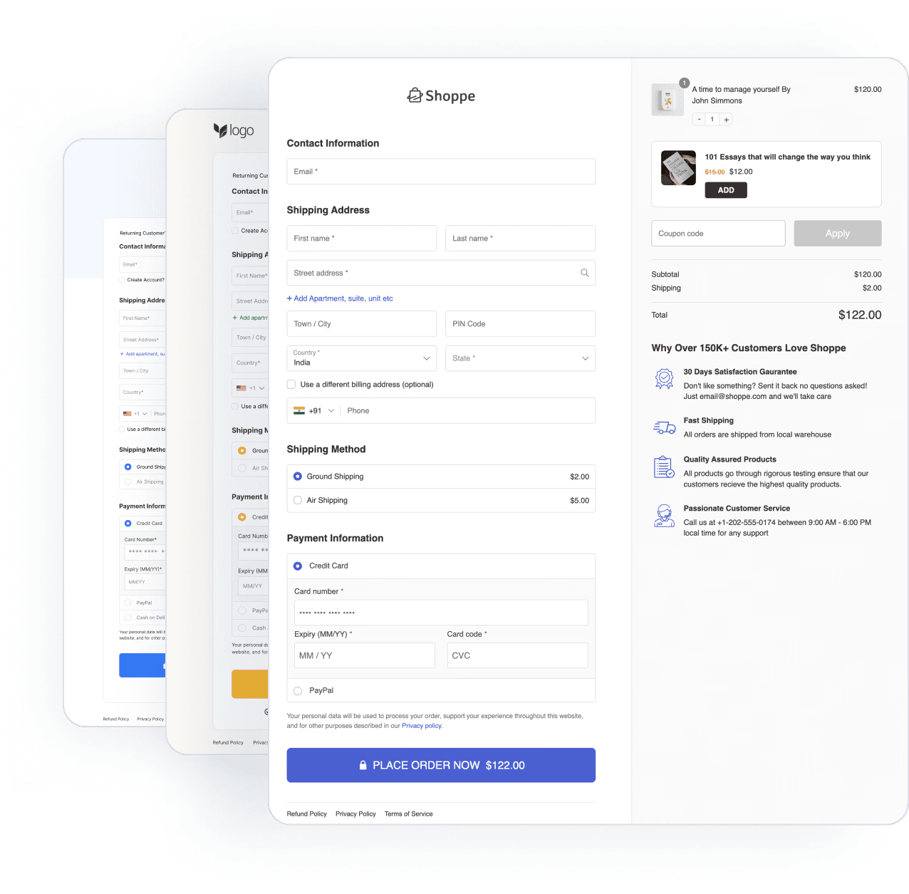
5. Use a clean single-column layout
Impact: Medium, Effort: 10 minutes
Form usability research from Nielsen Norman Group and Baymard consistently favors a single-column layout.
Two-column checkouts get fields skipped, misread, and tabbed through in the wrong order.
Keep the field flow in a single column, group it into labeled sections (contact, shipping, payment), and place the order summary in a sidebar or collapsible panel rather than mixing it into the form.
Most modern checkout templates and themes support this layout out of the box.
- With FunnelKit: Pick a one-column template.
- Without a plugin: Most themes expose this in the customizer; otherwise it’s a small CSS change to stack .woocommerce-checkout .col2-set columns.
6. Let shoppers edit cart items on the checkout page
Bouncing back to the cart page to change a quantity is a source of friction.
Show an editable mini-cart in the checkout's order summary, including a quantity stepper, a remove button, and, ideally, a "you removed an item, undo?" recovery link.
FunnelKit handles this. It allows users to change the quantity of items in the cart and delete or even recover them.
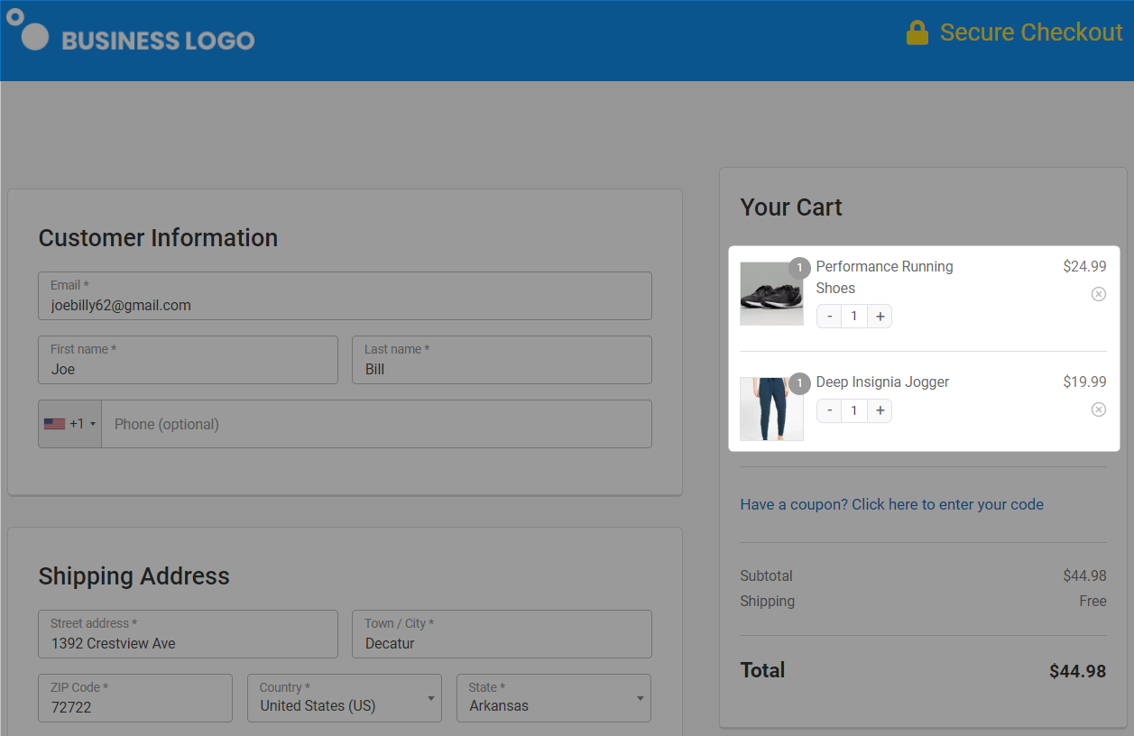
Enable the quantity switcher option and allow deletion when customizing the checkout page with a page builder.
Category 2: Speed Up WooCommerce Checkout
Speed is a conversion feature, not an IT chore. Deloitte’s Milliseconds Make Millions study found that a 0.1-second improvement in mobile site speed increased retail conversions by 8.4% and average order value by 9.2%.
In community discussions, store owners found proper caching, a real server cron, HPOS, Redis, and ruthless plugin pruning actually improved the checkout performance.
7. Configure caching correctly (and exclude the checkout page)
Impact: High, Effort: 10 minutes
Page caching makes your store fast, but the checkout must never be served from cache. A cached checkout results in stale carts, incorrect totals, and broken sessions.
Good caching plugins automatically exclude /cart/ and /checkout/; verify yours does.
Ensure you cache static pages at the CDN and server levels, compress images and convert them to WebP or AVIF, and minify CSS and JavaScript.
The goal is a checkout that loads in under two seconds on a mid-range phone.
Once done, test with PageSpeed Insights field data, not just lab scores.
Read our detailed post on WooCommerce caching here.
8. Replace WP-Cron with a real server Cron
Impact: High, Effort: 5 minutes
WP-Cron runs scheduled tasks on visitor page loads, which means peak traffic triggers background jobs at the worst possible moment.
Store owners report that add-to-cart and checkout redirects take 5 seconds or more during busy hours, solely due to this.
Disable it in wp-config.php:
define( 'DISABLE_WP_CRON', true );Then add a server cron job (or use your host’s control panel) hitting wp-cron.php every 5 minutes:
*/5 * * * * wget -q -O - https://yourstore.com/wp-cron.php?doing_wp_cron >/dev/null 2>&1Scheduled tasks keep running; buyers stop paying for them.
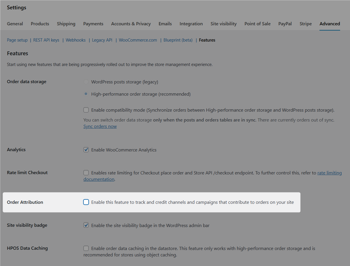
9. Enable High-Performance Order Storage (HPOS)
Impact: High, Effort: 15 minutes
High-Performance Order Storage (HPOS) moves orders out of the shared wp_posts/wp_postmeta tables into dedicated, indexed order tables, which speeds up when someone clicks the place order button.
New stores have it by default; older stores are often still on legacy storage.
Check WooCommerce ⇨ Settings ⇨ Advanced ⇨ Features and verify your critical plugins declare HPOS compatibility. Make sure to enable it in compatibility mode first, then switch to full once orders sync cleanly.
The higher your order volume, the bigger the win.
10. Add Redis (or Memcached) object caching
Impact: High, Effort: 15 minutes with dev/host toggle
Checkout pages can’t be page-cached because every one is unique, so the database gets hit hard.
A persistent object cache absorbs those repeated queries (sessions, cart contents, settings lookups) in memory.
Most managed WordPress hosts expose Redis as a one-click toggle plus a drop-in plugin. If yours doesn’t, it's a 15-minute job for a developer and one of the best speed-per-dollar changes on this list.
11. Cut third-party scripts and cart fragments from checkout
Impact: Medium, Effort: 15 minutes
Every chat widget, heatmap, and marketing pixel you load on the checkout competes with the payment form for bandwidth and CPU.
Run Query Monitor or your browser’s network tab on the checkout page, list every third-party request, and remove or delay anything that does not help complete the order.
While you are there, review cart fragments.
This AJAX feature updates mini-cart totals sitewide and, in many stores, fires uncached requests on every page. Limit or disable it where your theme does not need it, and block external HTTP requests you never approved.
12. Defer transactional emails
Impact: High, Effort: 5 minutes
When a buyer clicks place order, WooCommerce fires the order confirmation emails before showing the thank you page.
If your SMTP service is slow, the customer stares at a spinner while emails are being sent.
Defer email sending to a background job using Action Scheduler so the order completes instantly and emails go out seconds later.
add_filter( 'woocommerce_defer_transactional_emails', '__return_true' );It works with any checkout, including classic, block, or plugin.
If you're running email customizers like FunnelKit Automations, Omnisend, etc., transactional emails go through this queue automatically and don't block checkout.
13. Disable order attribution if you don't use it
Impact: Low-Medium, Effort: 2 minutes
WooCommerce 8.5+ added an order attribution feature that tracks the origin of each order.
It's useful if you actually use the data, such as origin, device type, session page views, etc., because it injects scripts and adds processing on every checkout submission.
To turn it off, navigate to WooCommerce ⇨ Settings ⇨ Advanced ⇨ Features and disable it.
14. Run query monitor on the checkout page
Use Query Monitor, a free developer tool that shows you every script, database query, and PHP function firing on a page.
Make sure to install it on a staging site, load the checkout, and look for:
- Plugins loading the scripts that aren't needed for checkout
- Database queries running into the hundreds (anything above ~50 queries on checkout is a red flag)
- Functions taking >100ms each
The usual culprits here are page builders, sliders, social-share plugins, and sitewide analytics scripts.
Use Perfmatters or Asset CleanUp to disable them specifically at checkout.
Category 3: Get the New WooCommerce Checkout Right
WooCommerce now ships a block-based cart and checkout as the default experience on new stores.
This new checkout experience changes how you customize the page, so decide your base before you optimize on top of it. WooCommerce documents the block-editing workflow in its store-editing guide.
15. Choose your checkout: Block, Classic, or plugin template
Impact: High, Effort: 5 minutes to evaluate
You have three options for the default checkout page.
The block checkout is modern, validates inline, and natively supports express payments, but it ignores classic PHP field filters and some legacy plugins.
The classic shortcode checkout ([woocommerce_checkout]) has the widest plugin compatibility and full hook support.
A dedicated checkout plugin replaces either with conversion-focused checkout page templates and extra features.
Please note that fields, hooks, or older extensions stay classic or move to a checkout plugin.
Whatever you choose, do not run half-migrated; a mixed setup causes plugin conflicts behind many checkout-not-working complaints.
16. Optimize the Block checkout in the editor
Impact: Medium, Effort: 30 minutes
If you keep the block checkout, open the page in the Site Editor and tune it there.
Select the checkout block to toggle the company, address line 2, and phone fields off; mark the phone field as optional; and enable the link to return to cart only if you truly need it.
Turn on express payment buttons at the top of the block, add your terms checkbox, and keep the order summary block visible.
Because block checkout fields are managed here rather than through code, this editor pass replaces the snippet approach used in Tactic 1 for block-based stores.
Category 4: Optimize Payments
Payment friction is silent. Shoppers rarely complain about a missing wallet button; they just leave.
Digital wallets now account for roughly half of global e-commerce transaction value, so treating them as an afterthought means designing for the minority.
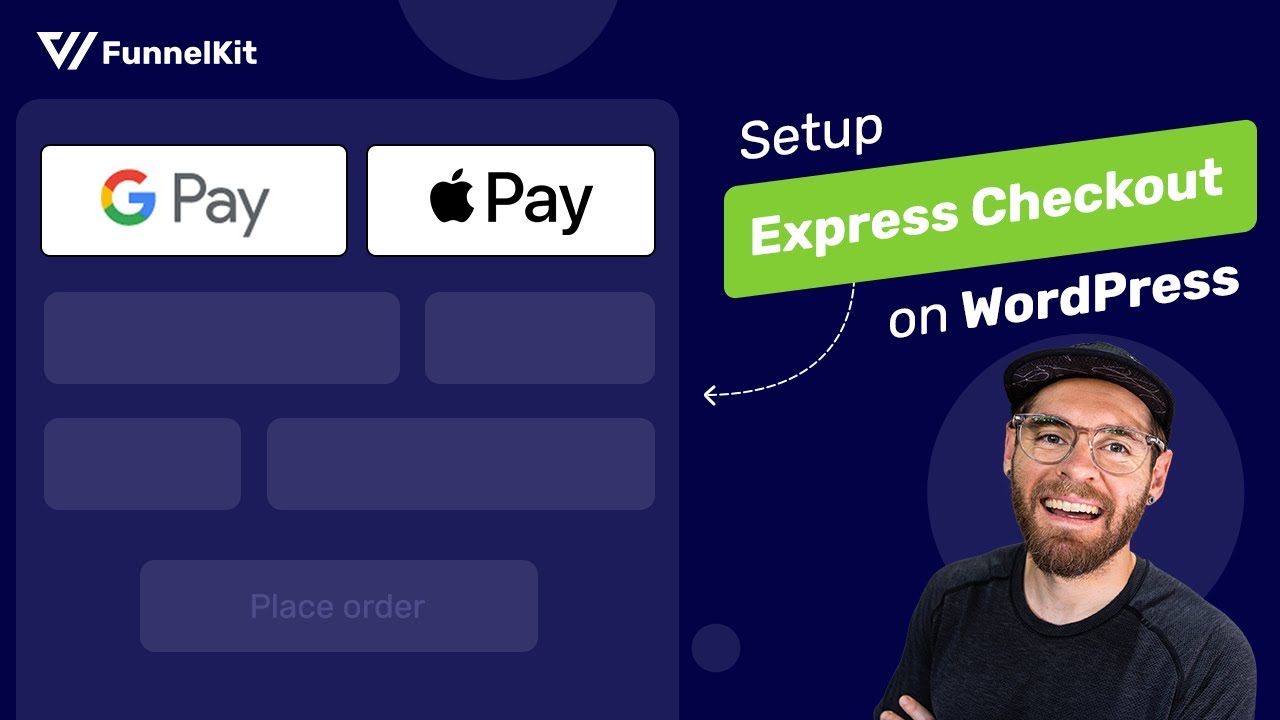
17. Put express payment buttons above the form
Impact: High, Effort: 10 minutes
Apple Pay, Google Pay, and Link let a returning buyer skip the entire form: address, card number, everything. That only works if the buttons appear before the form, not buried under it.
With just a tap of the express checkout payment button, shoppers can see all their saved cards for their purchases. They don’t even have to fill out the checkout form - it automatically sends the payment and address-related information to the merchant.
To enable express one-click checkout, install and activate the Stripe Gateway for WooCommerce from FunnelKit.
Once everything is set, go to the Express Checkout tab and enable it. You can even configure the visibility of the Google Pay and Apple Pay express checkout buttons here.
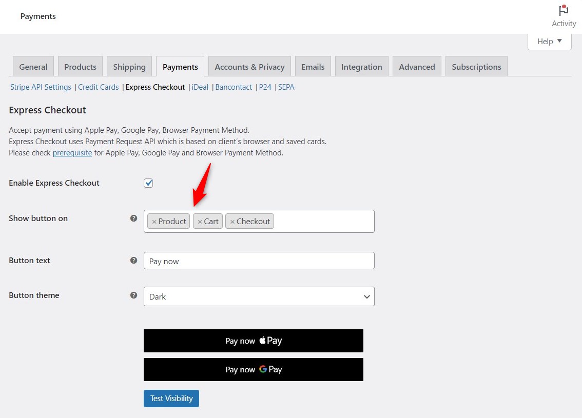
Read our detailed post on setting up Apple Pay and Google Pay in your WooCommerce store.
You can also check our video tutorial to set up express checkout below:
18. Turn On Stripe’s Optimized Checkout Suite
Impact: Medium, Effort: 10 minutes
If Stripe is your primary gateway, enable the Optimized Checkout Suite in the Stripe extension’s advanced settings.
It uses machine learning to reorder payment methods for each shopper, showing each buyer the options they are most likely to use, and hides methods that are irrelevant to their region.
We recommend you enable it for Stripe-first stores.
It requires a current Stripe extension version, settings sync enabled, and Stripe placed at the top of your payment provider list. Setup details are in the official documentation.
19. Offer the payment methods your buyers expect
Impact: Medium, Effort: 15 minutes
A meaningful share of abandonment happens because the preferred payment method is missing.
If they see Visa, Mastercard, Apple Pay, Google Pay, and PayPal, they trust the page. If they see only generic “Credit Card” text, some percentage will hesitate.
Install a good Stripe plugin for WooCommerce. Next, navigate to payment settings.
Here, multiple payment methods are available, including credit/debit cards, buy now pay later, and local options such as iDEAL, P24, Bancontact, SEPA, and more.
But don't overload the page with a dozen logos either. Monitor which methods are actually used in your gateway reports, and prune the ones that never are.
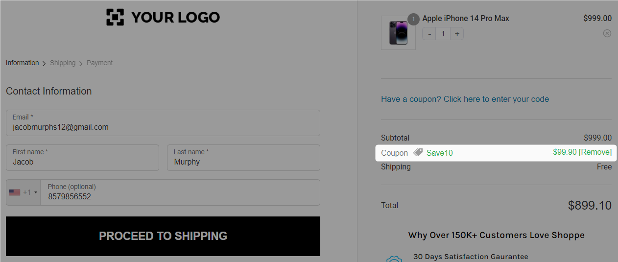
20. Auto-apply coupons and collapse the coupon field
Impact: Medium, Effort: 5 minutes
When a user sees an empty coupon field on the checkout page, they search for it everywhere online. Many of them never come back to your store.
Here are two ways to defuse it:
- If you run regular promotions, auto-apply the relevant coupon so the discount appears without the user having to enter it. They see the savings; they don’t go searching.
- If you don’t run promotions, hide the coupon field entirely. If you must show it, hide it behind a small “Have a promo code?” link rather than a prominent empty box.
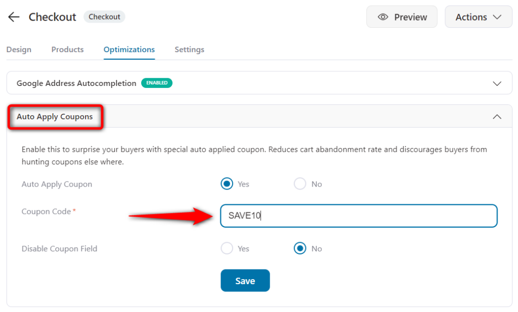
This is how the coupon is automatically applied on the checkout page, and the new order total is displayed:
Just go to the ‘Optimizations’ tab when editing your checkout page. Next, specify the coupon code that you want to auto-apply at checkout.
Category 5: Build Trust and Kill Surprises
21. Show every cost before the payment step
Impact: High, Effort: 10 minutes
Unexpected costs are the single biggest reason for abandonment in Baymard’s research, ahead of everything else. Shipping, taxes, and fees must be visible before the buyer reaches for a card.
You can solve it before they reach the payment step:
- Use a shipping calculator on the cart page or inside the mini cart
- Default to the most likely shipping method for each region
- Show the all-in total prominently in the order summary, not just on the Place Order button
- If you offer free shipping over a threshold, display the threshold and how close the customer is on every cart and checkout view
If your margins allow it, free shipping over a threshold is the single highest-leverage offer in ecommerce. It’s both an AOV lever and abandonment-reduction lever.
22. Add trust signals at friction points
Impact: Medium, Effort: 10 minutes
Building trust is crucial for instilling confidence in your shoppers at checkout.
Therefore, displaying trust signals and security seals on the checkout page helps alleviate your customers' concerns regarding the security of their personal and financial information.
For that, you can make sure that your WooCommerce store has the following:
- SSL certificate
- Secured payment seals
- Money-back guarantee
- Shop with confidence section
Here’s an example of security seals that make your checkout page look authentic and secure:
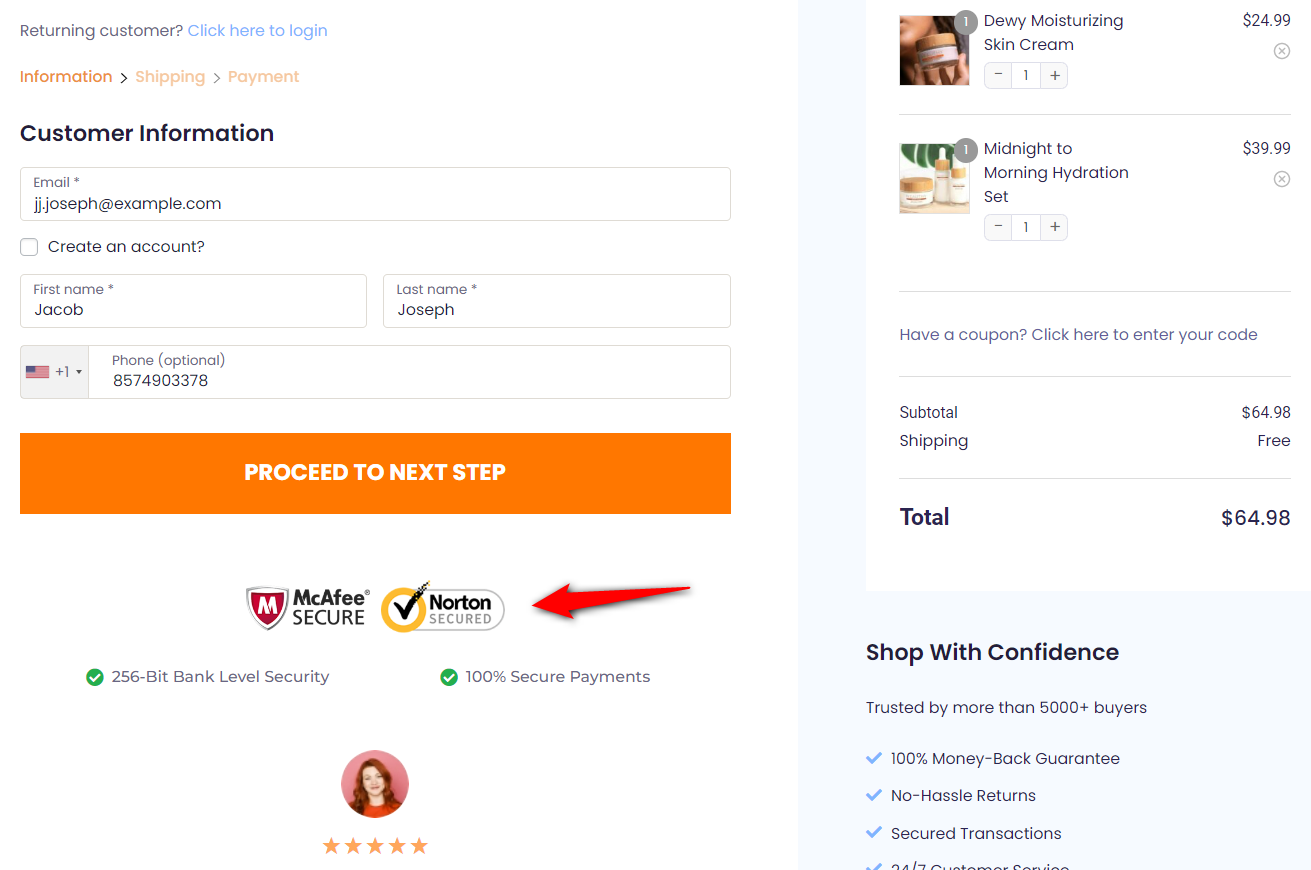
Also, credibility markers such as 'Why Buy From Us' and 'Customer Reviews/Testimonials' make the page appear trustworthy.
23. Show delivery date estimates at checkout
Impact: Medium-High, Effort: 10 minutes
“Arrives Thu, Jul 16” converts better than “3-5 business days” because it answers the question shoppers are actually asking: will it be here in time?
Attach an estimated date to each shipping rate at checkout.
Many carrier-calculated shipping plugins compute this from your handling time plus transit; in flat-rate setups, a shipping-method label like "Standard, arrives Jul 14-16", set in the method settings, provides the honest 80% version.
There's no native WooCommerce date engine, so label this correctly: a plugin or a small custom function is required for dynamic dates.
Category 6: Fix Mobile Checkout
More than half of your checkout traffic is on mobile, and mobile cart abandonment consistently runs higher than on desktop across industry benchmarks.
Optimizing WooCommerce checkout for mobile is not a variant of the desktop work; it has its own failure points.
24. Optimize fields for thumbs and autofill
Every field should trigger the right keyboard: numeric for phone and postcode, email keyboard for email.
Set the correct inputmode and autocomplete attributes so browsers and password managers can fill the entire form in one tap.
Make tap targets at least 44 pixels, add generous spacing between fields, and never rely on hover states.
Then test the real thing: add a product, check out on your own phone over mobile data, and note every moment you hesitate. Your customers hesitate there too.
Most modern checkout plugins handle this. The blocks-based WooCommerce checkout includes most of it by default. If you're on a custom or older shortcode checkout, audit your form HTML.
25. Add a sticky checkout button and collapsible order summary
Impact: Medium, Effort: 10 minutes
On a phone, the order summary can push the payment section down three screens.
Collapse the summary into an expandable "Order summary" bar, making the total visible so buyers can review it without scrolling past.
Pair that with a sticky “Place order” button that stays in view as the shopper scrolls.
The buyer always knows the total and always sees the way to finish. Most conversion-focused checkout templates include both patterns; on custom themes, a few lines of CSS get you there.
Mobile essentials:
- Tap targets at least 44×44 pixels
- Sticky Place Order button at the bottom of the screen
- Collapsible order summary so the form is the focus
- Disable iOS auto-zoom on form inputs (set input font-size ≥16px)
- Test on a real phone, on cellular data, with a card you don’t have saved
Category 7: Streamline the Flow
26. Strip distractions from the checkout page
Your header menu, footer links, sidebar, and promo banners are all exits. On the checkout page, remove them.
A distraction-free checkout keeps the logo (linked nowhere or to a confirm-exit prompt), the form, the order summary, and the pay button.
- Header navigation menus
- Sidebars
- Footer link forests
- Newsletter signup banners
- Live chat popups that auto-open on checkout
- Exit-intent popups firing on the checkout page itself
Several themes include a slim checkout header option, and checkout plugins ship distraction-free checkout page templates by default.
If you build it yourself, hide navigation with a checkout-specific template part rather than with CSS alone, so the links are truly gone and the page loads more lightly.
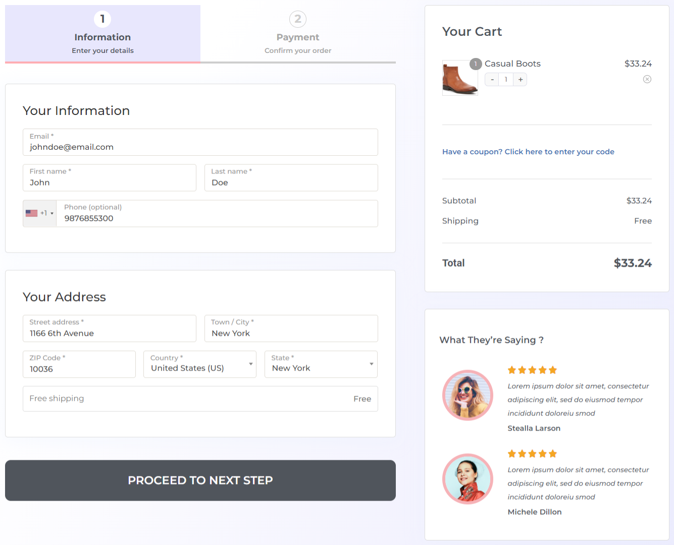
27. Use optimized multi-step vs one-page checkout
Impact: Medium, Effort: 15 minutes
This is a never-ending debate. But the answer depends on your requirements. It's always best to A/B test it on your actual traffic.
One-page checkout works better for digital products with minimal required fields, single-product checkouts, desktop-heavy traffic, and low-AOV stores where any extra step slows momentum.
Multi-step checkout tends to win for physical products that require shipping and billing, mobile-heavy traffic, higher AOV, and carts with multiple items.
When you do go multi-step, two things matter:
- Display a progress indicator (breadcrumb or tabs), so users know how many steps remain. Progress bars consistently improve completion rates in our internal testing.
- Show a preview of previously entered fields on each step so users can verify their entries without going back.
This multistep checkout, created with FunnelKit, looks clean and distraction-free. Take a look:
Watch this step-by-step tutorial to set up one page checkout in WooCommerce here:

You can customize your checkout page with page builders such as Elementor, Bricks, Divi, Oxygen, the Gutenberg Block Editor, or others.
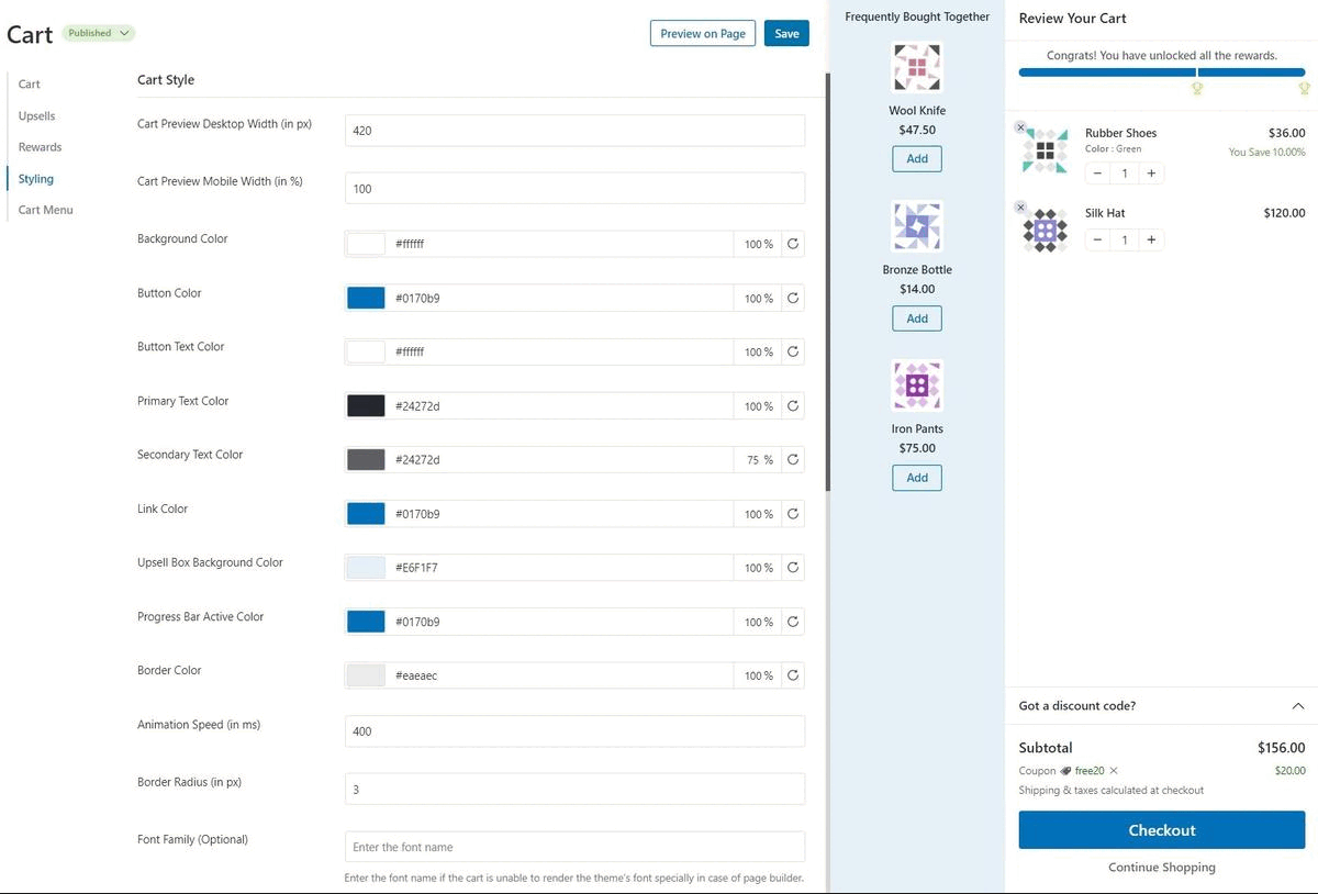
28. Add a modern sliding cart that skips the cart page
Impact: High, Effort: 10 minutes
In the default WooCommerce shopping process, users have to go to the products page, then the cart page, and finally the checkout page.
This shopping process is long and tedious. Instead, you can add a WooCommerce sliding cart and skip that one extra step in the journey.
It offers a modern interface with a seamless add-to-cart experience.
Furthermore, you can set up a smart in-cart recommendation system to offer relevant product suggestions.
Go to FunnelKit ⇨ Cart and enable it to set it up.
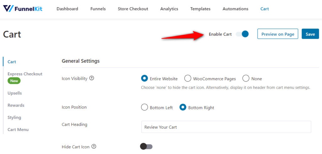
Configure different options for your sliding shopping cart and upsell recommendations.
Plus, you also get various styling options to customize your cart and its icon to your brand.
Keep the standard add-to-cart flow for multi-item shopping, and offer the direct path alongside it. Stores selling one flagship product, digital downloads, or subscription plans benefit most.
Compare conversion on the direct path against the cart path in your GA4 funnel from the baseline section.
Category 8: Raise Order Value and Recover the Rest
29. Display upsells and cross-sells on the checkout page
Impact: High, Effort: 15 minutes
Offering complementary or related products based on the items in the cart can help boost your store’s average order value.
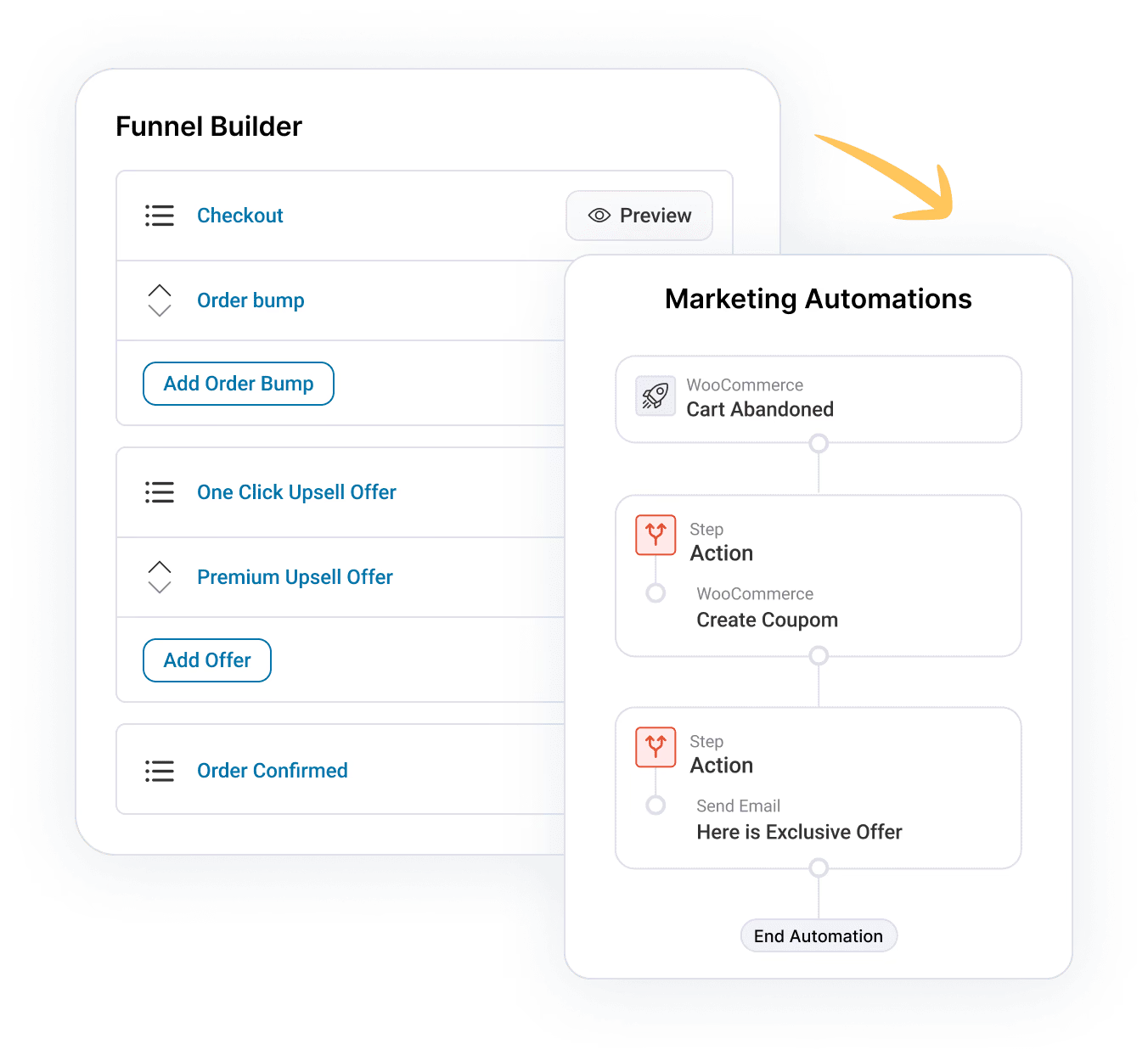
Upsells or cross-sells on the checkout page are called order bumps. These are usually low-priced items that prompt impulse purchases.
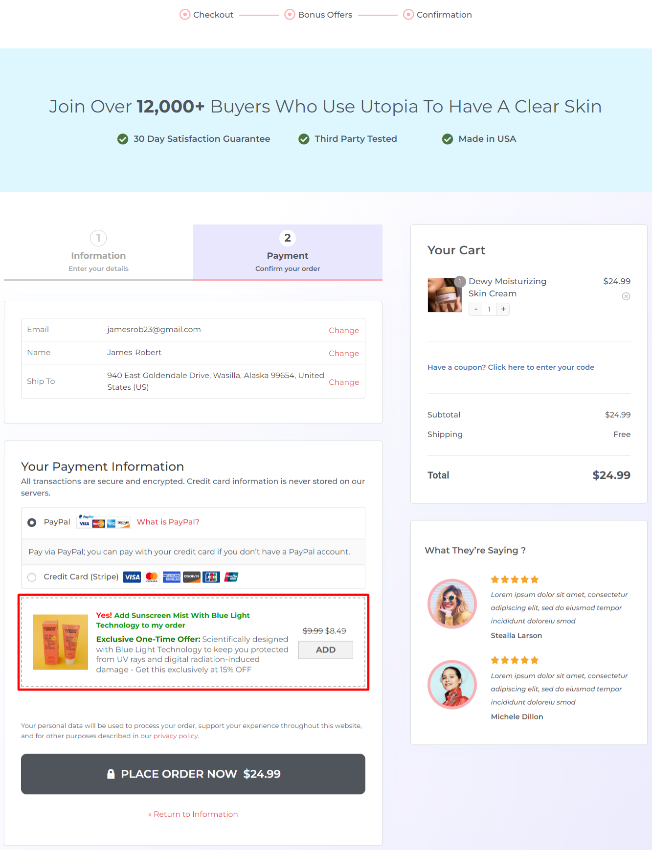
A few high-impact tactics don't fit cleanly into one layer.
All you have to do is click on ‘Add Order Bump’ below the checkout on your funnel, import any skin and add the product you want to offer.
You can design your bump offer by crafting an attractive piece of copy.
The rules that keep it converting are to keep one offer, clearly relevant to the cart, priced well below the main purchase, and added with a single tick.
Stacking multiple bumps clutters the page and erodes trust, so resist the temptation.
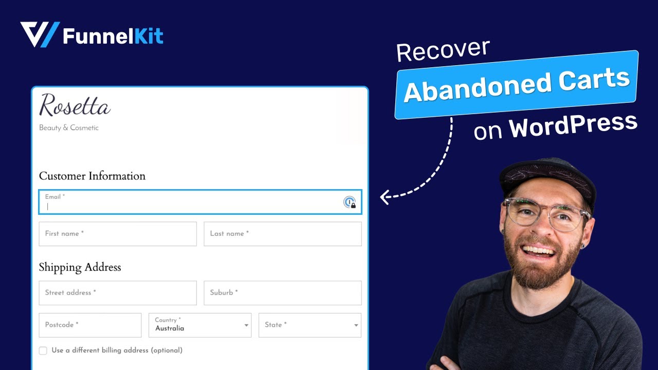
30. Capture email first and automate checkout recovery
Impact: High, Effort: 15 minutes
Even an optimized checkout loses people to interruptions. The difference between losing them forever and winning them back is whether you captured contact details before they left.
Put the email field first in your form order.
Once you have it, an automation can send a recovery sequence when a checkout stalls: a reminder within the hour, a nudge the next day, and, optionally, an incentive after that, with a link that restores the exact cart.
Recovered checkouts are the highest-margin revenue in your store because the marketing cost was already spent.
Watch this video tutorial to set up abandonment cart recovery automation in WooCommerce:
31. Use exit-intent to save the cart
Impact: Medium, Effort: 15 minutes
Exit-intent popups on the cart page can save 2-5% of would-be abandoners by offering a discount or free shipping.
Do not run exit-intent on the checkout page itself. It interrupts buyers who are already in the middle of a payment, creating a net negative experience.
OptinMonster is the standard tool here. Pair it with FunnelKit Cart for the cart-side experience.
Frequently Asked Questions
You should A/B test both. Our testing data shows that multi-step checkout outperforms single-page checkout for physical products (requiring shipping/billing), mobile users, carts with multiple items, and higher-value purchases.
Single-page checkout works better for digital products, simple offerings with minimal information requirements, desktop-heavy traffic, and low cart values, where any friction increases abandonment.
You can make basic customizations, such as CSS styling or using code snippets to hide fields, but deep optimizations like one-click upsells, order bumps, and express checkout integrations typically require a dedicated solution like FunnelKit to function reliably and securely.
Here's why optimizing checkout matters for your WooCommerce store:
- Reduces cart abandonment by keeping customers from dropping off before completing their purchase.
- Speeds up the buying process with features like auto-fill addresses, express checkout, auto-apply coupons, direct checkout, and more.
- Enhances the user experience with a clean, intuitive layout and minimal distractions, allowing shoppers to focus on their purchases.
- Boosts mobile conversions by ensuring seamless transactions across all devices.
- Increases trust and credibility with security badges, offers multiple payment options, and a transparent checkout flow to instill confidence in buyers.
You should display no more than two order bumps if they're distinctly different (e.g., warranty protection + gift wrapping). Our testing showed that conversion rates dropped by 23% when moving from one to three order bumps, due to decision paralysis. Quality and relevance matter more than quantity.
Page speed drastically affects checkout conversion. A 1-second delay in page load can result in a 7% reduction in conversions. Ensure your hosting is fast and that your checkout page doesn't load unnecessary scripts.
Yes, trust badges actually improve conversion, particularly for first-time customers. Our A/B testing across 40 stores showed that displaying a trust badge increased checkout completion by 8-12% for new customers but had a negligible effect on returning customers.
The most impactful seals are SSL certificate badges, payment processor logos (Visa, Mastercard), and money-back guarantee badges. Expensive third-party seals like Norton and McAfee were justified only for stores with an AOV above $200.
Our research across 500+ checkout implementations identified optimal ranges, such as 5-6 fields for digital products and 8-10 for physical products. Every field beyond this optimal range reduced conversion by approximately 2%.
The exact number depends on your products. B2B might justify the company name, international shipping requires a phone for customs, but start minimal and add only when truly necessary.
Checkout optimization prevents abandonment, but for those who leave, you need an automated recovery campaign.
We recommend capturing the email address early in the checkout process (as the first field) so you can send a smart recovery email even if they don't complete the payment.
If you run regular promotions, auto-apply codes and hide the manual coupon field to prevent external coupon hunting.
If you rarely run promotions, hide the field entirely because empty coupon fields trigger FOMO and drive abandonment. If you must show it, use microcopy like "Have a promo code?" with a collapsible field, not a prominent empty box.
Start Your WooCommerce Checkout Optimization With the Quick Wins
Don’t try to ship 31 changes this week. Run the 5-minute baseline, do the five quick wins, wait two weeks, and read the funnel again, then work down the High-impact labels in whichever category your drop-off points to.
Want the short version and the fast path? Grab the printable 31-point checkout checklist (impact and effort labels included), and if you’d rather click than code, FunnelKit Funnel Builder implements the plugin-side path of this playbook
You get access to all the templates, the field editor, express payments, bumps, and analytics to show what moved.
So go ahead and start implementing the checkout page optimization hacks you like.
Editorial Team
July 6, 2026A WooCommerce order form lets customers select multiple products, set quantities, and choose variations from a single page instead of visiting individual product pages. There are two ways to add...
Editorial Team
July 6, 2026The Bricks WooCommerce builder is built directly into the Bricks theme. Activate the free WooCommerce plugin, and Bricks unlocks more than 30 store-specific elements plus visual templates for every part...
Editorial Team
July 3, 2026A WooCommerce side cart is a panel that slides in when shoppers add a product to their cart. Customers can review items, change quantities, apply coupons, and proceed to checkout...