
Mobile traffic now drives most WooCommerce store visits.
In fact, 62.54% of global website traffic comes from mobile devices, highlighting just how dominant mobile shopping has become [Source: Statista’s Reach and Traffic Report, 2025].
Even with this shift, mobile checkout still converts far worse than desktop for most WooCommerce stores.
The problem is not a lack of buying intent. It is friction in the checkout experience.
After reviewing hundreds of WooCommerce checkout setups, one pattern appears again and again.
Small mobile UX issues add up quickly, increase cognitive load, and push shoppers to abandon their purchases.
This guide covers seven essential mobile checkout optimization checkpoints.
These optimizations reduce friction, simplify decision-making, and help customers complete purchases faster without any custom development.
Watch this mini masterclass to customize your WooCommerce checkout page like a pro:
Table of Contents
- 1 Why Should You Optimize Your Checkout Process for Mobile Devices?
- 2 Top 5 Reasons Why Mobile Users Don't Convert Into Buyers
- 3 7 Proven Tactics to Increase WooCommerce Mobile Checkout Conversions
- 3.1 1. Show order details in a collapsible section
- 3.2 2. Enable one-click express checkout payments
- 3.3 3. Automatically complete the address field
- 3.4 4. Make navigation easy with a sticky CTA button
- 3.5 5. Display the required checkout form fields only
- 3.6 6. Address security concerns through contact details and trust badges
- 3.7 7. Provide the option of editing the cart items on the checkout page
- 4 More Questions About WooCommerce Mobile Checkout
- 5 How do I test my mobile checkout for common usability issues before going live?
- 6 Are these optimizations compatible with popular page builders?
- 7 Can I apply these mobile checkout improvements to specific product types (subscriptions, digital downloads, physical products)?
- 8 How will these optimizations affect my site’s page load time on mobile?
- 9 Get Ready to Optimize WooCommerce Mobile Checkout and Transform Your Store Sales
Why Should You Optimize Your Checkout Process for Mobile Devices?
As mentioned, mobile devices accounted for over 62% of global website traffic in the first quarter of 2025, and this number is expected to grow year after year.
It’s no longer a secret that most people prefer accessing the internet on their mobile devices.
Here’s why optimizing the WooCommerce mobile checkout process is more important than ever
- Great user experience: An overwhelming or confusing mobile checkout process frustrates users and leads them to abandon their cart. Optimizing your checkout flow for mobile devices enables you to deliver a seamless, user-friendly experience that helps shoppers complete their purchases. And, of course, there are lower abandoned cart rates.
- High conversions: A streamlined mobile checkout leads to high conversions. You'll likely see more sales and repeat purchases by making it easy for your customers to complete their purchases on their mobile devices.
- Build customer loyalty: If you provide a great user experience and make your checkout process convenient for mobile shoppers, they are more likely to visit your WooCommerce store. This, in turn, ensures overall customer satisfaction and thus builds strong customer loyalty.
- Massive revenues: Optimizing your WooCommerce mobile checkout boosts the number of successful orders placed on your store. This leads to high sales revenues and helps you grow your business.
Before you begin optimizing the checkout process for mobiles, let’s look at a few reasons why many users who shop via their smartphones don’t convert.
Top 5 Reasons Why Mobile Users Don't Convert Into Buyers
Let’s compare mobile and desktop conversion rates during the U.S. holiday season — the difference is striking:
In 2024, Cyber Monday had a conversion rate of about 7.0% on desktop and approximately 4.6% on mobile. Even Black Friday recorded around 6.5% for desktop users compared with 3.3% for mobile users. [Source: Statista]
Here are a few reasons why:
1. Poor user experience
The navigation space on a smartphone is much smaller than on a desktop or laptop.
It should be easy to switch between steps, go to the next step, come back to the previous step, etc.
You may make the logo at the top of your checkout page clickable. That’ll help users return to the homepage if they want. However, most checkout pages close all the exit gates, forcing users to close the tab if they want to return or go elsewhere.
User experience also includes ensuring fast load times with an optimized web host and a smooth checkout process.
If the mobile checkout page gets difficult to navigate, users might completely abandon their purchase.
2. Security concerns
People are concerned about giving credit card details, especially on mobile phones.
ConversionXL conducted a study to determine whether trust badges impact how people perceive a website. They found that some trust seals are considered more trustworthy than others.
Most visitors noticed that Google Trusted Store and PayPal were verified. Here's a list of the seals in their order of priority:
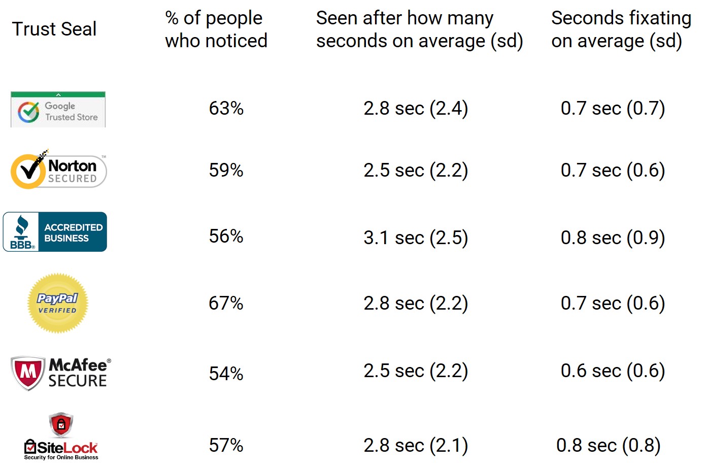
The difference is not that much. However, trust seals made a difference and are much better than having a simple 'lock' icon.
3. Lack of information on the checkout page
It's obvious that people want to make sure that they're buying the right products before clicking on the place order button.
Mobile shoppers are usually in a hurry and on the go. Therefore, you must let them double-check the items and the order total on the checkout page before they place the order.
Here are a few concerns in the mind of a mobile shopper:
- What if I have accidentally added the wrong item(s) to my cart?
- Have I got the right size? I hope I didn't click on the wrong size!
- What's my order total?
According to a survey published by Baymard Institute, 16% of people abandoned the checkout because they couldn't see the order total upfront. Now that's a biggie!
4. Hard to input details
Most mobile users hold their smartphones with just one hand- keep that in mind. You must ensure that everything is within the user's thumb's comfortable reach.
Take a look at this picture highlighting the easy and hard-to-reach areas on a smartphone:
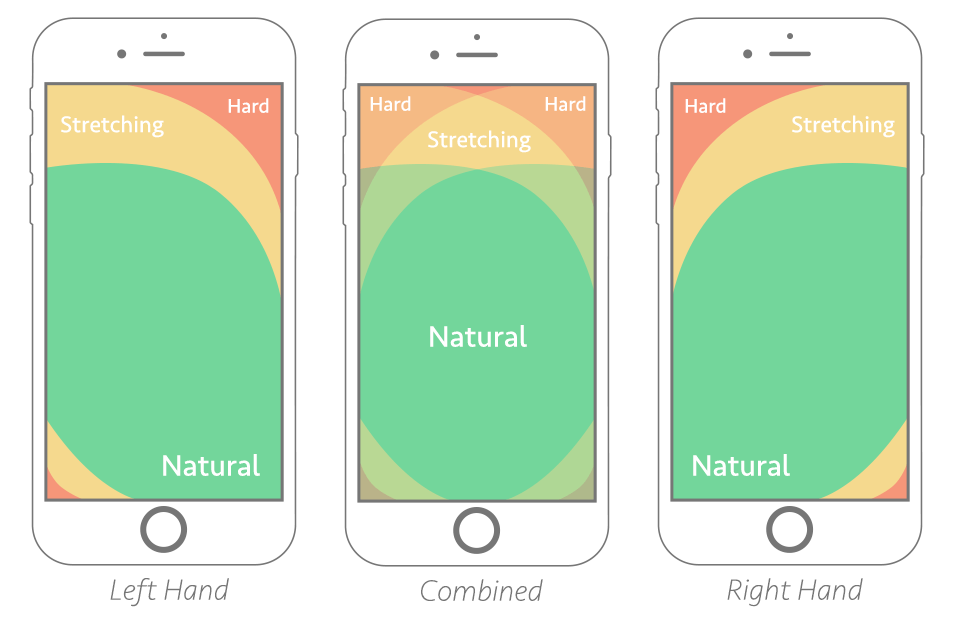
Make things convenient for them by vertically stacking the fields, buttons, or items up without the need to pinch or zoom the page.
5. High distractions
You should never forget the primary use of a mobile device, i.e., making/getting calls or texts for a conversation.
Users can be easily distracted by in-app notifications or incoming calls, which can distract them from shopping.
Therefore, you must make the entire checkout process quick and seamless to avoid such distractions.
7 Proven Tactics to Increase WooCommerce Mobile Checkout Conversions
It’s time to jump into the tactics that will help you improve your users' WooCommerce mobile checkout experience.
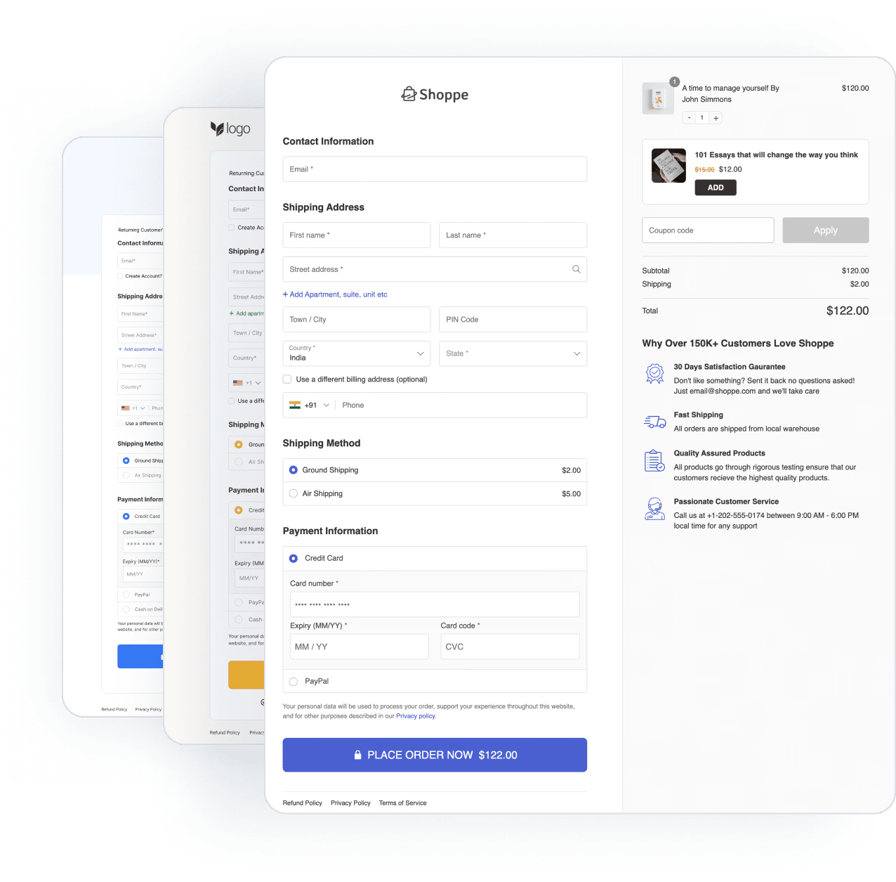
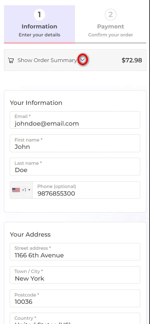
But first, let's look at a mobile-optimized WooCommerce multi-step checkout page that we’ve built using FunnelKit Checkout:
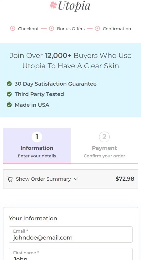
Notice how all the information is vertically stacked and uses the entire screen. Users don't have to pinch and zoom to enter details.
Further, the checkout form has only the most important fields. This way, shoppers don’t have to fill out redundant information.
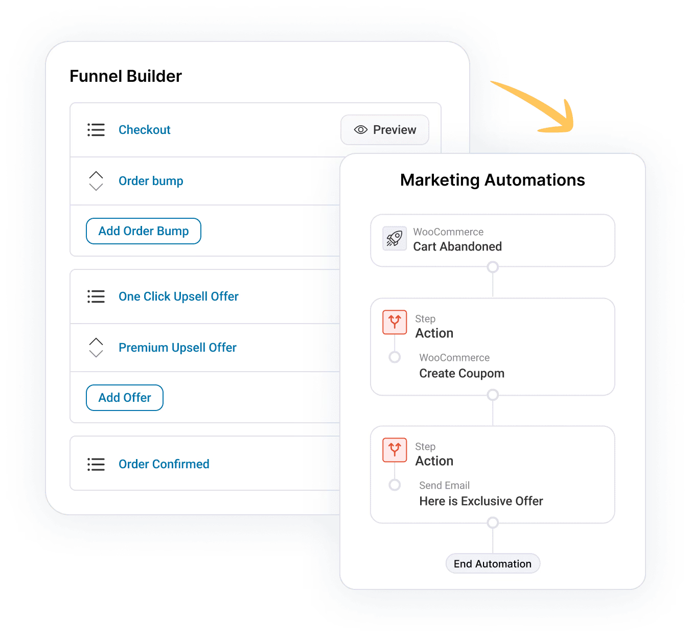
FunnelKit Funnel Builder has the most advanced WooCommerce checkout manager plugin, which will help you increase conversions.
Let’s start with our top 7 tactics to optimize your mobile checkout page.
1. Show order details in a collapsible section
Place the most important information right at the top. Remind users what they're buying and let them double-check their order summary for satisfaction.
Make sure it has the following information optimized for mobile such as:
- Clear images of the products
- Names of the items
- Quantity of the items
- Any variations they chose, such as size, color, etc.
Many high-converting stores keep the order summary section collapsible, so it doesn't take up much space.
This way, users won’t have to scroll further down to reach the checkout form. The collapsible order summary makes the checkout form appear above the fold section.
2. Enable one-click express checkout payments
According to the Global Payments Report 2021 from FIS WorldPay, digital wallets accounted for 49% of global eCommerce transaction value. Digital wallet payments have surpassed credit cards, sitting at 21%.
People prefer digital wallets such as Google Pay or Apple Pay because they can complete transactions quickly with a single click.
When you tap on the payment button, it shows all your saved cards, allowing you to complete the transaction.
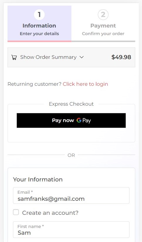
Users don’t need to fill out their checkout form; it automatically sends the payment and billing address information to the merchant.
3. Automatically complete the address field
Do you know that incorrect addresses can cause 41% of delayed deliveries and 39% of failed orders?
That’s why you should optimize your WooCommerce mobile checkout with address autocompletion. The best thing is Google Address Autocomplete provides such a feature.
Address autocompletion is a feature of the Places library in the Maps JavaScript API. It allows users to autofill the complete address once they start typing in the field.
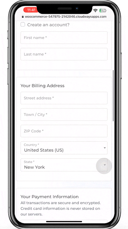
Refer to this blog on how to set up Google Address Autocomplete on your WooCommerce mobile checkout.
4. Make navigation easy with a sticky CTA button
A sticky CTA button is great for keeping the user's attention on the button. The user knows what's expected of them.
It's always right before them; they can click it when ready.
To make the CTA button sticky, click on the pencil icon next to the ‘Checkout Button’ and make the button sticky under the ‘Style’ tab.
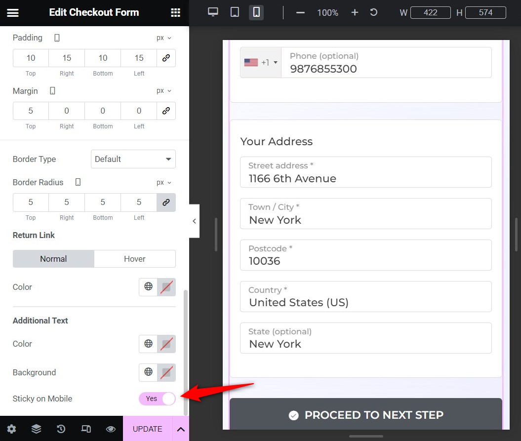
The button should always be big and easy to tap. Also, notice the CTA button copy is super specific - there's no room for doubt. The users know what the next step is.
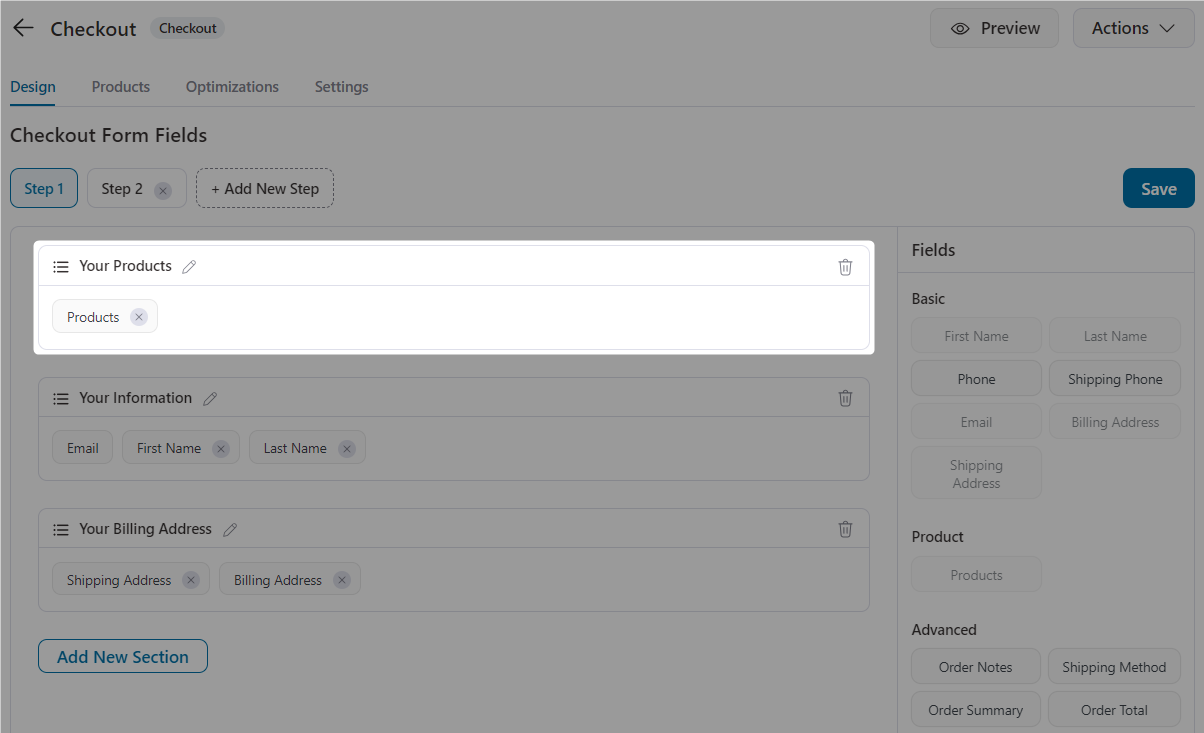
5. Display the required checkout form fields only
You don’t want to make your checkout form lengthy. The more fields your checkout form has, the more steps it has, and the more friction it creates, increasing cart abandonment in your WooCommerce store.
Since mobile devices have small screens, you should simplify the fields in your checkout form.
Therefore, you should only display the required checkout form fields.
FunnelKit Funnel Builder’s checkout form field editor allows you to drag and drop the required fields onto your checkout form.
For an effective WooCommerce mobile checkout page, you can add a custom field, rearrange, edit, or remove any field you want.
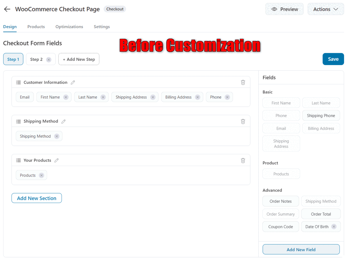
Let’s suppose you’re an online course seller. Now, you don’t need shipping-related information from your customers. Therefore, it’ll be best to remove the fields you don’t want and make the checkout process quick.
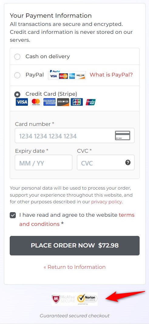
6. Address security concerns through contact details and trust badges
You can add the store's contact details below your brand's logo. This will help you take care of their security concerns immediately.
FunnelKit lets you customize your checkout page with any of your details.
Furthermore, the constant fear of hacks and thefts is one of the reasons that users abandon their carts.
Therefore, you should add trust badges to address the users' security concerns.
7. Provide the option of editing the cart items on the checkout page
This is a genius hack. Allow users to edit their order details while on the checkout page - which is especially useful on mobile. When in a hurry, users can easily make mistakes and may even change their minds at the last minute.
Make room for errors. The mini cart section on the checkout page, built using FunnelKit, allows users to change the quantity of item(s) they're purchasing and delete and recover deleted items.
Here's how it looks on a mobile device:
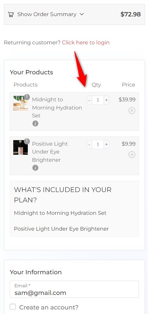
You can easily configure this from the form section in FunnelKit Checkout. Just drag and drop the 'Products' field into any section (wherever you'd like to display this editable cart).
More Questions About WooCommerce Mobile Checkout
Here are some of the frequently asked questions with answers:
How do I test my mobile checkout for common usability issues before going live?
To test your mobile checkout, use mobile emulators or real devices to simulate the mobile shopping experience. Look for issues such as Form field visibility, Button placement (especially for thumb reach), Page load speed, Payment options visibility, etc.
Are these optimizations compatible with popular page builders?
Yes, FunnelKit’s mobile checkout optimizations are fully compatible with Elementor, Divi, Bricks, Block Editor, etc.
Can I apply these mobile checkout improvements to specific product types (subscriptions, digital downloads, physical products)?
Yes, these mobile checkout optimizations are designed to be flexible across all product types. However, for stores that sell subscriptions or digital downloads, we recommend adjusting the shipping options and order summary sections to ensure clarity and usability.
How will these optimizations affect my site’s page load time on mobile?
Our mobile checkout optimizations are designed to enhance performance, not hinder it. By streamlining the checkout layout and reducing unnecessary content, load times should improve. However, it’s always a good practice to test performance using tools like Google PageSpeed Insights or GTmetrix to confirm that there are no regressions.
Get Ready to Optimize WooCommerce Mobile Checkout and Transform Your Store Sales
Mobile users contribute to high global traffic across retail websites. Therefore, as a store owner, it’s important to take advantage of this opportunity to optimize your checkout process for mobile devices of all sizes.
If we want to summarize the WooCommerce mobile checkout optimization strategies that we discussed above, here’s what it boils down to:
Get your shoppers to the end of your checkout process with fewer clicks and minimum distractions.
This is exactly how you can optimize your WooCommerce checkout page for mobile.
You can use FunnelKit to incorporate all the WooCommerce mobile checkout optimizations we discussed.
We’re sure you’ll see lower cart abandonment and more successful orders placed in your store.
So click the button below and start with FunnelKit’s Funnel Builder today!

Editorial Team
July 27, 2026WooCommerce subscription upsell can help boost your revenue through subscription-based sales. Moreover, subscription-based products allow you to add predictability to your revenue. You can sell physical and digital products and...

Editorial Team
July 7, 2026Are you looking for WooCommerce checkout optimization hacks to streamline your users' shopping experience? 7 out of 10 shoppers who reach a WooCommerce checkout leave without paying; according to Baymard...

Editorial Team
July 6, 2026A WooCommerce order form lets customers select multiple products, set quantities, and choose variations from a single page instead of visiting individual product pages. There are two ways to add...