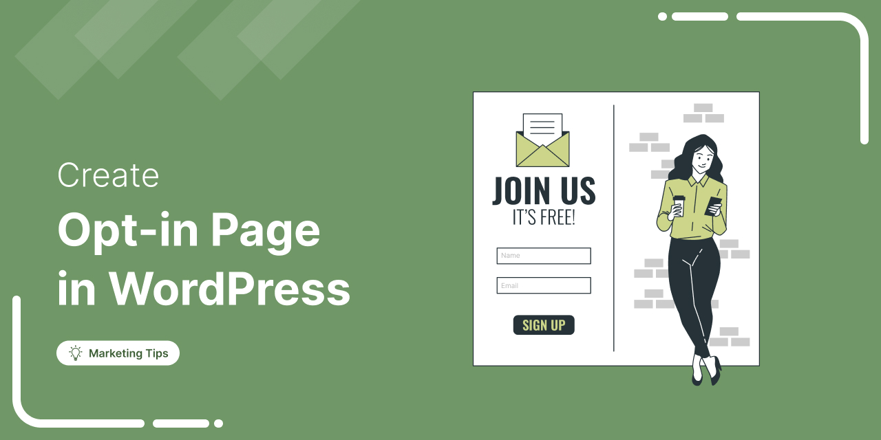
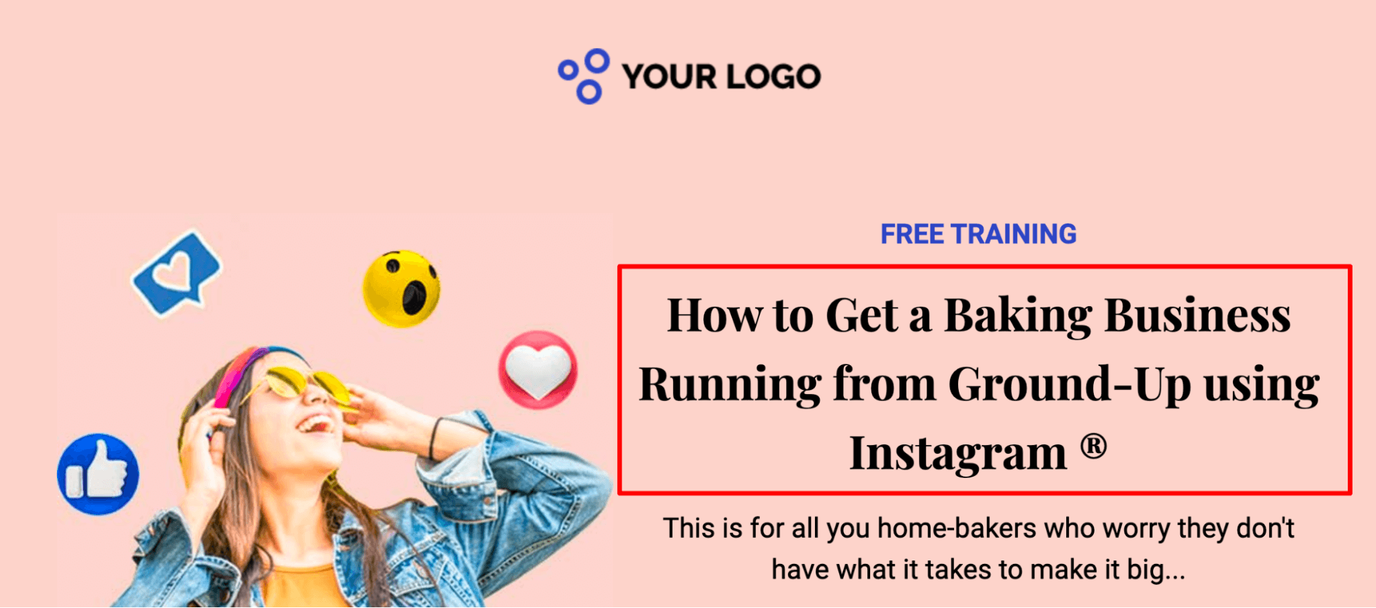
Do you want to create an Opt-in page on WordPress that converts more visitors into leads?
Most visitors leave your site without buying. In fact, data shows that 76% of traffic isn’t sales-ready on the first visit.
If you’re sending that traffic directly to a checkout page, you are leaving money on the table.
The solution is a dedicated Opt-in Page, a focused gateway designed to capture emails so you can nurture leads toward a purchase later.
But simply throwing up a lead capture form isn’t enough.
Through analyzing thousands of funnels at FunnelKit, I’ve learned that design and offer alignment are everything.
In this guide, I’ll walk you through the anatomy of a high-converting opt-in page, practical offer ideas, and the step-by-step process to build one in WordPress today.
Table of Contents
- 1 What is an Opt-in Page?
- 2 The Anatomy of a High-Converting Opt-in Page
- 3 How to Create an Opt-in Page in WordPress That Converts?
- 4 Nurture Your Leads With Automated Emails for Maximum Conversions
- 5 5 Opt-in Offers/Lead Magnets That Work Wonders
- 6 5 Best Opt-in Page Examples
- 7 Frequently Asked Questions (FAQs) on Creating High-Converting Opt in Page
- 8 What is the difference between a landing page and an opt-in page?
- 9 How to choose the right opt-in offer?
- 10 What is a good conversion rate for an opt-in page?
- 11 Should I use a single opt-in or double opt-in?
- 12 Can I use these pages with Elementor or Divi?
- 13 How do I guide visitors’ attention toward my opt-in form?
- 14 Why is “message match” between my ads and opt-in page important?
- 15 How do I optimize my opt-in page for mobile users?
- 16 Ready to Create Your First Opt-in Page in WordPress?
What is an Opt-in Page?
An opt-in page, also known as a lead capture page or squeeze page, is a landing page designed to capture a user’s contact information (such as email) in exchange for a valuable offer (lead magnet), such as an ebook, webinar, or discount.
This page enables businesses to build email lists for marketing and nurture leads by getting explicit consent to communicate.
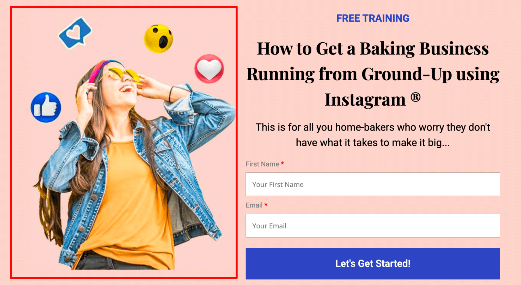
An effective opt-in page focuses on a single goal, featuring a benefit-driven headline, a compelling description, a clear form, a strong call-to-action (CTA), and social proof, all with minimal distractions to encourage signups.
The Anatomy of a High-Converting Opt-in Page
Certain aspects of an Opt-in landing page make it a success among users and generate leads for you.
The structure and components of your opt-in page make the difference in the number of leads it generates.
Some of these high-converting elements are:
1. Clear heading
On average, 8 out of 20 people would read only the heading, while only two would read the copy as well.
So the headline should clearly state the promise made on your opt-in page.
2. Hero image
Humans process images 60,000 times faster than text. Your visuals need to make the digital intangible feel “real”.
The hero image should be either product-focused or outcome-focused.
Avoid using stock images because they don’t capture attention.
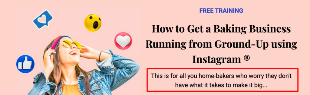
3. Landing page copy
The text on your opt-in page should add value and shouldn’t just be written to increase word count.
The copy should be scannable for the readers’ convenience.
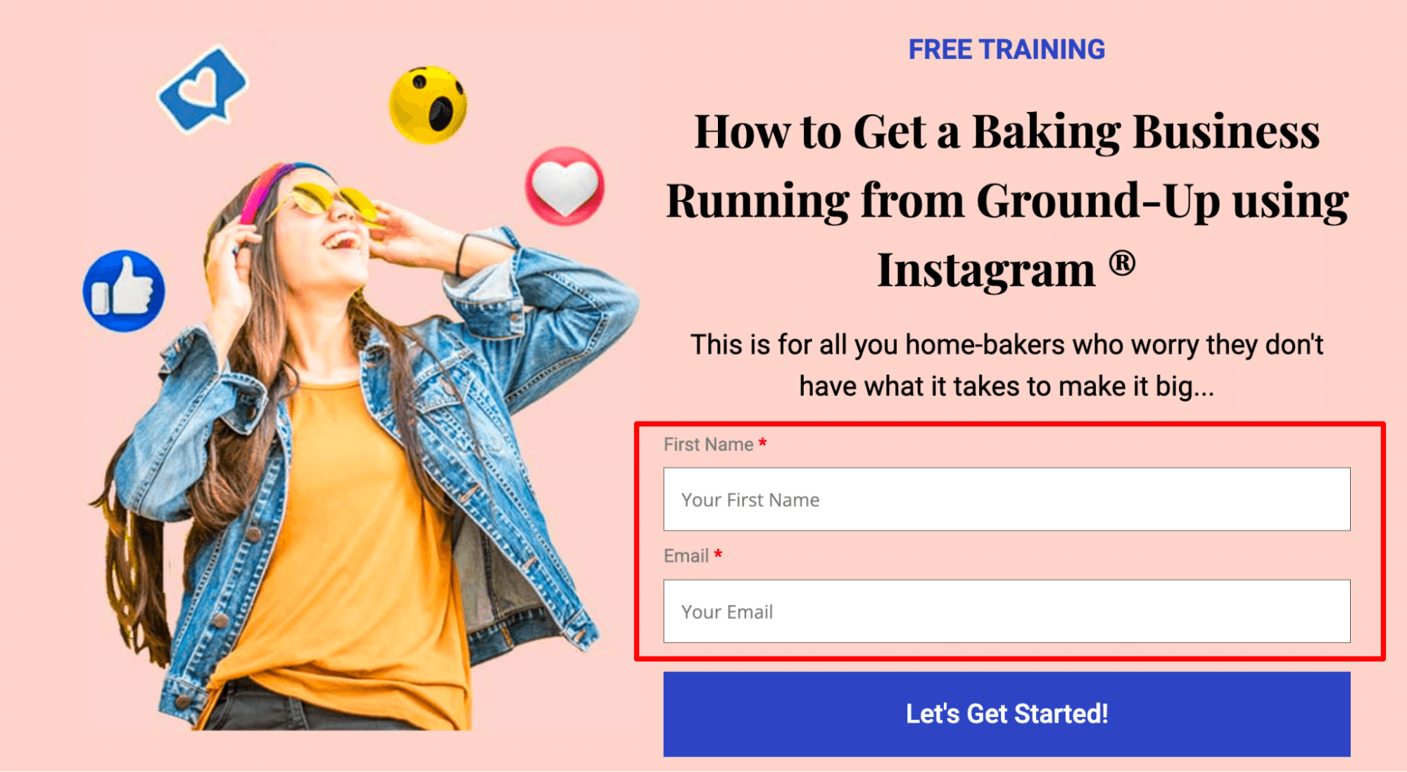
4. Frictionless opt-in form
The fewer the opt-in form fields, the higher the conversion rates.
Hubspot's study showed that as the number of form fields increased, the conversion rate went down by about 50%.
The ideal number of fields for opt-in forms is 2 (name and email), but these days even one is enough, as on most opt-in pages, you may only ask for the email addresses and not anything else.
- Email Only: Lowest friction, highest volume.
- Name + Email: Slightly higher friction, but allows for personalization in email automation later.
- Phone Number: High friction. Only request this if you have a dedicated SMS strategy or sales team.
5. Call-to-action (CTA) button
A ‘Call to Action’ button would direct your users to the next step, so this button needs to stand out from the rest of the page.
No one likes to click on the generic ‘Sign up’ or ‘Submit’ or ‘Click here’ buttons. Your audience has matured beyond that.

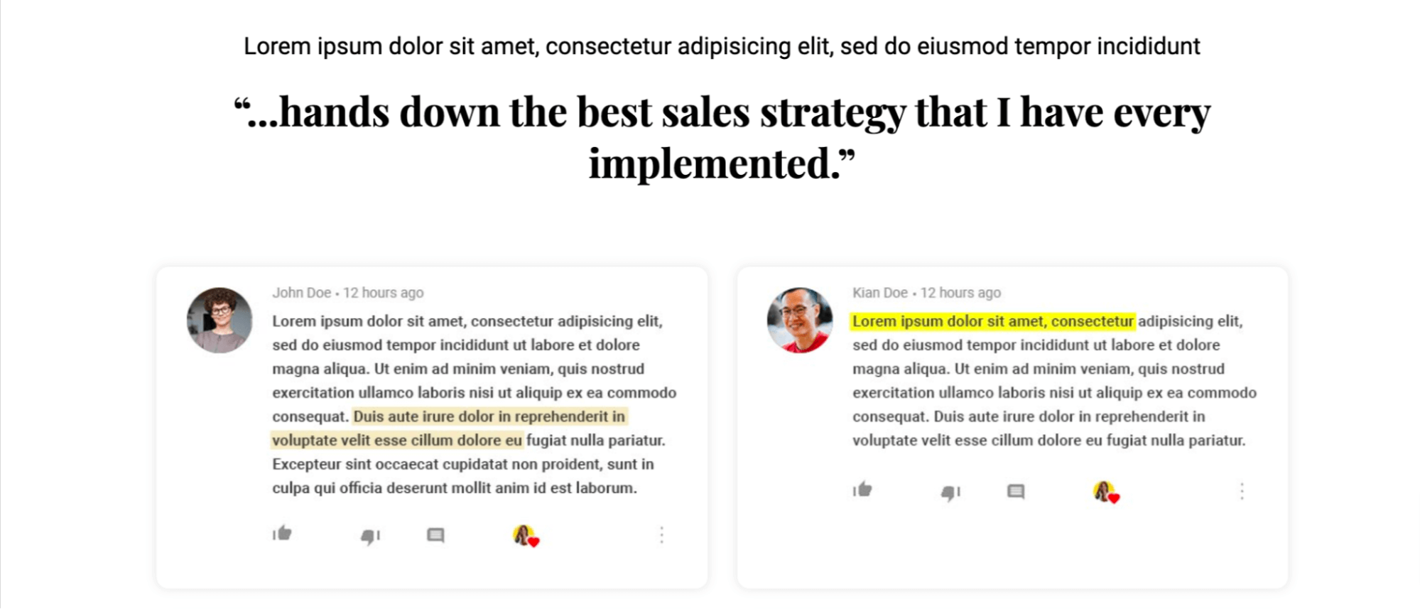
6. Trust builders
Every opt-in page in the funnel needs to include trust-building elements that reassure the product and the seller.
These elements can be social proof, such as user testimonials, past results, media coverage, your story, and more.
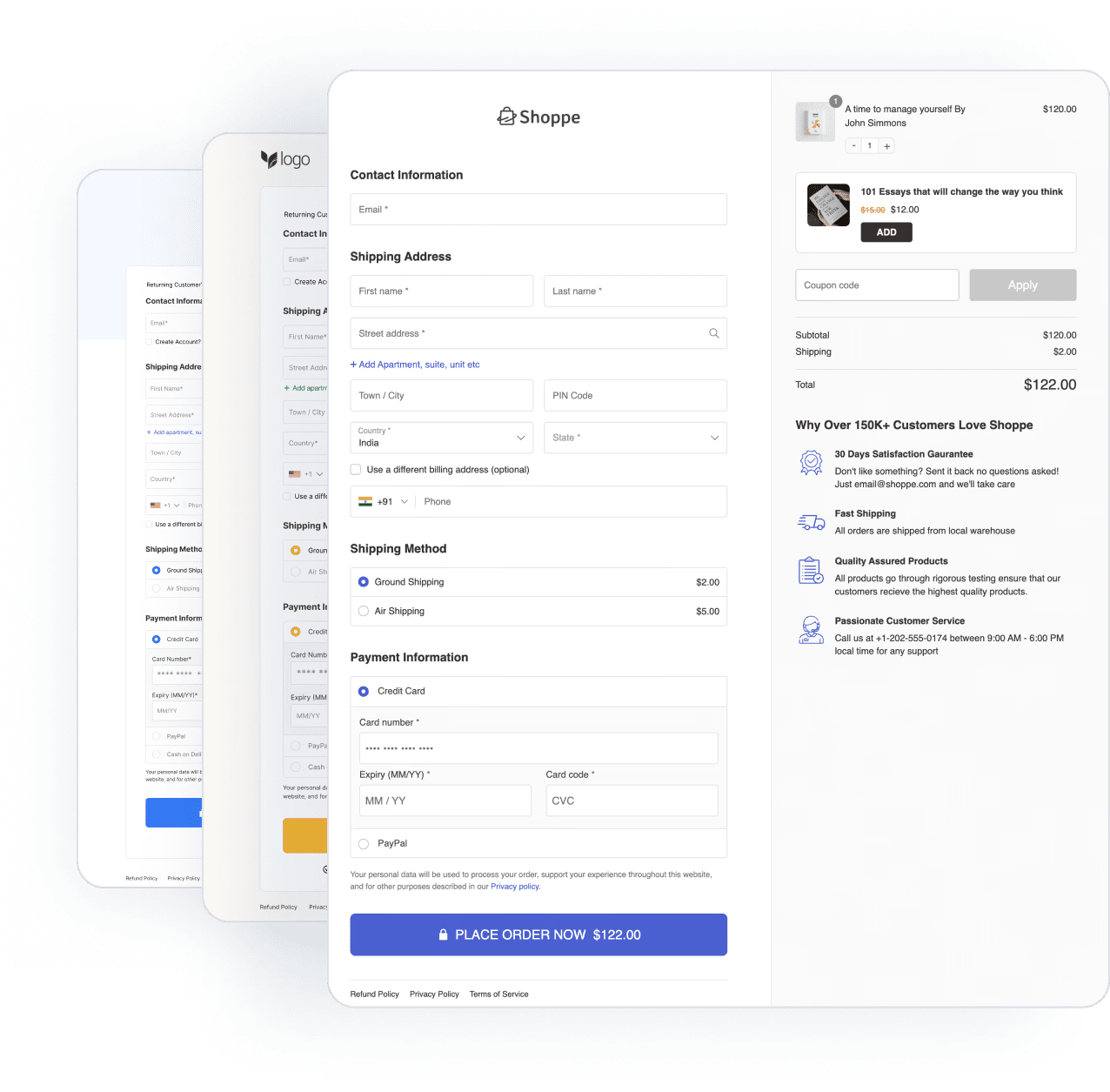
How to Create an Opt-in Page in WordPress That Converts?
Here, I’ll show how you can create an opt-in page from the WordPress dashboard to convert leads easily.
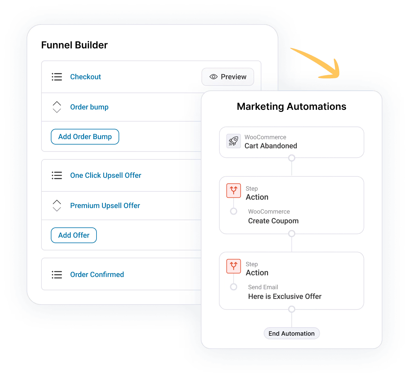
To create an opt-in funnel, I’ll use FunnelKit Funnel Builder.
This is the ultimate sales funnel plugin for WordPress that lets you create high-converting lead generation and sales funnels with opt-in pages, sales pages, custom checkouts, order bumps, one-click upsells, and thank-you pages.
Let’s install and activate the FunnelKit Funnel Builder before we dive deeper into the process.
Step 1: Create a new opt-in funnel with a pre-built template
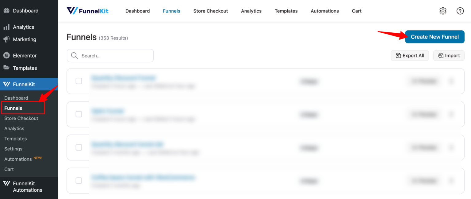
First, you need to create an opt-in funnel.
For that, Go to FunnelKit ⇨ Funnels and click on the ‘Create New Funnel’ button.
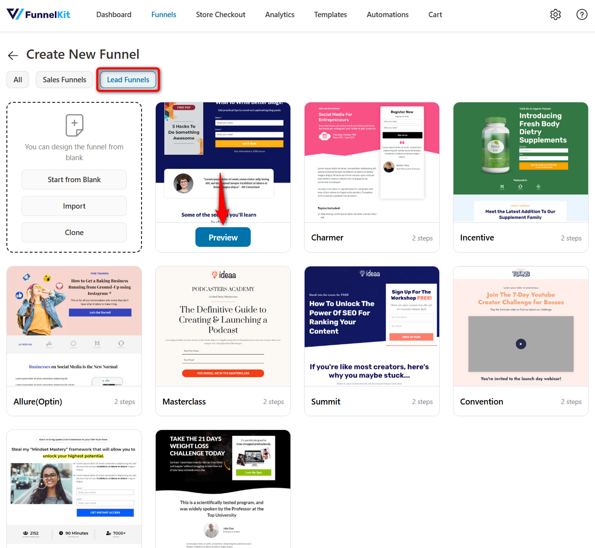
Now choose Lead Funnels as type and then your favorite page builder. Let’s go with Elementor here. After that, hover over the template you like and click on the “Preview” button.
Here, I’ll choose FunnelKit’s “Enchant” lead generation template. This template offers a free eBook in PDF format in exchange for the contact name and email address.
Enchant Opt-in template two types of opt-in forms: Inline and Popup.
With the inline form, you can add an embedded form with two fields, and with the popup you can add a popup form that appears after someone clicks on a button.
If you are looking to create an opt-in page for free, then choose the inline form. The popup form is only available with the pro version of FunnelKit.
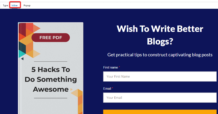
You can choose any opt-in form option you like. We are going with the inline option.
Now to import this funnel click on “Import This Funnel”, provide a name, and click on “Done”.
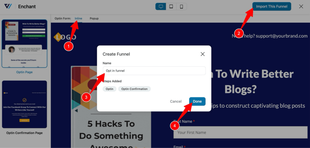
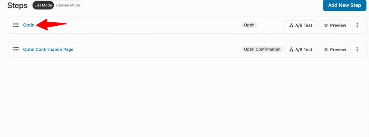
This will import the opt-in funnel with two steps: the opt-in page and the confirmation page.
Step 2: Customize the opt-in page
Now it’s time to customize the opt-in page. For that, click on the opt-in step. After that, click on the “Edit Template”.
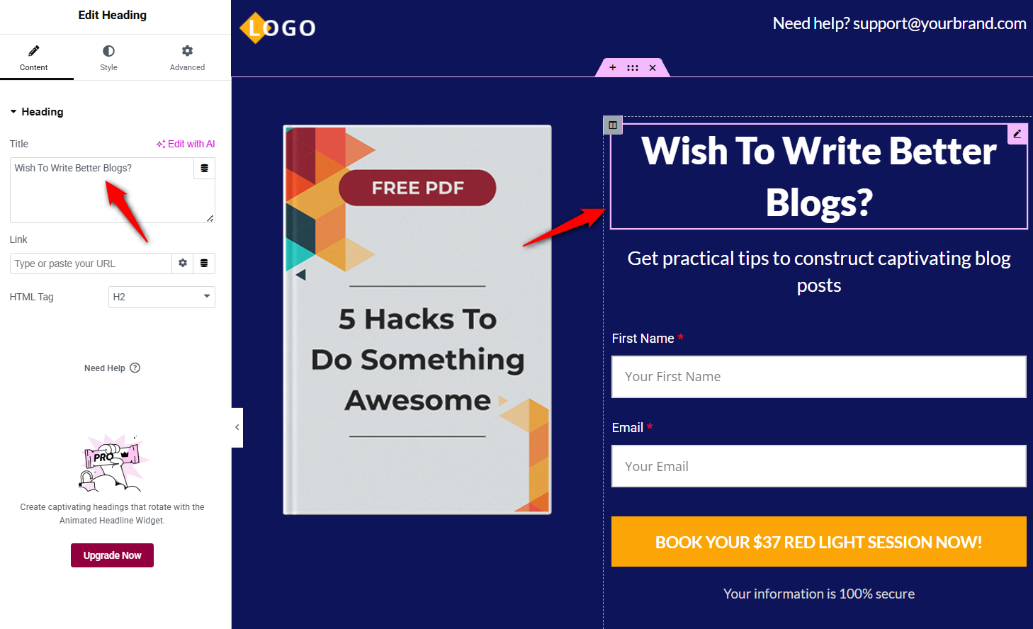
Now you can customize the content as per your needs. To customize any content, click on that element, and you will find customization options on the left-hand side menu.
For example, you can update the title or main heading.
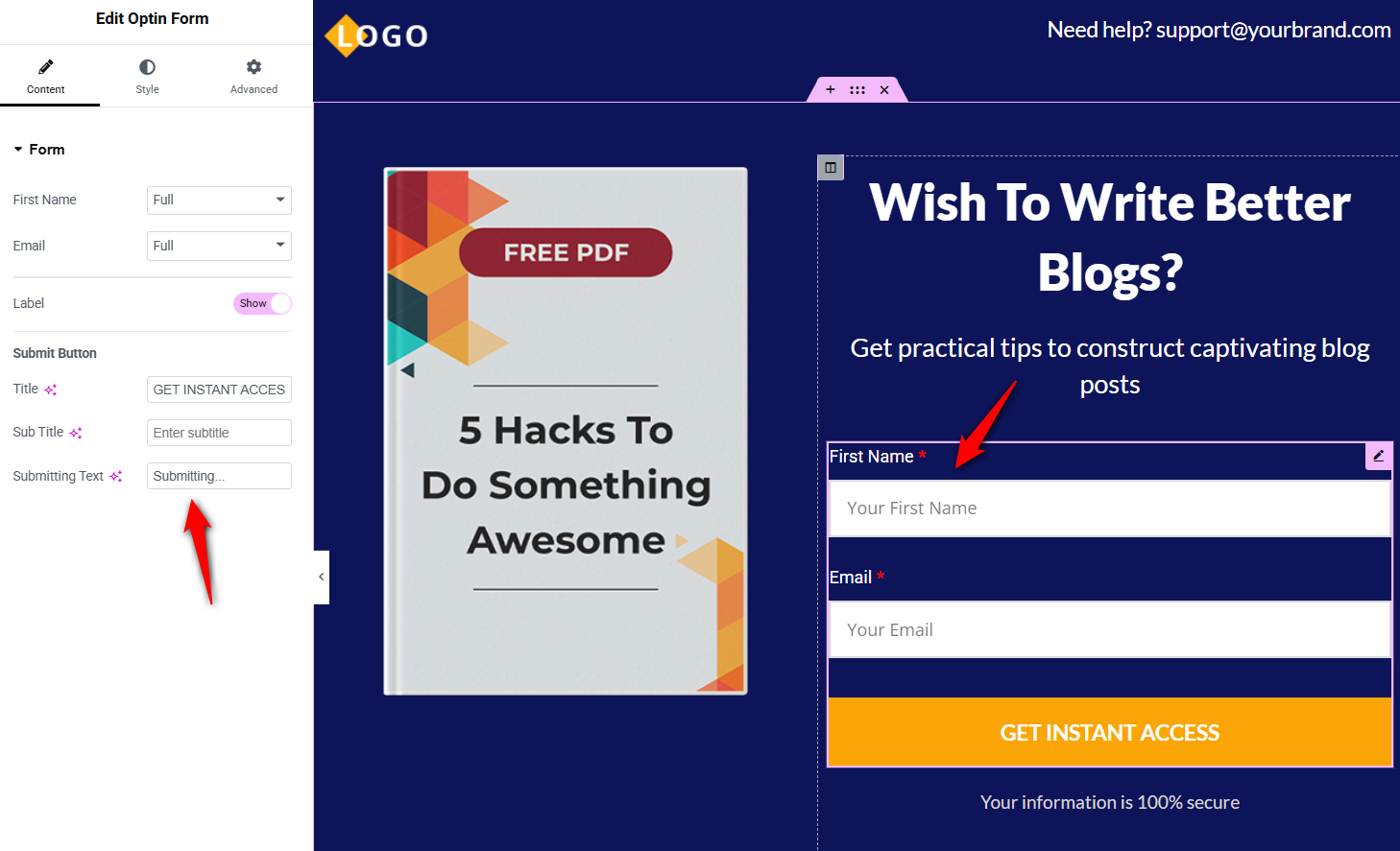
You can also change the form field width. Moreover, you can alter the CTA text, subtext, and submitting text.
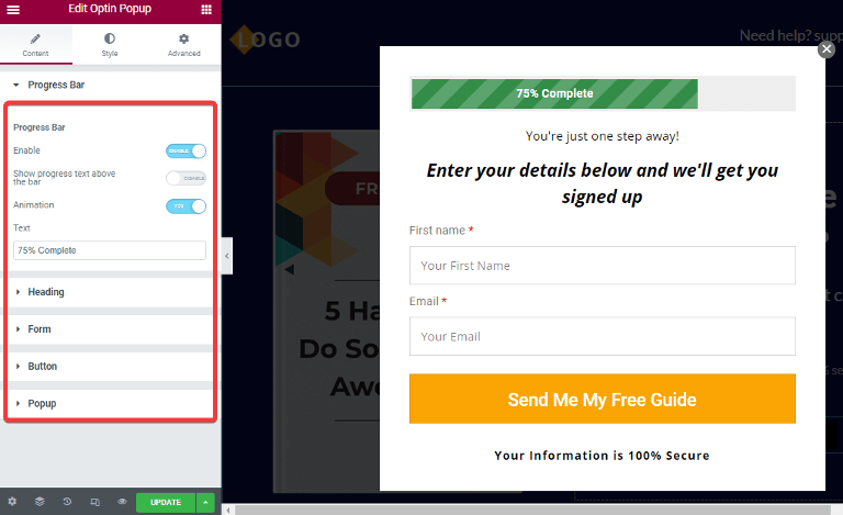
In case you choose the pop-up type form, you can customize the progress bar, heading, button, etc, for the pop-up form.
After updating the form, make sure you update the content of all the sections to match your offer and brand.

After making the changes, make sure to click on “Update” to save all the changes.
Here is what the opt-in page looks like:

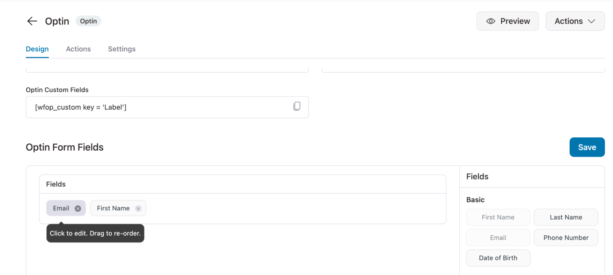
Step 3: Manage the opt-in form fields
FunnelKit lets you easily manage the fields on your opt-in form. The template we chose currently has two form fields: first name and email.
If you want, add more fields by drag and drop on the Optin Form Fields section.
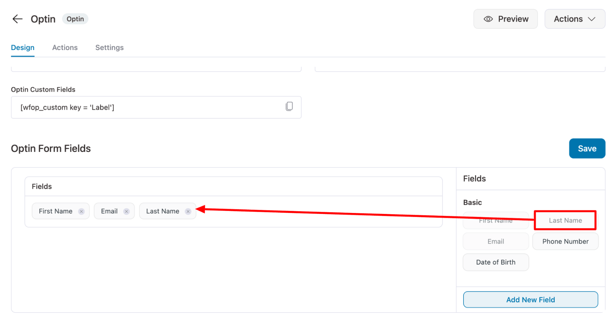
If you want, you can remove any of the fields from your opt-in form.
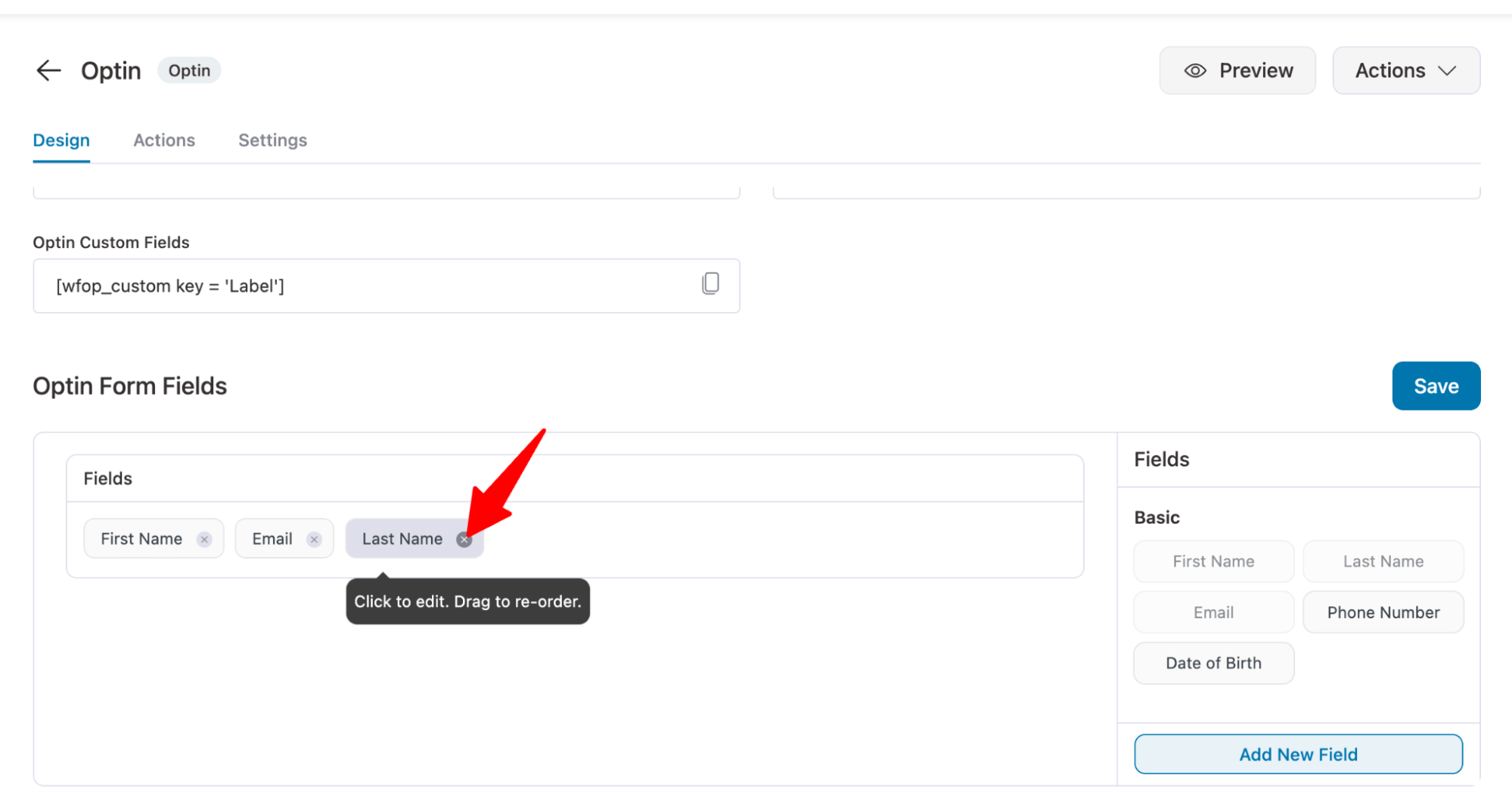
You can rearrange the form field as well just by drag and drop. For example, you can make email the first field.
Step 4: Send an email notification to your leads
Once users sign up, you can send them a confirmation email with a link to the freebie.
For that, move to the Actions Tab. Here Select “Yes” for the Lead Notification option.
After that, you can customize the email subject and body. To personalize the email body content, you can use different shortcodes given below the “Body” option.
You can also enable Admin notification if you want to receive notifications as soon as a lead gets captured.
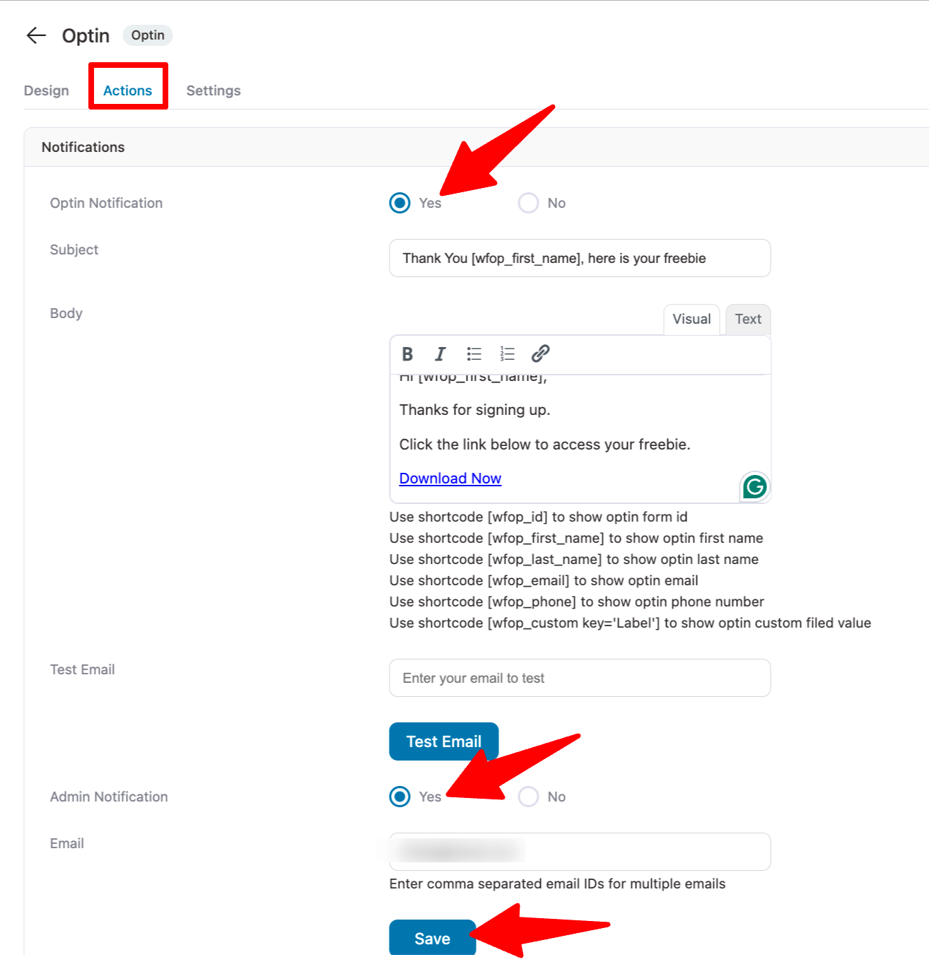
After making the changes, make sure to hit “Save” to update.
That’s it. Your opt-in page is ready. Similarly, you can customize your opt-in confirmation page.
Nurture Your Leads With Automated Emails for Maximum Conversions
Once you have the leads, you need to nurture them so they become loyal paying customers.
To nurture your leads, you need to leverage email marketing automation, where you can send users different email campaigns automatically.
To run automated email campaigns, you can use FunnelKit Automations. With this automated tool, you can send triggered emails, such as:
- Welcome emails
- Educational content emails
- Discount emails
- Order confirmation emails
- WooCommerce follow-up emails
- Abandoned cart recovery emails
- Winback emails, and so on.
5 Opt-in Offers/Lead Magnets That Work Wonders
Coming up with an opt-in offer idea that appeals to your audience can seem a bit challenging.
You don't want to spend all your time and effort creating something that people don't want to download.
While messaging plays an important role, the actual offer is just as important.
Let's look at some products that can be pretty impressive lead magnets or opt in offers:
#1: Digital Books
eBooks make for great lead magnets. Easy to access, no shipping required, and hard to misplace.
Digital books encourage instant gratification as they are sent to the user when they sign up.
Here's an example from SmartBlogger:

So, eBooks, cheat sheets, and swipe files are some great opt in offers to consider!
#2: Workshops / Webinars
Offering a workshop or replaying a webinar for free is sure to get some heads turned.
List out the merits of your offer along with all they’ll learn by the end of the event on your opt in page.
Including a preview of the workshop will work like a charm and help boost conversions.
Here's an example from Mindvalley, where they offer a short 1-minute preview of the workshop:

This would immediately get people hooked, and they'll also get a sense of how you would be teaching them after they sign up.
Again, a great opt in offer idea!
#3: Drip Training
Providing all the content at once can often overwhelm people. Dripping content allows you to break your training into shorter, more manageable chunks.
Watching hours-long content in one sitting is a big commitment. But, 10 minutes a day for a week sounds more doable.
You have to convince people that you're not asking too much of them, and they don't need to make extraordinary efforts to consume your material.
Take a look at a marketing coach's opt-in offer:
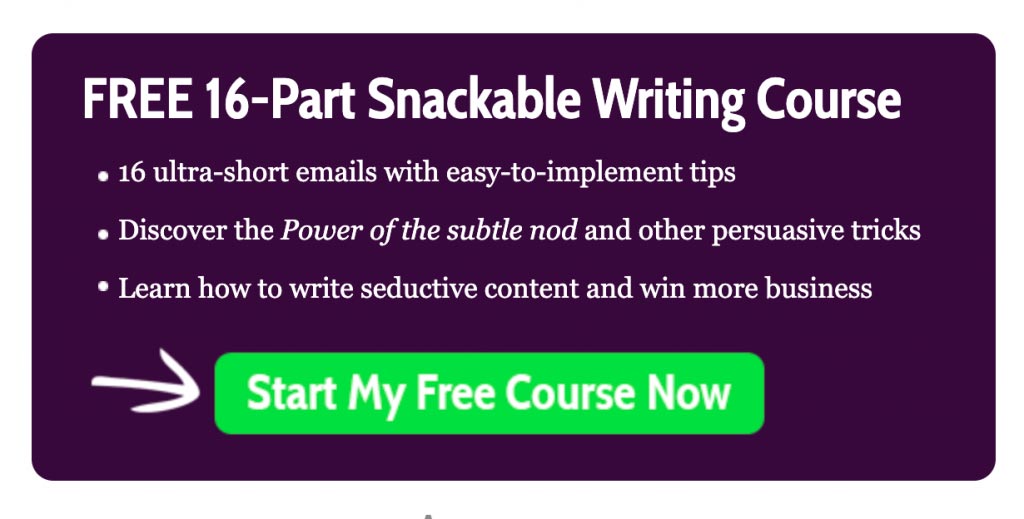
We love how she says 16 ultra-short emails to lure people. Also, notice how she calls it a snackable course, letting people know that they're not signing up for something which requires a lot of their time.
You can use such offers on your opt in page.
#4: Free Trial Offer
Allowing your users to test-run the products or services you’re trying to sell is a genius marketing technique.
Giving them a taste of your main products would tell you about the genuinely interested audience.
Take a look at this offer on Traditional Cooking School; it's perfectly aligned with the paid offering:
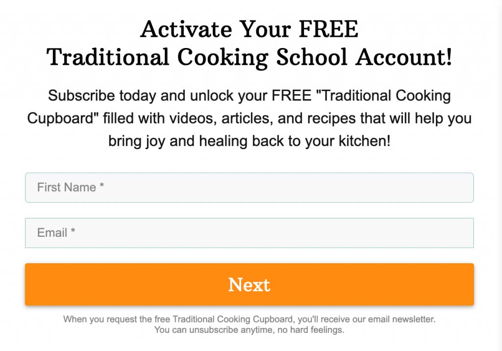
If you put an expiry on the free trial, it is likely to get more people to act on the offer to avoid losses.
Brands like Netflix and Spotify also work on this model, making it a brilliant lead magnet.
#5: Challenges
People love challenges, and these days challenges are in trend anyway.
Offer your prospects fixed duration challenges with actual results to look forward to, like - "Grow your Instagram profile by 1000 followers in 10 days".
What particularly makes a challenge interesting is the specificity of the result promised at the end of the engagement.
Here's an opt-in page example of a haircare challenge:
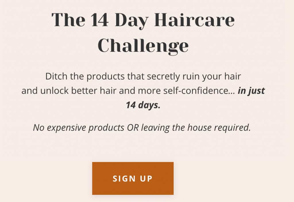
Your challenge should be aligned with your audience's goal, a goal they've been struggling to smash on their own.
This gives the users some excitement and builds a sense of connection with the others aiming for the same goal!
5 Best Opt-in Page Examples
Let’s have a look at some of the inspiring opt in page examples.
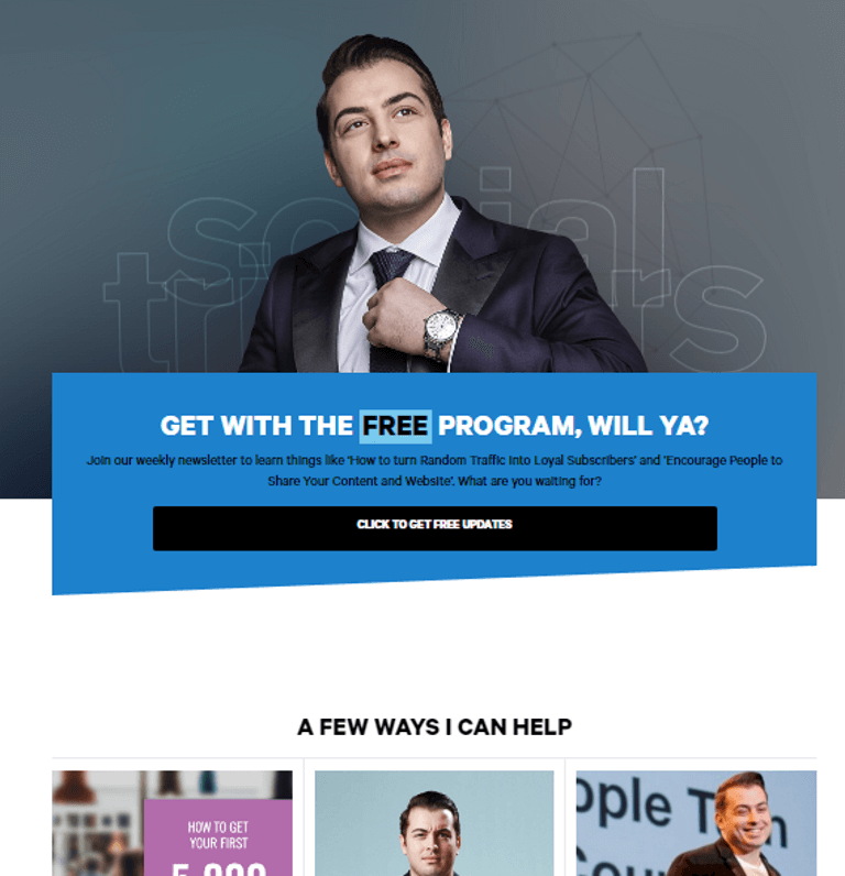
1. Social Triggers
First on our list, we have an opt-in page by Social Triggers run by Popular blogger Derek Halpern. This page reflects the blogger’s personality in a beautiful way.
This opt-in page contains all the key elements, such as catchy headlines, hero images, CTA, and trust builders.
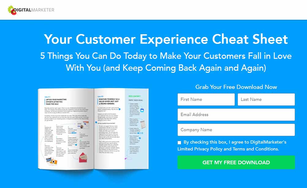
2. Digital Marketer
Next, we have an opt-in page by Digital Marketer.
On this page, the bright blue and white colors keep the eyes captivated, and the hero image increases the pitch's attractive quotient. It also has a catchy headline.
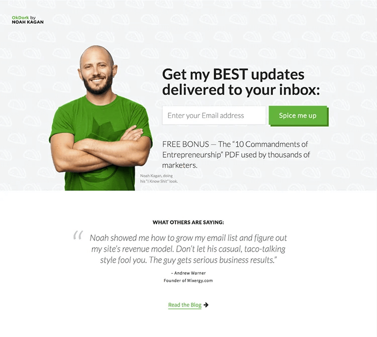
3. OK Dork
The opt-in page of OK Dork by Noah Kagan is another great example you can take inspiration from.
This page is simple but effective. We really like the Image and the CTA. Clearly stating what the freebie is, along with the review section, works as a good motivation for the users to give out their email addresses.
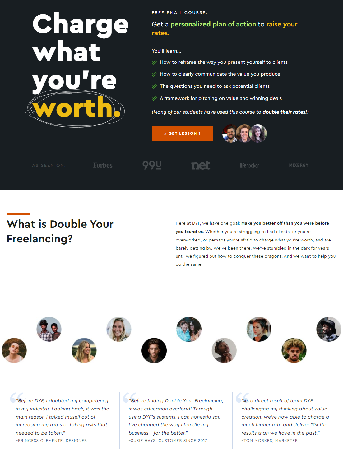
4. Double your freelancing
We really use the opt-in page by doubleyourfreelancing.com. What stands out the most about this page is that you highlight the benefit one will receive neatly in bullet points. This section effectively motivates users to give their email addresses in exchange.
Along with the benefits section, the other parts are also well-designed.
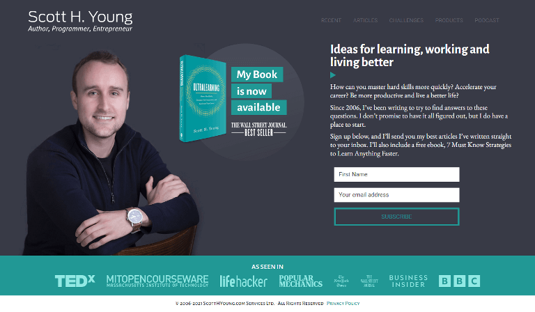
5. Scott H Young
The opt-in page is created by Scott H Young, a popular personal development blogger. The page features a compelling headline that effectively describes the essence of the book.
Additionally, there is a trust-building section labeled "As Seen In", showcasing the various platforms where this writer's work has been featured.
Frequently Asked Questions (FAQs) on Creating High-Converting Opt in Page
What is the difference between a landing page and an opt-in page?
A landing page is a web page designed with a specific goal, such as converting visitors into leads or customers. On the other hand, an opt-in page is designed to turn visitors into leads by collecting their email addresses of contact information.
So, the main difference between a landing page vs. an opt-in page lies in their goals and intended outcomes.
A landing page can have various conversion goals, such as making a sale, generating leads, driving downloads, or promoting a specific event, etc., beyond just capturing email addresses. On the other hand, an opt-in page is specifically focused on collecting your visitor’s contact information for future marketing efforts.
If we talk about use cases, landing pages are used in various marketing contexts, such as pay-per-click (PPC) advertising, social media campaigns, email marketing, etc. However, opt-in pages are only used to build an email subscriber list for email marketing campaigns.
How to choose the right opt-in offer?
Your opt-in offer or lead magnet must grab attention, reel in the users, and get them to share their email addresses.
1. Keep it simple
Most marketers over-complicate things and try to overdeliver. The key is not to go overboard with it. For example, if you are a coach who helps grow Instagram followers, don’t offer the whole course as a lead magnet on their opt-in page.
Offer a free cheat sheet on the "Best times to publish a post" or "Tips for creating emotionally engaging Instagram stories" to users. The idea is to give them a head start on a path that leads toward your paid offering.
2. Be relatable
As humans, we love to assign meaning to things around us, making them all relatable or personal. A story influences how a person thinks, so presenting your opt-in copy in a manner that makes it interactive surely helps!
3. Induce the fear of missing out
One thing people absolutely hate is being left out of the loop. Not knowing is a great evil that your users would want to avoid. One way to push the FOMO level high is by providing some compelling testimonials on your opt-in page. This will get you a lot of conversions.
What is a good conversion rate for an opt-in page?
While it varies by industry, a benchmark for a healthy opt-in page is between 20% and 30%. Highly optimized pages with warm traffic can exceed 50%. If you are below 10%, you likely have a headline or offer alignment issue.
Should I use a single opt-in or double opt-in?
For list hygiene, double opt-in is better (it prevents fake emails). However, for pure conversion volume, single opt-in wins. If you use single opt-in, ensure you clean your list regularly.
Can I use these pages with Elementor or Divi?
Yes, FunnelKit integrates deeply with popular page builders like Elementor, Divi, Gutenberg, and Oxygen, allowing you to use your preferred design environment while leveraging our funnel logic.
How do I guide visitors’ attention toward my opt-in form?
Use directional cues. Explicit cues like arrows or lines can point directly to your form, while implicit cues such as a person in the hero image looking toward the form naturally draw the user’s eye. Heatmaps consistently show this increases CTA engagement.
Why is “message match” between my ads and opt-in page important?
Because users expect the page to reflect exactly what the ad promised. Matching the ad’s headline, offer, and even color scheme maintains the “scent” and prevents confusion. Any disconnect causes instant drop-offs.
How do I optimize my opt-in page for mobile users?
Design for thumb zones, not just screen fit. Place the CTA button in the lower third of the screen so it’s easy to tap. Also remove heavy images on mobile to keep load speed under 2 seconds. Slow pages lose sign-ups.
Ready to Create Your First Opt-in Page in WordPress?
An opt-in page is more than just a digital form; it is the gateway to your business. It is the first "yes" you get from a customer, and in digital marketing, that first yes is often the hardest to win.
By combining a compelling offer, a distraction-free environment, and the psychological triggers we discussed, you are collecting emails and building a relationship at the same time.
Remember, the biggest killer of conversion rates is hesitation.
Don't wait for the perfect headline or the perfect lead magnet. Use the FunnelKit templates we highlighted, pick an offer that solves a real problem for your audience, and get your page live today. You can always A/B test your way to perfection later.
The tools are ready. The strategy is proven. The rest is up to you.
Editorial Team
June 18, 2026Want to sell your LearnDash courses through WooCommerce and accept payments seamlessly through gateways like Stripe, PayPal, or Apple Pay? To sell LearnDash courses through WooCommerce, you install the WooCommerce...
Editorial Team
June 17, 2026Looking for the WooCommerce thank you page so you can edit it, but can’t find a page anywhere in your dashboard? You’re not alone. WooCommerce doesn't show this page like...
Editorial Team
June 16, 2026Upselling is one of the most important revenue levers for earning more from existing buyers. But it isn’t about throwing random products at customers. It’s about offering add-ons or upgrades...