A dedicated newsletter landing page attracts visitors and turns them into subscribers.
It helps you highlight the benefits of signing up and show your expertise as the creator. It also helps you build a bond with your audience and train them to open emails.
Do you want a newsletter subscription page that captures your audience’s attention?
In this post, we’ll look at how to create a landing page for your newsletter in WordPress.
Further, we will look at some well-done examples and key elements for your landing page.
Table of Contents
- 1 What is a Newsletter Landing Page?
- 2 Why Do You Need a Newsletter Landing Page?
- 3 Key Elements of a High-Converting Newsletter Landing Page
- 4 How to Create a Newsletter Landing Page in WordPress?
- 5 Sending a Welcome Email to your Leads
- 6 3 More Newsletter Landing Page Examples To Inspire Your Own
- 7 Frequently Asked Questions (FAQs) on Newsletter Landing Page
- 8 All Set to Create Your Fabulous Newsletter Landing Page?
What is a Newsletter Landing Page?
A newsletter landing page is a dedicated landing page where your users sign up for your email newsletter.
Think of it as a simple opt-in page. The signup box collects users’ information with the promise of delivering valuable content via an email newsletter.
It might take some time to create a spectacular newsletter landing page, but it’ll definitely be worth it.
If you do everything correctly, your email opt-in landing pages can convert by 30% or higher.
Fabulous, isn’t it?
Why Do You Need a Newsletter Landing Page?
There are many ways to capture leads for your newsletters. You can use exit-intent or time-based pop-ups, sidebars, hello bars, etc.
But nothing beats a dedicated newsletter subscription landing page. It’ll help substantially increase your leads.
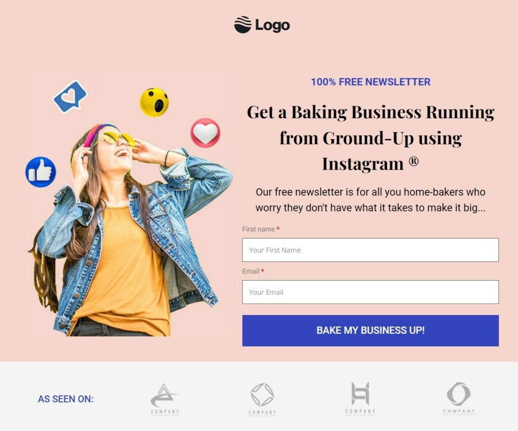
Here are a few reasons why you might need it:
#1: To position your newsletter as a solution to their problem
Writing a persuasive copy on your page helps you form compelling arguments to woo your audience.
Here’s how you can use the space on your newsletter landing page:
- Write a clear objective stating your newsletter will help them achieve
- Mention the benefits you’ll deliver to your audience when they sign up
- Establish a connection by sharing your own personal success story
Implementing these points will help you create convincing arguments on your landing page.
#2: To run paid ads on your landing page
A lot of marketers and businesses take advantage of paid advertisements to target their audience.
Running ads on different platforms is a kickass way to drive traffic to your newsletter landing page.
Target your ideal subscribers based on their geographical location, age, interest, and more. It's easiest to convert cold audiences into subscribers than into customers straight away.
Clicking on these ads will take them to your landing page - where they can sign up for your newsletter.
#3: To position yourself as an authority on the subject
If you don’t have a website yet, you can still use your landing page and generate leads for your newsletter.
It helps them understand who you are and what goals you can help them achieve.
You can see a few of your case studies where you helped people or businesses reach where they wanted to.
Dr. Robert Cialdini's Authority Principle is a clear example of it. People tend to follow personalities who are successful in their field or know what they’re doing.
Thus, it’s important to show your expertise on the landing page. It gets the right people to sign up for your newsletter.
Having read about the benefits, let’s now look at the elements of high-converting newsletter pages.
Key Elements of a High-Converting Newsletter Landing Page
An effective newsletter landing page includes some crucial elements. It includes an attention-grabbing headline, a clean layout, an actionable CTA button, etc.
Let’s look at each of the key elements in detail.
1. Captivating headline
The headline is the first thing a visitor sees on your newsletter landing page.
8 out of 10 people read your headline but only 2 of them will go through the rest of your copy. Therefore, you must make a statement with your headline.
Writing a short, gripping headline entices people to take action on your landing page.
Notice the headline used by The Hustle. It appeals to their audience that wants to gain insights and become knowledgeable.
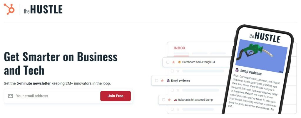
Your heading should give a clear message of what your readers can expect from your newsletter.
2. Minimalist form design
Hubspot conducted a study and found a 25% increase in conversions when they lowered the number of form fields.
Therefore, your form should be minimal which allows users to quickly signup.
Remember your goal: getting users on your email list. For that, you just need an email field on your newsletter sign-up form.
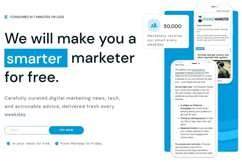
Noticed how the Stacked Marketer has used one email form field in their newsletter landing page.
3. Clear and specific deliverables
Your author’s or description copy should mention the intent of your email newsletter. This includes what your email newsletter is about and why visitors should sign up for it.
Your copy should include the following details:
- What topics your newsletter will cover
- What to expect when your audience signs up
- How often you’ll send your newsletter (like weekly or monthly)
Notice how the Nerdletter uses an interesting copy on its landing page. They have clearly highlighted their financial newsletter full of insights, practical reads and ideas.
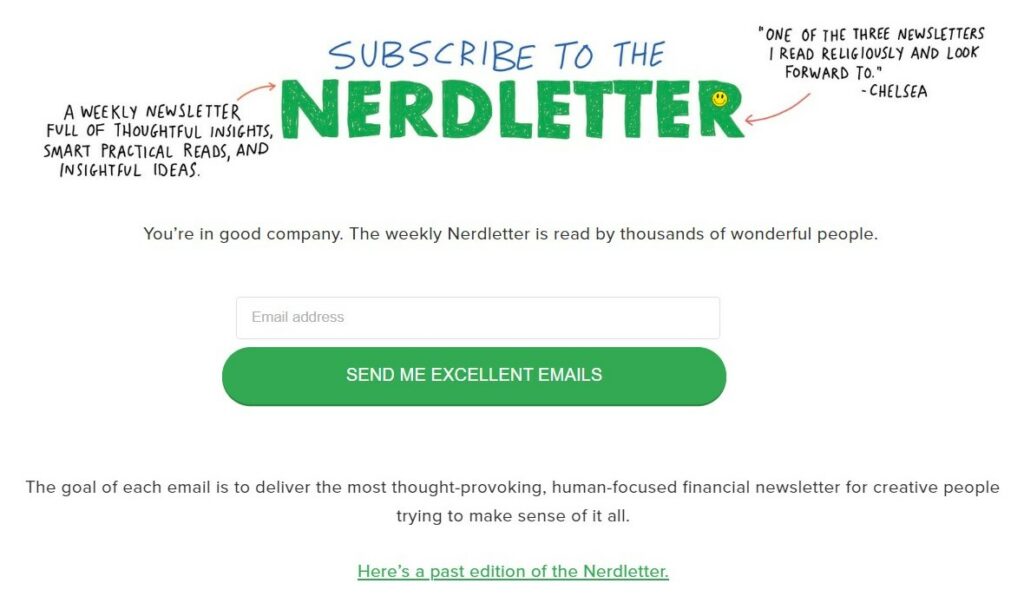
Besides this, you should also tell about yourself as a creator and the intent behind it.
The mission statement in your newsletter builds your credibility as a creator. It focuses on what your expertise is and how can you help your subscribers.
4. Genuine social proof
88% of consumers trust user reviews before making any decision online.
When people see that others are saying good things about your newsletter. They are more likely to subscribe.
You should show social proof of your genuine subscribers and how much your email newsletter means to them.
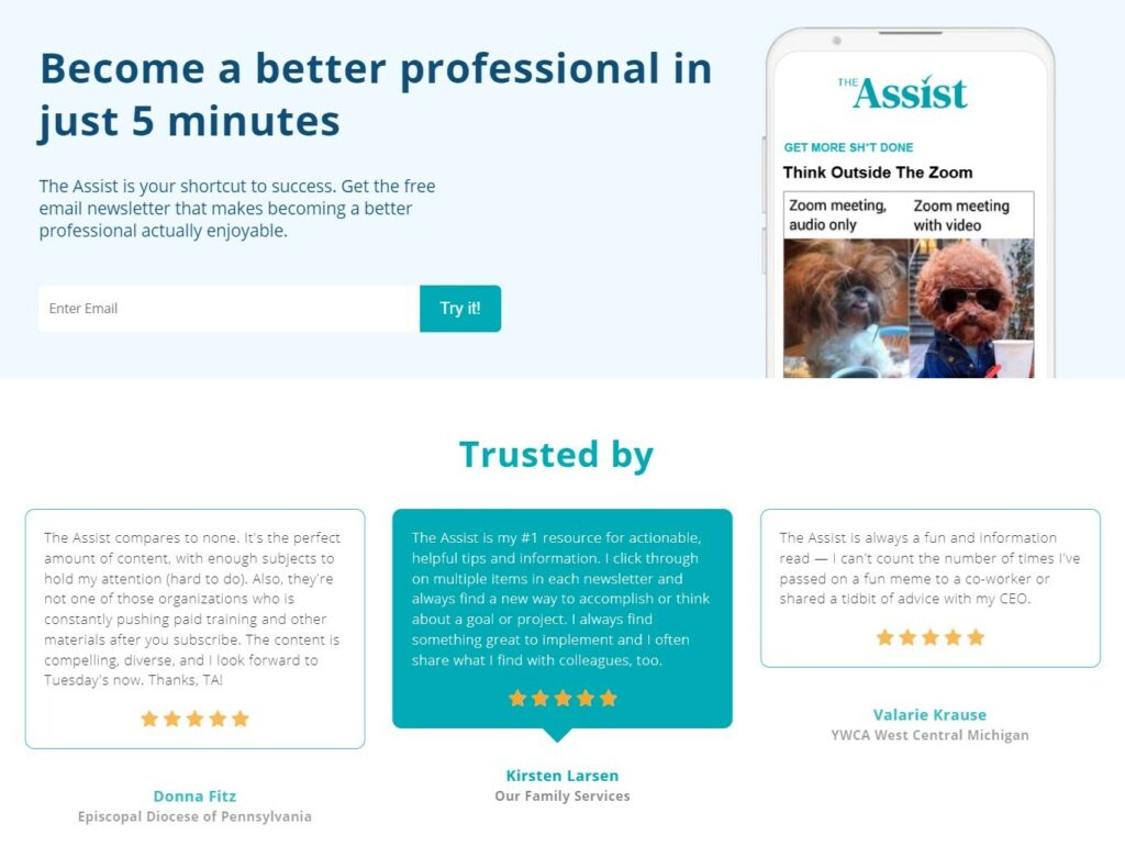
The Assist gives out a scrolling social proof section on its newsletter subscription landing page. This section includes the name of the subscribers, their designations, ratings and actual reviews.
5. Goal-oriented call to action (CTA) button
The CTA button on your newsletter landing page has only one goal. That is to inspire your audience to sign up for your newsletter.
As per Hubspot, personalized CTAs perform 202% better than usual CTAs. That’s why your CTA button should be short, personal and actionable.
So instead of the ‘Subscribe Now’ button text, use the first person in your button copy. Or be as specific as Ramit Sethi has used - “Join Rich Life Insiders” here.
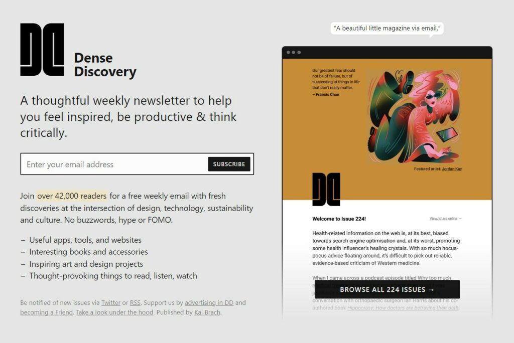
Now we know about the core elements to include, let's understand how you can create our landing page for your email newsletter.
How to Create a Newsletter Landing Page in WordPress?
We will be using FunnelKit’s Funnel Builder to create a spectacular landing page for the email newsletter subscription.
Funnel Builder is a far-off superior tool for WordPress. It lets you design your funnels with conversion-optimized templates, set up AOV-boosting offers, and more.
Here are a few reasons why Funnel Builder is the right tool to design your newsletter landing page:
- Conversion-optimized templates: FunnelKit's templates are designed to smash your conversion targets. You can find 20+ templates that bring life to each one of your use cases. All of these templates come pre-optimized to be used for all types of devices.
- Integrates with all page builders: Funnel Builder integrates with your favorite page builders. These include Elementor, Divi, Gutenberg, and Oxygen to help you design impressive-looking pages. If you want to use other page builders like Thrive, Beaver, etc., you can create your pages with shortcodes.
- Built-in pixel tracking: Driving social media traffic to your landing page is quite common. Funnel Builder has the in-built capability to track pixels. It works with Facebook Pixels, Google Ads, TikTok Pixels, Snapchat, Pinterest tags, etc. to track pixels on your website.
- A/B testing: Funnel Builder has integrated an A/B testing feature to split-test the pages on your funnel. It lets you create and customize multiple variants of your newsletter landing page to A/B test them.
- Detailed Analytics: Analyze your views, conversions and revenue made in each funnel step. Go in-depth with the metrics to see how your landing page is performing and work on it for continuous lead flow.
Follow the steps below to create a stunning newsletter landing page:
Step 1: Install and activate the Funnel Builder
Get your copy of FunnelKit’s Funnel Builder.
Please note that FunnelKit is available in both the free and premium versions.
With the Pro version, you get fresh premium templates, A/B testing module, unlimited revenue-boosting funnels, and more.
Read more to install and activate FunnelKit.
Step 2: Add an Opt-in funnel
Go to Funnels and click on 'Add New Funnel' to create a new funnel.

You'll be directed to the funnel templates. Click on the 'Lead Funnels' and you'll see dedicated templates for your opt-in funnel.
Click 'Preview' on the template you like.
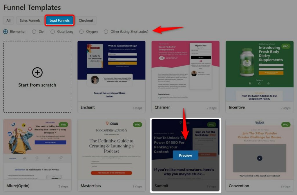
Here you’ll be able to see the full preview of the template.
Choose the type of form you want to use in your newsletter landing page:
- Inline - Form embedded on a page
- Popup - Popup style form gets opened when you click on the button
Once done, hit 'Import This Funnel' and name your funnel.
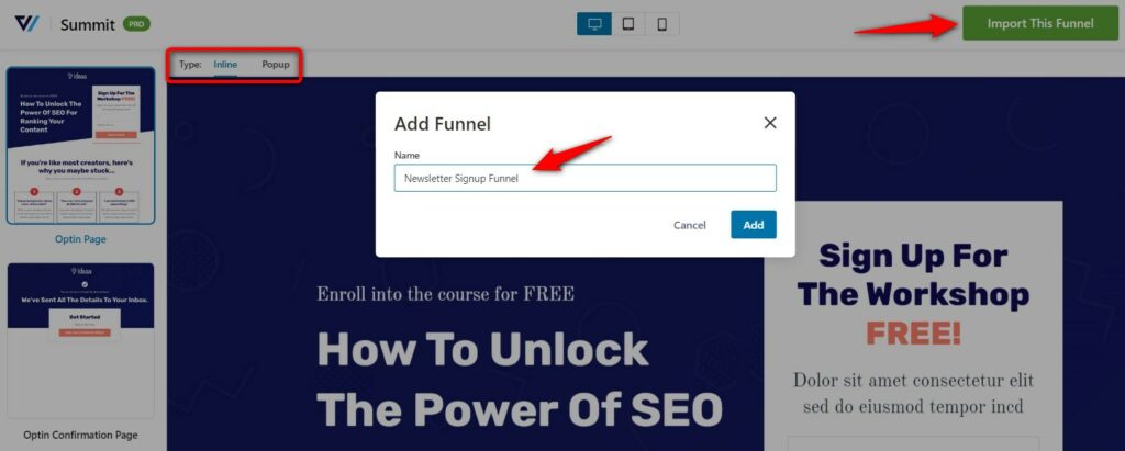
Clicking on 'Add' will create your opt-in funnel that has an Opt-in and Opt-in confirmation page.
Step 3: Customize your newsletter landing page
Click on the ‘Edit’ button to configure your page.
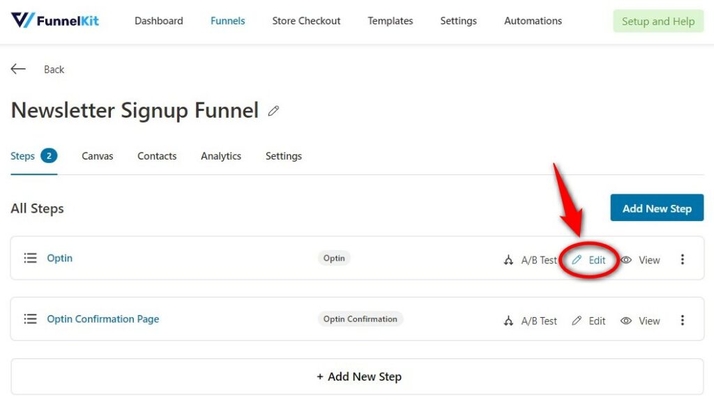
On the ‘Design’ tab, click on the ‘Edit Template’ to start customizing your opt-in page.
These templates are highly customizable that let you create a perfect page the way you want.
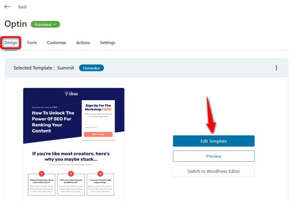
Since we selected Elementor at the time of importing our funnel, it’ll load the page in this page builder.
Let's start by giving an appropriate title and subtitle.
We're providing just two fields here to make the process quick and easy.
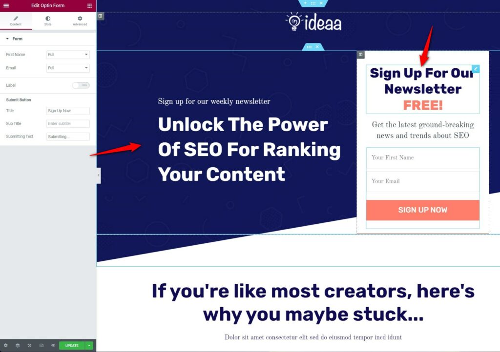
Make sure to create a copy that perfectly highlights the intent of your newsletter.
So, it's always nice to reinforce your USPs in the author's section:
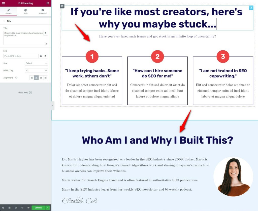
It's important to include at least three benefits on your newsletter landing page. If users know about the benefits, there is a probability that they will sign up.
Finally, we'll edit the testimonials section on our page.
Testimonials act as social proof of how your email newsletter benefitted them.
Simply, edit and customize them on your landing page:
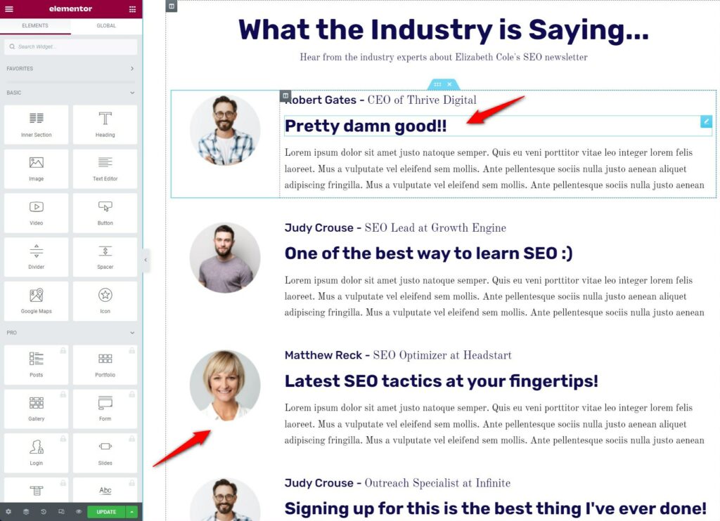
Once done, click on Update to save your changes.
This is what your page will look like:
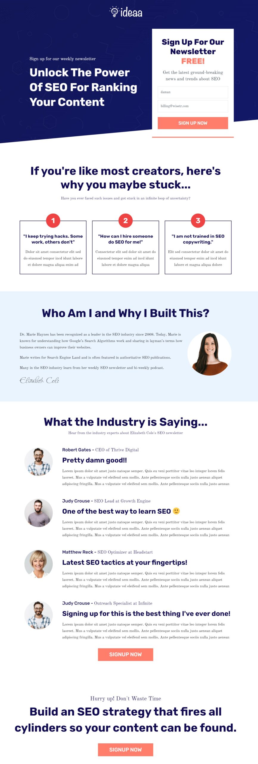
That’s it! This is how you can customize your newsletter landing page.
Step 4: Edit your opt-in confirmation page
Go back to your funnel and hit 'Edit' to customize your opt-in confirmation page.
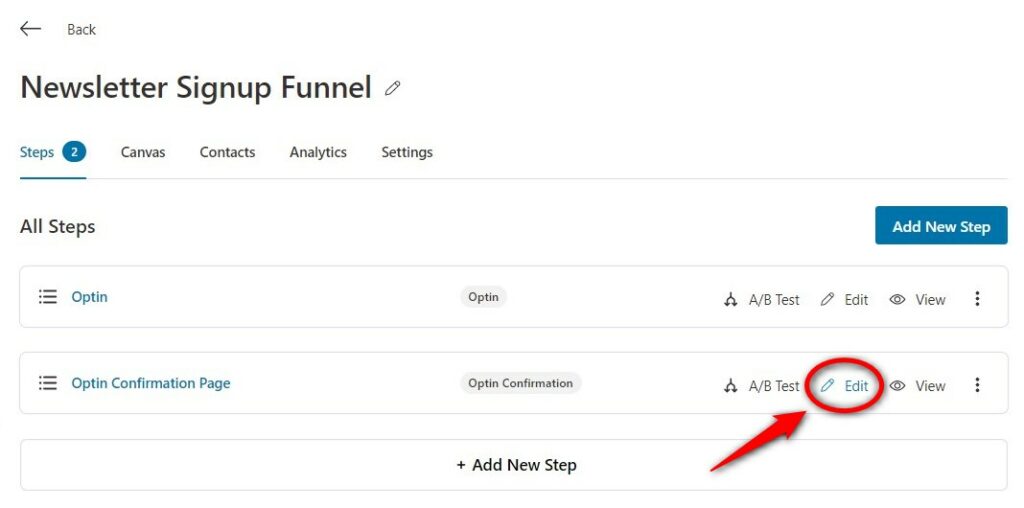
The process of customizing the page will be the same as you did above.
Make sure to hit 'Update' after making the changes.
This is how your newsletter sign-up confirmation page will look:
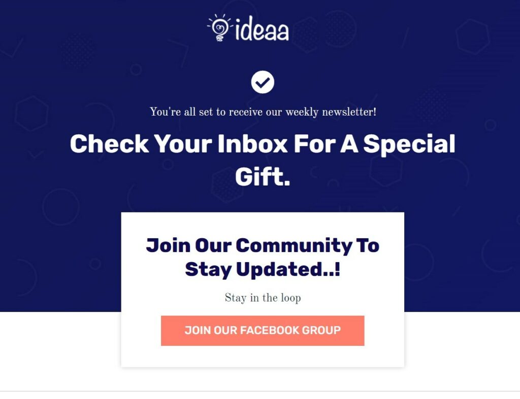
That’s it! This is how you can customize your newsletter landing page.
Sending a Welcome Email to your Leads
Welcome emails have a 91.43% open rate, so you need to present your email well enough to build anticipation.
To send a welcome email to contacts who have subscribed from your opt-in page, go to the Actions tab.
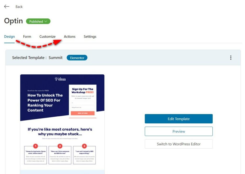
Enable the lead notification there.
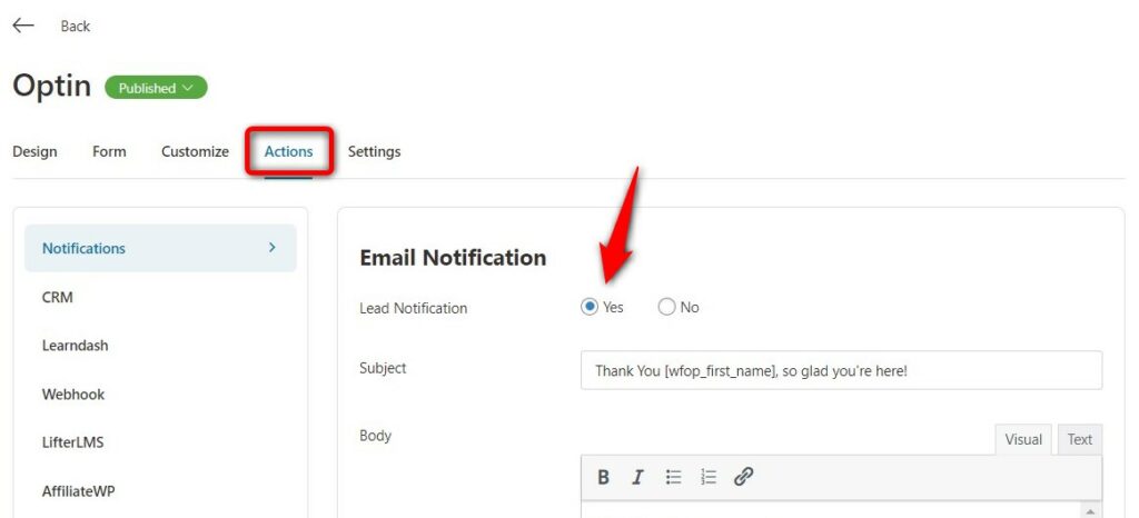
Now enter a personalized subject line, preheader, and email body the way you want.
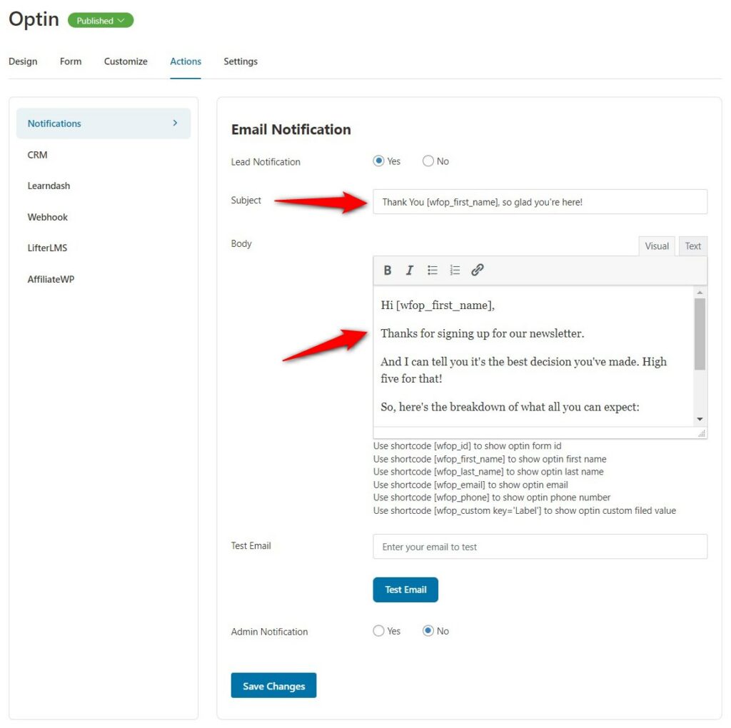
Once done, click on 'Save Changes'.
Now, this welcome email will be sent to contacts who have opted in for your email newsletter.
3 More Newsletter Landing Page Examples To Inspire Your Own
In this section, we’ll look at three examples of newsletter landing pages that are our favorite.
These landing pages are from some of the influential marketers. Let's find some effective conversion secrets that dominate the industry.
Look closely, put on your conversion scientist hat, and get ready to extract powerful insights:
1. Emails Done Right
Emails Done Right, created by Samar Owais, a copywriter and email conversion strategist. She helps her clients boost their sales and enhance conversions with effective email sequences.
Let’s look at her landing page:
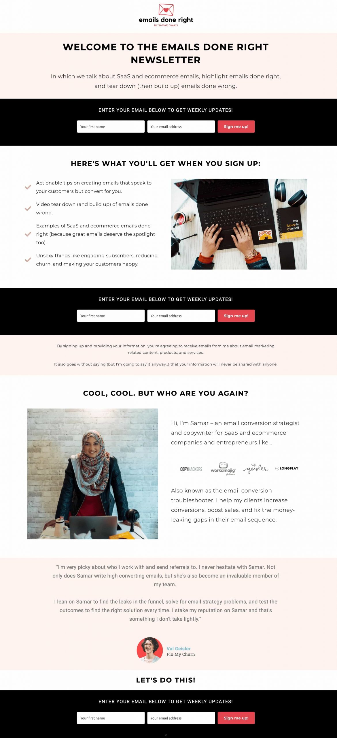
What we liked about this newsletter subscription landing page:
- A clear above-the-fold section - The headline is quite clear. The sub-head quickly gives away who the newsletter is actually for.
- Minimalist Form Fields - A simple form with two basic fields so the potential leads don’t get lost.
- Author section - The author section briefly talks about her expertise. Notice there are also logos of the media houses, she got featured! Further, bolstering credibility.
2. Meat & Hair Creative Writing
Meat & Hair targets content creators who need to punch up their writing. Their daily newsletter of creative writing lets you develop amazing skills through interesting stories.
Take a look at their newsletter landing page:
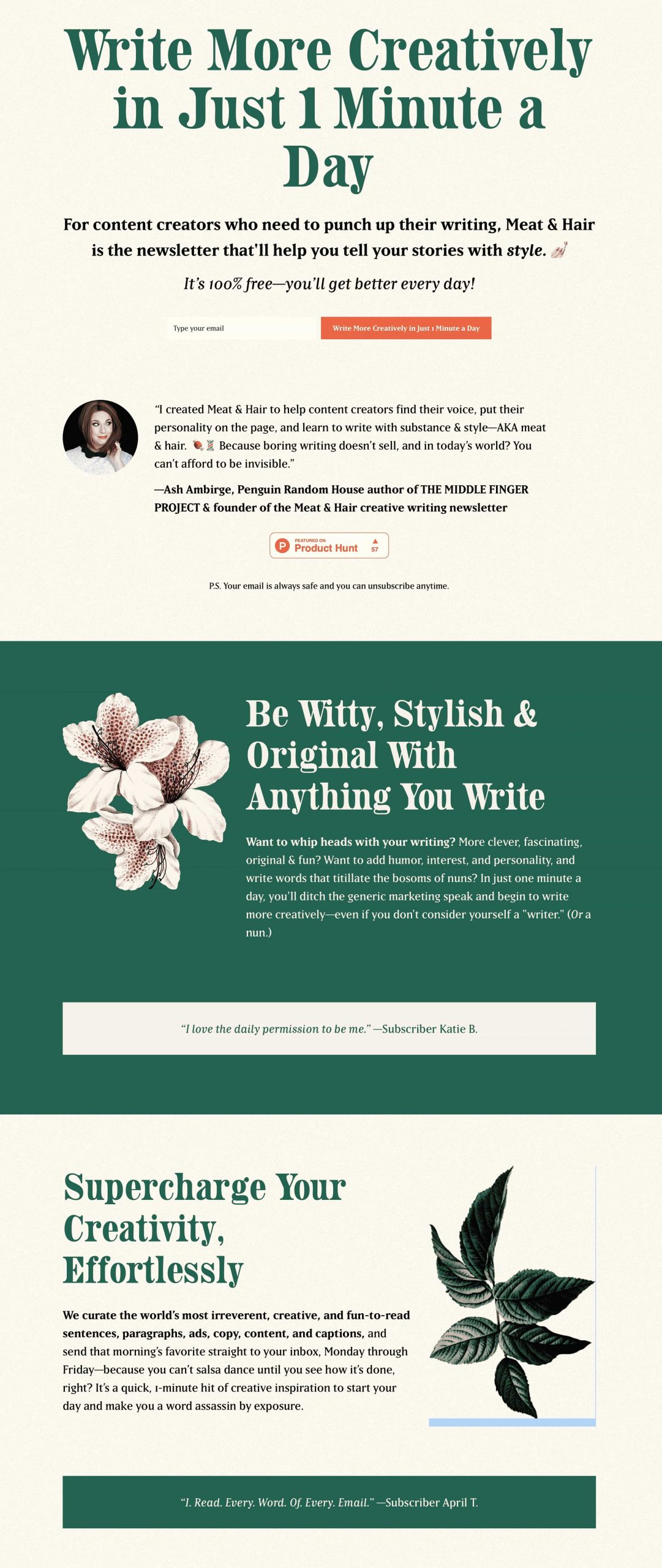
What we liked about it:
- USP - Used their USP as the headline which is quite attractive. The offer straightaway gives the impression that it is easy to consume (only 1 minute a day).
- Audience match - This landing page has clearly specified its target audience, i.e., content creators.
- Using the power word ‘free’ - Uses the term “It’s 100% free” to arouse users to sign up for the newsletter.
3. Nik Sharma
Nik Sharma is one of AdWeek’s Young & Influential personalities and an investor. He serves as an advisor to some fastest-growing companies in the eCommerce industry.
Let’s take a look at Nik’s newsletter landing page:
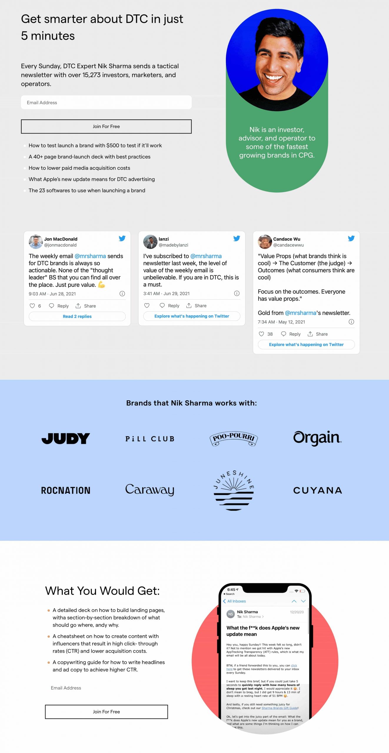
Nik Sharma has done a brilliant job of sharing his knowledge of market trade secrets on his landing page.
What we liked about it:
- Headline - The headline and description clearly explain what users will get when they sign up.
- What you'll get section - The benefits section pinpoints all the juicy details you’ll find in his email newsletter once you sign up.
- Tweet-based social proof - Displayed tweets from real people for his newsletter testimonials.
These are some of the examples from world-class marketers that effortlessly bring conversions!
Learn from them to create a power-up landing page for yourself.
Frequently Asked Questions (FAQs) on Newsletter Landing Page
Here, we have answered the most common questions asked by users regarding the newsletter landing pages:
How do I create a newsletter landing page?
You can create a newsletter landing page with FunnelKit. Just import a template, customize it with a page builder and you’re ready to go!
What core elements should I include in my newsletter landing page?
The core elements you should include in your newsletter landing page:
- Short, concise headline
- Minimalist form design
- Compelling description copy
- Social proofs or testimonials
- Actionable CTA button
Where can I find some of the best newsletter landing page templates?
You can find some great landing page templates in FunnelKit. All its templates can be customized with any page builder of your choice. Plus, these templates are optimized for each device. You can import them with a single click and start customizing them as per your need.
All Set to Create Your Fabulous Newsletter Landing Page?
We hope this detailed post has helped you. Here we have uncovered the little-known secrets of creating a stunning newsletter landing page.
Funnel Builder has some impressive templates that let you create delightful pages for your funnel.
These templates are highly customizable and pre-optimized for all devices.
Take inspiration from the foolproof examples and create a high-converting newsletter landing page today!
Editorial Team
April 1, 2026The WooCommerce place order button on your checkout page is literally where the money changes hands. However, most store owners leave it completely untouched. You aren't stuck with the default...
Editorial Team
March 25, 2026Running a WooCommerce store without the Facebook Pixel is like pouring money into ads while blindfolded. You're spending, but you have no idea what's actually working. Every abandoned cart, every...
Editorial Team
March 24, 2026Every WooCommerce store needs a reliable way to generate PDF invoices and packing slips. Hand-typing order details into a Word template results in misspelled addresses, missing tax IDs, and a...

