
Are you looking to create a gorgeous WooCommerce checkout page design that converts perfectly well?
Well, then, this case study of Wardee Harmon from TraditionalCookingSchool.com is for you.
Wardee has carved out her niche with thousands of customers loving her time-saving cooking methods.
She is a veteran when it comes to selling online and has been in this space since 2010!
Recently, we spoke to Wardee Harmon to go over her checkout page design and understand her strategies.
She generously shared her checkout design optimization lessons learned in the trenches.
In this post, we'll break down the exact best checkout page design practices she uses to optimize and convert her checkout pages.
By the end of it, you'll know how to make your checkout more effective.
Table of Contents
- 1 Why is checkout page design so Important?
- 2 First up, How Wardee Got Started With Traditional Cooking School
- 3 Analysis of Wardee Harmon’s Checkout Page
- 4 Best WooCommerce Checkout Page Design Practices Recommended By Wardee Harmon
- 4.1 #1 Use one-page checkout to eliminate friction
- 4.2 #2 Add security seals and social proofs to your checkout pages
- 4.3 #3 Use a trust-winning checkout page design + welcoming language
- 4.4 #4 Use form field validators to help users
- 4.5 #5 Use Product-Selector To Let Users Select Multiple Items
- 4.6 #6 Ensure the checkout page is device responsive
- 4.7 #7 Allow guest checkout
- 4.8 #8 Provide multiple payment options
- 4.9 #9 Connect users to customer support
- 4.10 #10 Make the most Of order bump: Wardee uses it to sell the free trial Of her membership
- 5 Ready to design your checkout page with FunnelKit?
Why is checkout page design so Important?
A checkout page is the last stage of the shopping process, where users provide the necessary information to complete the transaction. Most checkout page includes:
- Order summary
- Form to collect user information such as billing and shipping address
- Payment options etc.
While these are the basic elements of a checkout page, just adding them isn’t enough.
Optimizing the checkout page design of any online store plays a crucial role in achieving success.
A checkout page can be a single page or multi-step checkout. Whatever you go for, optimizing your checkout page design is quite important. Here are a few reasons why checkout page design is crucial for your business:
- Conversion optimization: A well-designed checkout page can significantly impact conversion rates. By creating a streamlined and intuitive process, businesses can reduce friction and eliminate barriers that may hinder customers from completing their purchases.
- User experience: A poorly designed checkout page can lead to frustration, confusion, and, ultimately, cart abandonment. A smooth and user-friendly checkout can enhance the overall user experience and leave a positive impression on customers.
- Trust and security: Online shoppers worry about the safety of their personal and financial details. But when a checkout page is well-designed and includes trust signals like SSL certificates and secure payment options, it reassures customers and makes them feel more confident to go for the purchase.
- Reduce cart abandonment rates: A well-designed checkout page can significantly reduce checkout abandonment. If you can make the checkout process streamlined and user-friendly, then customers are more likely to complete the purchase, reducing the cart abandonment rate.
To summarize, checkout page design is important because it directly impacts conversion rates, user experience, trust, and security. Investing time and effort into creating an optimized and visually pleasing checkout page can lead to higher sales, happier customers, and a stronger online presence for businesses.
Having said that, let’s look into our case study now.
First up, How Wardee Got Started With Traditional Cooking School
Wardee has created a remarkable space on the internet for sharing traditional cooking recipes and teaching absolute beginners how to master healthy cooking.

In 2010, when her (third) son was diagnosed with eczema, she felt the need to explore traditional cooking.
And once she did it, it completely cured her son of eczema and positively influenced her family's overall health and well-being. So she started writing blogs and sharing recipes online about it.
But her readers wanted more from her!
Today, her business revolves around selling ebooks, courses, select physical products (like print textbooks), and even a membership site.
And, at the heart of it all, is a thriving community of traditional food lovers.
If you remove the revenue, money and all of that, we really want to help people get healthier, at the core.
-- Wardee Harmon, Founder (Traditional Cooking School)
Her team has grown from just her husband and her to about 20+ people, including the support staff.
Take your notebook out; there's plenty you can learn.
Analysis of Wardee Harmon’s Checkout Page
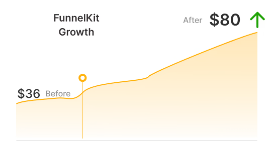
Wardee mentioned that thousands of transactions occur in her store each month while remaining anxiety-free.
So we took a look at her checkout page to see what makes it tick:
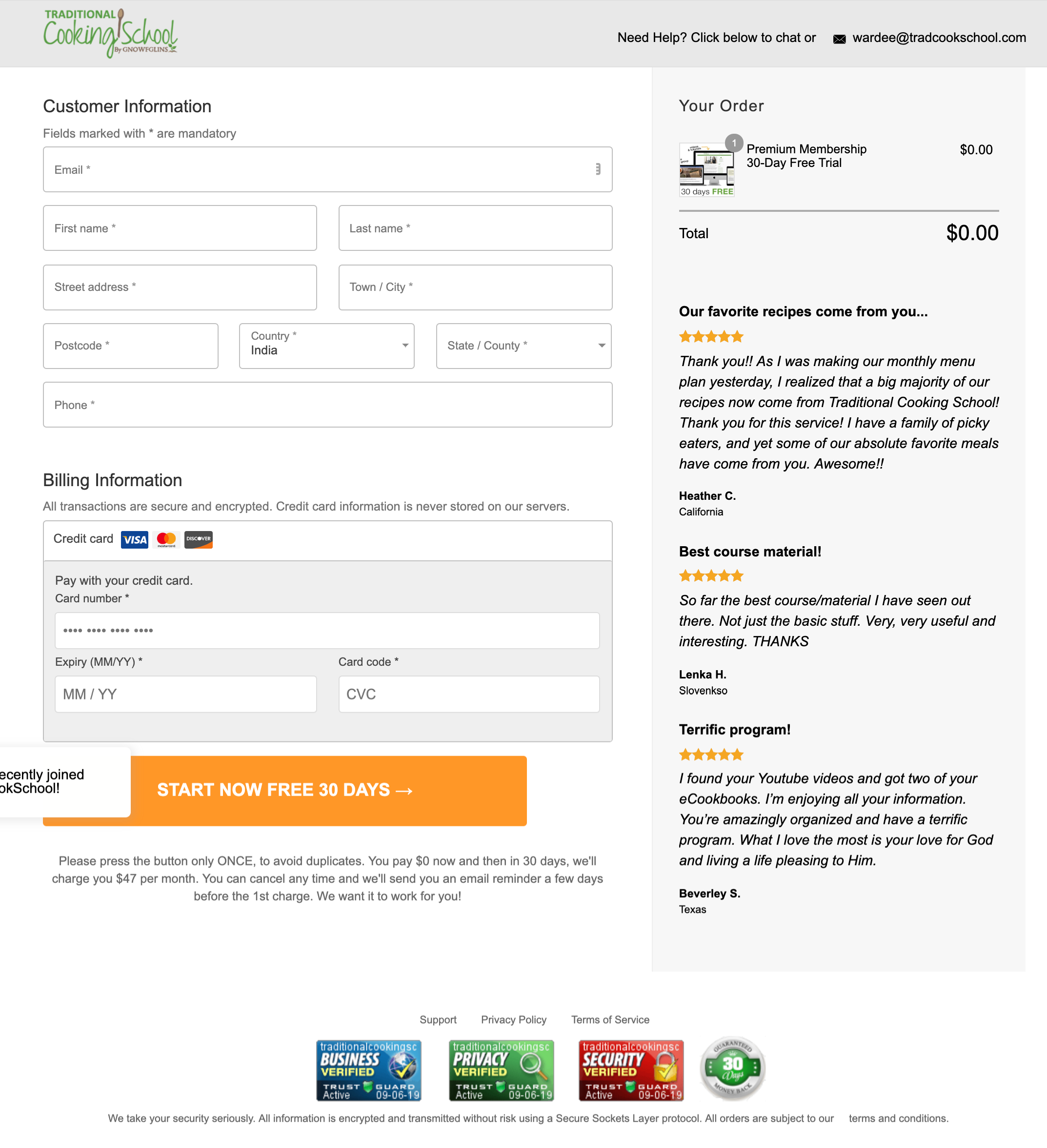
Have a look at what makes Wardee's checkout page convert:
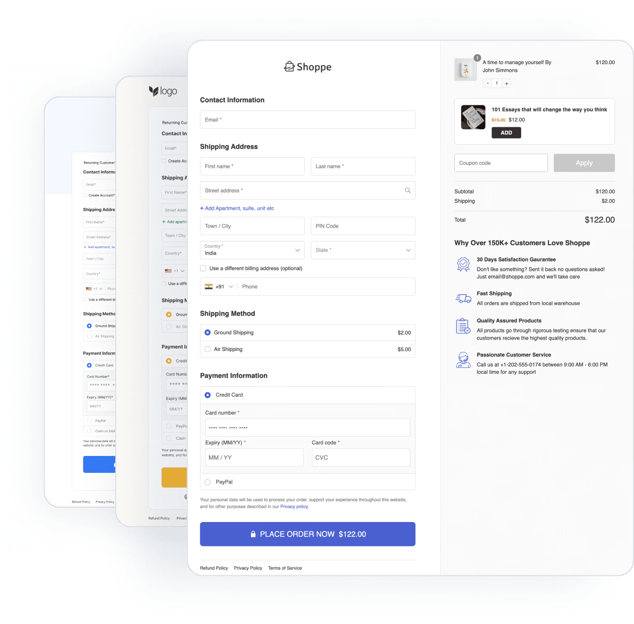
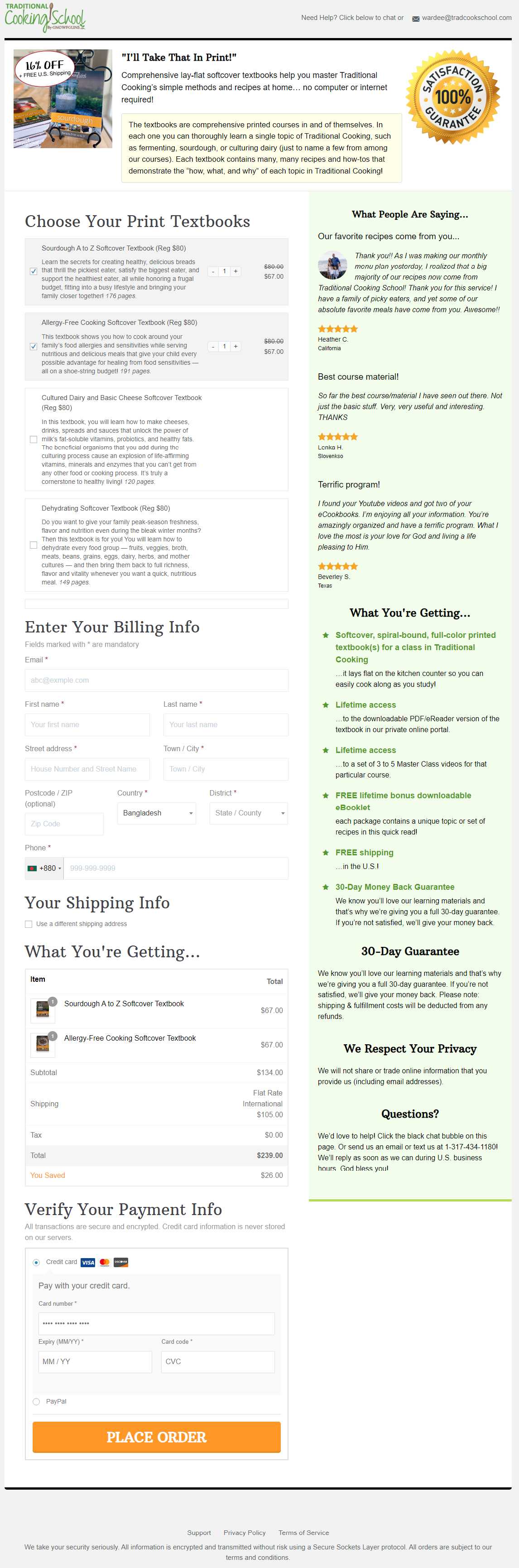
- The checkout page looks extremely neat, clean, and easy to navigate.
- On the top, it shows the product details, such as how much the users will save from this order, guarantee, etc., all of which work as a giant motivator for users to complete their purchase.
- The checkout page offers multiple product options to choose from. Users also get the option to update the product quantity.
- The order summary gets updated based on the product that users choose to buy.
- The testimonials on the right side also help earn users’ trust in the brand and encourage them to hit the “Place Order” button.
- The order summary section displays all the information in a compact yet eye-catchy way.
- Other sections like guarantee, privacy, and questions/support add the much-needed elements of credibility to the page.
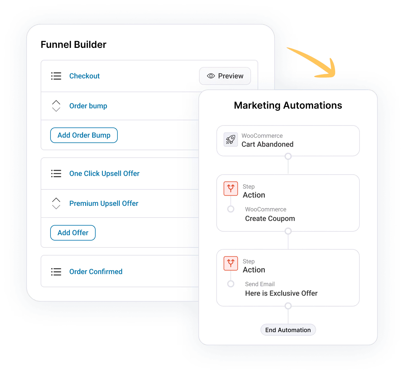
Note: Wardee uses different checkout pages for different product categories using the sales funnel builder by FunnelKit Funnel Builder.
Let's look at how one of their checkout pages looks on mobile devices:
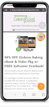
The logo takes center stage at the top, making her checkout look perfectly on-brand. Also, you can clearly see what you're ordering right above the fold - so there's no room for confusion.
Plus, everything fits the screen perfectly.
Now let’s check out some of the best practices this entrepreneur suggests when it comes to the WooCommerce checkout page design.
Best WooCommerce Checkout Page Design Practices Recommended By Wardee Harmon
In this section, let's explore Wardee's top strategies for designing a great checkout page.
#1 Use one-page checkout to eliminate friction
The conventional approach says to send people to a product page from the category listing, where they can click on “Add to Cart”. Then send them over to the cart page and finally to the checkout page.
Wardee looked at the flow and realized that she didn't need these unnecessary steps in the middle. So when you click on a product listed on her store, she'll send you directly to the checkout.
The checkout is specially built to sell the item the user clicked on. Hear her talk about her checkout page design:
Wardee believes that users should clearly know what they're buying. Even if they get distracted - the section at the top serves as a reminder.
There's a clear image of the item with desirable benefits written in about 2-3 lines. By eliminating the cart in its entirety, Wardee offers her prospects a faster and smoother route to checkout. This strategy works for her!
People often end up abandoning the cart when they don’t know exactly what they have in their cart! This tool (FunnelKit Funnel Builder) allows you to specify what the customers are getting and make them comfortable. - Wardee
Here's an example of her membership free trial checkout page:
This is our Shop checkout template (inspired by Shopify).
#2 Add security seals and social proofs to your checkout pages
This is one of the critical strategies to ensure that your checkout wins the heart and wallets of your prospects.
Wardee puts a seal at the top of her checkout along with the product title, description, and image to make it appear genuine and trustworthy.
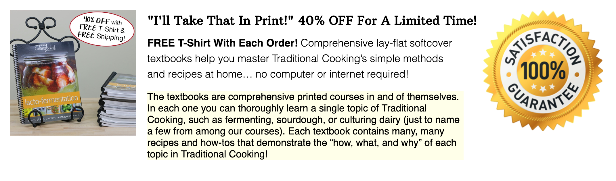
A seal of satisfaction signifies that the product is genuine in terms of quality. It also shows that the customer can trust the product. At least, they can go by the product description and make the purchase.
She uses the sidebar to display the testimonials and benefits of the product she's selling:
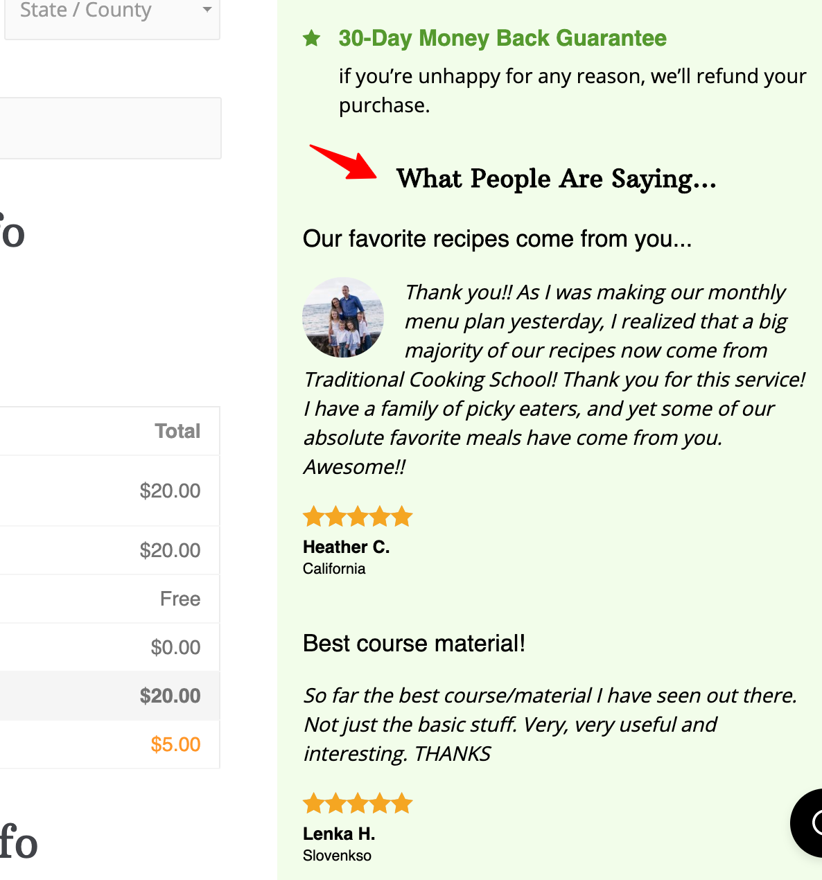
The image of the reviewer accompanies the testimonials - and notice they're not product-specific. But are about her products and the business in general, which is excellent for building trust and rapport.
#3 Use a trust-winning checkout page design + welcoming language
Wardee has given a lot of thought to the language on her checkout page. She uses the prebuilt checkout templates by FunnelKit.
Wardee knows that making people feel at ease is the key to persuading them.
She uses user-friendly, welcoming, and trust-building language to talk to her users.
For example, she uses phrases like, 'You're getting:
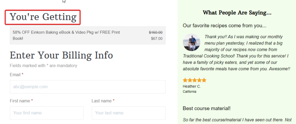
The more at ease your customers are on the checkout, the more readily they will buy your products.
#4 Use form field validators to help users
Notifying customers with a popup about the input or typographical errors made on a checkout form will frustrate the user. Especially if they make multiple errors and are told to fix them every time they submit a form, it may frustrate them even more, resulting in a bad user experience or maybe cart abandonment.
Wardee emphasizes adding validators in your form fields as it saves users time and also makes the checkout process smoother.
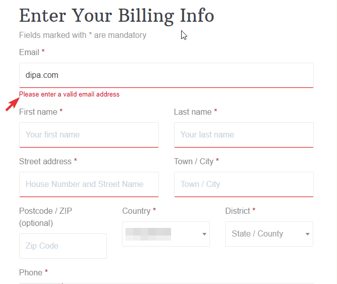
Note: FunnelKit checkout templates have built-in form validators, so you don’t have to do any extra coding or settings to add the form fields validator.
#5 Use Product-Selector To Let Users Select Multiple Items
Wardee uses a product selector on her checkout page. It lets users select one or multiple products from a given list of items on the checkout page.
There are broadly 3 cases for implementing a Product-Selector:
- Allow buyers to select any number of items and adjust their quantity
- Allow them to choose only one item from the list
- Force-sell a bundle with all the products pre-selected
I. Allow buyers to select any number of items to boost order value
You can use this setting to allow buyers to choose whichever products they want from the list and the number of unit(s).
Here’s Wardee’s product selector on the checkout page:
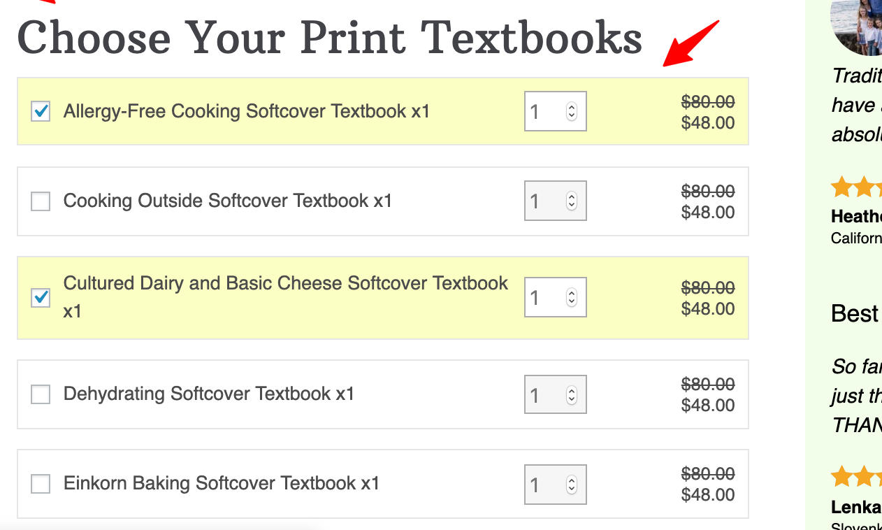
The ticks on the checkboxes (highlighted with yellow) are the ones that the customer has selected to purchase.
Notice the quantity incrementer that allows users to adjust the number of units.
II. Allow them to select one of the options from the list
This option allows prospects to choose only one of the given items.
Let us look at one of Wardee’s checkout pages which has such a Product-Selector enabled:
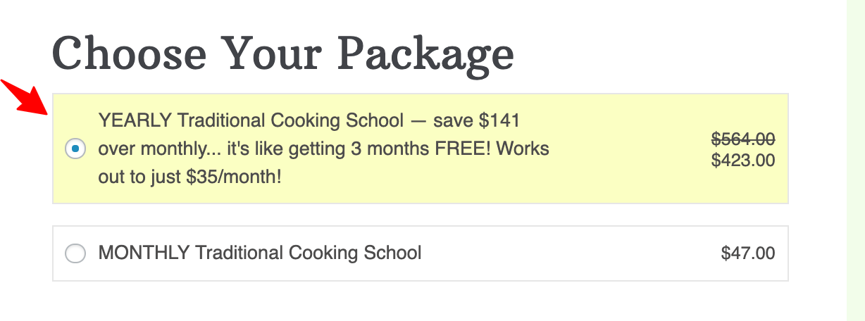
As it shows, her buyers can choose between any one of the cooking school subscriptions out of the two listed - either monthly or annually.
This strategy is useful because it allows her customers to choose the smaller plan and minimize their risk OR choose the annual plan and pocket handsome savings. The users feel in control of their decision.
She uses the small real estate effectively to upsell the yearly plan by mentioning that “it’s like getting three months FREE! Works out to just $35/month”.
You can use this same technique to upsell users a higher volume of your product too. For example - 'buy 1 and save X' or 'buy 3 and save 2X'.
III. Force-sell, a bundle with all the items in it
In this setting, users are displayed with pre-checked checkboxes, listing out all the products that the user gets with the purchase.
For example, a user wants to buy a shaving set. A product selector will appear with all the components (like foam, razors, blades) listed and ticked.
If the customer has to buy, he can either buy them all or nothing.
#6 Ensure the checkout page is device responsive
Most people shop using their mobile nowadays, so it’s important to ensure your checkout page looks on all devices. Wardee took responsiveness very seriously while building her website. As we have shown earlier, her checkout is perfectly mobile-responsive.
Note: All the FunnelKit templates are optimized for different devices. if you create your checkout page using this plugin, then you don’t have to worry about device responsiveness.
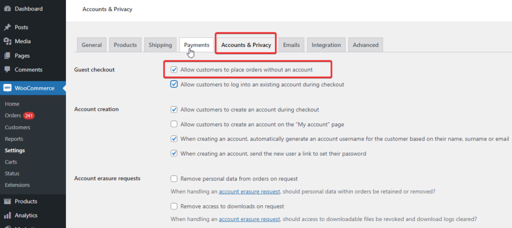
#7 Allow guest checkout
According to research, 23% of shoppers abandon the checkout process if they have to create a new account to place an order.
Removing the account creation requirement on the checkout page can help you reduce checkout abandonment and increase conversions.
Wardee not only preaches but also practices that, as you can place an order on her website without creating an account.
#8 Provide multiple payment options
Customers go through the entire purchasing process, but when they discover their preferred payment method is not available, they may abandon the purchase. In fact, 7% of people abandoned the cart because the store didn’t offer enough payment methods.
To prevent this, it is crucial for online retailers to have multiple payment methods available on their website checkout page.
As you can see in the image below, Wardee offers multiple payment options for users.
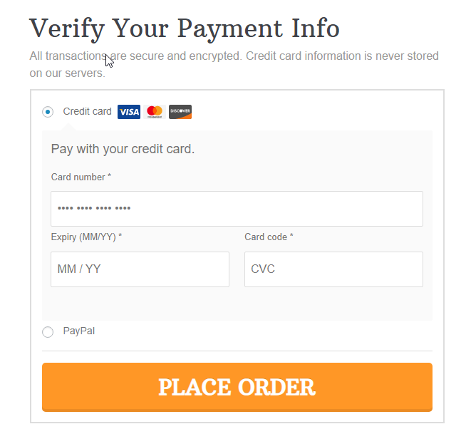
Note: Stripe helps you offer multiple secure payment options such as Credit and Debit Cards, Google Pay, and Apple Pay express checkouts and local payments on your WooCommerce store. Learn how you can integrate Stripe with WooCommerce in easy steps.
#9 Connect users to customer support
Providing a better user experience and building trust goes a long way.
That’s why we recommend including the customer support contact details on your checkout page in case users have questions or encounter issues. This shows that you care about your customers and their experience.
Wardee, who values customer care, placed the customer support details on the checkout page to demonstrate this care.

#10 Make the most Of order bump: Wardee uses it to sell the free trial Of her membership
A FREE Trial offer is providing access to your membership site for a specified duration of time at no charge.
After the FREE Trial period ends, they are charged on a monthly, quarterly, or yearly basis to stay a member.
Wardee offers a free trial of her membership program, and her checkout page design has an order bump section where she sells it. It allows users to check a box on such the checkout page and add the $0.00 trial to their order.
Let’s take a look:
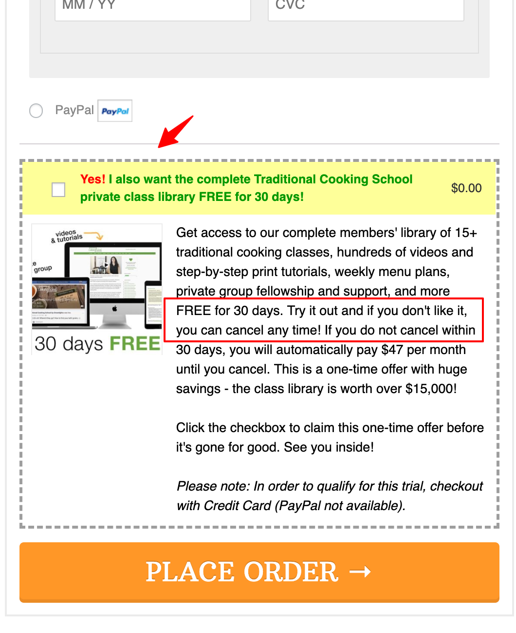
Wardee’s membership plan has 15+ courses in them, and her members can access them 24/7 at a low monthly cost. But they can also get these courses à la carte. She offers order bumps on some of her order forms to upsell a 30-Day Free Trial of the membership plan.
A quick note on Order Bumps:
- Order Bumps are checkout page offers that can be added to the order with one tick on the checkbox
- Generally, people don’t give much time to read this section, therefore keeping it short and persuasive helps a lot
Limited edition items, Complementary products, ebooks, free trial offers make excellent order bumps. For more details, see our post on order bumps.
On why free trials work as order bumps...
Free Trial Offer in the order bump works like a charm because they’re going to submit their payment details anyway on this page. So they practically only have to tick a box and add the $0.00 item to their order.
According to themembershipguys.com, here are a few questions that people have before buying a paid membership program:
- Is the membership program meant for me, and does it solve my problem?
- Will I even like it and want to stay?
- In case I don’t, can I cancel my membership?
That’s why you need a free trial plan so that your prospects can see it for themselves and if it works, then they can stay on.
🔔 Pro tip: Another tip we like to add to the amazing tips Wardee provided is to enable Google address autocomplete on your checkout page. An incorrect address can not only result in delivery to the wrong address causing users a bad user experience, but it will also cost you money.
So, make sure to add Google address autocomplete to your WooCommerce checkout page.
Ready to design your checkout page with FunnelKit?
We are sure Wardee Harmon’s case study helped you understand the ingredient that makes a successful high-converting checkout page.
If we have to sum up all the best practices tips she gave, we can say she advises us to focus on customers and their experience.
If you follow the tips provided, you’ll surely create a beautiful checkout page with a first-class customer experience. To help you with that, we can’t think of any tool other than FunnelKit Funnel Builder that’ll help you build a user-friendly checkout page.
FunnelKit offers a variety of checkout page templates with device-responsive design, form field validators, and unlimited customization options. Moreover, you can design your checkouts with the Funnel Builder using any page builder, such as Elementor, Divi, Oxygen, and many more.
Irrespective of the page builder you use, you can utilize FunnelKit to create the checkout page design that will boost your conversion rate.
Are you ready to design your checkout page with FunnelKit?
Editorial Team
July 7, 2026Are you looking for WooCommerce checkout optimization hacks to streamline your users' shopping experience? 7 out of 10 shoppers who reach a WooCommerce checkout leave without paying; according to Baymard...
Editorial Team
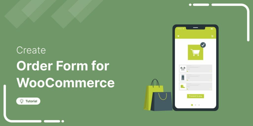
July 6, 2026A WooCommerce order form lets customers select multiple products, set quantities, and choose variations from a single page instead of visiting individual product pages. There are two ways to add...
Editorial Team
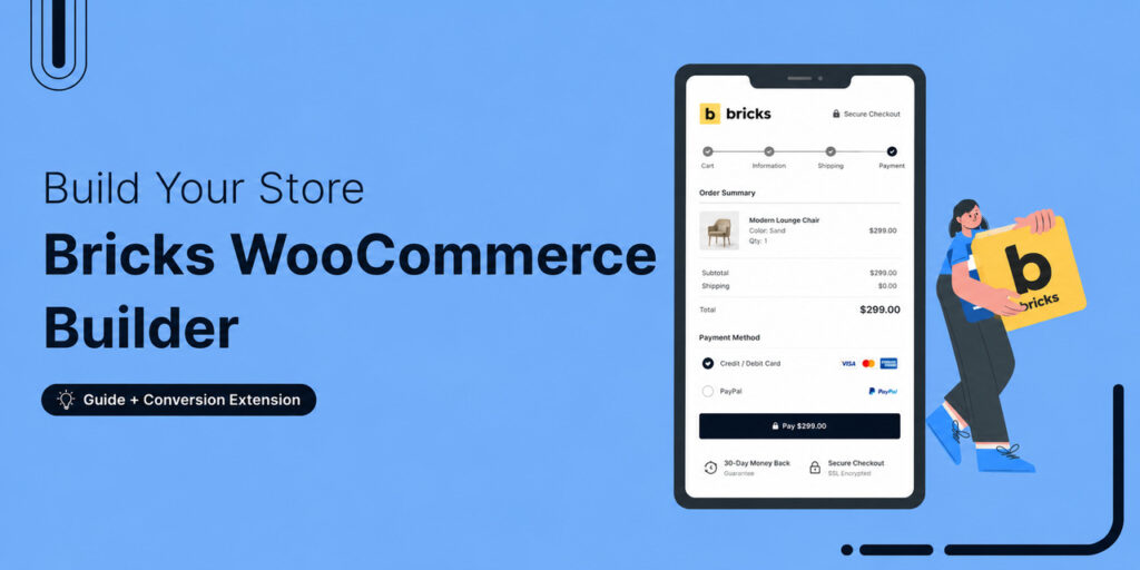
July 6, 2026The Bricks WooCommerce builder is built directly into the Bricks theme. Activate the free WooCommerce plugin, and Bricks unlocks more than 30 store-specific elements plus visual templates for every part...