Do you want to create a sizzling sales page for your online course that crushes your competition?
Creating such a sales page requires planning, a powerful and persuasive copy topped with emotions, and a remarkable user experience.
Well, we have covered everything in this blog post.
Here we'll look at the elements of a great sales page and study some excellent online course landing page examples.
Further, you'll learn how to create this page step-by-step in WordPress.
Let’s start right away.
Table of Contents
What is an Online Course Sales Page?
An online course sales page is a page that describes your course, its ingredients, the ‘why’ behind it, and more.
But more importantly, a great sales page builds an emotional connection with your audience before you even try to sell your course.
Your sales page must clearly define the value proposition of your product.
Think about it - your course competes with several other similar courses, why should anyone buy yours?
Forming an emotional connection with your readers will help your page stand out and win conversions.
Some of the best online course sales pages use the PAS framework.
Here's what it is:
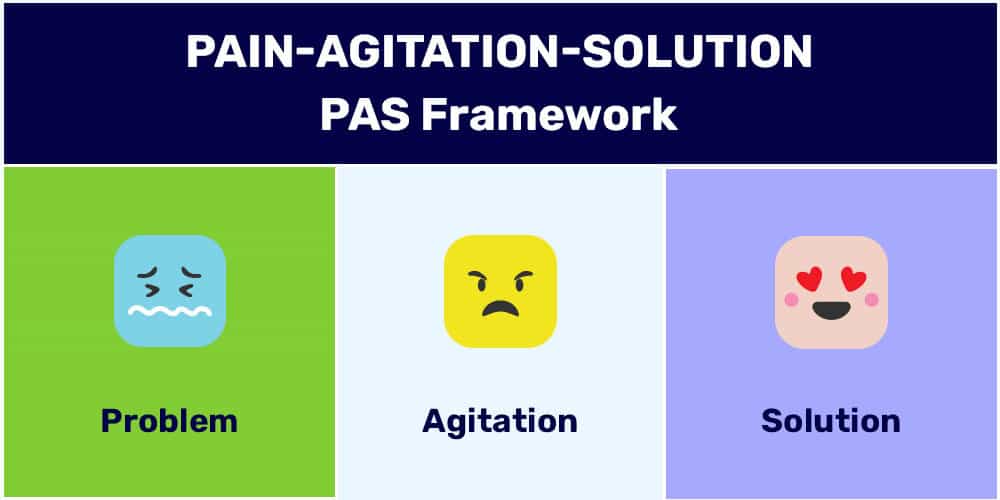
PAS basically stands for Problem - Agitation - Solution.
- Problem - Write down the challenges that your audiences face
- Agitate - Emphasize the pain that this problem will continue to cause them if they don't resolve it
- Solution - Introduce your online course as the potential solution to their problem
Simple, isn’t it?
That's a simplified definition of the concept, you'll follow it up with a detailed explanation and demonstration in this post.
Key Elements of a Online Course Sales Page
In this section, we will look at the core elements of an online course sales page.
1. A Power Headline that Strikes a Chord
A great sales page starts with powerful, action-driven headings.
They are usually gripping and speak to their target audience.
Let’s take a look at how Recurring Profit has included headlines on their sales page:
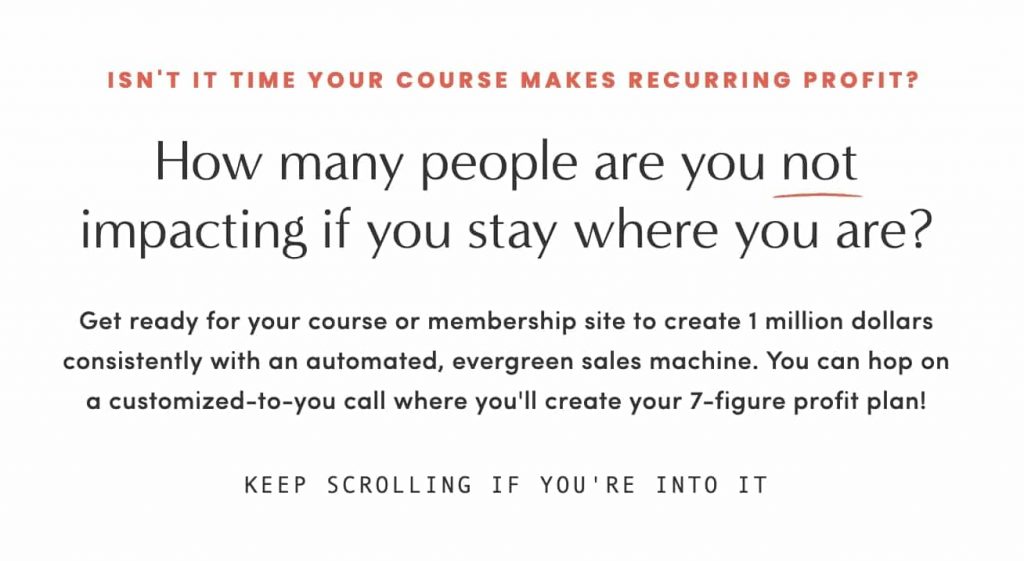
What makes this headline stand out is how it appeals to the buyer’s psychology.
It uses the principle of loss aversion. The headline strongly hints that their prospects are missing out on something and staying stagnant by not making progress.
60% of millennial consumers tend to make a reactive purchase when they experience FOMO right within 24 hours.
The sub-head proposes an obvious goal and how to get to it, i.e., customized for your call.
2. A Copy that Resonates with Your Prospects
A well-crafted online course sales page copy helps increase conversions by turning your visitors into customers.
Many users have asked this question - 'How do I write a landing page for an online course?'
Here are the three elements you should put on your copy when creating a sales page for your online course:
A) Talk about your buyer’s pain points
Write down the worries and frustrations that people have over the problem.
It could be anything like time-crunch, lack of skills, education, etc.
Here’s an example of the problem section for Meat & Hair’s creative writing course:
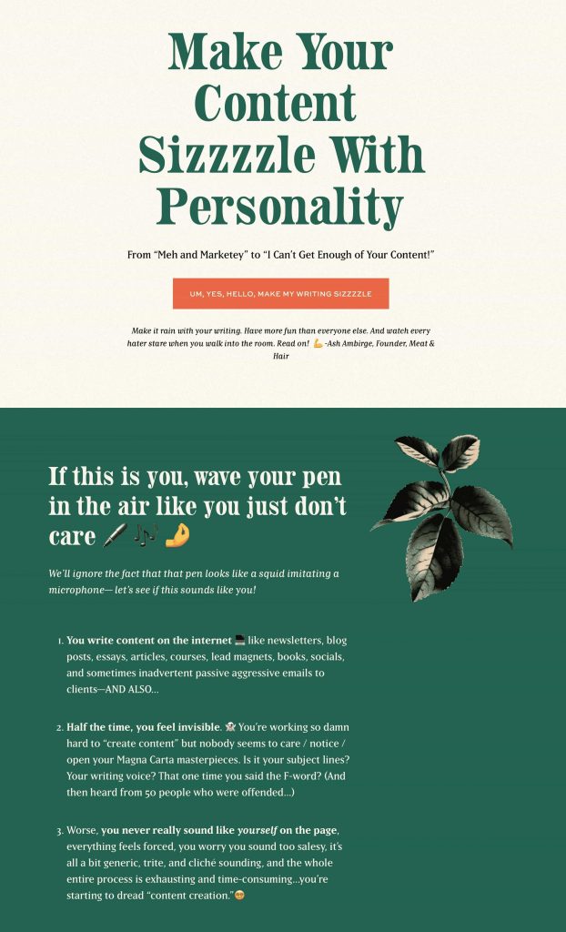
Their sales page is 100% based on the PAS framework.
It starts off by stating the problem that one's writing makes them feel invisible and how they wonder what the reason could be!
Further, they aggravate the problem by stating how your writing sounds forced and salesy!
The entire process becomes so exhausting and time-consuming that they’ve started to wear out.
This way, tapping into your audience’s pain points will help you establish the much-needed connection, making them press the buy button on your online course sales page.
B) Position your course as the easy and fun solution
It’s better to step into the buyer's shoes and give them what they want - The easiest and simplest solution!
Here’s show Meat and Hair have introduced their product on their long form sales page:
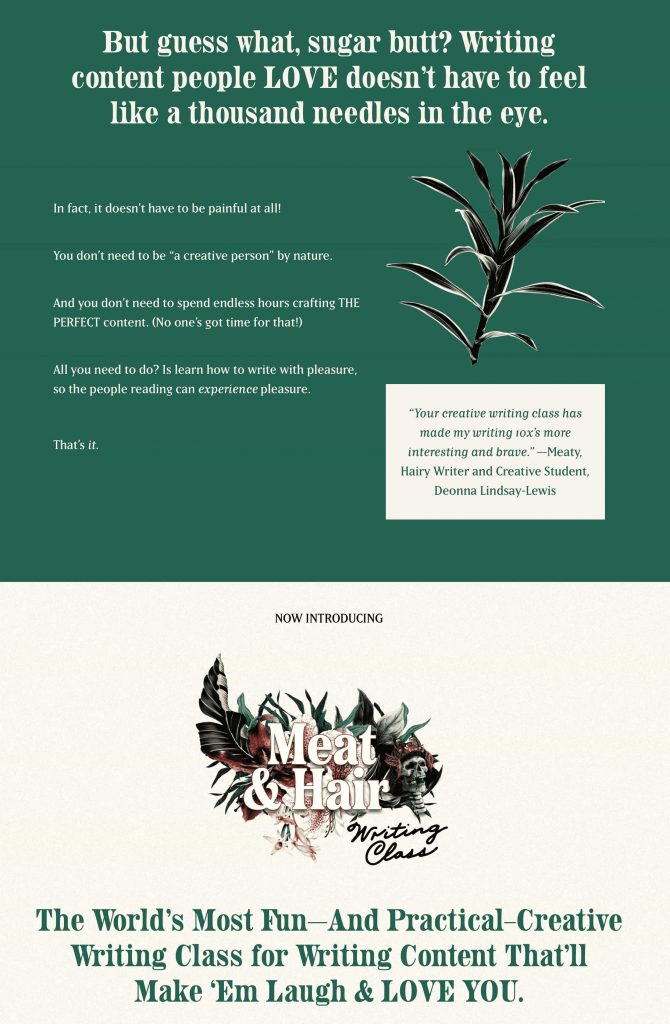
They went ahead to reassure people that creative writing doesn’t have to be painful.
Notice the words used - fun, practical, creative because these indicate the course's ease, speed, and applicative nature.
These words alone set the course “Meet & Hair Writing Class” apart from others.
This is how you can set the context using the PAS framework on your online course sales page to develop an emotional connection.
C) Integrate the benefits
Mention the benefits that will fix the pain points of users.
Focus on what they will gain from the course material.
For instance, look at the same example and how Meat and Hair have introduced their product:
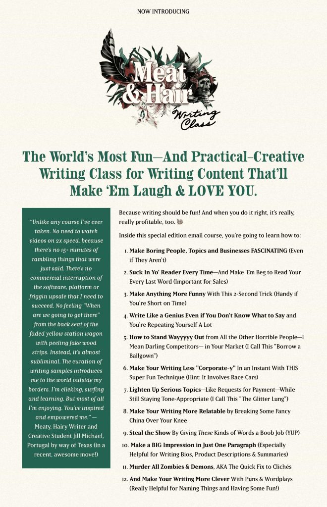
As you can notice, they’ve created 12 bullets in which they have quickly described what buyers will gain from enrolling in their course.
Notice how every bullet makes readers feel emotionally involved.
It promises to teach one to write relatably and make their writing steam the show and make a big impression.
They have included everything that a writer truly desires!
3. A Direct Call to Action Button
A call to action (CTA) button is one of the essential elements of your online course sales page.
Its main job is to convert your visitor into an enrolled student.
For that, your CTA buttons should be bold and prominent.
Personalized CTAs speak well to the audience and convert 202% better than the usual plain CTA buttons.
Here’s an example of a personalized CTA button that Meat and Hair use on their sales page for the creative writing course:
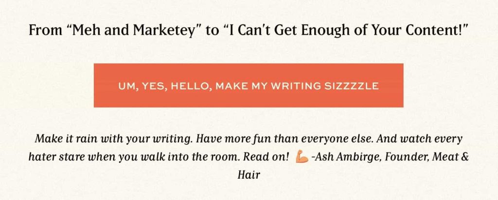
Notice how the CTA is in the first person and reinforces the benefit of their online course.
The best online course sales pages reassure prospects of their purchase with a solid money-back guarantee.
4. A Review Section
Positive reviews and testimonials help increase the trust in a brand among 72% of consumers.
People sign up or purchase when they see user testimonials who have vouched for the same product.
Having a dedicated section of social proofs gives credibility to your course and increases conversions.
Here’s how Meat & Hair narrates the story around testimonials from the students:
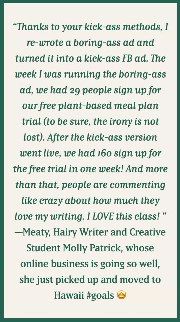
Notice how specific this testimonial is.
It uses the exact number "160 signups in one week" - a goal worth achieving!
5. Visual Infographics
Humans process visual information 60000 faster than text.
Adding visual representation on your online course sales page proves to be immensely powerful as it helps raise your conversion rates.
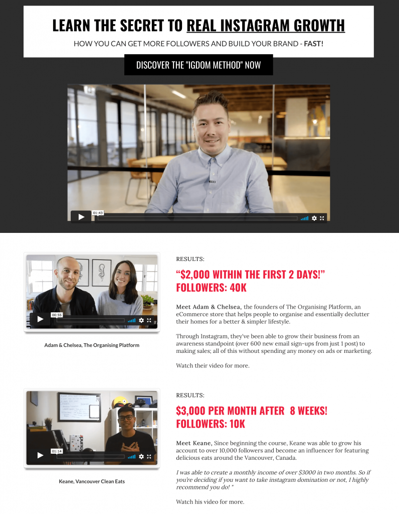
As you can notice, Foundr is using videos on their “Real Instagram Growth” online course sales page.
These videos get displayed on a mini-player if you further explore this page, giving a great user experience free from any interference.
Not just videos; instead, you can add visuals such as charts, diagrams, mockups, etc., to make a compelling sales page.
You can use videos to answer the common questions asked by users. This way there'll be no need to add a separate FAQ section!
How to Create a Sales Page for Your Online Course?
Let's now answer the most important question here, 'how do you create a sales page for an online course?'
Here, we will look at the step-by-step process of how to create a sales page for your online course with Funnel Builder by FunnelKit (formerly WooFunnels).
With the Funnel Builder, you get access to 40+ templates to create your opt-in pages, checkouts, sales pages, upsell offers, and thank you pages.
It integrates with popular page builders like Elementor, Divi, Oxygen, Gutenberg, and many more to create pages for your sales funnels the way you want.
Plus, you can A/B test the pages and measure the performance of each page on your funnel.
Let’s look at how you can create your online course sales page.
Step #1: Install the Funnel Builder
Get your copy of the Funnel Builder.
Then, go to your FunnelKit account and download the following two zip files:
1. FunnelKit Funnel Builder
2. FunnelKit Funnel Builder Pro
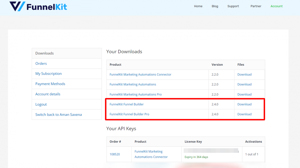
Install and activate the plugin in the same order by uploading it to your WordPress website.
Now go back to your account and copy the activation code.
Then, paste the code into the FunnelKit Settings.
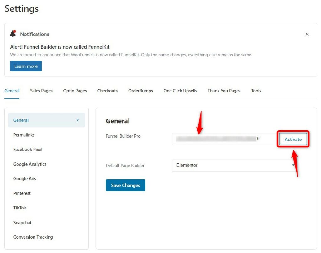
Click on Activate to start using the Funnel Builder.
Step #2: Add a New Sales Funnel
Go to Funnels and click on Add New Funnel.
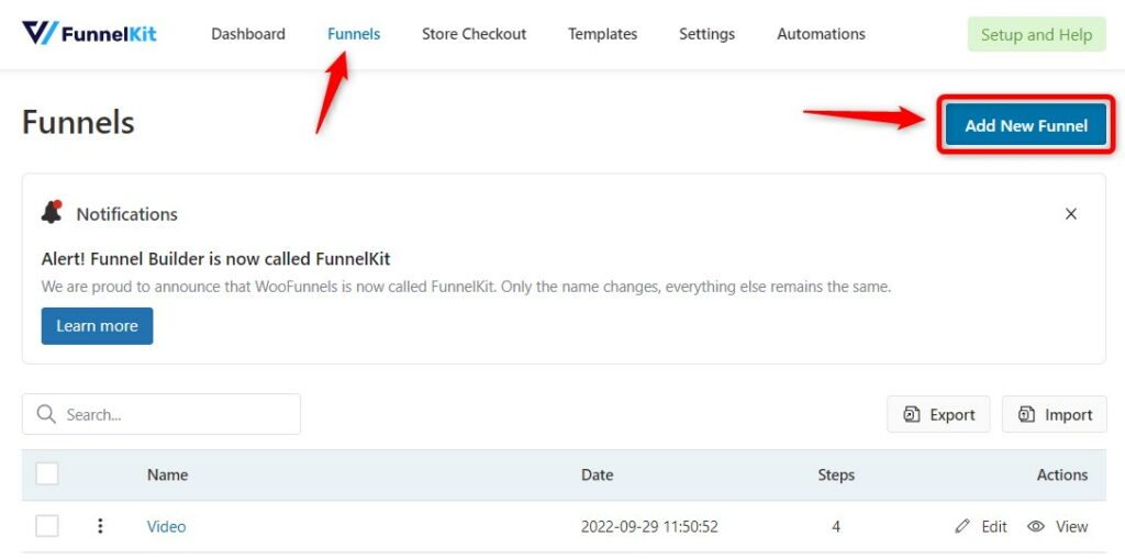
You can either choose the sales funnel templates and import with different funnel steps or start building your funnel from scratch.
Here, we will choose 'Start from scratch'.
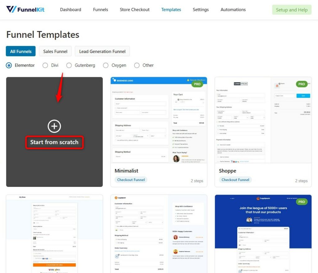
Name it as Sales Page for Online Course and click on Add.
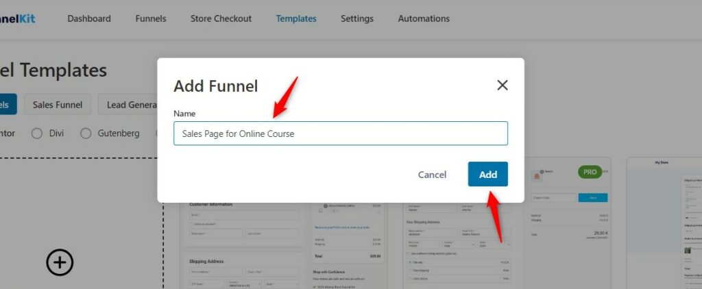
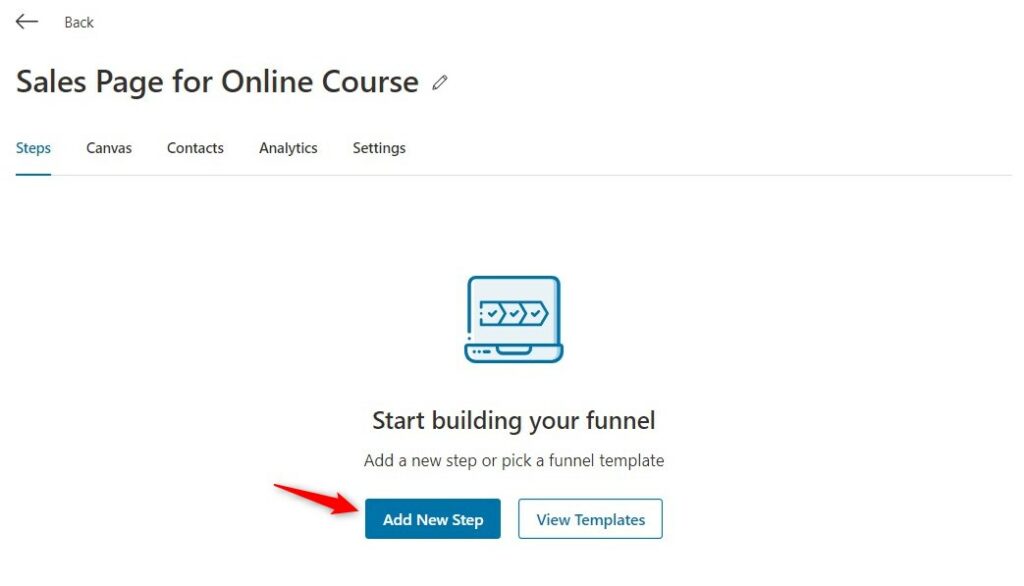
Your blank funnel will get added.
Click on 'Add New Step' to add a new sales page.
Click on Sales Page and you’ll see the online course sales page template that you can choose.
Funnel Builder has free sales page templates as well as premium ones based on your requirement.
Plus how it integrates with different page builders to design your page is a cherry on top.
Select your preferred page builder and import the template for your sales page.
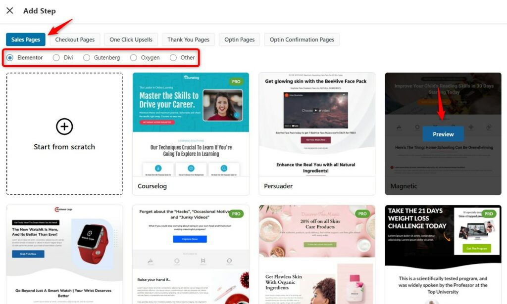
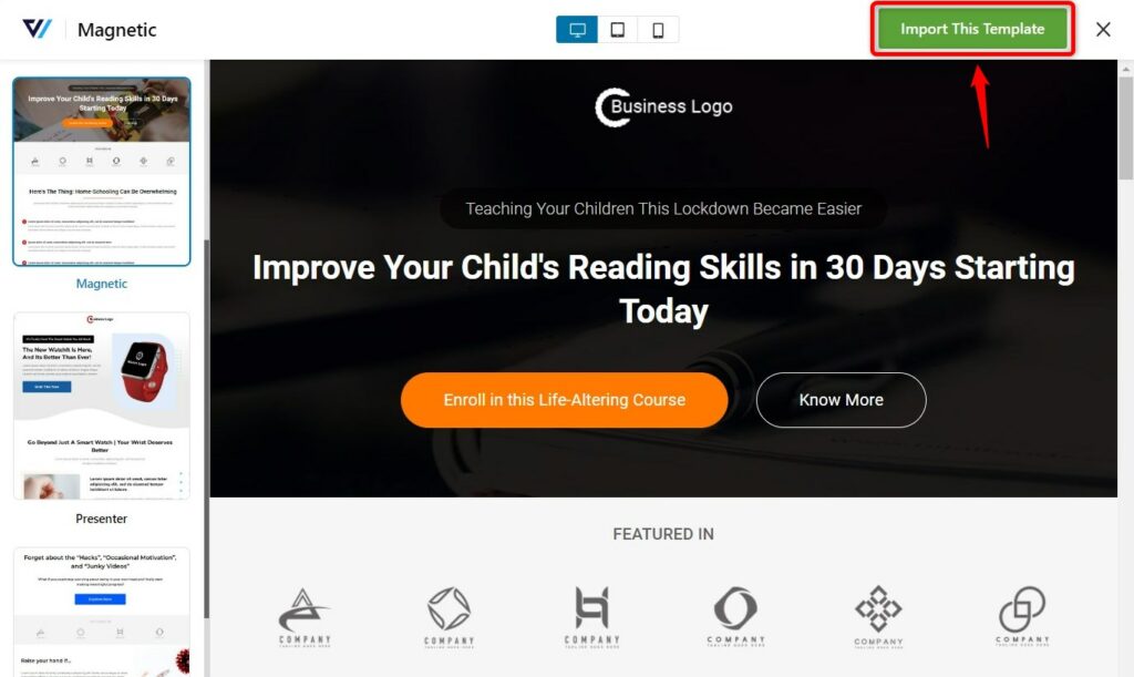
Here we have selected Elementor and imported the Magnetic template.
You can see the preview of your selected template. If you're satisfied, click on 'Import This Template' from the top right.
Name your sales page.
After you’ve imported the template, the Sales Page will get added to your funnel.
Step #3: Customize Your Online Course Sales Page
Click on Edit to customize your sales page.
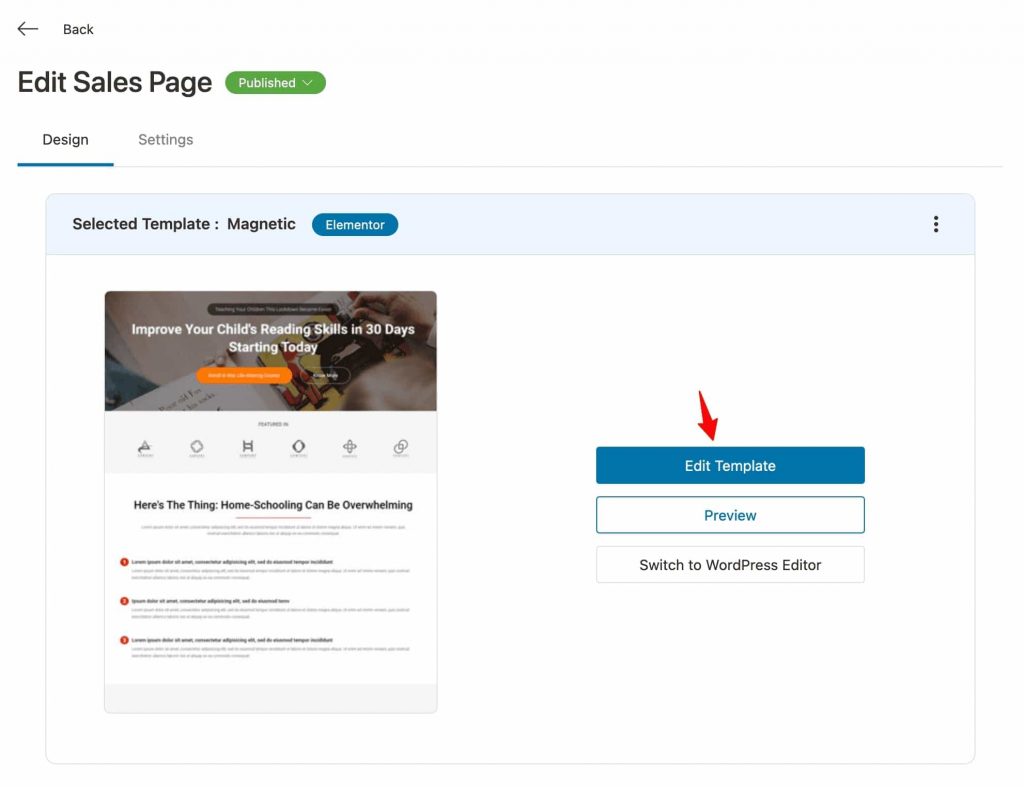
Your page will load in the page builder tool you have selected.
Start customizing the headline of your page.
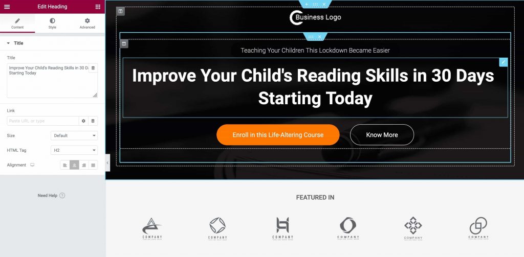
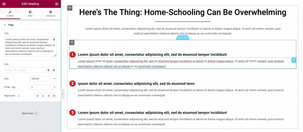
Work on the PAS framework on your online course sales page.
Make the changes to your problem section here:
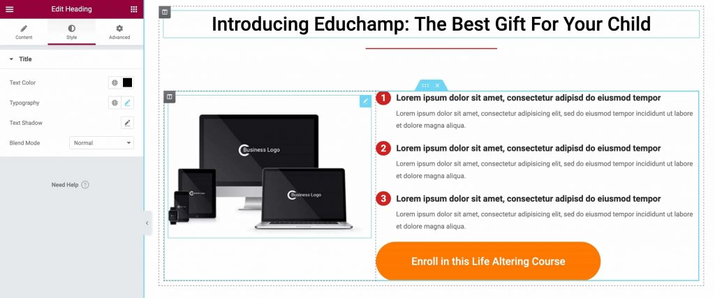
Now emphasize the agitation and solution part of your online course:
As discussed earlier, reviews and testimonials are an incredible way to boost your authority.
Let's include some testimonials from your customers here:
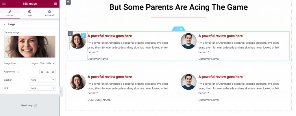
Click on Update when done.
There you go! This is how you can customize the sales page for your online course.
Step #4: Link to a Checkout Page
Create a new Checkout page step on your funnel so that your potential customers can complete the payment process.
To add a new step, click on Add New Step.
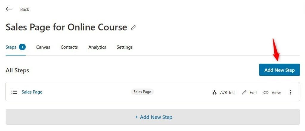
Select the Checkout Page.
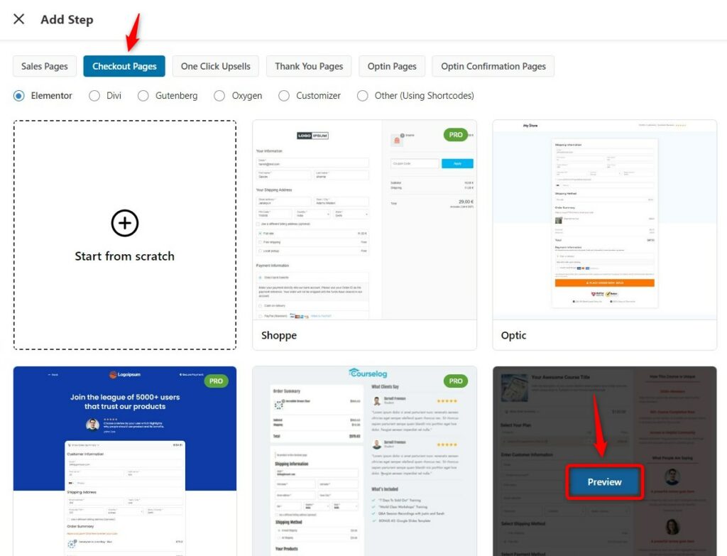
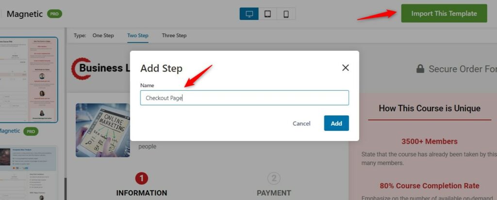
Next, import the template, enter the name of your checkout page and click on Add.
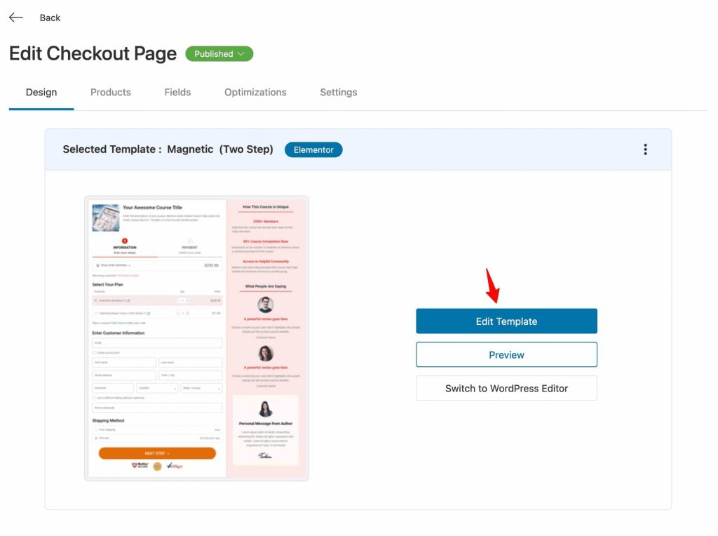
Click on the checkout page to start customizing it.
Under the Design tab, you can import a template and customize your checkout page.
Edit this page as you did with your online course sales page.
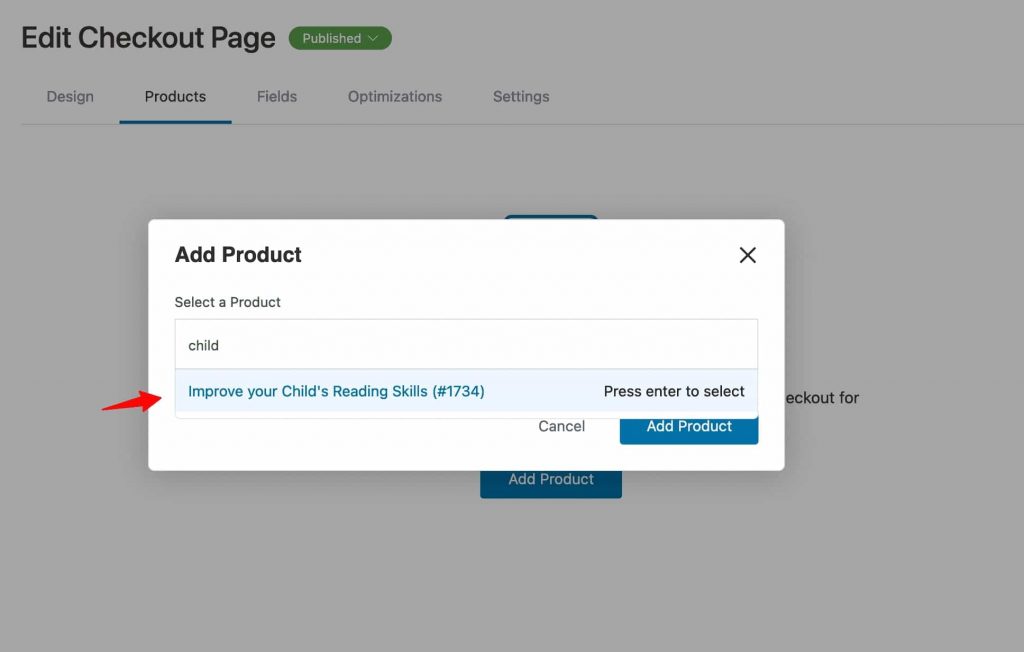
Add this course to your product-specific checkout page.
Click on Add Product and then choose your course.
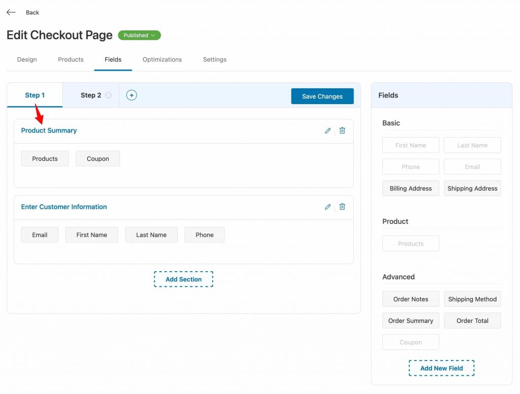
Edit the fields on your Checkout page.
For instance, you don’t need Shipping details for the online course on your Checkout page, so remove it.
Optimize your checkout page by enabling the time checkout expiry, smart pay buttons, auto-apply coupons for your online course, and more.
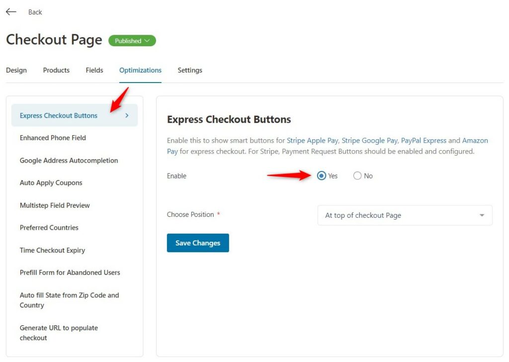
Read more about these Checkout page optimization hacks to reduce shopping cart abandonment.
Here's the checkout page:
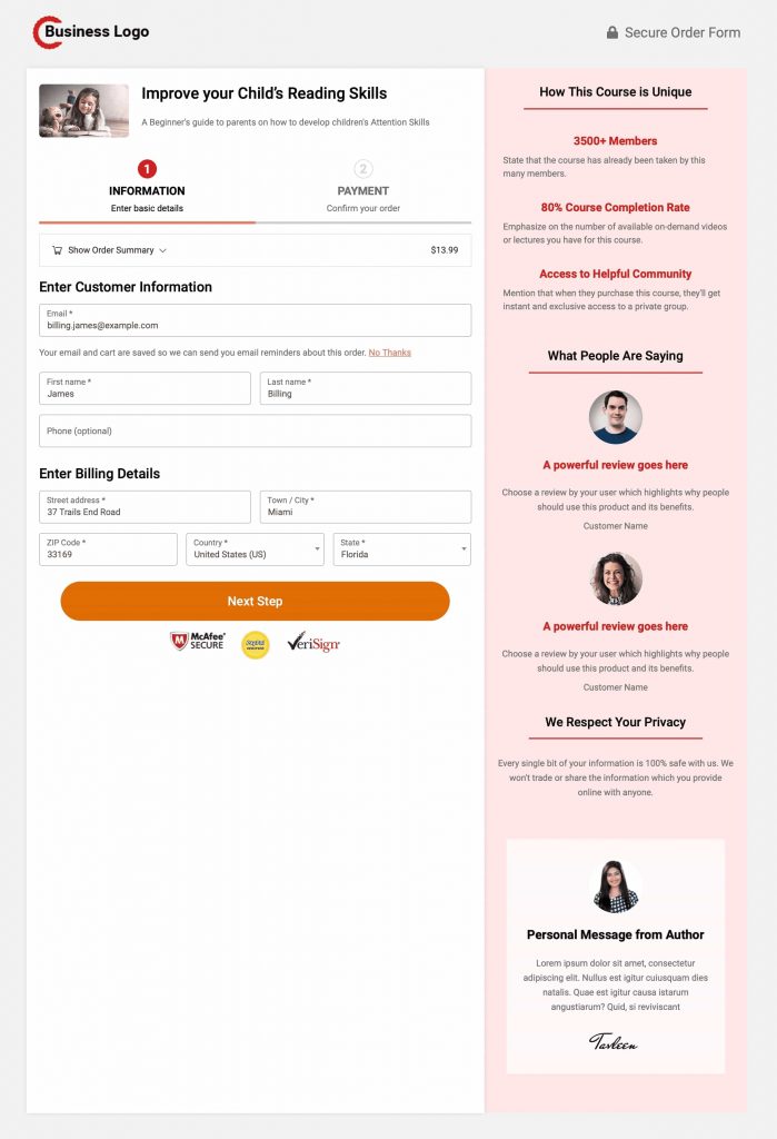
Make sure to click on Save Changes on each tab when you proceed further.
Step #5: Add a Thank You Page
Go back to your online course sales funnel and add a thank you page.
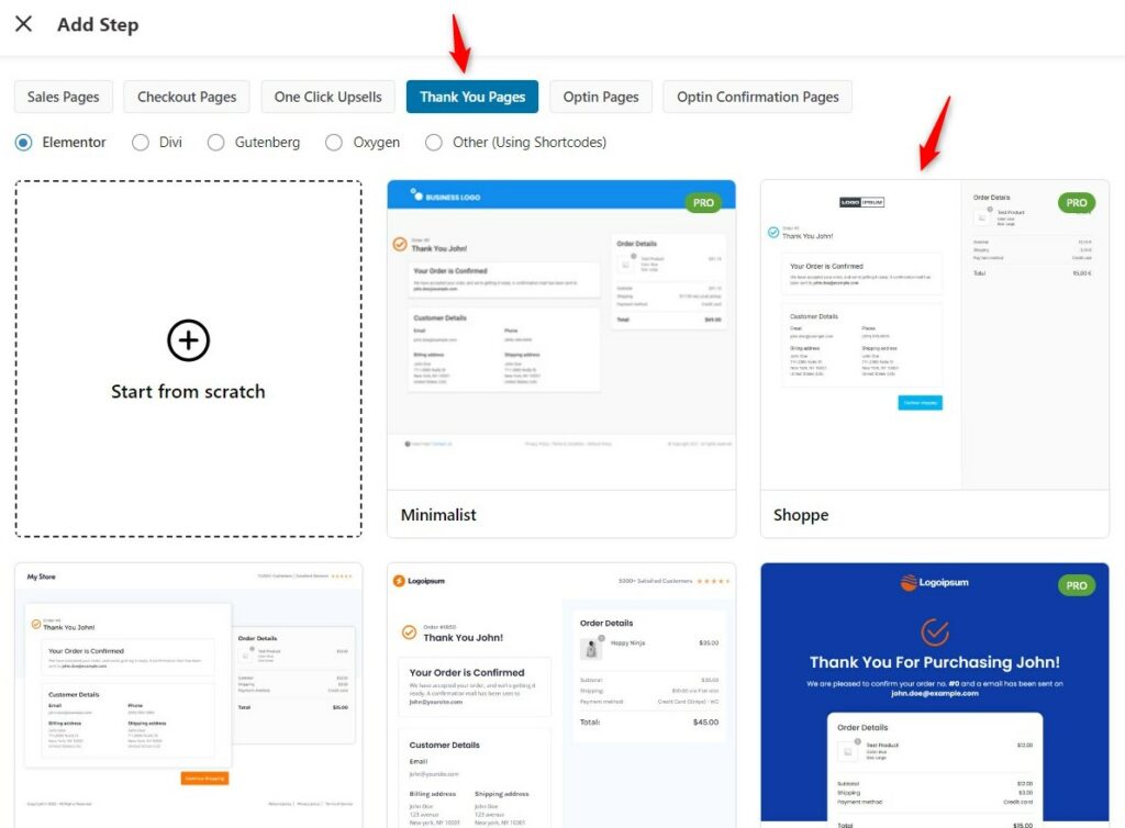
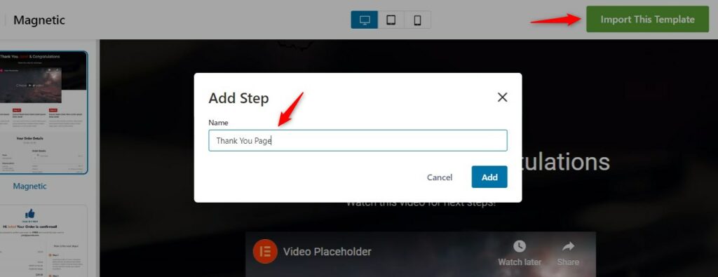
Click on 'Import This Template' and name your thank you page.
Now customize it the way you want.
Take a look at your Thank you page:
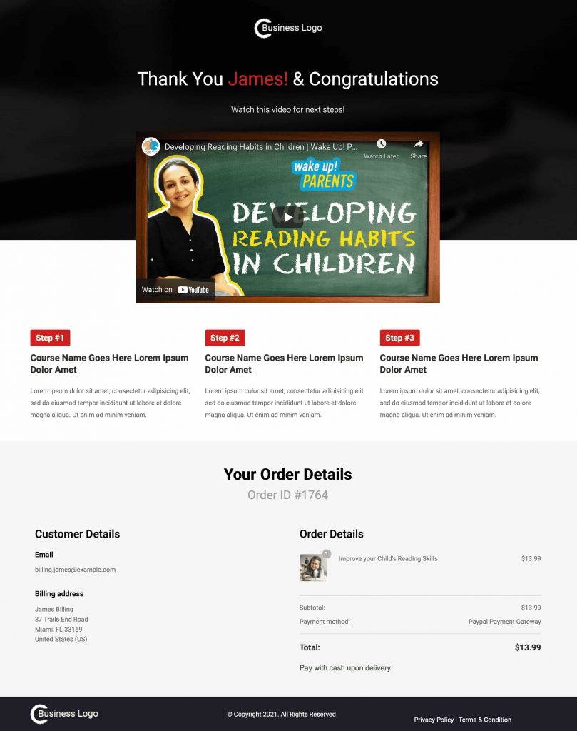
Click on Update when done.
Well done! You have successfully created your online course funnel with the sales, checkout, and thank you page.
Check out our YouTube channel for such tips and tricks to boost your conversions.
All Set to Create a Sales Page for Your Online Course?
Creating a winning online course sales page is crucial for course creators.
It’s all about developing an emotional connection with your visitors on your sales page.
Include all the elements and implement the PAS framework that we learned in this post today.
Paying close attention to the design, writing a great sales copy, and messaging will further enhance the appeal of your product.
That’s where the FunnelKit (formerly WooFunnels) Funnel Builder is a perfect choice!
Apart from letting you build a full-fledged funnel as we saw, you can split-test and improve the performance of your pages.
So what are you waiting for?
Get the Funnel Builder NOW and create a sales page for your online course that SMASHES your conversion goals >>
Editorial Team
May 5, 2026If you're selling products, courses, services or memberships on WordPress and still relying on a single product page to all the heavy lifting, you're leaving money on the table. Dropping...

Editorial Team
May 1, 2026If you sell products online, you need to build an Elementor sales funnel to maximize sales. A sales funnel guide helps you convert visitors into buyers through a well-charted course/well-defined...
Editorial Team
May 1, 2026Are you looking for WooCommerce checkout optimization hacks to streamline your users' shopping experience? Your WooCommerce store may have an attractive layout with a user-friendly interface. You may even have...

