Do you love Elementor but are struggling to create a high-converting sales page with it?
Here’s a simple success mantra: a beautiful design + persuasive copywriting + optimized checkout form = GREAT SALES!
“Uhh… But I don’t have design skills, and neither can I code!”
No worries, just import one of our premium pre-built Elementor sales page templates, customize it within WordPress using a drag-and-drop interface, and GO LIVE IN MINUTES!
Today, we will show you how to create a powerful sales-booster landing page that makes you money while you sleep.
Table of Contents
- 1 Do's and Don'ts for an Awesome Sales Page (With Examples)
- 2 How to Create an Elementor Sales Page with FunnelKit?
- 3 9 Tips to Multiply Your Sales Page Conversion Rates
- 3.1 #1: Start with a compelling headline and sub-headline
- 3.2 #2: Embed the checkout form right on the sales page
- 3.3 #3: Aggravate the problem
- 3.4 #4: Introduce the solution
- 3.5 #5: Reveal the modules and associated benefits
- 3.6 #6: Highlight social proof
- 3.7 #7: Give a money-back guarantee
- 3.8 #8: Introduce yourself
- 3.9 #9: The perfect close
- 4 So Are You Ready to Skyrocket Your Conversions with FunnelKit?
Do's and Don'ts for an Awesome Sales Page (With Examples)
A sales page is your digital asset, and it's supposed to sell products. It's not a blog post meant to educate readers but the start of your sales funnel to earn you profits.
You also pay ad dollars to Facebook, Google, Instagram, and others to send traffic over to it.
People land on it from various sources - there's the ice-cold audience from social media, a warm audience from the email list, and a very warm audience from re-targeting ads.
Thus it has to convince people at different stages of awareness and close the sale.
To create a conversion-friendly Elementor sales page that resonates with all kinds of audiences, take a look at some of the crucial Do's and Don'ts.
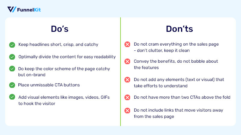
Examples of Bad Sales Pages That Will Not Drive Sales
#1. A sales page that lacks a proper design layout
Here's one badly executed sales page trying to sell a nutrition guide.
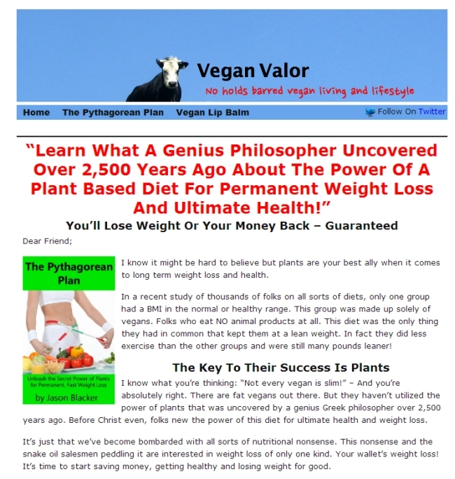
The problem with this page:
- Verbose headline: The headline takes up more space than it should
- Lack of Structure: An ill-presented problem aggravation section - it’s like a wall of text that no one wants to read
- Improper CTA Placement: The CTAs are not sprinkled optimally throughout the copy
To conclude, even if the product behind the paywall is great - people will never feel confident to follow through with the purchase.
And that right there is the problem.
#2. A sales page that looks and feels scammy
Here's another example of a sales page that looks particularly scammy:

The major issues:
- Skeptical Headline: The wordy headline is off-putting. Additionally, the unnecessary capitalizations make the headline look scammy instead of impressive.
- Weak Follow-up: The follow-up sub-headline tries to pull the prospect into the conversation but looks bland due to how it’s presented.
- Lack of Structure: The ‘I have some questions for you’ section fails to stand out - easily blending in with the others and looking perfectly ignorable.
People will not give the product a chance, even if it's loaded with value, just because its sales page looks so bloated.
So here’s one golden rule for increasing your sales page conversion rate.
Design for skimmers and scanners. Write for readers.
Serious prospects always read - they want all the information they need to make a decision.
But first, they scan the page to decide whether they want to read it or not.
Example of a Good Sales Page That SELLS
Here is a top-notch sales page with on-point copy and stunning visuals.
Let's take a look at it.
#1. Robin Sharma’s 'The 5 AM Club' Course Sales Page
Robin Sharma - a world-renowned author, speaker, and businessman - is using this sales page template to sell his popular - 'The 5 AM Club' course.
Doesn’t it grab your attention at first glance?
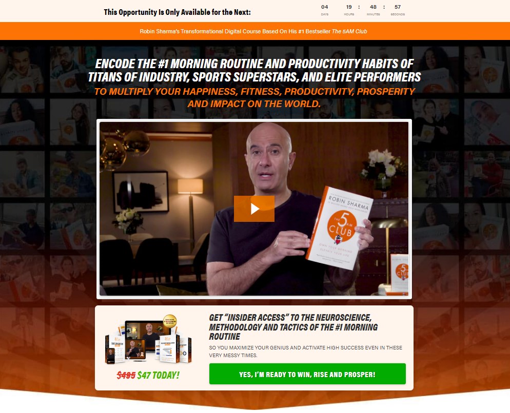
Here's what works in its favor:
- Catchy Headline: The headline evokes emotions and establishes authority by mentioning the users of this course - titans of the industry, sports superstars, and elite performers.
Who doesn’t want to be like them? - Color Scheme: With its snappy colors, this sales page surely makes a good first impression. Fonts with different colors and size blend well with the bold and clear green CTA button.
- Supplementary Subheadings: Beneath each bold heading, you will see a subtle subheading that supplies the additional information i.e. benefits of the course.
- Urgency: Notice the countdown times at the top of the page. It creates urgency. The timer drives people to take action quickly.
- Visual Media: Interactive media like video/image can hook the visitor and encourage them to hit that buy button.
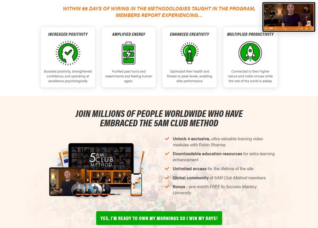
Below the fold, the sales page hammers down on the benefits of the course - increased positivity, amplified energy, enhanced creativity, and multiplied productivity.
The CTA button text affirms the user what they will get when they buy the course.
Further down this landing page, you will find other elements that build trust and clarify the contents of the course.
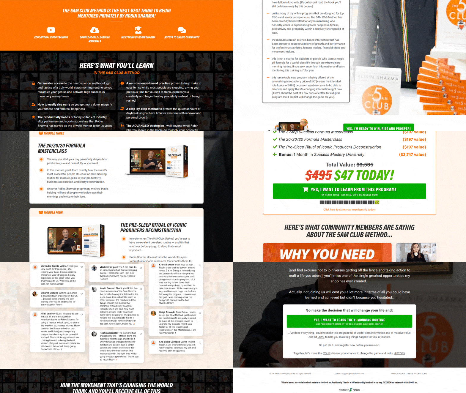
- Content of each module
- Customer testimonials
- A personal note from Robin Sharma himself
Now, you have a clear idea about how your sales page should look like.
So, let's create one with FunnelKit (formerly WooFunnels), which empowers you to create a high-converting Elementor sales page template and rake in sales like hotcakes.
How to Create an Elementor Sales Page with FunnelKit?
Now that you know what makes a sales page conversion-friendly let’s design one.
We will use FunnelKit to import and edit our Elementor sales page template. Remember that FunnelKit comes in two versions - free and pro.
The free version can give a lot of free Elementor templates for sales pages, landing pages, squeeze pages/optin pages, checkout pages, thank you pages, and more to get a headstart in your eCommerce marketing journey.
But the Pro version lets you unleash the full potential of your sales funnel with its premium templates and advanced features.
FunnelKit empowers you to build the entire sales funnel inside WordPress with the Elementor page builder, but today we are focusing on creating the sales page only.
It deeply integrates with popular page builders like:
- Elementor
- Divi
- Oxygen
- Gutenberg
This powerful integration allows you to edit your entire sales funnel with a drag-and-drop interface.
Nifty, isn’t it?
We integrate with other page builders as well, you can use them with shortcodes. FunnelKit works well with Beaver Builder, Brizy Builder, Thrive Architect, Spectra Website Builder, Bricks Builder, and others.
1. Install and Activate FunnelKit Funnel Builder
Once you’ve purchased the Funnel Builder Pro, go to the FunnelKit account and download the zip files:
- FunnelKit Funnel Builder
- FunnelKit Funnel Builder Pro
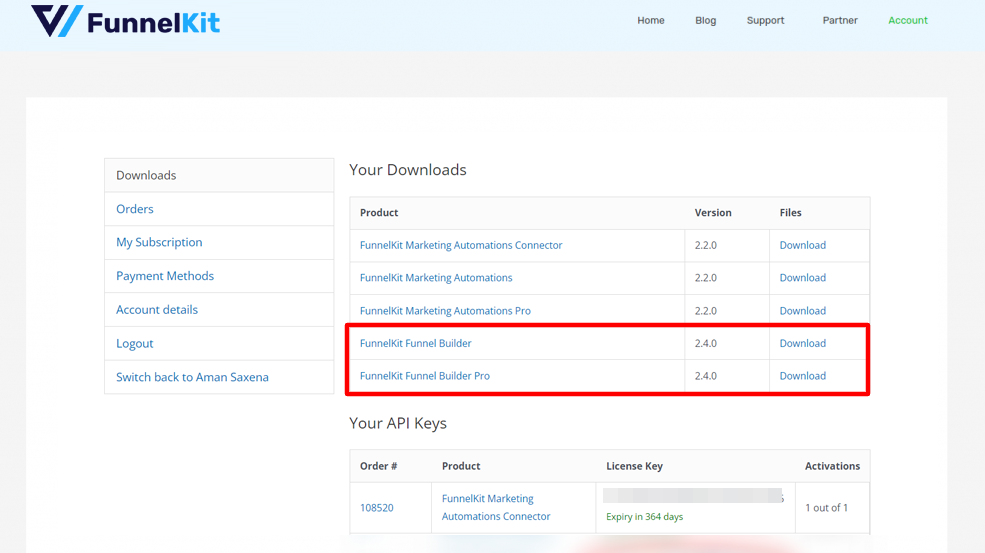
Upload both the plugins to your WordPress website, install and activate them.
Next, go back to your account and copy the activation code.
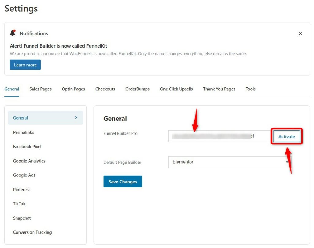
Paste the license and activate the plugin from the FunnelKit settings page.
You can even choose your default page builder. Elementor is a good sales landing page builder for its ease of customization, so we have chosen that.
2. Import the Pre-built Elementor Sales Page Template
A sales page needs to convince the visitor to hit that BUY NOW button.
But what if instead of taking the visitors to another page - the checkout page - you provide them a checkout form right on the sales page?
This page can be referred to as checkout-cum-sales landing page. Modern marketers use this page to minimize the exits and make it easier for visitors to complete their purchases.
FunnelKit comes with various Elementor sales page templates like
- Booster
- Stunner
- Closer
- Classic
These FunnelKit’s checkout pages give you a lot of content space to pitch your product and an on-page checkout form to complete the sale.
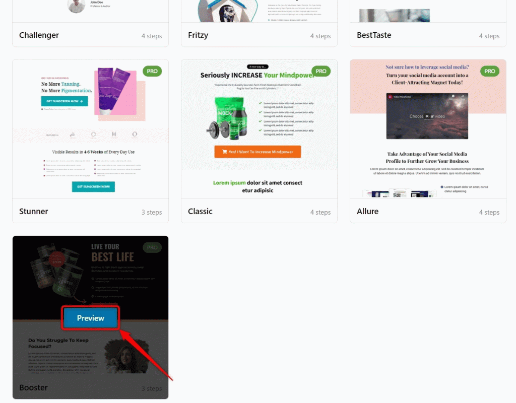
In the FunnelKit menu, navigate to Funnels and click on Add New Funnel.
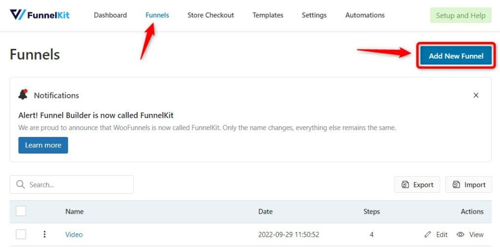
Scroll down to find the Booster template. This WordPress sales page template is compatible with Elementor and comes with:
- Checkout-cum-Sales Page
- Upsell Page
- Thank You Page
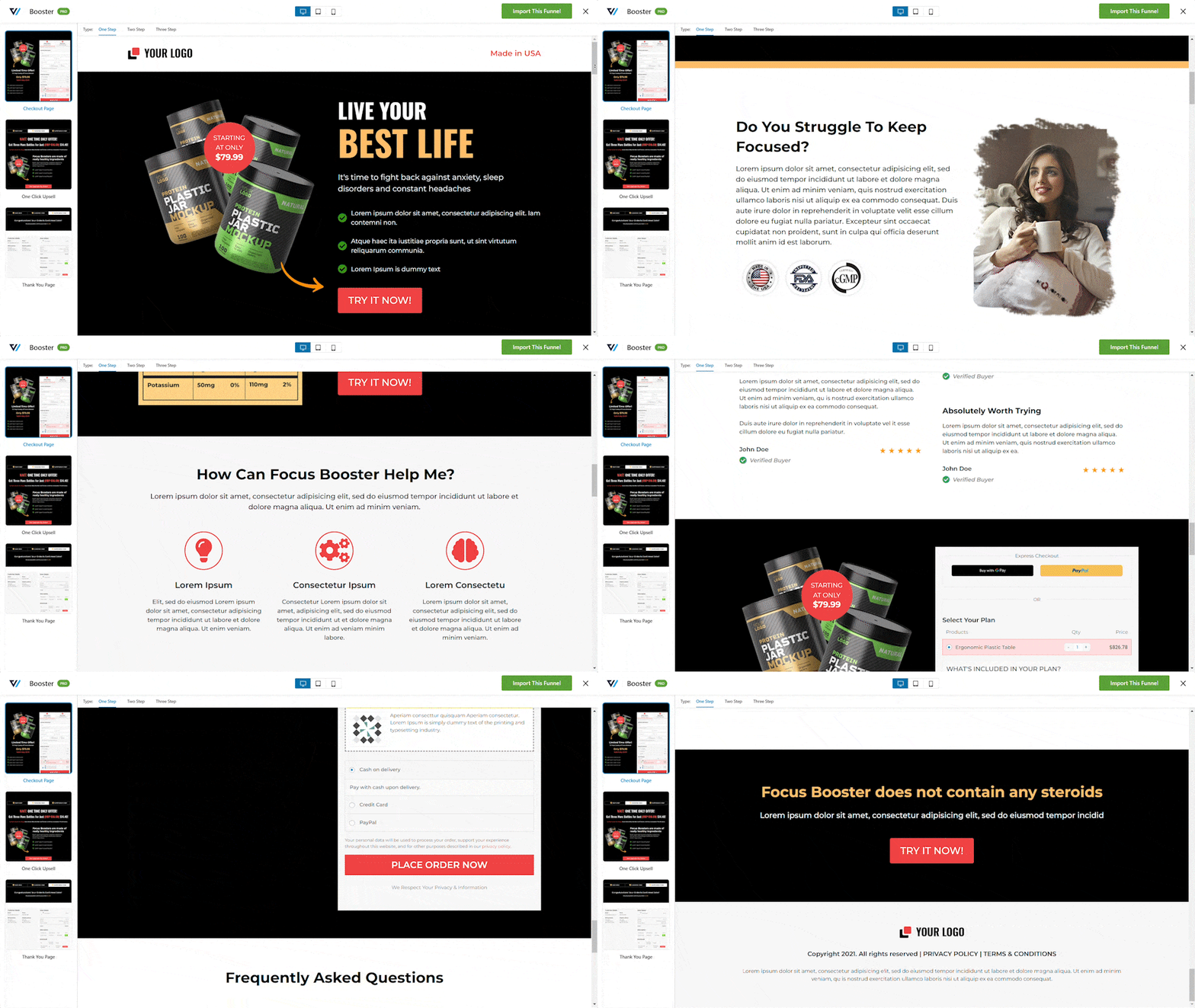
So, this is what the Booster template looks like. Just click on "Import this Funnel" and import this pre-built Elementor sales page template.
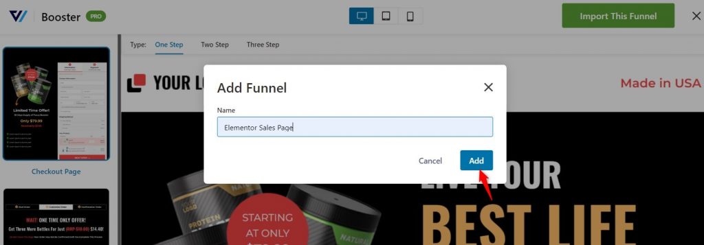
Import the template. Assign a suitable name to this WordPress sales page template and click on Add.
3. Customizing the Elementor Sales Page Template
Let’s customize the checkout-cum-sales landing page with Elementor to make it look on-brand.
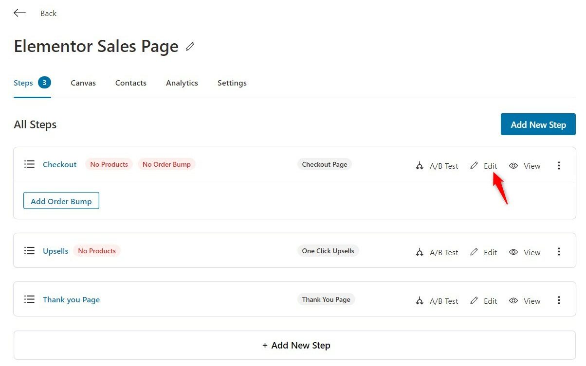
Click on Edit, and in the next step, click on Edit Template.
Adding a Logo
A logo not just makes your business look professional but also your brand more recognizable.
Hence, the logo is one of the most crucial elements of your sales page.
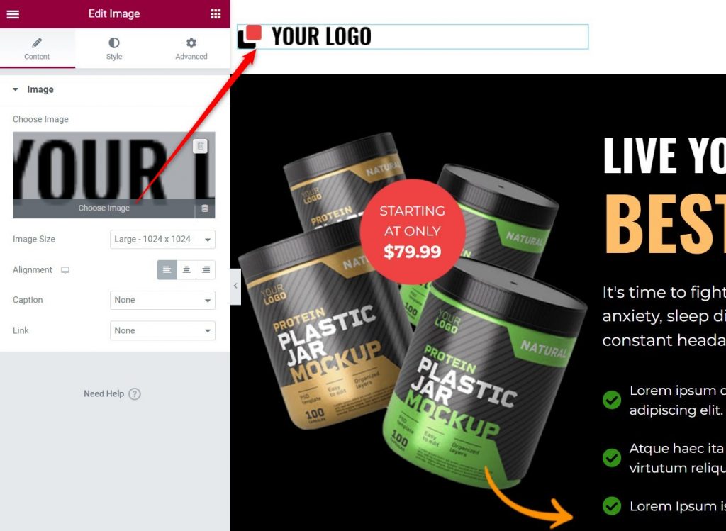
To add your logo, click on the logo and choose your new logo.
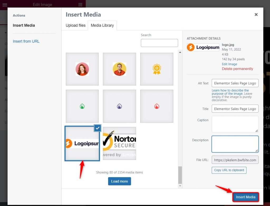
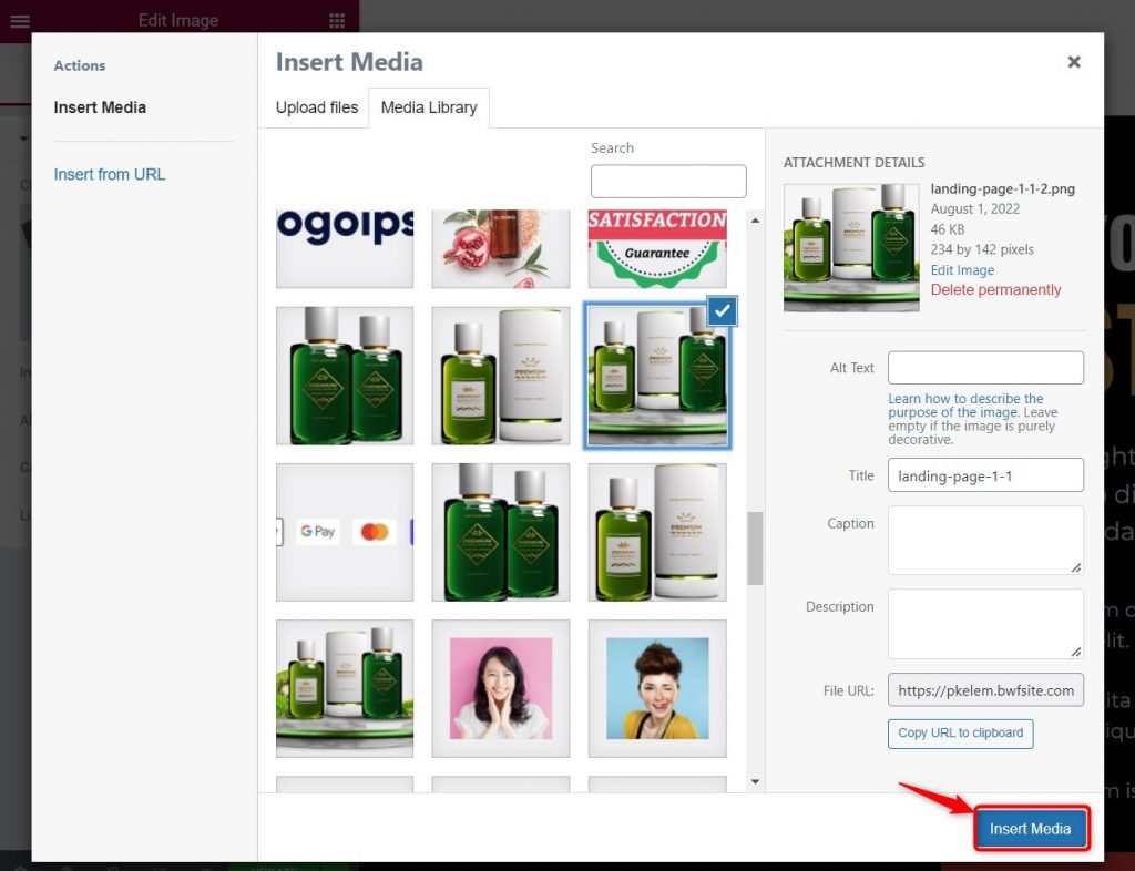
Select your new logo and click on Insert Media.
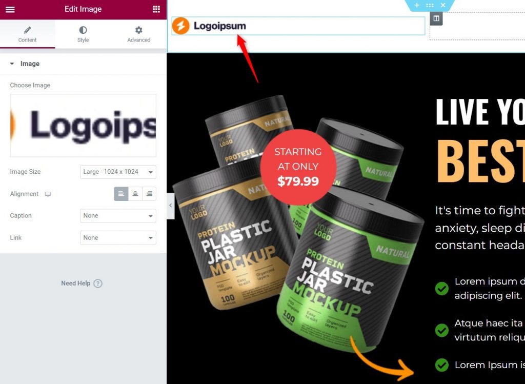
The new logo is all set.
Adding Visual Media Such as Images/Video
Just like you changed the logo, you can change the images on this Elementor sales page template.
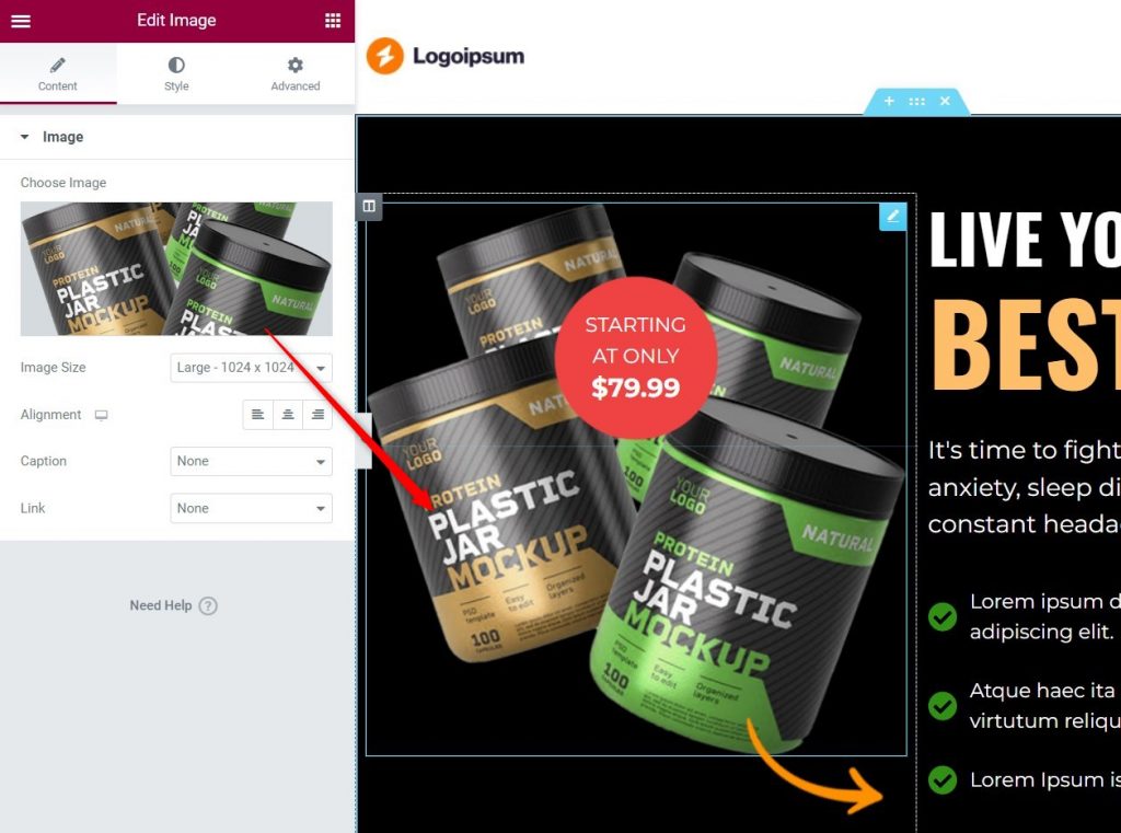
Select the image you want to add.
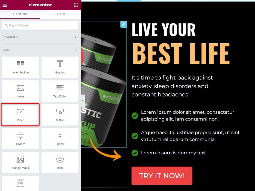
To add a video, drag and drop the Video widget on your page, and insert a video, just how we inserted an image above.
Change the Headings, Subheadings, and Copy of the Elementor Sales Page Template
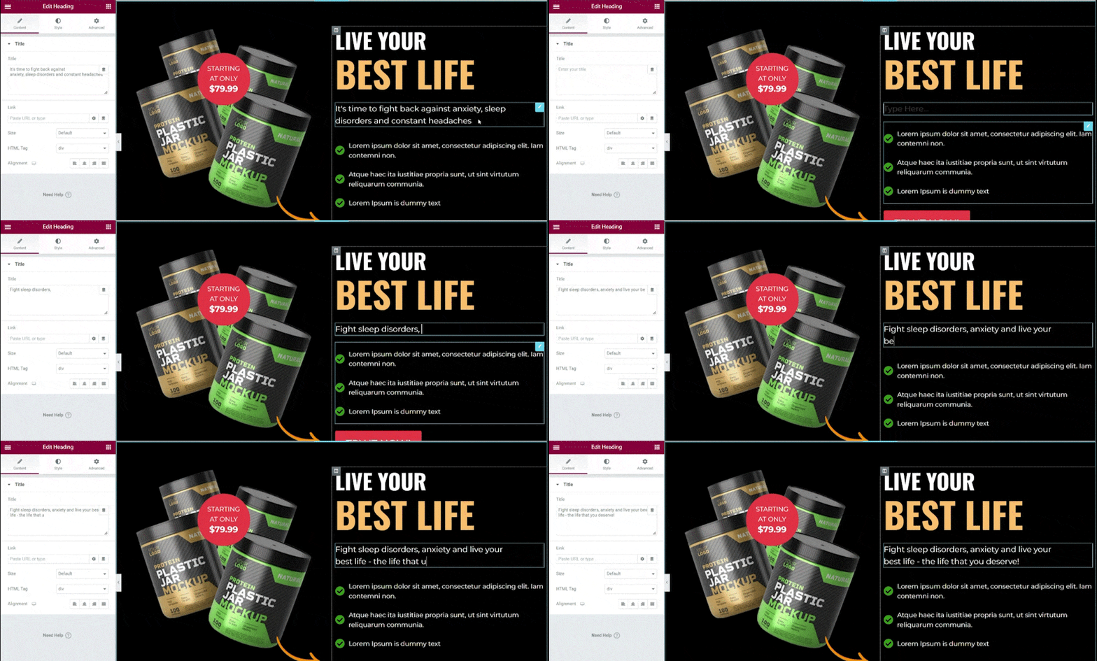
Adding/modifying text on the sales page template is easy-peasy with Elementor’s drag-and-drop interface.
Just click on the text that you want to edit, and add new text or modify the existing one.
Changing the Color of Buttons or Texts
To make this Elementor sales page template look on-brand, you can change the colors of the text or buttons.
Again, FunnelKit’s deep integration with Elementor allows you to do this in just a few steps.
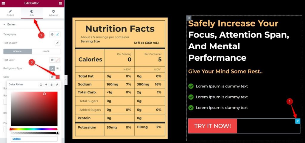
Just explore all the possibilities and create a kickass sales page out of this Elementor sales page template.
4. Customizing the Checkout Form
As discussed above, one of the best ways to get maximum conversions is to combine your sales page and the checkout page.
This Elementor sales page template comes with a checkout form embedded on the sales page, this minimizes the possibility of the visitor exiting the funnel.
When the visitor clicks on the “Try It Now” button, they will be redirected to the checkout form.
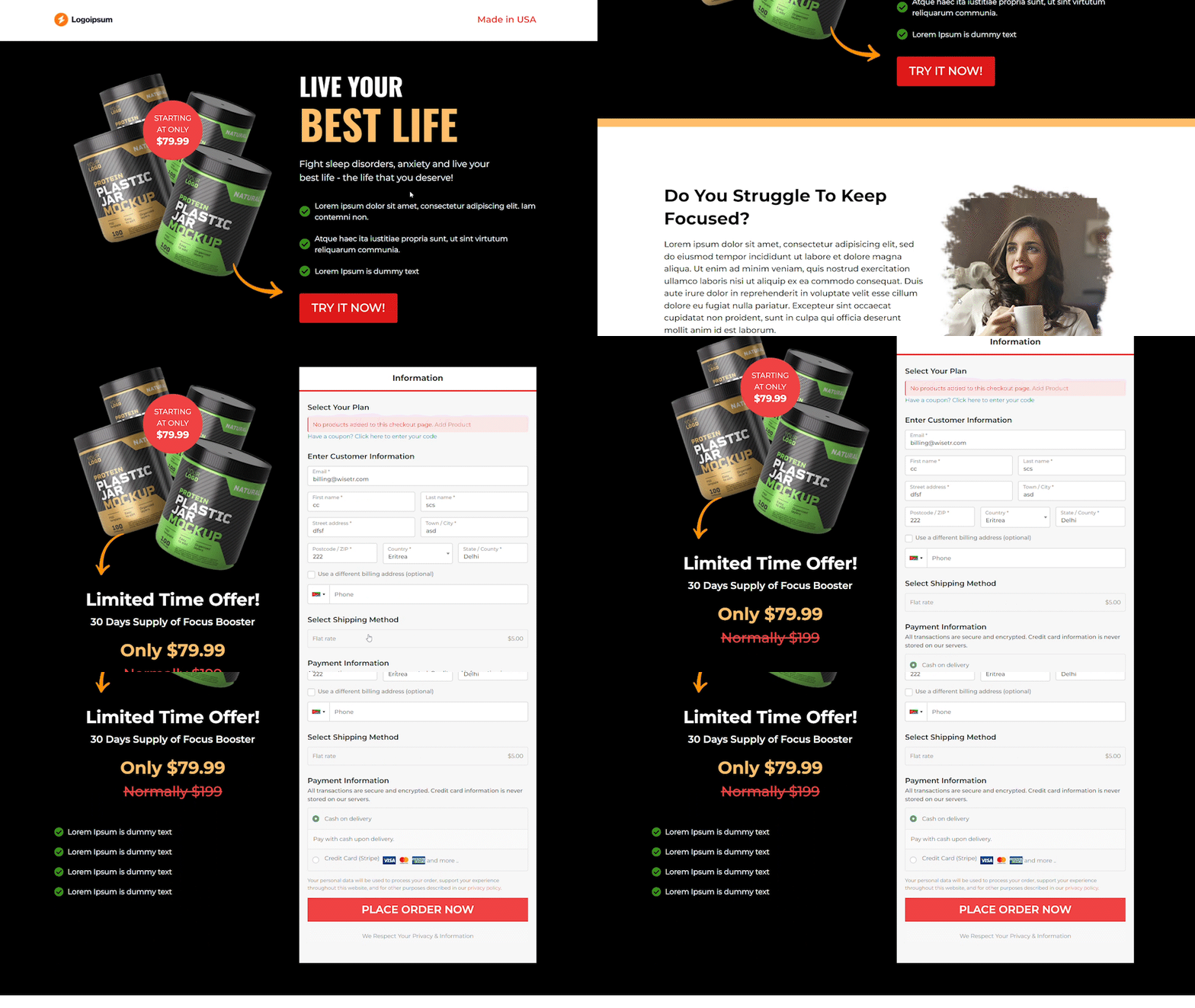
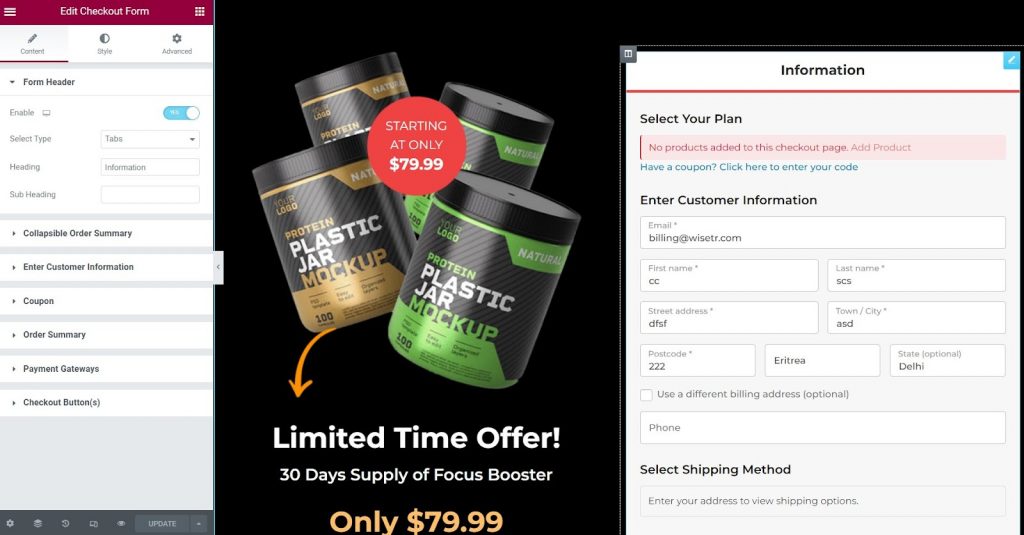
You can customize the checkout form as you like - add/remove/rearrange checkout fields, change the colors of the button, edit the text, add icons, and much more.
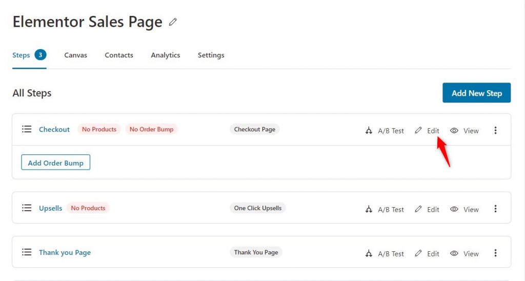
If you wish to add more form fields to your checkout, then go to the funnel's dashboard and click on Edit.
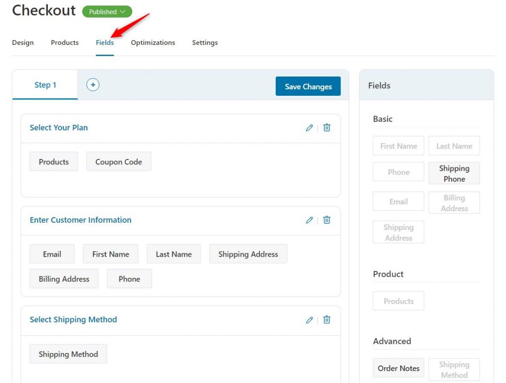
Once you are in the Edit mode, click on Fields, and here you can add/remove/rearrange the fields the way you want.
9 Tips to Multiply Your Sales Page Conversion Rates
It depends on your product whether you want to create a long-form sales page or a short-form sales page.
Conventionally, a long-form sales page gives you more touch-points to convince the visitor and make the sale. For example, in niches like educational courses, SaaS products, etc, you will see long-form pages.
When you are selling a simple course or a specific product (for example, Macbook Pro 13 inch), short-form sales pages tend to perform better.
No matter what you choose, you need to sell via your sales page, and for that, you should know the 9 MOST important elements of a sales page to double-check before you make your sales page live.
#1: Start with a compelling headline and sub-headline
Your opening sentence on the sales page is obviously the most important.
Based on it, the prospect decides whether they want to scroll to read more or not.
In one of his interviews, Seth Godin said, "the point of your first line is to make the reader read the second one."
So keep that in mind when writing the heading and the subheading.
For example, look at this headline and subheading on Kindlepreneur - a business that teaches people how to sell books on Amazon and build passive income.
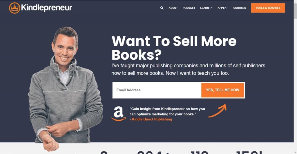
The headline directly addresses the visitor’s problem - they want to sell more books, or maybe they want to get started with selling books on Amazon.
The subheading supplements the heading and establishes the business’ authority in the publishing industry.
#2: Embed the checkout form right on the sales page
You may have come across several sales pages where the checkout is on a different page.
But having everything that a user needs on the same page means lesser exit routes. People won't have to switch pages or tabs and can buy when they're ready.
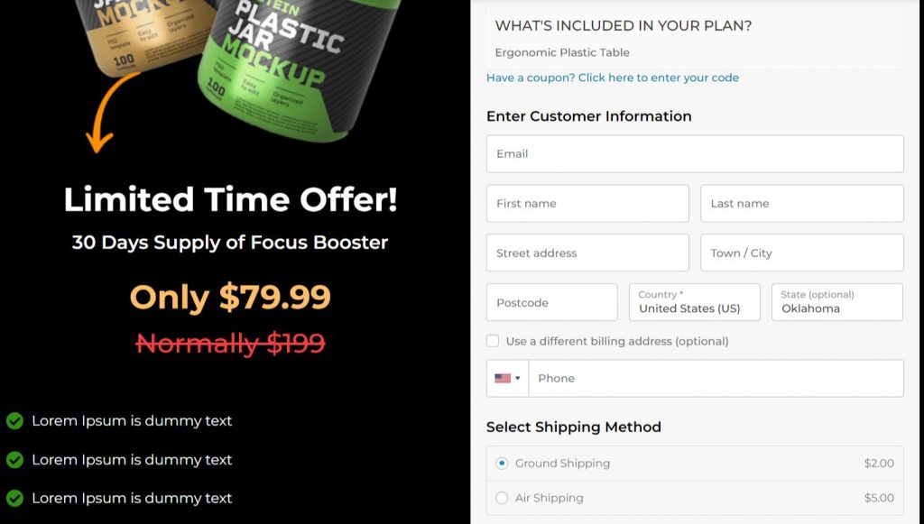
Another big advantage is that you can capture more abandoned carts.
So if people just enter their email and leave the page - you can always reach out to bring them back.
With FunnelKit, you get multiple free and premium WordPress sales page templates that help you build checkout-cum-sales page.
Right after the checkout-cum-sales page, you can even add a one-click upsell that boosts your AOV.
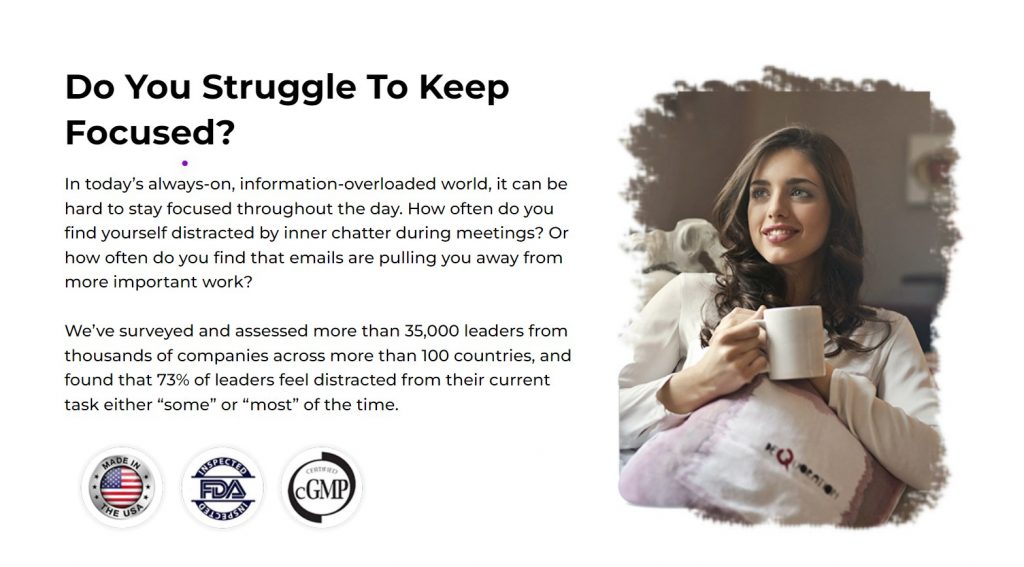
#3: Aggravate the problem
This is the most important section on the sales page. Use it well to tell your prospects you know them and understand them well.
Talk about their struggles by using phrases like:
- Sounds familiar ...
- Can you relate to this ...
- Does this ring a bell ...
Have a look at this example.
#4: Introduce the solution
Now that you have taken the time to emphasize the before state, introduce the solution.
The solution is your product - a physical product, a course, or a masterclass designed to take them to the "after" state.
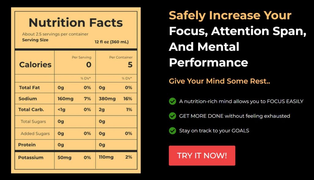
Use phrases such as:
- Introducing the most advanced ...
- Announcing the only system that ...
- Presenting ...
Describe it vividly and share the key highlights. Make sure you stick to giving them only a glimpse.
#5: Reveal the modules and associated benefits
The most basic rule of copywriting is - to relay the benefits, not the features.
So, you need to provide a futuristic picture to your visitors that shows them the BENEFITS of your product, service, or course.
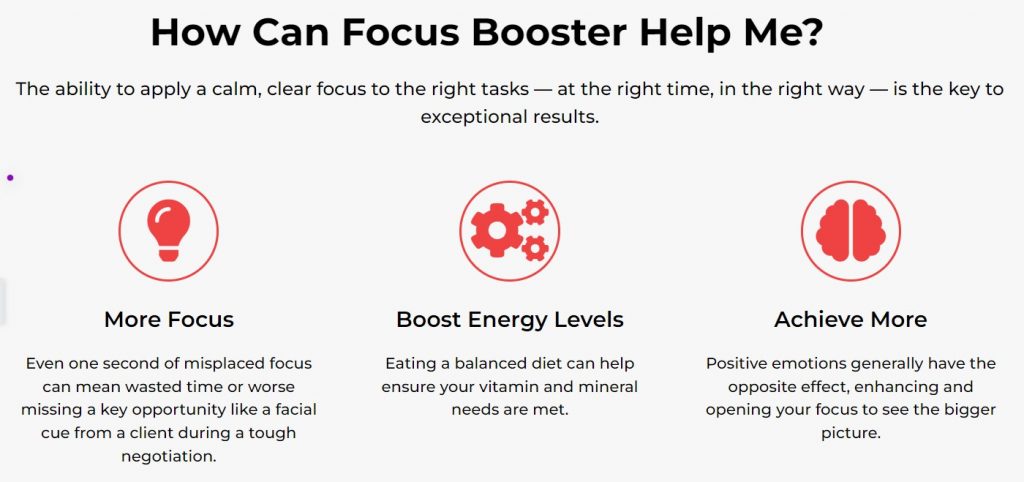
If you are selling a course - reveal the modules and what the visitor will learn in them. If you are selling a product - reveal the ease of use and the benefits of its continued use.
#6: Highlight social proof
You can choose to either add all the testimonials together, i.e. one below the other, or sprinkle them throughout the page.
Adding a testimonial is great to make prospects believe that your course sure works and delivers on the promise.
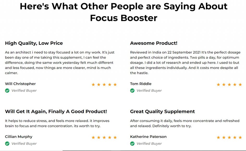
Your prospects want to see other people from different backgrounds and with similar challenges to theirs doing well with the course to believe that they can do it too.
Slick marketing copy can only do as much, credible social proof helps close sales.
If you're just starting out and this is your very first course, learn more about getting social proof here.
#7: Give a money-back guarantee
Transacting online comes with an associated risk. Your customers are already thinking of a million questions.
For example:
- "What if this program doesn't work?"
- "If I don't feel it's worth it, will I get my money back?"
- "Can I get the results they claim from it?"
As a seller, it's 100% your job to help prospects overcome their doubts and feel confident about paying.
For example, you can add a line of text about a money-back guarantee or trust seals, as shown below.
FunnelKit's templates come with these trust seals already embedded on the checkout page.
#8: Introduce yourself
People need to know that the person offering the course is authentic and qualified to teach or sell the program.
So go ahead and use this section to highlight what puts you in a position to offer the course.
Maybe you've been through the same struggles and found your way out.
Or you've done the research and developed systems to solve the problem for others.
Whatever it may be, tell your story.
Your personal story of struggle and success will make your sales page convert higher.
So use this section optimally.
#9: The perfect close
Now, the visitor is at the end of your sales page. Maybe they are almost convinced but need that final push.
You can directly tell them about the opportunities and the benefits they will be missing out on if they do not sign up now. This will create a feeling of FOMO and might push them to click the BUY button.
Or, you can show your featured articles/videos that will subtly position you as the authoritative personality who can help these visitors in achieving what they are looking for.
This might indirectly push them to say, "they seem to be an authority on this topic. Let's try what they've got!"
So Are You Ready to Skyrocket Your Conversions with FunnelKit?
FunnelKit lets you experiment with your sales funnels with its premium pre-built templates, immense customization possibilities, powerful funnel analytics, and more.
Import an Elementor sales page template and execute your bold marketing strategies like you always wanted.
FunnelKit (formerly WooFunnels) is optimized for the fastest speeds and won’t make your website lag. With a faster website, you’ll see more leads and conversions from your sales page.
Also, there are no limits on the sales funnels you can create - whether you use the free version or the lite - CREATE AS MANY FUNNELS AS YOU WANT!
So, hop on the bandwagon, get your copy of FunnelKit Pro today, and see your conversions soar like never before!
Editorial Team
May 5, 2026If you're selling products, courses, services or memberships on WordPress and still relying on a single product page to all the heavy lifting, you're leaving money on the table. Dropping...

Editorial Team
May 1, 2026If you sell products online, you need to build an Elementor sales funnel to maximize sales. A sales funnel guide helps you convert visitors into buyers through a well-charted course/well-defined...
Editorial Team
May 1, 2026Are you looking for WooCommerce checkout optimization hacks to streamline your users' shopping experience? Your WooCommerce store may have an attractive layout with a user-friendly interface. You may even have...

