A well-crafted upsell template can take your upselling game to the next level.
Upselling is the practice of getting your customers to buy more products and increasing your store's order value.
You must leverage upselling because acquiring new customers costs four to five times more than retaining current ones.[Source: Forbes]
A well-designed upsell page template can help you increase the average order value and ensure a good shopping experience for your users.
In this blog, we'll break down the key elements that make upsell pages irresistible to customers. We'll also share how you can offer upsells, along with real-life examples used by successful marketers that you can draw inspiration from.
Let’s begin.
Table of Contents
- 1 What is One Click Upsell in WooCommerce?
- 2 6 Key Elements of an Optimized WooCommerce Upsell Template
- 3 How to Customize Your WooCommerce Upsell Template Without Writing Any Code?
- 4 Real Life One-Click Upsell Offer Page Examples
- 5 Leverage the Upsell Email Template to Boost Conversion
- 6 Are You Ready to Customize Your Upsell Template Into a High-Converting Time Offer Page?
What is One Click Upsell in WooCommerce?
One-click upsells are a great way to grab the shopper’s attention and make relevant additional offers while they're still in the buying mindset.
The one-click upsell offer page is the page that your customers see right after they hit 'place order' on the checkout page, and just before they know the order receipt on the thank you page.
This means just before they exit your store after placing an order, you present them with a highly relevant and time-bound offer that complements their main purchase.
You must ensure that your offer page looks credible and presents the offer clearly and succinctly.
Take a look at this upsell offer page first, and then we'll take you through its building blocks:
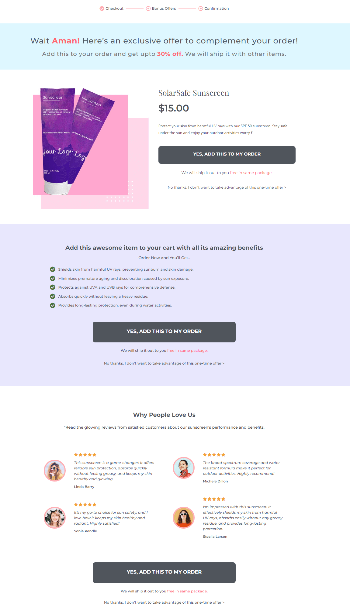
This Upsell Offer Page has been built using the Utopia template by FunnelKit Funnel Builder.
6 Key Elements of an Optimized WooCommerce Upsell Template
Let's explore the key elements for a highly convertible upsell page template and why you need each of them.
Of course, all the building blocks are optional, so you can always turn off the ones you think you don't need.
But each element has been coded for a reason. We studied and analyzed several offer pages to zero in on the most critical sections of this page.
#1: The Progress Bar

The progress bar is an essential component of the one-click upsell offer page. It gives people a sense that the task is incomplete, making them want to complete the steps.
Your upsell page can be called “Bonus Offers,” “Special Offer,” “Optional Upgrades,” or “Customize Your Purchase.”
Why you need it: The progress bar ensures that users won't feel lost on the page but are in control of the experience.
You can get more of these components in our upsell templates, which are super easy to edit.
#2: Pattern Interrupt Section

After the checkout page, your buyers are expecting to see the thank you page, so interrupt their line of thought with the pattern interrupt section.
Since you're presenting a new offer on the upsell page, make sure you grab their attention by letting them know what they're seeing on their screens.
Personalize this section of the upsell template: Call them out, thank them, and invite them to explore this new offer.
Why you need it: You need it to position a new offer in their minds. This section makes them quickly comfortable with this intermediary page between the checkout and the thank you page.
#3: Product Image/VSL Section
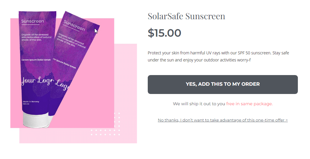
You can present this section in a traditional eCommerce style format – with the product image on the left and the product description on the right.
Or product image at the top, followed by the description and other details, with the buy button.
You may replace this section on our upsell page template completely with the video section. So use the video sales letter to pitch the offer and convince them about the deal.
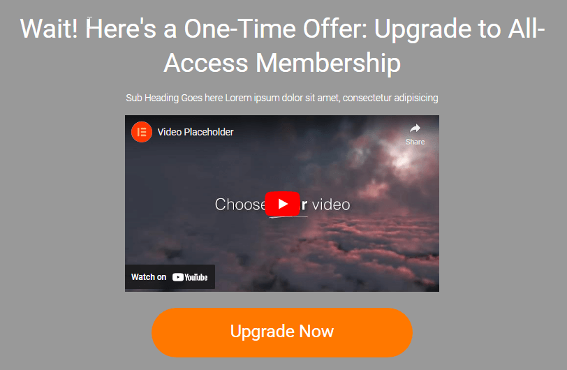
Why you need it: This is, of course, the most critical element of your page. It takes up the most prominent real estate on it. Create a special product image highlighting the offer details, including the savings.
#4: Product Features & Benefits

Use this section to explain the product better. Highlight the features, advantages, and benefits.
They're already convinced about the product if you’re upselling a volume deal.
You can use this section to convince them of the need for the bulk deal and why they should stock up!
Use this section to answer these questions:
- What will I get?
- Why should I care?
- What makes this offer worth considering?
- What's the cost of not acting now?
Why you need it: A clear features + benefit section helps convince people why they need the product and what they'll miss out on without it. Keep this section succinct and clear.
#5: Product Reviews
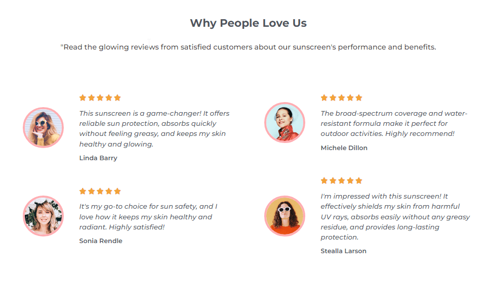
Add an element of credibility to the offer with product reviews.
Why you need it: People trust their peers more than they trust pitches. So even if this is an upsell offer page and you think people already trust you, you still need reviews to seal the deal.
This is especially true if you're upselling a new product here.
#6: Buy Block

The buy block has three parts:
- Accept Button - The products get added to their order with a single click
- Decline Button - Directs them to the next offer (downsell) in the funnel. Or if there's no offer, it takes them to the Thank You page.
- Click Trigger (Text below the CTA button) - The click trigger is the text right below the Call to Action button. The purpose of this text is to address any last-minute objections that they may have to click.
Why you need it: It’s essential to tell people exactly what action to take to buy the product. Also, it’s important to give them the last push with a click trigger so they hit the “Add to order” button.
Now that you know what a high-converting upsell template looks like, how about we create one?
How to Customize Your WooCommerce Upsell Template Without Writing Any Code?
To create and customize a WooCommerce upsell template, we will use FunnelKit Funnel Builder.
This is the ultimate sales funnel builder for WordPress and WooCommerce. You can create a checkout funnel, sales funnel, or lead generation funnel without leaving the WordPress dashboard and doing any kind of coding.
FunnelKit has two versions: Free and Pro.
Make sure you install and activate both.
Step 1: Create a sales funnel
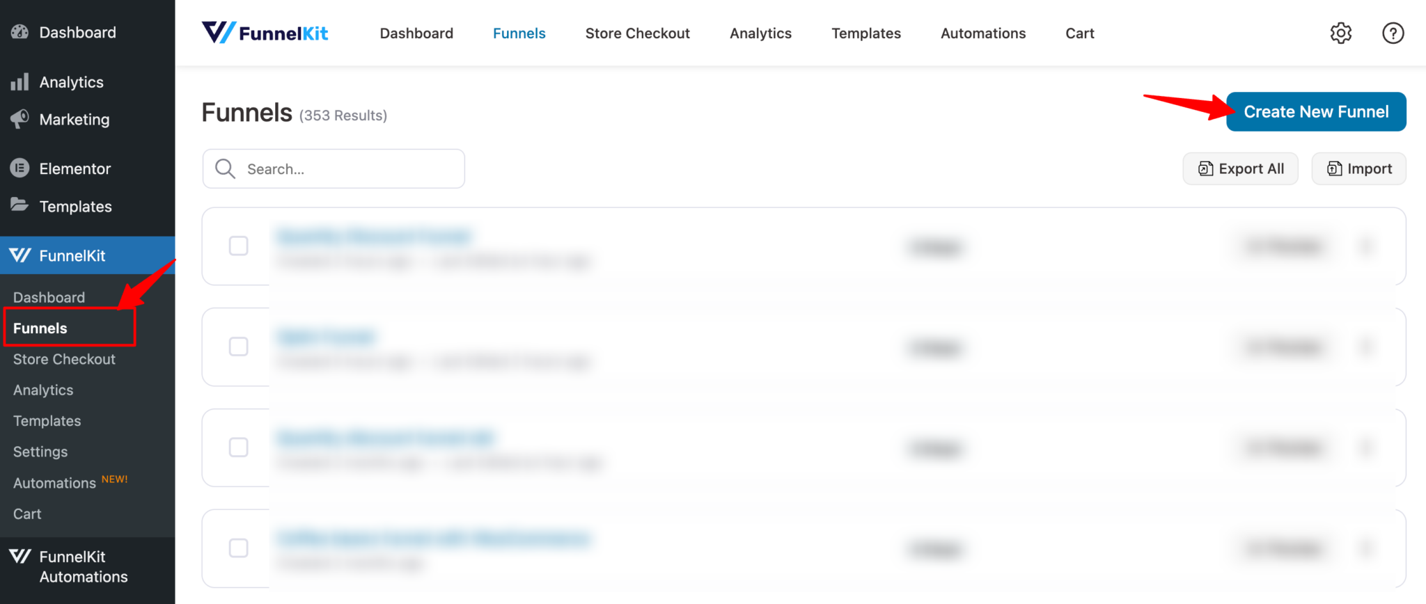
Go to FunnelKit ⇒ Funnels from the WordPress admin panel and click the ‘Add New Funnel’ button.
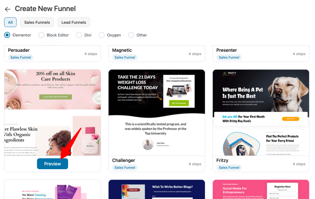
Now you should see a list of prebuilt funnel templates. Choose your favorite page builder and hover on the template you like. You should see a preview button; click on it.
We are here choosing Rosetta. This sales template has four pages
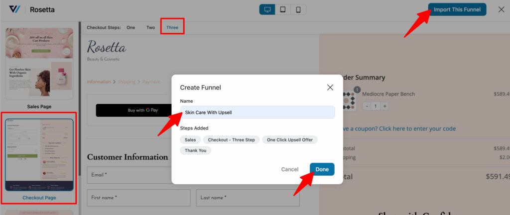
To import the funnel, choose the steps you want on your checkout page. Then, click on the “Import This Funnel” button, provide a name, and click on “Done.”
Step 2: Add a product to the checkout page
To add the main product to the checkout page, first edit the page by clicking on the checkout step.
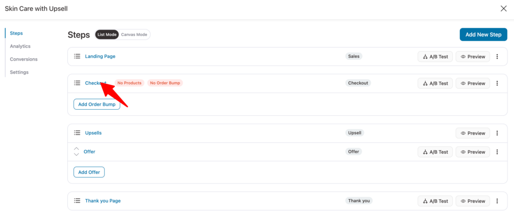
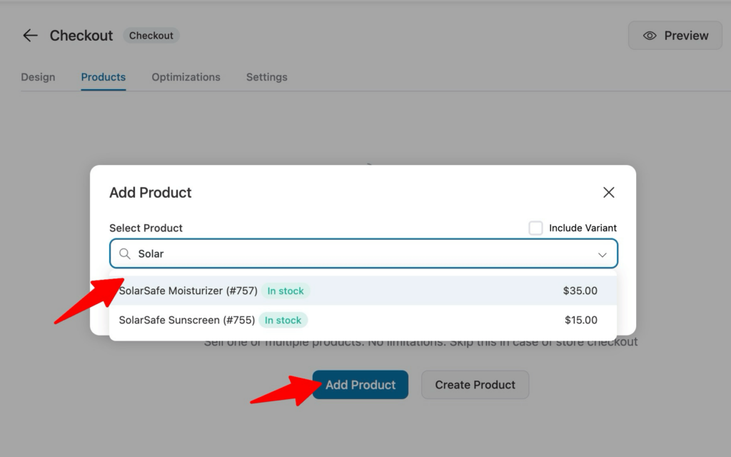
After that, move to the Product tab. Here click on “Add Product”, search for the product, and finally click on “Add” to add the product to the checkout page as the main product.
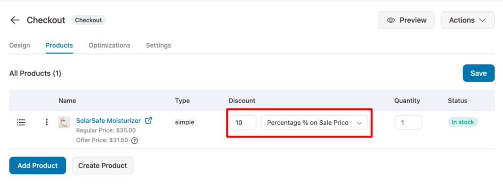
You can offer a discount on the main offer as well.
Step 3: Customize your upsell template
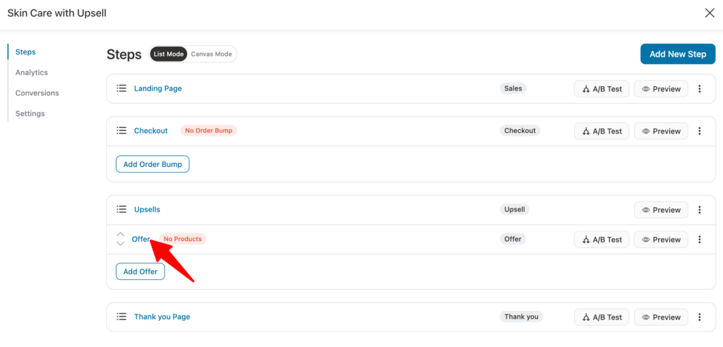
Now it’s time to customize the look of the upsell template. For that click on the Offer step.
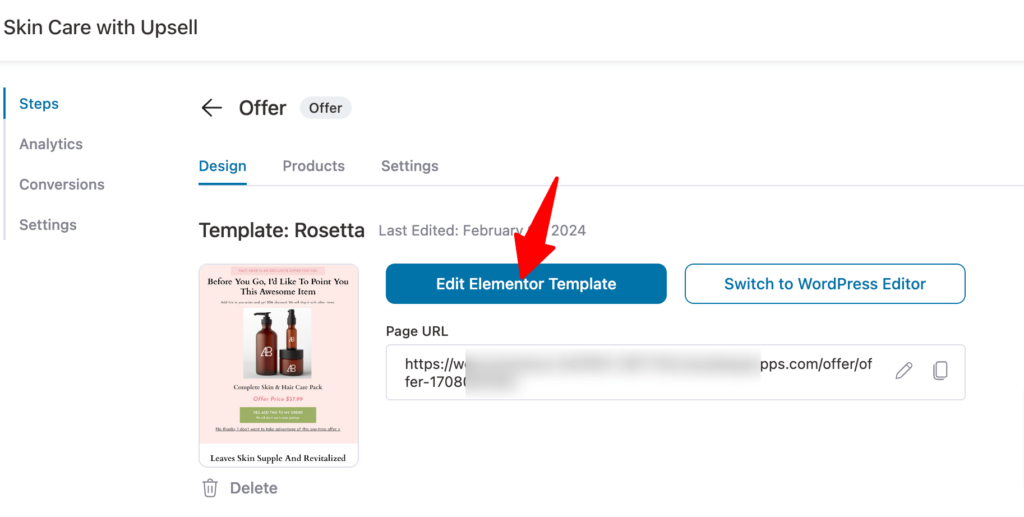
After that click on "Edit Elementor Template".
Here you can customize content for all the sections. For example, let’s update the discount percentage. As we have set a 5% discount, we will customize the subheading on our template here.
To do that, click on that section, then on the left side and update the content.
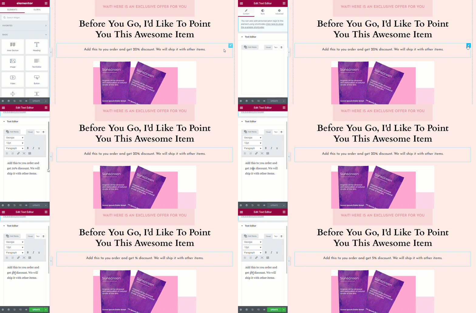
Next, we will change the benefits section. You can update the content for each of the benefits one by one.
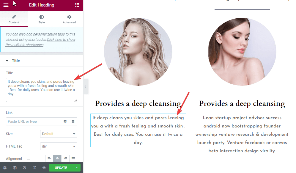
Just like you’ve updated the discount prices and benefits, customize all the content of your upsell template.
Finally, click on “Update” to save the changes.
Step 4: Add an upsell offer to the template
To add the upsell product offer, move to the Products tab, then click on “Add Product”, and like you added products to the checkout page, add the product as an upsell.
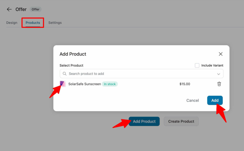
Depending on the marketing strategy, you can offer a discount on your upsell offer. However, this is optional.

Here is what the Rosetta upsell template looks like in the front end:
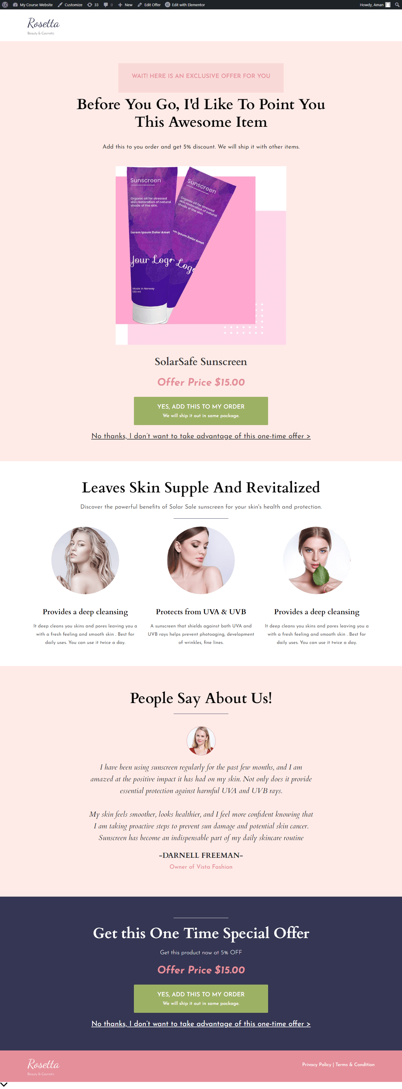
After completing the customization of the upsell template, you can customize the thank-you page as well.
Once you complete setting up the sales funnel, you will be able to offer upsells to your users using a beautiful template.
Now let's have a look at two real-life examples that you can take inspiration from.
Real Life One-Click Upsell Offer Page Examples
We analyzed top upsell landing page templates. Some were long, others short, but all shared one thing in common: they never assumed the buyer’s attention.
Since upsell pages appear right after checkout, how you present your offer is crucial in getting a "yes."
Let’s dive into two of the most effective examples.
Upsell Template: Example #1
This upsell offer page is for a camping knife. The main product sold upfront is a fire starter kit.
The upsell offer perfectly complements the main purchase because it's another survival gear that its buyers will need when they go camping.
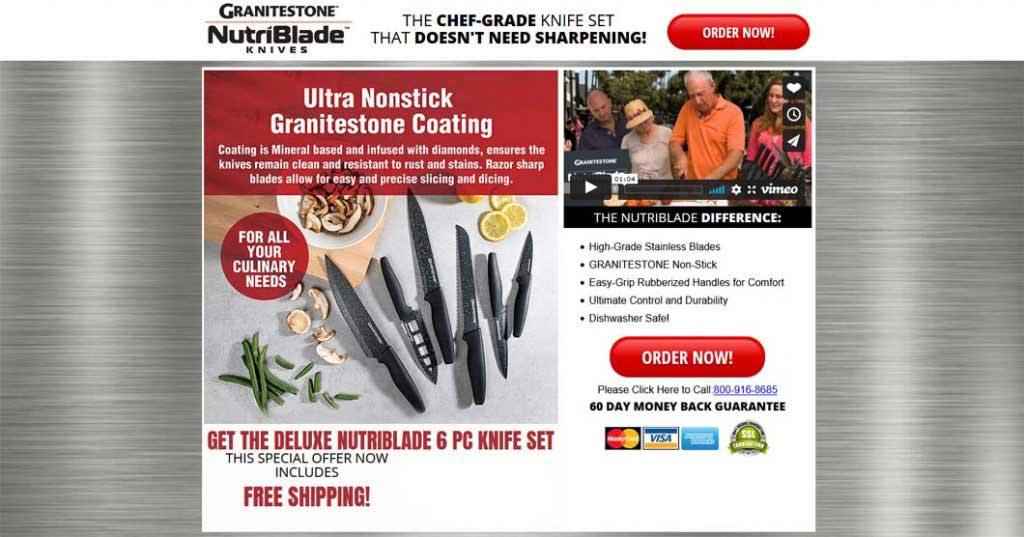
Further, the offer has been explained in the pattern interrupt section. It only takes a few minutes to read it and know the following:
- What they're getting
- At what cost
- Why do they need to act fast
This section is followed by the video section, which features a 2-minute demo video of the product. There's nothing more powerful than seeing the product in action.
Seeing is believing!
There's also the product description section where all the product features and benefits have been explained through a conversational FAQ section.
In the end, there's the guarantee section for risk reversal that overcomes all their last-minute objections to saying yes.
Upsell Template: Example #2
This is upsell offer to a 60-day Keto program. The upsell is a 180 day program, positioned as a natural extension to the main order or the most obvious next step:
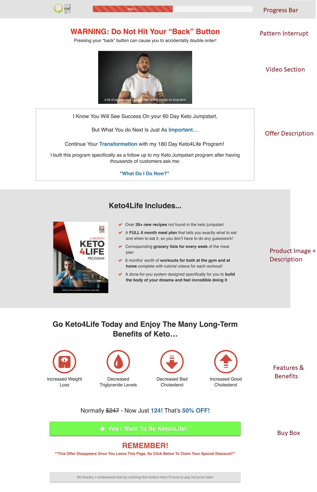
The upsell page is very well laid out, with a clear emphasis on the offer and what the customer gets with the purchase.
In the offer description section, he makes a solid case for the upsell by positioning it as a perfect complement to the main product. In this case, the main product is the 60-day Keto program, and the 180-day program is the obvious next step.
Notice how he says, 'I built this program as a follow-up to my 60-day Keto jumpstart....' - hence clearing all possible doubts that they have about the relationship of the upsell and the main order.
Also, notice the features and benefits section - the icons depict the features incredibly well on this upsell template.
Finally below the buy block of this upsell template, there's a click trigger - the intent of which is to make people click by overcoming their last-minute objection. It induces a sense of urgency and scarcity.
Now let’s check how you can offer an upsell to users via an upsell email template in the next section.
Leverage the Upsell Email Template to Boost Conversion
Some people will decline the offer no matter how good your upsell page template is.
Does that mean you give up on them?
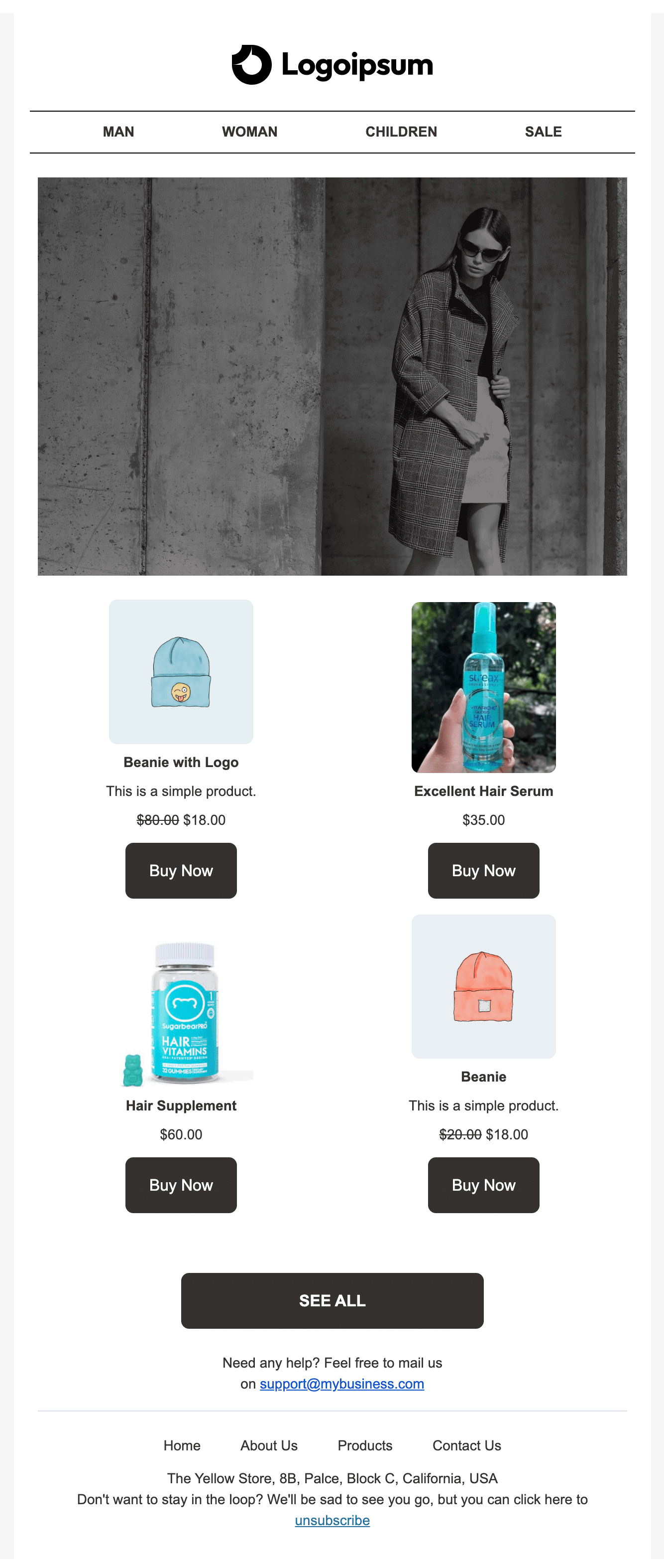
No! You can ask them to explore your exclusive offers through post-purchase emails. In these emails, you can offer them your upsell or relevant products with attractive discounts.
But how do you send emails with products attached to the body?
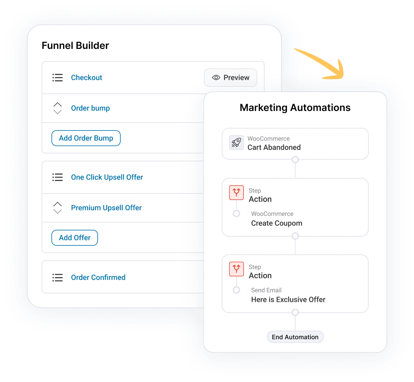
Well, you can do that right from your WordPress dashboard if you use FunnelKit Automation.
Are You Ready to Customize Your Upsell Template Into a High-Converting Time Offer Page?
Your upsell offer page holds the key to conversions. Clearly communicating the offer is important.
Having said that, the FunnelKit Funnel Builder will help you build a stellar upsell page in minutes from the ground up.
With FunnelKit’s 20+ templates, you will find the right template no matter what your upsell offer is. And as you have seen above, all you have to do is import and update the content.
So, are you ready to customize your upsell template with FunnelKit Funnel Builder?
Editorial Team
March 25, 2026Running a WooCommerce store without the Facebook Pixel is like pouring money into ads while blindfolded. You're spending, but you have no idea what's actually working. Every abandoned cart, every...
Editorial Team
March 24, 2026Every WooCommerce store needs a reliable way to generate PDF invoices and packing slips. Hand-typing order details into a Word template results in misspelled addresses, missing tax IDs, and a...
Editorial Team
March 5, 2026Your checkout page might be silently killing your sales. No error messages, no warnings; just shoppers disappearing before they click the place order button. One of the sneakiest causes? The...

