Are you looking to create the WooCommerce perfect product landing page that converts your visitors into customers?
A product landing page is specially designed to convince users to buy a particular product.
An average Ecommerce conversion rate is around 2.5-3%. However, an effective landing page can boost your store’s conversion by up to 9.7%.
If you want to convert more visitors into buyers and get higher returns on ad spending, then dedicated landing pages are your best bet.
But how to build a high-converting product landing page in WordPress?
What are the ingredients of a converting product landing page?
This blog will cover answers to all your questions related to product landing pages. Our experts have also shared some exemplary WooCommerce product landing page examples to give you extra motivation.
So, keep reading…
Table of Contents
- 1 What is a Product Landing Page?
- 2 Why Do You Need a Product Landing Page?
- 3 Key Elements of a High-Converting WooCommerce Product Landing Page
- 4 How to Create a WooCommerce Product Landing Page in WordPress?
- 5 3 Inspiring Landing Page Examples
- 6 Frequently Asked Questions
- 7 Ready to Design Your WooCommerce Product Landing Page?
What is a Product Landing Page?
A product landing page is a page designed to convince users to buy a particular product. It demonstrates the product’s capabilities in solving the problems of your user, further convincing them to make the purchase.
Such pages feature some effective conversion-friendly elements. These include a powerful headline, compelling description, hero image, and social proof, all designed to convert prospects into paying customers.
Usually, a product landing page is a post-click page where people land after clicking on
- Paid ads
- Email Newsletters
- Social media posts
- Organic search results etc.
Note: Product landing page is different from a product page and landing page.
A product page describes the features of a product. However, a landing page is a general web page designed for a specific marketing goal such as lead capture, special offer promotion, product sales, or webinar sign-ups.
On the other hand, a product landing page focuses on convincing users to take action and purchase the product. It converts your visitors into paying customers.
Why Do You Need a Product Landing Page?
Have a look at some of the reasons why you should use the landing page to sell products:
Landing pages are conversion-centric
Product landing pages are part of the sales funnel with a clearly defined strategy to convince customers to buy. Since it focuses on getting a conversion, you will likely get better results.
Arouse users' interest in your products
Since people land on a landing page after clicking on a post or ads, you can be somewhat assured that they are interested in your product. Now you can compactly put all the information to arouse more interest and eventually turn your customer's desire into the action of buying your product.
Streamline the buyer’s journey
A well-designed product landing page is built to streamline the buyer journey. Information is put together strategically to convince the customer to purchase the product.
For example, you can highlight the benefits to convince them your product will solve their problems.
Moreover, you can add social proof showing how other people have benefited from your products. You also can draw their attention by mentioning the USP of your products that they can't find in other products.
A product landing page is a perfect tool that you can use to convince your users to buy. Therefore, you should opt for a landing page in your sales funnel.
However, you must ensure your landing page has all the right elements to bring results.
Move on to the next section to find out what those elements are.
Key Elements of a High-Converting WooCommerce Product Landing Page
Let’s have a look at the key elements of a WooCommerce product landing page:
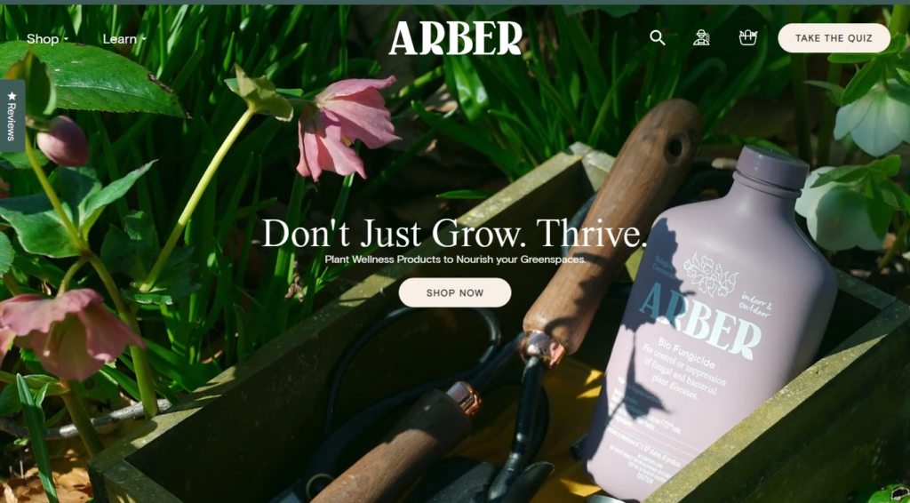
Captivating headline
According to research, 80% of people read the headline only. Captivating headlines is a must to hook your prospects so they continue to read the rest of the content.
So make sure you put an attractive headline on top of your landing page that is visible to the viewer without scrolling down. If users find the content on the visible part interesting enough, they will scroll down to read more.
Attractive product benefits section
People are not interested in your products but in how your product will benefit them or solve their issues. Thus, it’s important you highlight how your products will solve prospects’ problems. Describing features in a way that highlights the benefit is an excellent approach you can follow.

Unique selling proposition
In most businesses, your competitors are likely to offer similar features or benefits that your product does.Thats why you need to give users a reason to choose you by adding a USP section on your landing page. The section should talk about the unique selling points of your product that no one else offers.

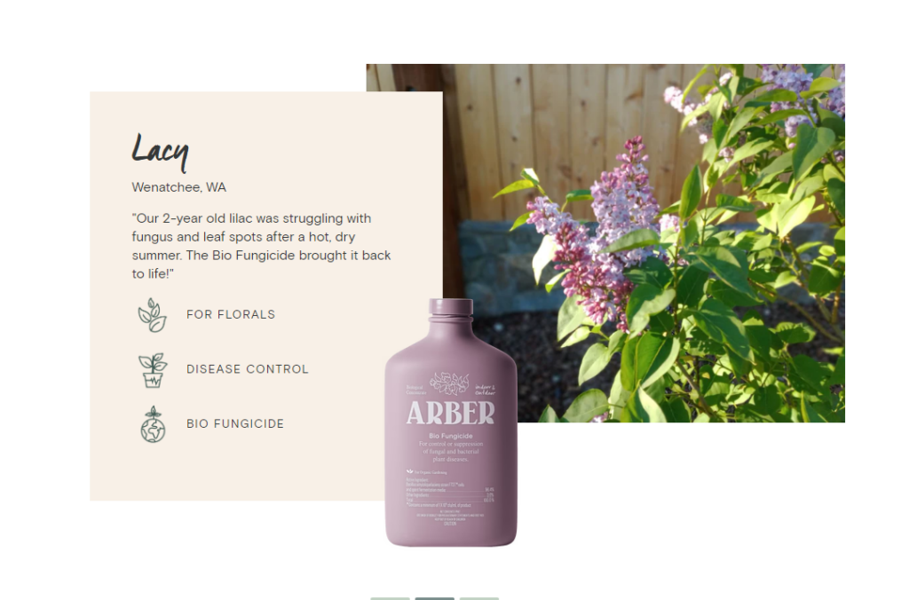
Social proof, testimonials, and reviews
Social proof is a powerful tool of persuasion. Almost 70% of online users typically review customer reviews before purchasing. So ensure you include authentic and positive social proof and reviews on your product landing page. This will help you gain user’s trust and thus convince them to buy your product.
High-quality images, videos, animations
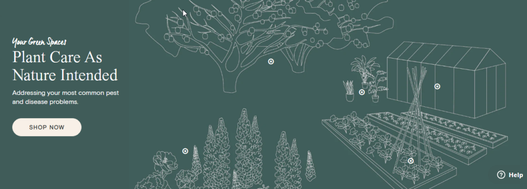
A picture is worth a thousand words”. This statement applies to landing pages as well. Not just an image, adding videos and animation can help you communicate with users more effectively.
For example, with an image, you can show the before and after effects of using the product. Again you can show how easy it is to use your product and son.

Compelling CTA
The primary goal of your product landing page is to get conversions and CTA directs users towards that goal. A CTA button should represent the whole landing is designed to achieve. You should avoid using CTAs such as "CLICK HERE" or "SUBMIT".
While these are widely used CTAs, you should use a CTA that indicates the result users will get if they click and purchase the product. In addition, you should repeat CTA on different parts of your landing page, so users don't have to scroll up to find a CTA.
How to Create a WooCommerce Product Landing Page in WordPress?
Now we will show how to make a WooCommerce product landing page in WordPress using FunnelKit. We are using FunnelKit as it’s the highest-rated sales builder plugin out there.
The reason why people including us love this WordPress plugin is it’s a complete plugin and comes with all the features to build landing pages as well as sales funnel with ease.
Some of the reasons why we chose FunnelKit to build landing pages for products include
- Popular page builder compatibility - whether you like Elementor, Divi, or Oxygen, you can use Funnelkit to build your sales funnel pages, including a landing page with your preferred page builder.
- Pre-built customizable templates - FunnelKit comes with many prebuilt product landing page templates that you can just import and use. You can customize these templates to suit your needs.
- AOV-boosting offers - You can also add order bumps and one click upsell on your sales funnel followed by the landing page which will increase the average order value of your site.
Before we start with the process of creating a landing page in WordPress, make sure to install FunnelKit and activate it on your WordPress website.
Step 1: Create a sales funnel and import a pre built template
We are going to use an Elementor-based prebuilt product landing page template by FunnelKit- Challengers. This is a 4-step sales funnel template that includes landing page, checkout page, upsell page and thank you page.
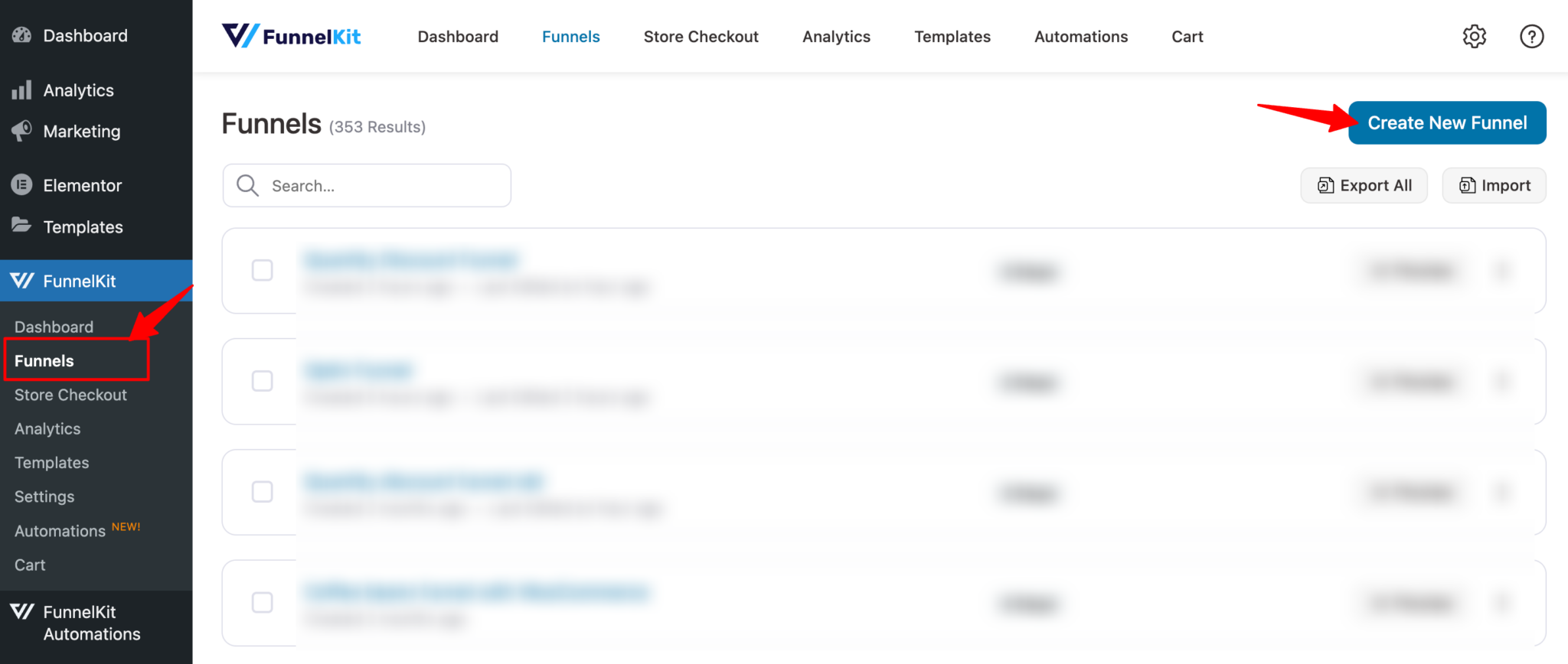
Before you can import and use the landing page template you need to create a sales funnel. For that, navigate to FunnelKit ⇒ Funnels from the WordPress admin panel and click the “Create New Funnel” button.
Next, look for the Challengers template and click on the Preview.
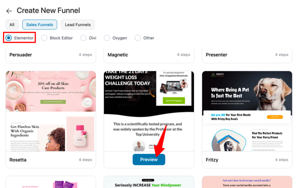
Now click on the “Import This Funnel” button. After that, provide a name and click on “Done”.
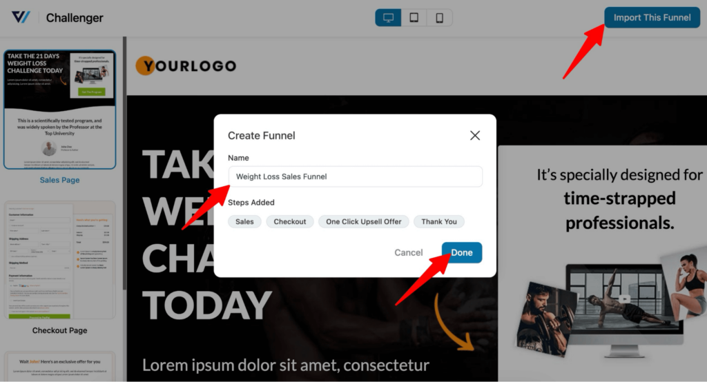
Now you should see all the sales pages have been imported including the landing page.
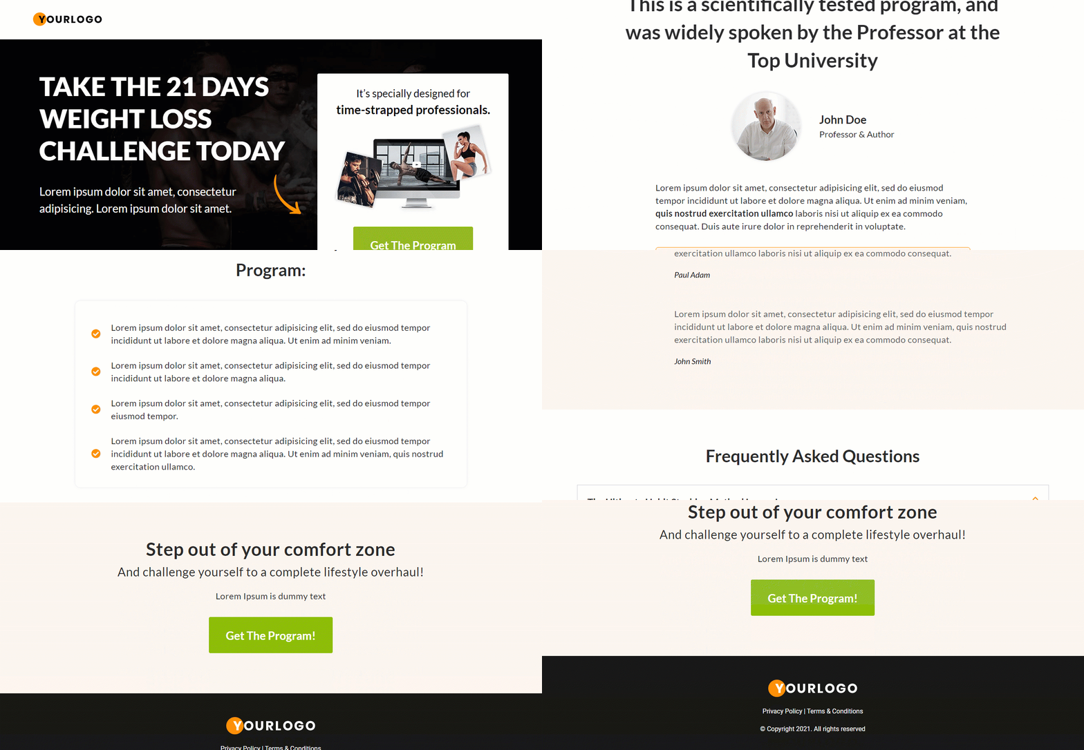
Here is the product landing page that will be imported:
Step 2: Customize the product landing page
Now let’s edit the landing page. For that click on the landing page step.
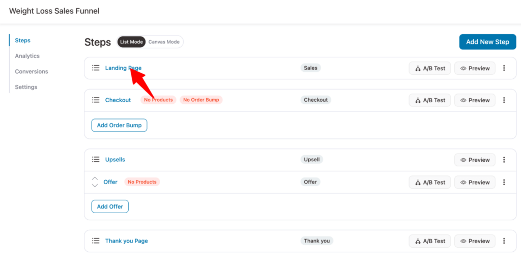
You'll get redirected to the design section. From there, click on the 'Edit Elementor Template' option.
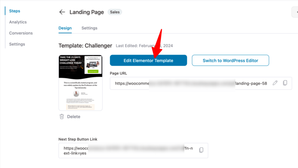
Now you can change any section of this landing page using the Elementor editor panel on the left.
Just choose the section and on the left you will find all the customization options.
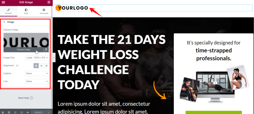
For starters you can update the logo and your brand’s logo.
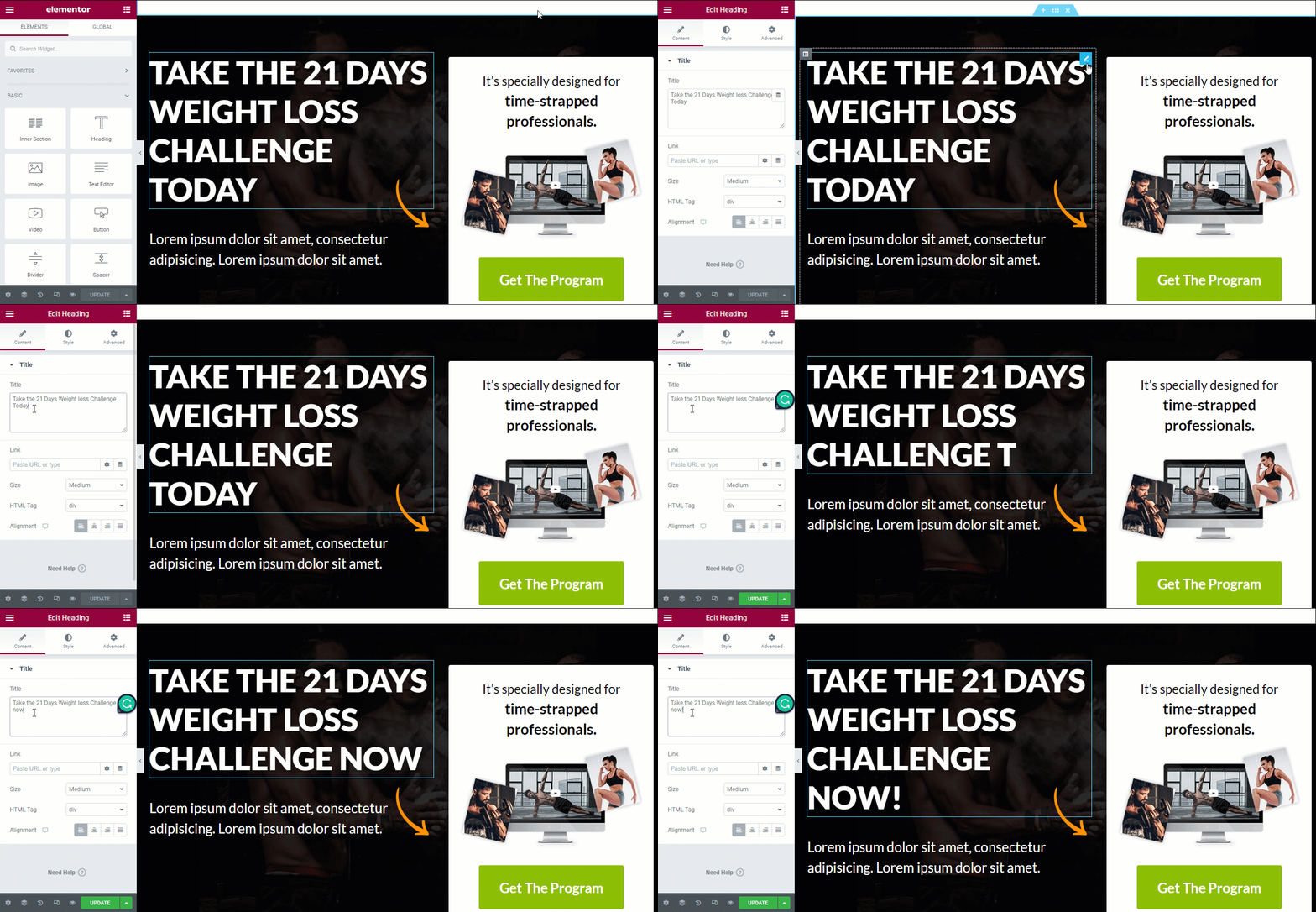
Similarly you can change the headline.
As mentioned before you can customize each and every section of this landing page to fit your brand’s voice.
We are showing another example here for the review section. In the review section. You can update the review and author. You can also change the alignment for both review and author along with many other settings.
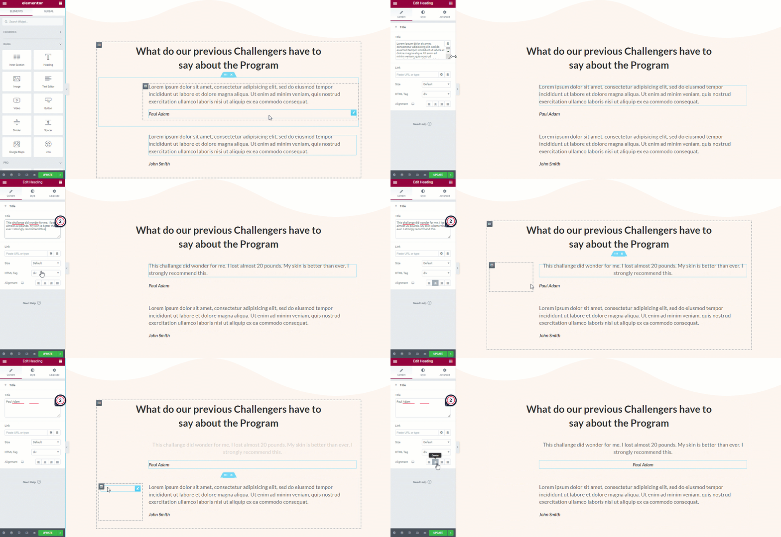
Once done, click on the update button.
Step 3: Add products to check out the page
Now it’s time to add the products that will be added to the cart once users click on the landing page CTA. For that go to the checkout step.
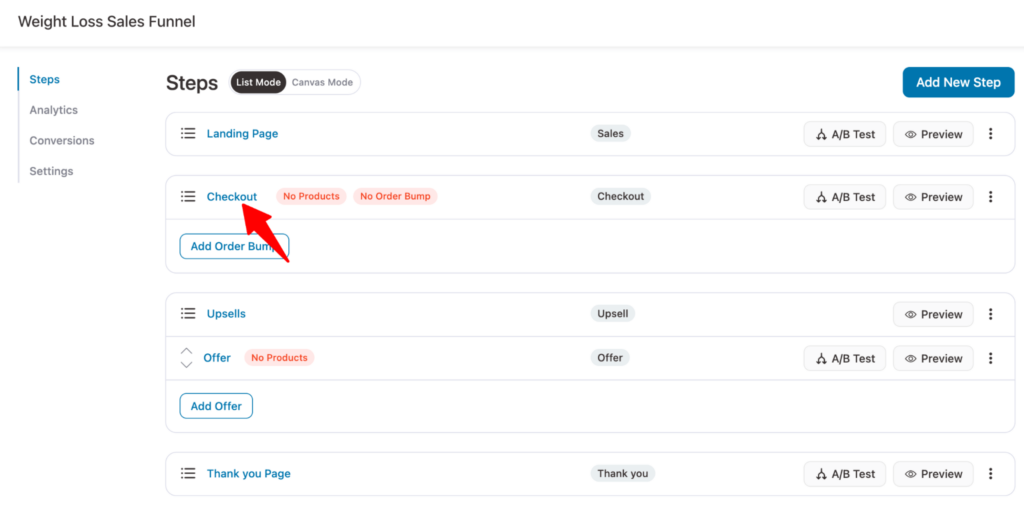
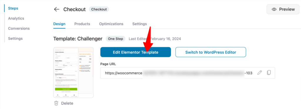
You can customize the checkout page like you did the landing page with the “Edit Elementor Template” option.
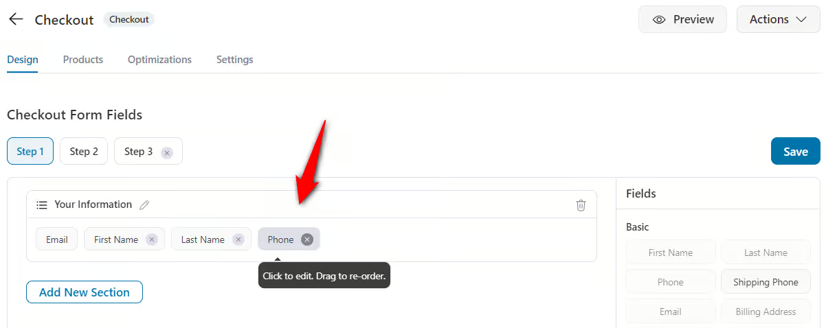
You can customize the fields on your checkout form as per your needs by going to the Design tab and scrolling down to Checkout Form Fields.
Its built-in checkout form field editor lets you add, edit, rearrange, or delete any fields. And all this is possible with a simple drag and drop - no coding required!
Now go to the Products tab and click on Add Product. Then search the product and add it.
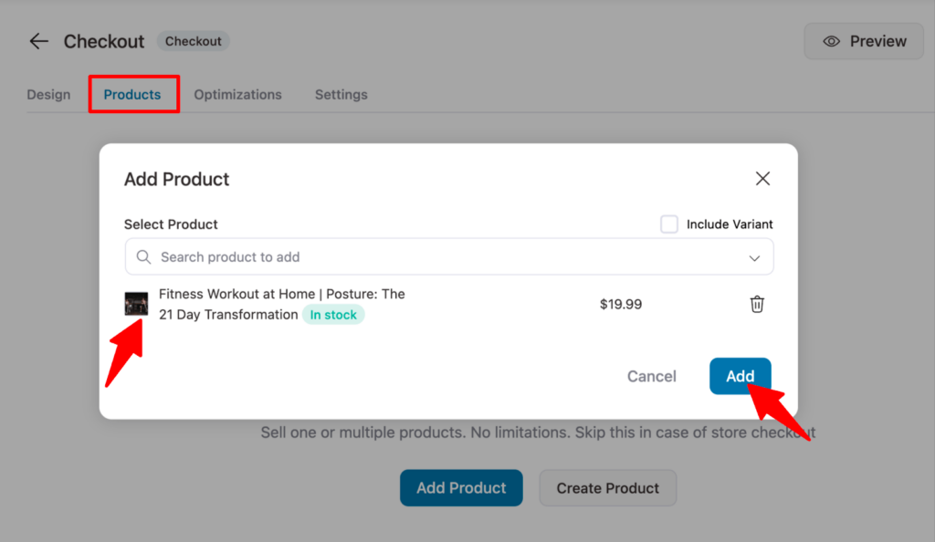
Add a discount to the product if you want then click on Save to update.
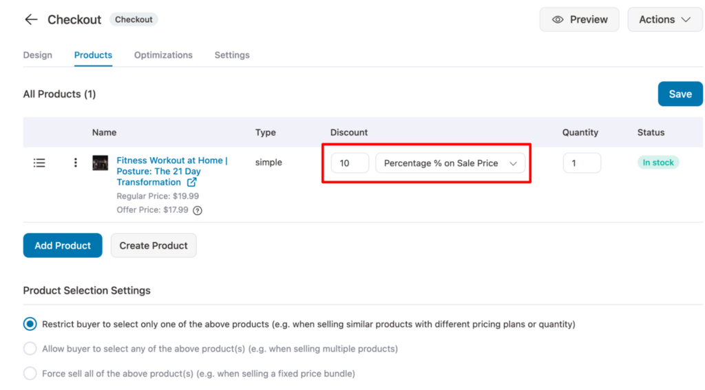
Note: You can offer an order bump on the checkout if you want to increase the order value.
🔔 For a more detailed guide on how to customize the checkout page by FunnelKit, check our blog “How to customize WooCommerce checkout page without coding ”
Step 4: Customize your one-click upsell offer
Upselling is the practice of offering high-value products after the checkout page. To add an upsell product, click on the Offer step.
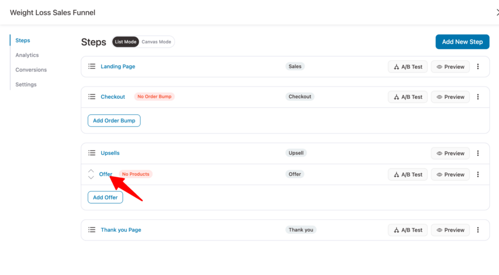
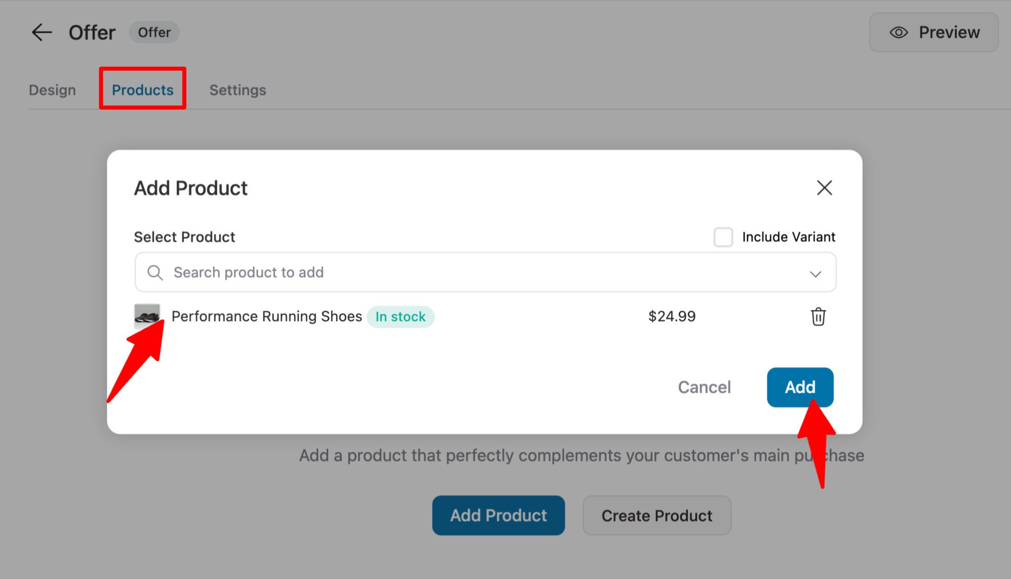
Like you added products to the checkout step, move to the Products tab and add products to upsell products.
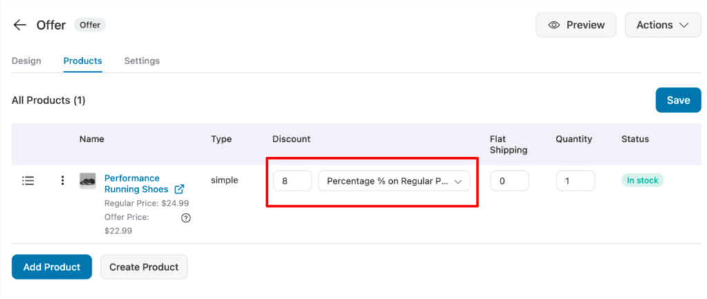
If you want, you can add discounts to upsell products as well. However this is optional.
Step 5: Customize the thank you page to complete
The last step is to customize the thank you page. You can edit the thank you page using the “Edit Elementor Template” option.
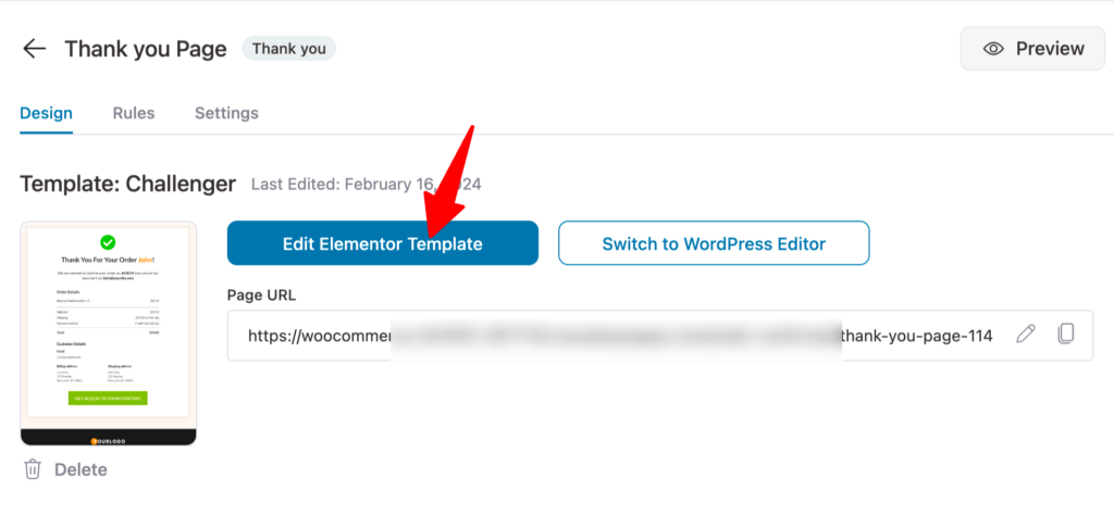
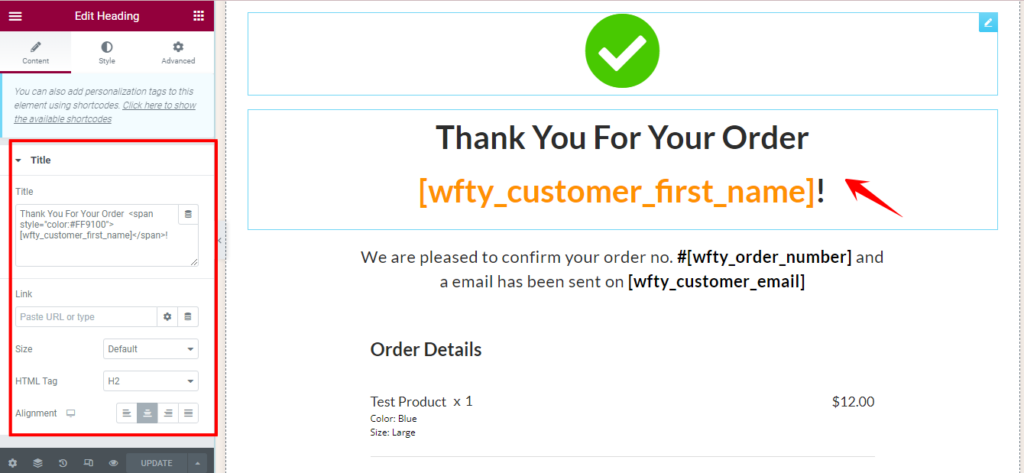
You can customize the different sections of the thank you page. For example, you can change the page title,size, link HTMl tag etc.
🔔 Read our blog how to customize thank you page for a more detailed guide.
And that’s it! Your landing page is ready with a proper sales funnel to boost sales.
3 Inspiring Landing Page Examples
Now let’s have a look at three inspiring landing page examples that got it right. Here we will look at the landing pages for digital products, physical products and subscription products.
The 10x Freelance Copywriter
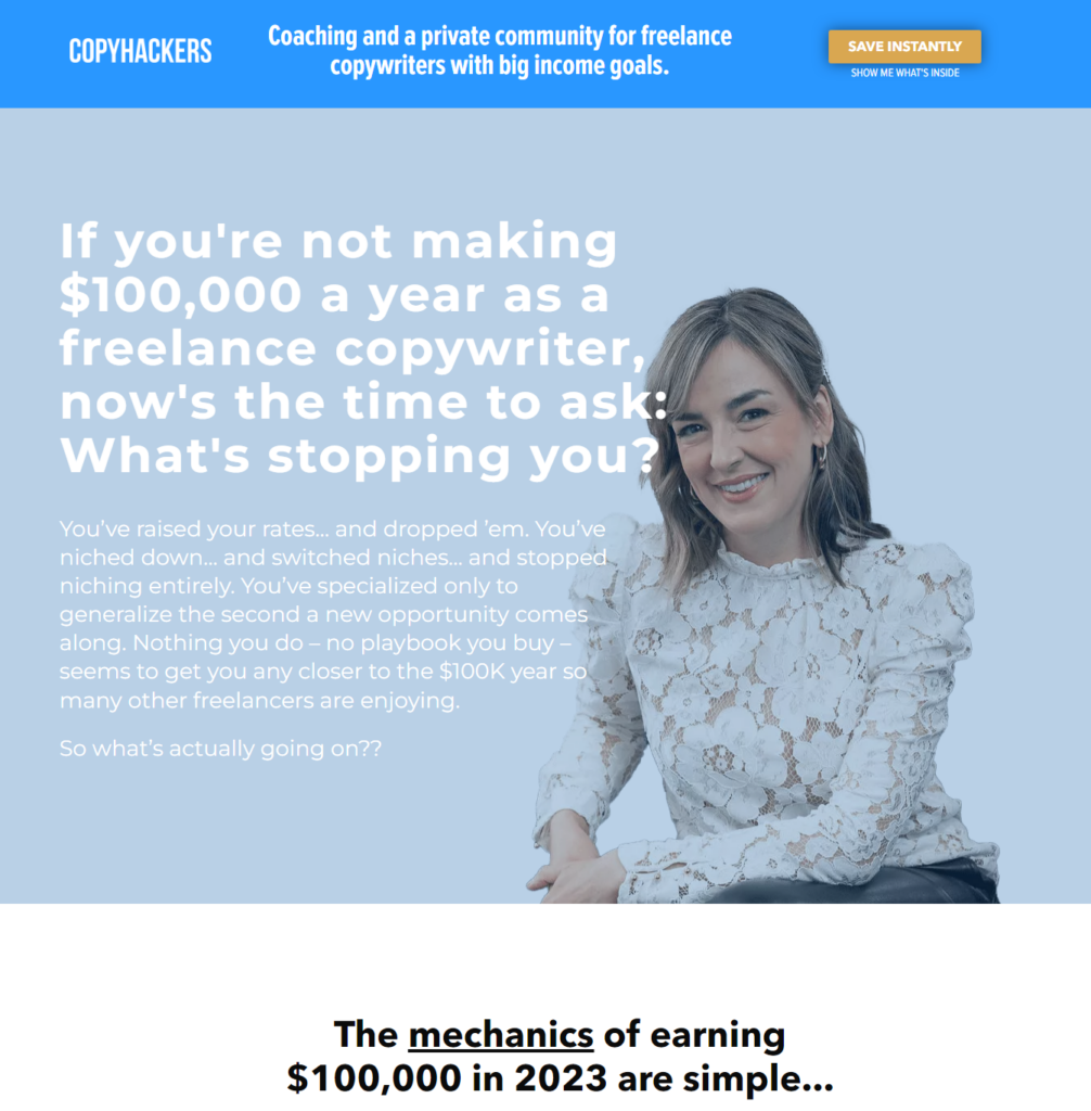
This is a landing page by Copyhackers for their product 10x Freelance copywriter which is an online course. This is a great example of how a landing page for a digital product should be.
Why we love landing page for physical product :
- Captivating headline - If has a captivating headline that hooks the prospect at onset.
- Catchy Benefit section- Highlights the benefits so users are tempted to buy the product
- Use cases with data: Includes a good amount of testimonials and highlights the user's success story of using the product.
- Attractive graphics: The graphics used in this landing page are also of good quality and catches user’s attention.
Gather
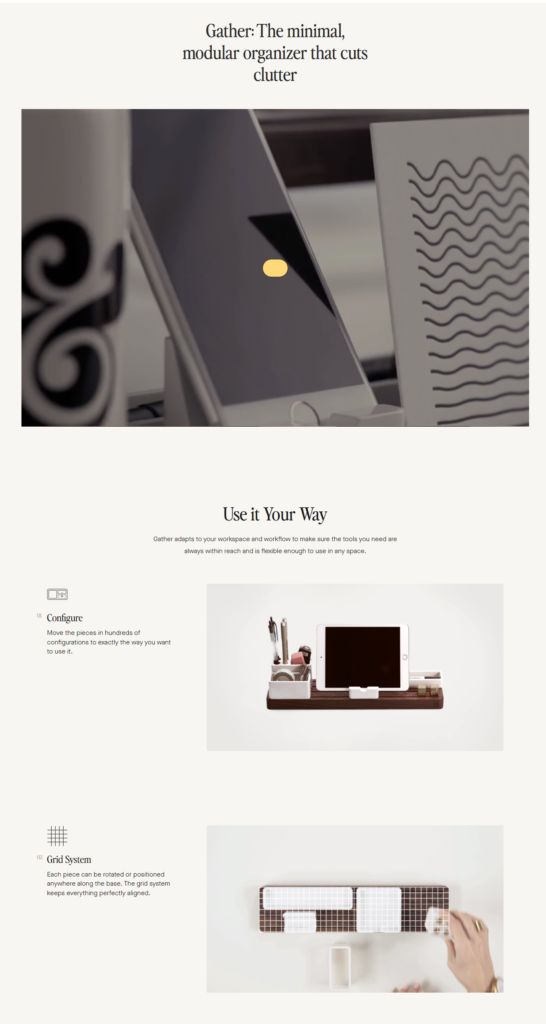
Next, we have an example of a landing page for a physical product named This landing page is designed to sell modular organizers. What makes it an excellent landing is the product. It doesn't only use catchy words but also what they are talking about with images and videos.
Why we love landing page for digital product:
- Attractive hero section- Starts with a catchy headline followed by a video that shows how the product works
- Core Features: Mention the core features of the product which is essential in convincing users to make the buying decision.
- Elegant design- The design is simple yet elegant. Adding small videos along with still images really works and helps users picture how they can also use the product.
Pianu
Last but not least we have a landing page for a subscription product - Pianu. This is a subscription based product that sells piano lessons online.

Why we love this landing page for subscription based products.
- Appealing hero session- It has an appealing hero section with an enticing CTA that offers a free service.
- Convincing feature section- Properly highlights why their online lessons are a good option for users.
- Great Review section- Incorporated customer review nicely which inspires users to also try out the lessons.
Frequently Asked Questions
Have a look at some of the common questions about the WooCommerce product landing page with answers:
What are product landing page examples?
We have covered some of the excellent product landing page examples such as The 10x Freelance Copywriter, Gather, Pianu, Jasper, Asana, etc.
What is the difference between a product landing page vs product page?
A product page usually consists of the important information about the product. On the other hand, a product landing page includes everything needed to convince a customer to make a purchase.
So the landing page does include the product information but it also highlights the benefits,USP, review and other features that makes the product and company more sellable.
What is a landing page for 1 product?
A landing page for one product focuses on promoting one product only and tries to convince users to buy that product.
How do product landing pages differ from lead generation landing pages?
A lead generation landing page aims to collect user data whereas a product landing page aims to convert the prospects into buyers.
Ready to Design Your WooCommerce Product Landing Page?
Now you know how easy it is to create a high-class WooCommerce product landing page that ticks all the key elements with FunnelKit in WordPress.
This WordPress plugin was launched to help online merchants increase their sales through the sales funnel. But at the same time making sure creating sales funnel pages such as landing pages doesn't become too difficult.
Especially for people who are not good with coding.
That’s why it offers pre-built templates which makes creating beautiful product landing pages as easy as walking in the park.
However, make sure to incorporate all the key elements we mentioned to get the best result.
So, are you ready to design your first WooCommerce product landing page?
Editorial Team
March 23, 2026Does your WooCommerce store offer enough payment options? If not, you could be losing up to 13% of sales. [According to Baymard]. WooCommerce’s default payment options don’t always meet customer...
Editorial Team
January 27, 2026Imagine a customer makes a purchase, but instead of the order smoothly processing through your system, it gets stuck in “Pending Payment” or “On Hold” indefinitely. You’re checking your settings...
Editorial Team
October 14, 2025Are shoppers dropping off before completing their purchase? You’re not alone! According to a Baymard Institute study, nearly 18% of customers abandon their carts because the checkout process is too...

