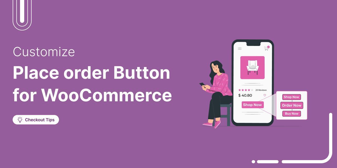
The WooCommerce place order button on your checkout page is literally where the money changes hands.
However, most store owners leave it completely untouched.
You aren't stuck with the default setup. Changing the button text to something actually persuasive (like "Complete My Purchase"), matching your brand colors, or moving its position can make a real difference in your checkout flow.
In this guide, we will show you the quickest way to customize the place order button in WooCommerce using a plugin, no coding required.
We will also walk you through a code-based method using PHP and CSS for developers, and share best practices for optimizing your checkout button to drive conversions.
Table of Contents
- 1 How the WooCommerce Place Order Button Works?
- 2 Method 1: Customize the WooCommerce Place Order Button Without Code
- 3 Method 2: Change the WooCommerce Place Order Button With Custom Code
- 4 7 Best Practices for Optimizing the WooCommerce Place Order Button
- 5 Frequently Asked Questions (FAQs) About WooCommerce Place Order Button
- 6 Start Converting More Customers With a Better WooCommerce Place Order Button!
How the WooCommerce Place Order Button Works?
Clicking the checkout button fires off a specific sequence of actions.
- WooCommerce immediately validates user inputs, such as billing and shipping details and email addresses.
- It checks the selected payment method and sends the data for processing.
- After successful payment, the database logs the new order, updates inventory counts, clears the cart session, and redirects the buyer to a thank-you page.
- But if a single step fails? A declined card. A missing zip code. A JavaScript conflict. The button simply shows an error message and does nothing.
When you customize the button's appearance, you have to be careful. Make it look however you want, but you can't break the core scripts tied to it.
A beautifully branded checkout button is entirely useless if it stops working with your payment gateway.
Why Customize the WooCommerce Place Order Button?
Customizing the WooCommerce purchase button may seem like a small change, but research consistently shows that even minor CTA adjustments can produce measurable results.
Here's why we recommend customizing the WooCommerce place order button for your store:
- Builds trust at the most critical step
Shoppers are most hesitant right before clicking the final button. Add specific, reassuring text, such as "Complete Secure Purchase", to reduce anxiety and encourage action.
- Improve mobile tap targets and readability
A well-optimized checkout button looks great and functions well across all devices, especially mobile devices.
Custom styling lets you increase the size, adjust the color, and make the confirm purchase button easier to tap on mobile devices.
- Match the button to your offer
A customized checkout place order button matches the brand's color combination, tone, style, and fonts.
Matching the WooCommerce order button text to the product type removes confusion and sets the right expectation for customers.
- Stand out from the default checkout experience
A well-designed button can guide your customers through a smooth checkout process. People can quickly complete their purchases without hesitation if it's easy to spot.
- Reinforce urgency or value at checkout
Adding context like "Place Order and Save 15%" or "Complete My Free Trial" reminds customers of the value they are getting, right when they need that final push to buy.
Method 1: Customize the WooCommerce Place Order Button Without Code
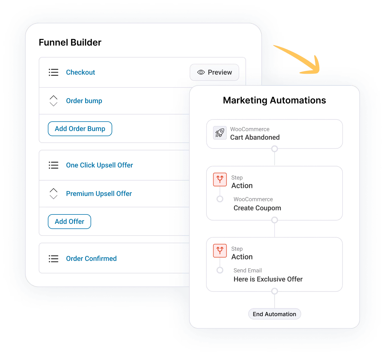
To customize the WooCommerce place order button without writing any code, we will use FunnelKit Funnel Builder.
FunnelKit replaces the default WooCommerce checkout with a modern, conversion-optimized checkout page that works with both classic and block-based stores.
It offers a range of customizable templates and powerful tools to help optimize the buying process, leading to more sales and conversions.
Ensure that you install and activate FunnelKit on your WordPress site.
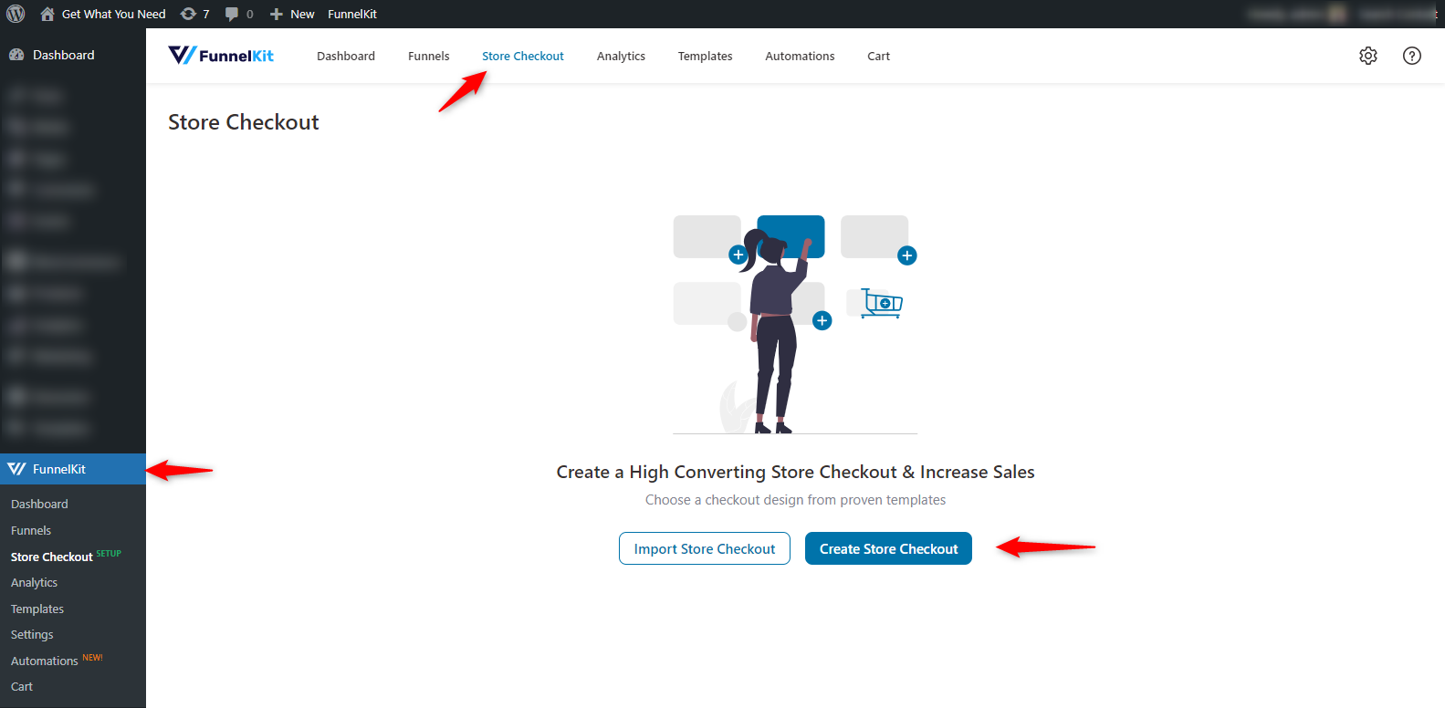
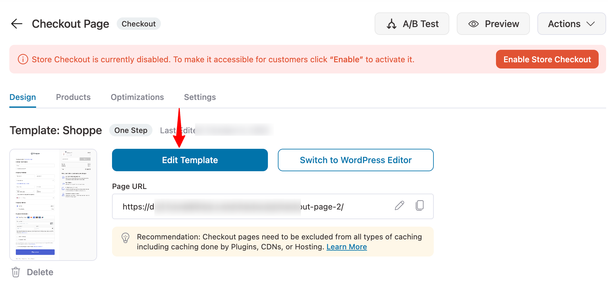
Step 1: Create a store checkout
First, navigate to FunnelKit ⇨ Store Checkout and click on the 'Create Store Checkout' button.
Choose your preferred template for your store’s checkout page.
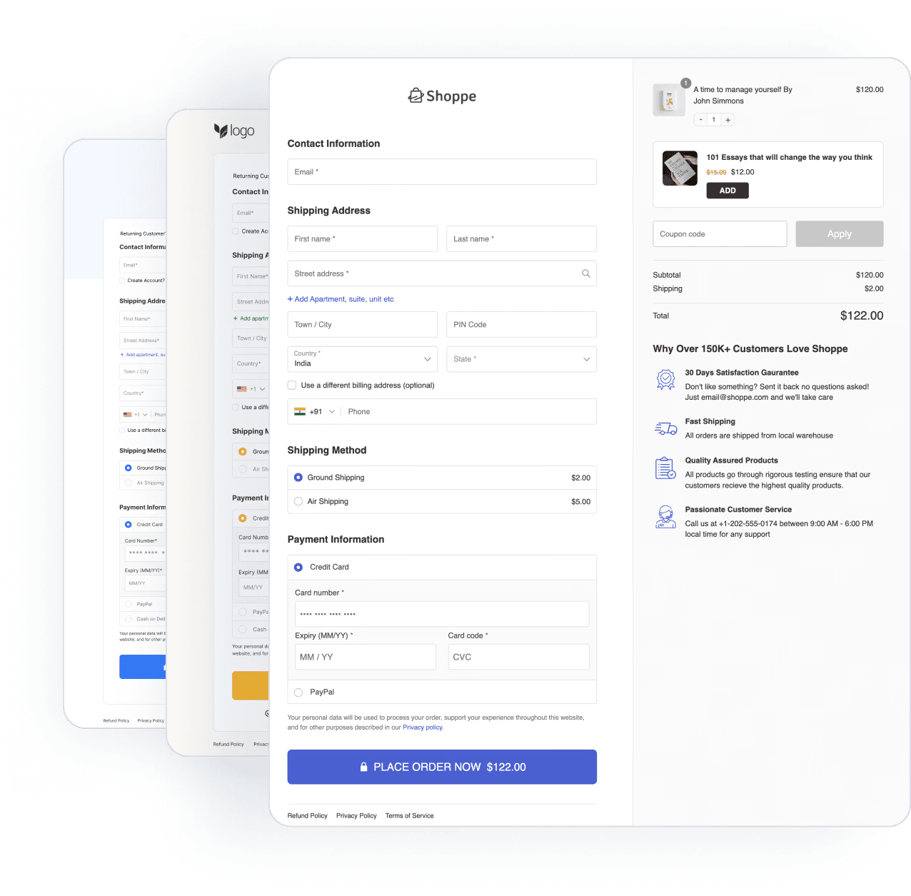
Let's go with the Shoppe template, a good option to start with.
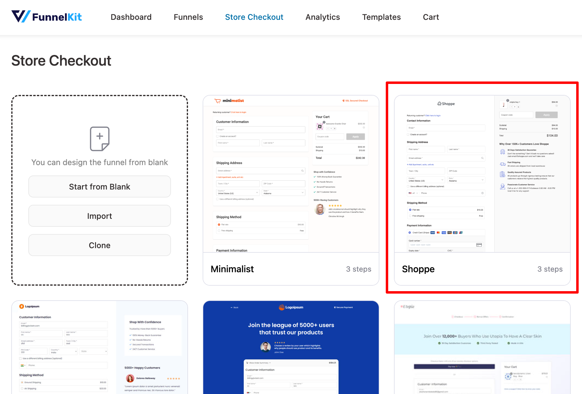
Here, you can see other pages related to this template. Check them one by one. Also, you can select how many steps you want in the checkout form.
Then, set the same on your store at checkout.
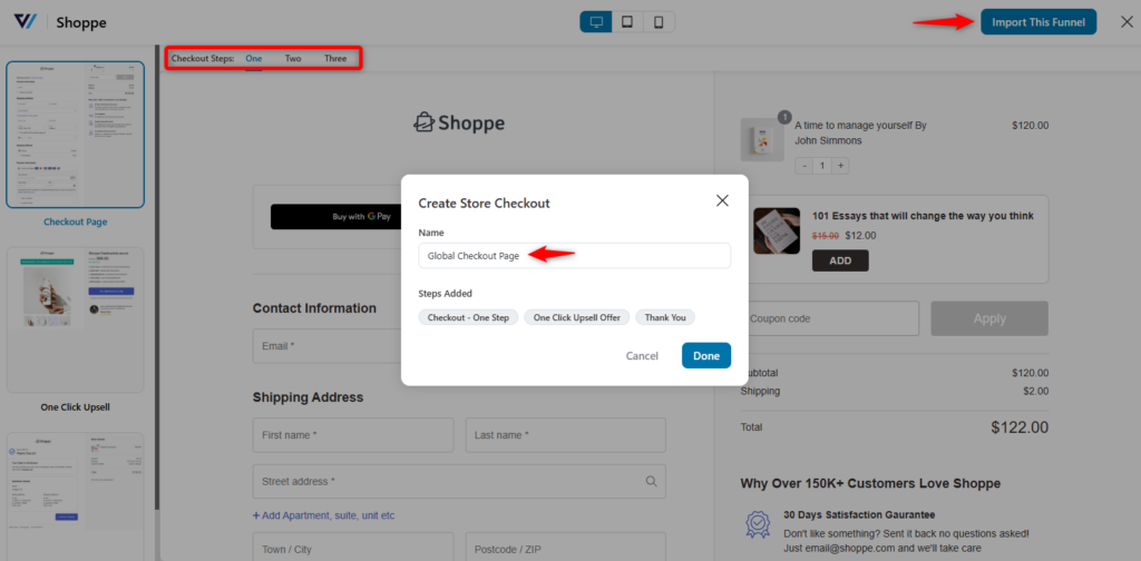
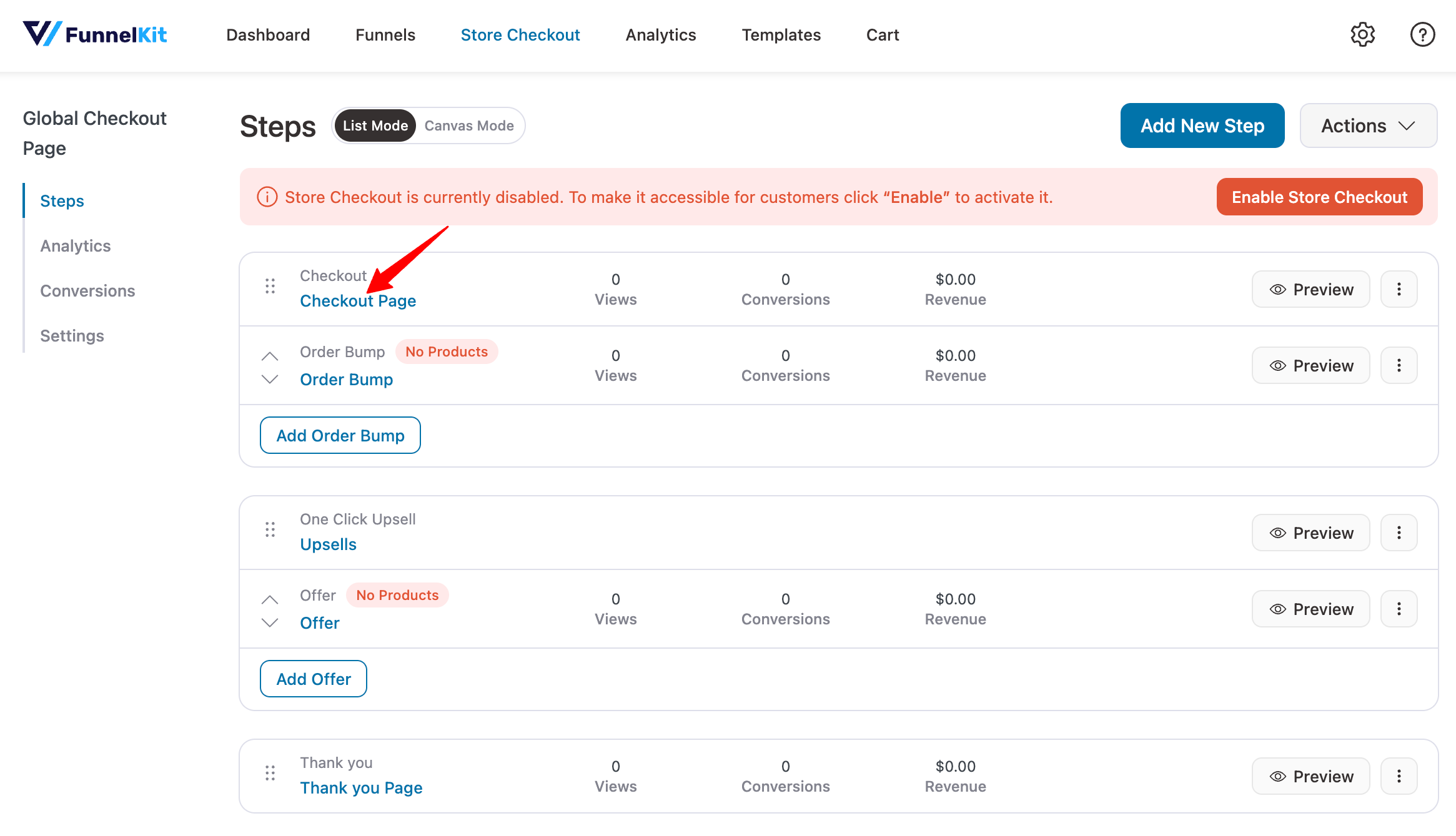
After adding the template, you can see that the pages inside the funnel are listed here.
Step 2: Design the checkout page template
Click on the checkout page to start customizing it.
Click the 'Edit Template' button to edit the checkout page.
Once you open the Elementor editing panel, you’ll get all the details to customize your checkout page.
You can edit two things in the editing panel: the Checkout form and the Mini Cart.
If you click the pen-like icon, you'll see the customization options in the editing panel (on the left side).
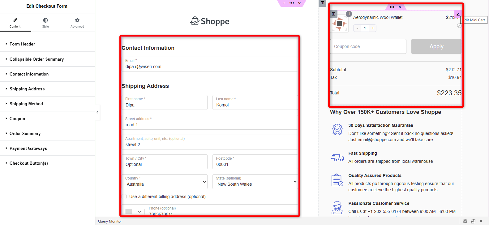
So, check each option one by one and customize your checkout page.
We have a dedicated post on customizing the WooCommerce checkout page.
👉 Alternatively, you can check out the video tutorial to unlock more information and ideas about creating a checkout page.
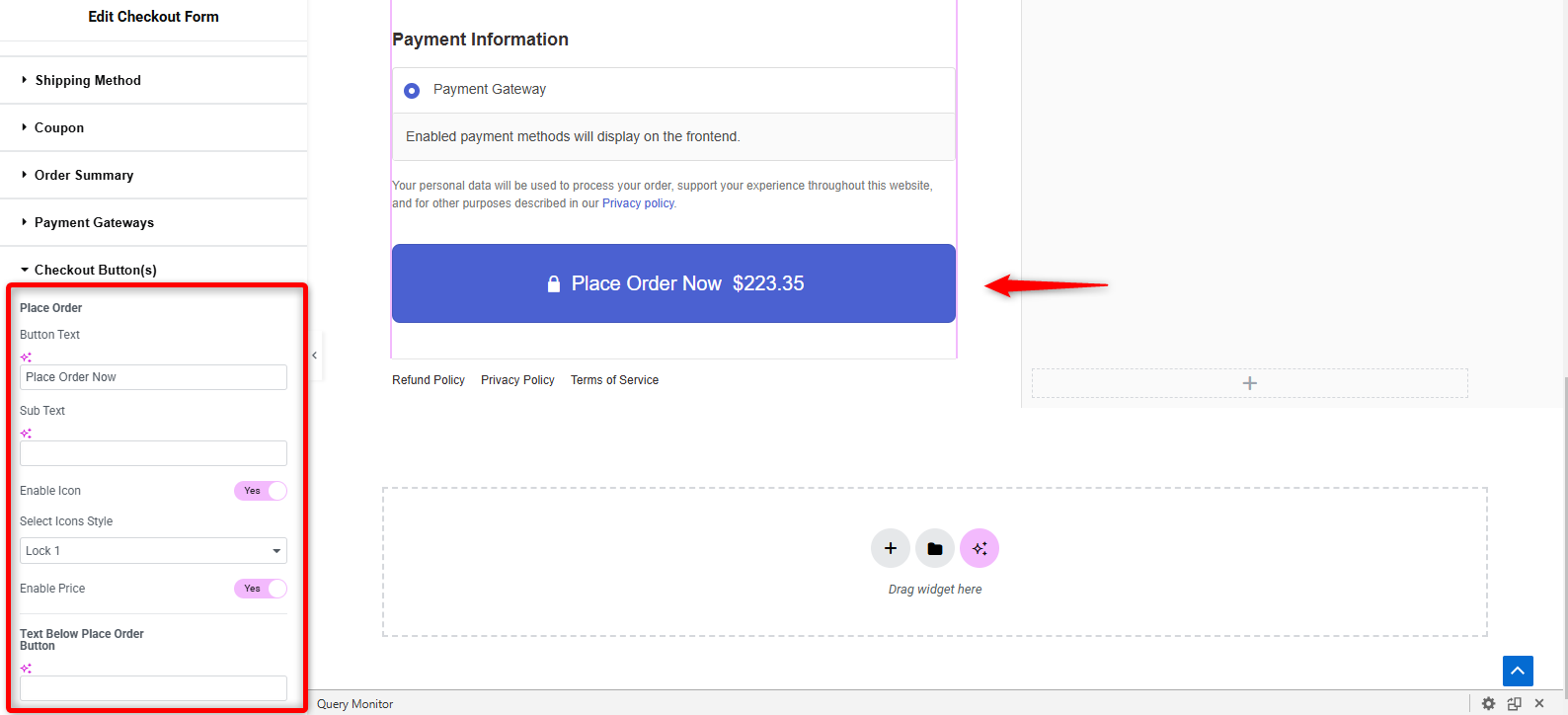
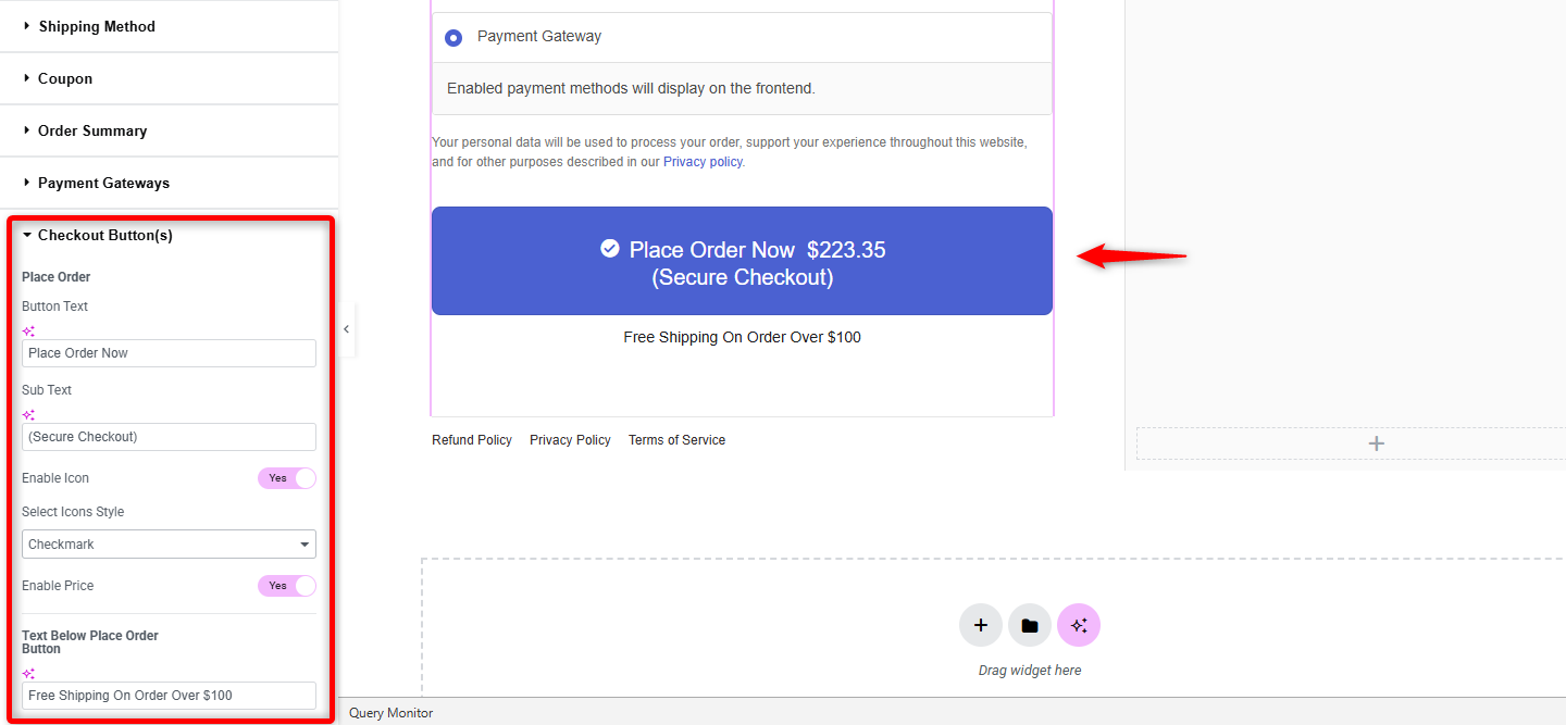
Step 3: Customize the WooCommerce place order button
Scroll down, and you’ll find the “Place Order” button. Also, on the left side, you’ll find the related options to customize the button.
Expand the collapsed option and check the possibilities.
Here, you can customize the:
- Button text
- Subtext (optional)
- Use the icon on the button
- Add the price amount to the button
- Add a text below the order button (optional)
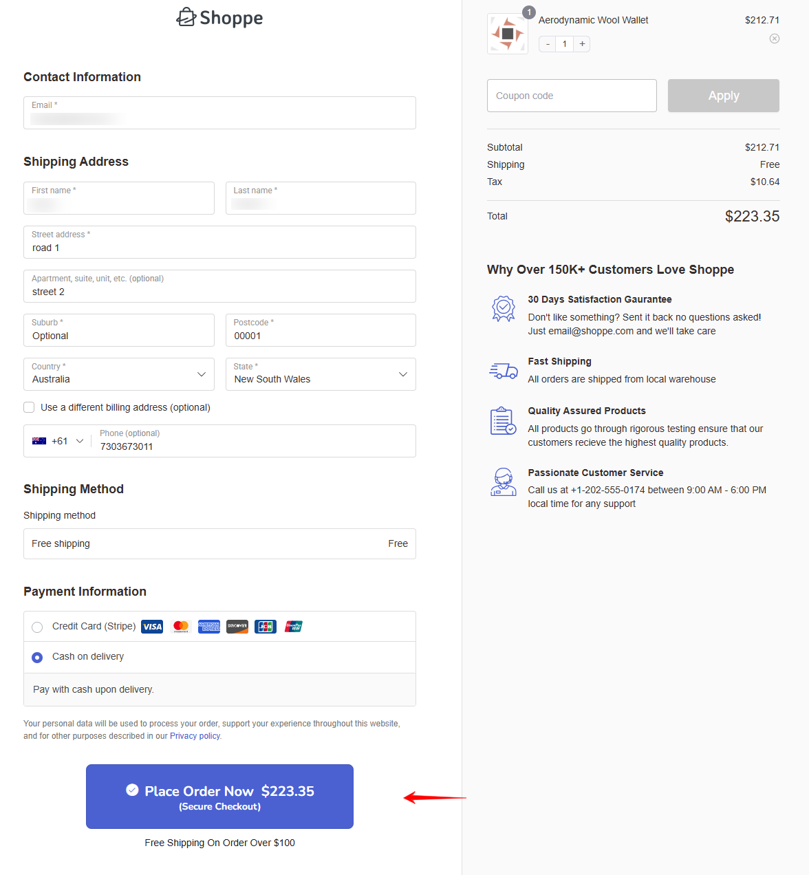
Let’s set the button:
- Button text: You can use different button text depending on your needs. In this case, we're using it: “Place Your Order Now”.
- Sub-text: Sub-text can provide users with additional context or reassurance, helping reduce any friction or hesitation before clicking the CTA. For that, we're adding a text like (Secure Checkout). It shows that the checkout process is secure.
- Enable the icon: Icons can enhance the clarity of the CTA button by making it more noticeable.
- Enable price: Display the total cart amount at the top to prevent users from scrolling down to check it, making the process quicker and more convenient.
- Text below place order button: The text below the "Place Order" button, often referred to as reassurance text or supportive text, provides additional information about the cart items.
Once you finish the content part, click the style icon to stylize the button.
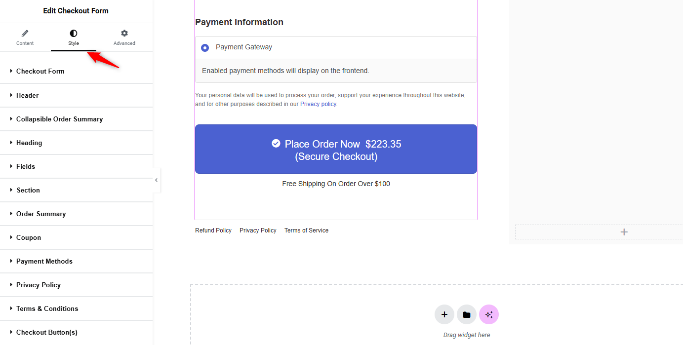
Expand it and apply the options one by one.
- Adjust the width of the button
- Select the typography
- Choose the button text color
- Button background and hover color
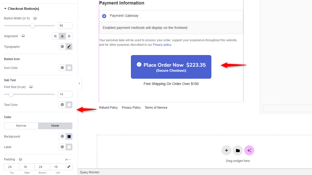
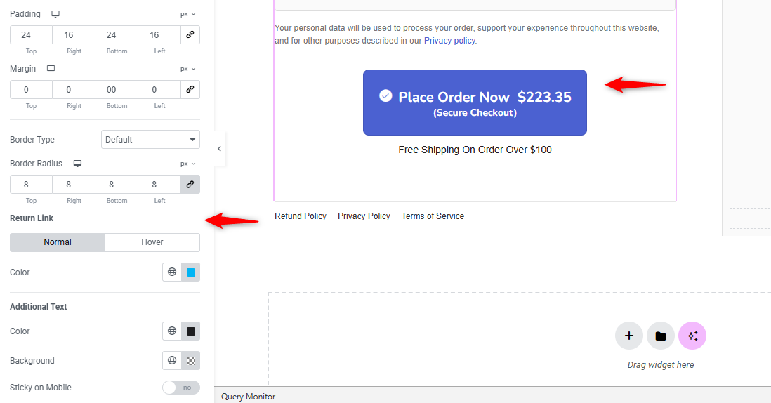
Here are some options for styling your WooCommerce place order button, such as padding, margin, border type, and border radius.
Make sure the place order button matches your brand tone and identity.
Once you’re happy with the design, hit the 'Publish' button.
Now, you need to enable and activate your store checkout. To do that, click on the 'Enable Store Checkout' button.
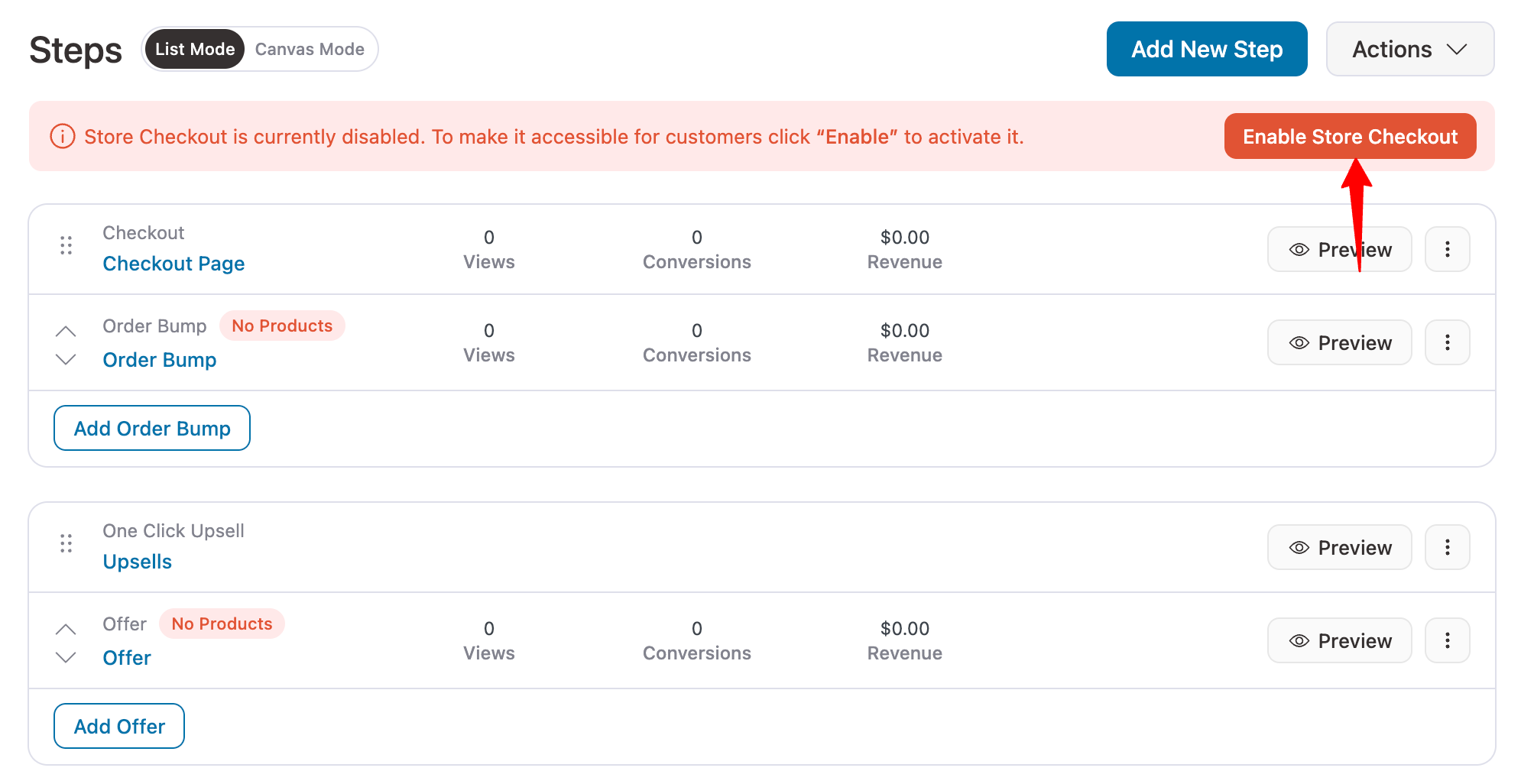
Now, test by adding items to the cart and proceeding to checkout.
You can see the WooCommerce place order button is working perfectly, along with other options.
This is how you can customize the WooCommerce place order button on your checkout page.
Method 2: Change the WooCommerce Place Order Button With Custom Code
If you prefer a code-based approach or just need to rename the button text without installing a plugin, you can use PHP filters and JavaScript depending on your checkout type.
Please note that you should always use a child theme or code snippets plugin when adding custom PHP. If you edit your parent theme's functions.php file, these changes will be lost on the next theme update.
For classic checkout (shortcode-based)
Change the button text using the woocommerce_order_button_text filter:
add_filter( 'woocommerce_order_button_text', 'custom_place_order_button_text' );

function custom_place_order_button_text() {
    return 'Complete Purchase';
}
This snippet changes the WooCommerce order button text from "Place order" to "Complete Purchase" across your entire checkout. Replace “Complete Purchase” with any text you want.
Change the button text conditionally based on product category:
add_filter( 'woocommerce_order_button_text', 'conditional_place_order_text' );

function conditional_place_order_text() {
    foreach ( WC()->cart->get_cart() as $cart_item ) {
        if ( has_term( 'bookings', 'product_cat', $cart_item['product_id'] ) ) {
            return 'Confirm Booking';
        }
        if ( has_term( 'donations', 'product_cat', $cart_item['product_id'] ) ) {
            return 'Donate Now';
        }
    }

    if ( class_exists( 'WC_Subscriptions_Cart' ) && WC_Subscriptions_Cart::cart_contains_subscription() ) {
        return 'Start My Subscription';
    }

    return 'Complete Purchase';
}
This code checks whether the shopping cart items belong to specific categories and adjusts the WooCommerce checkout button text accordingly.
It also detects subscription products if you are using a subscription plugin. This is especially useful for stores that sell a mix of products, such as physical goods, digital downloads, bookings, etc.
For block checkout (Gutenberg-based)
WooCommerce provides a JavaScript filter API for block checkouts.
Use the __experimentalRegisterCheckoutFilters API to change the button label:
import { __experimentalRegisterCheckoutFilters } from '@woocommerce/blocks-checkout';

__experimentalRegisterCheckoutFilters( 'my-plugin', {
    placeOrderButtonLabel: () => 'Confirm Booking',
} );
This method works within the block checkout framework without breaking the UI.
There were many community discussions related to this.
Avoid using JavaScript DOM manipulation (such as MutationObserver or direct textContent replacement) to change the block checkout button text.
The block checkout renders with React, and modifying the DOM directly can cause errors such as "Failed to execute 'insertBefore' on 'Node'" and break the checkout flow entirely.
Always use the official WooCommerce Blocks filter API.
To use this filter, you need to create a small JavaScript file, enqueue it with the wc-blocks-checkout dependency, and register it as a block integration.
Refer to the WooCommerce developer documentation for the full setup process.
7 Best Practices for Optimizing the WooCommerce Place Order Button
Here are some best practices to help you get the most out of your “Place Order” button:
- Use specific, action-oriented button text
Research shows that action-oriented CTA language can increase conversions by up to 121% compared to passive alternatives.
Therefore, replace generic labels with text that tells customers exactly what will happen, such as "Complete My Order" or "Pay $49.99 Now".
Always avoid using vague words like "Submit" or "Continue".
- Use a high-contrast button color
Choose a button color that stands out from the rest of the page to grab attention. Make sure the text color contrasts nicely with the button color for readability.
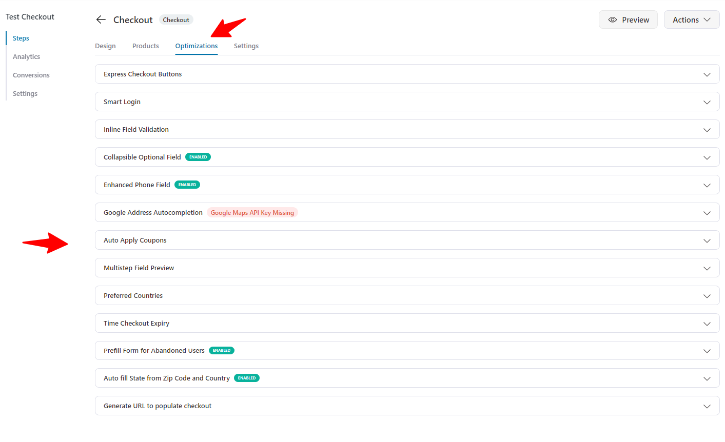
Once that's done, make sure to optimize your checkout for quick conversions.
Add functionalities, such as express payment buttons, Google address autocomplete, smart login, collapsible optional fields, and more.
- Add a sense of urgency
Phrases like "Order Now" or "Buy Now" can encourage immediate action. Adding a countdown timer can also create urgency.
Furthermore, showing the exact amount on the button itself, such as "Pay $67.00 Now", eliminates last-second price surprises.
- Optimize the button size for mobile
A majority of eCommerce traffic comes from mobile users. Make sure your WooCommerce checkout button is at least 44 pixels tall (per web accessibility guidelines).
This helps you span the full width of the screen on mobile, and has enough padding around it to prevent accidental taps on nearby elements.
Test its appearance and functionality on various screen sizes.
- Prevent duplicate orders with loading states
There is a common frustration among shoppers who double-click the place order button when the page appears slow, resulting in duplicate orders.
Ensure your checkout disables the button after the first click or shows a loading spinner.
Some of the enhanced checkout managers, such as FunnelKit, handle this automatically.
- Ensure the button is accessible to all users
Use alt text, proper labeling, and keyboard navigation to make the button accessible to all users, including those with disabilities.
Accessible checkouts serve more customers and comply with web accessibility standards.
- A/B test different button variations
Test different versions of your checkout page buttons (text labels, colors, sizes, and positions) to determine which one performs best.
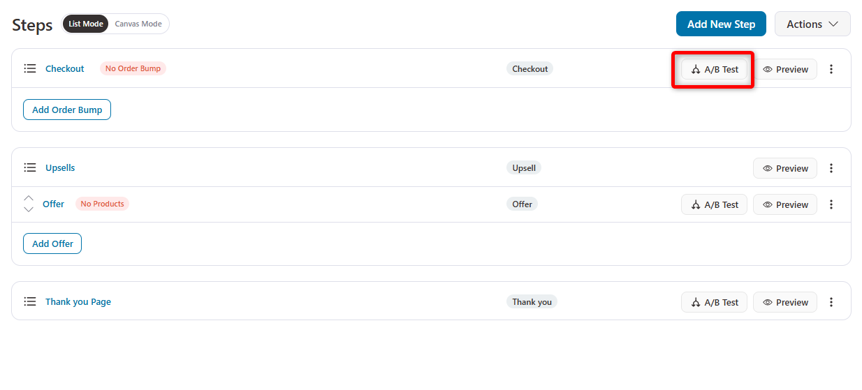
Even small changes like swapping "Place order" for "Complete Purchase" can produce measurable differences in conversion rate.
Frequently Asked Questions (FAQs) About WooCommerce Place Order Button
Optimizing the WooCommerce “Place Order” button can make a noticeable impact on your conversion rates.
Start by customizing the button text to make it more action-driven, for example, use “Complete Purchase” instead of the generic “Place Order.” Next, ensure the button looks great on all devices by applying responsive design techniques.
Finally, run A/B tests to compare different styles, colors, and wording to see which version encourages the most checkouts.
Yes, you can easily change the text of the WooCommerce Place Order button using custom PHP code or through plugins like FunnelKit.
Customize the text to suit your store's branding and create a more engaging call to action, such as "Complete Your Purchase" or "Secure My Order.
Mobile optimization ensures that the WooCommerce Place Order button is easy to click on all devices, especially smartphones.
Given that a large percentage of online shopping occurs on mobile devices, ensuring your button is responsive and visible across all screen sizes can significantly reduce cart abandonment and improve conversions.
The color of your Place Order button should align with your brand colors, website theme, and user experience goals. It’s important to choose a color that stands out on the checkout page but also complements your overall design.
For example, if your brand uses a green-and-white color scheme, a green Place Order button will provide a seamless, branded experience while encouraging trust and action.
Yes, you can enhance the Place Order button with icons to make it more visually appealing and engaging for users. Tools like FunnelKit make it easy to add icons to the button.
However, using images is generally not recommended, as it can increase load times and clutter the button, affecting clarity. Icons are a cleaner and faster option, providing a better user experience while maintaining a sleek, functional design.
To test the effectiveness of your Place Order button customization, use A/B testing. You can test different designs, colors, or button placements and track conversion rates for each version.
The version with the highest conversion rate is usually the most effective. By running regular A/B tests, you can continually optimize your checkout process to deliver the best user experience and improve sales performance.
The most common causes are JavaScript conflicts with other plugins, missing or misconfigured payment gateways, caching issues that serve stale checkout pages, and theme compatibility problems.
Start by switching to the Storefront theme and deactivating all plugins except WooCommerce to isolate the issue. If the button works in that setup, reactivate plugins one at a time to find the conflict. Also, check that at least one payment method is enabled and your API keys are correct. See our full troubleshooting section above for detailed fixes.
Start Converting More Customers With a Better WooCommerce Place Order Button!
We covered two methods for customizing your WooCommerce place order button, along with CSS styling snippets for both the classic and block checkouts.
Customizing this button is a simple yet powerful way to enhance your online store. By making it more appealing and user-friendly, you can enhance the shopping experience, decrease cart abandonment, and ultimately boost sales.
Tools like FunnelKit Funnel Builder simplify the customization process, offering many options to match your brand's identity.
So, don't hesitate to make these tweaks. A slight change can greatly affect how your customers interact with your store.
Happy customizing, and may your sales soar with the WordPress funnel builder FunnelKit.

Editorial Team
July 7, 2026Are you looking for WooCommerce checkout optimization hacks to streamline your users' shopping experience? 7 out of 10 shoppers who reach a WooCommerce checkout leave without paying; according to Baymard...
Editorial Team
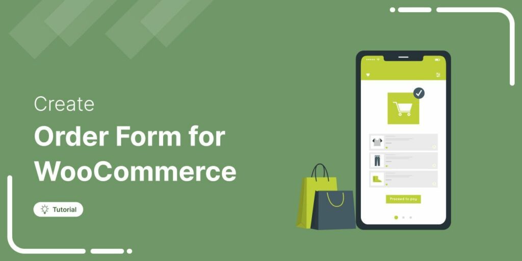
July 6, 2026A WooCommerce order form lets customers select multiple products, set quantities, and choose variations from a single page instead of visiting individual product pages. There are two ways to add...
Editorial Team
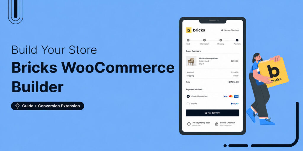
July 6, 2026The Bricks WooCommerce builder is built directly into the Bricks theme. Activate the free WooCommerce plugin, and Bricks unlocks more than 30 store-specific elements plus visual templates for every part...