We’re excited to announce that the new version of the FunnelKit Funnel Builder is here!
Introducing the FunnelKit Funnel Builder Version 2.14 - your secret weapon to dominate your checkout page like never before.
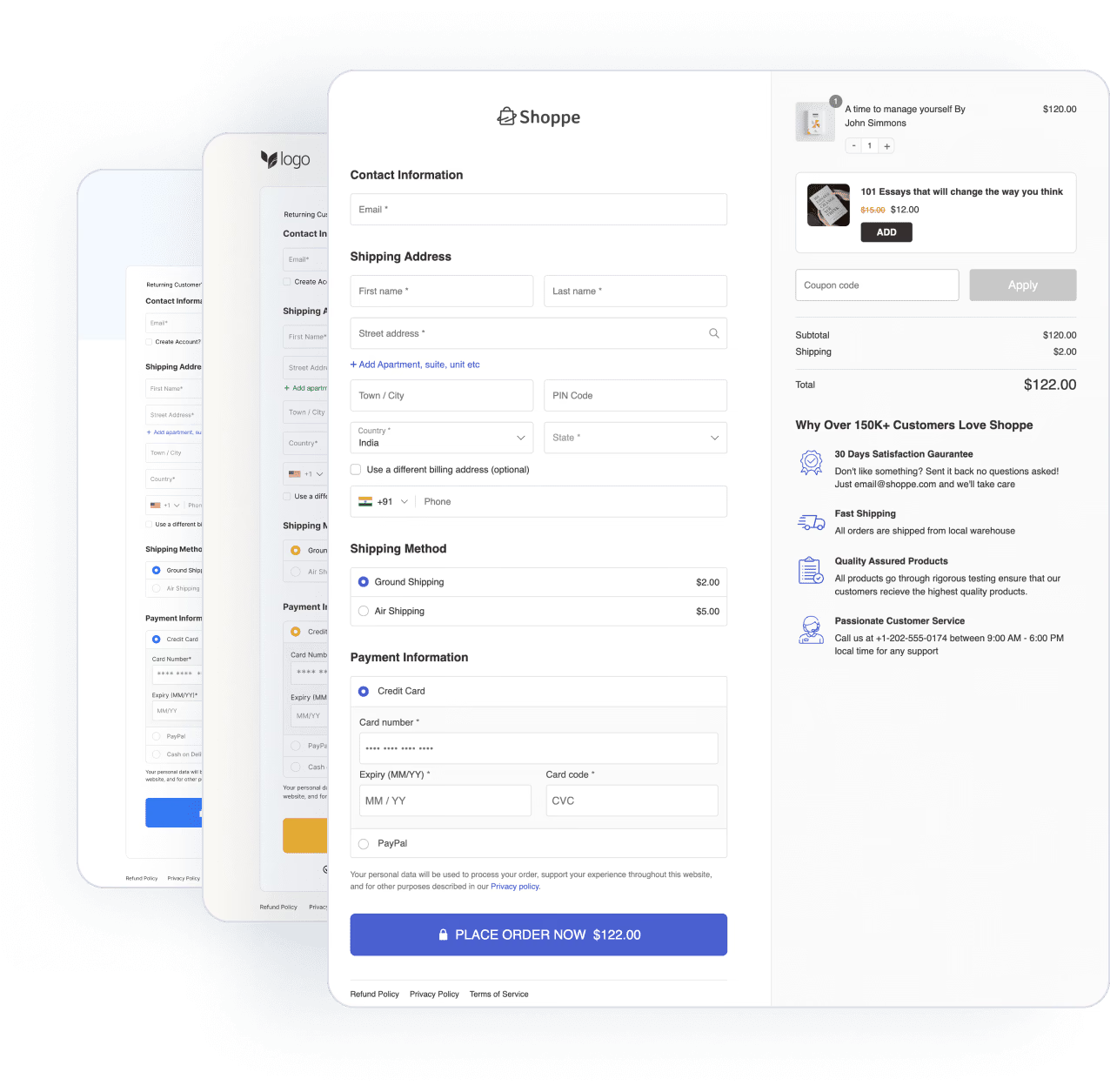
The new version features an overall improved styling of your checkout pages.
It enables you to pay attention to those micro-interactions that make your checkout pages convert even higher.
Let’s explore the new features and optimizations it has in store for you.
Table of Contents
- 1 Enhancement 1: Inline Validation Extended to All the Checkout Form Fields
- 2 Enhancement 2: Improved Styling of Address Dropdown
- 3 Enhancement 3: Collapsible Optional Fields on the Checkout
- 4 Enhancement 4: New Phone Field Tooltip
- 5 Enhancement 5: Enhanced Templates
- 6 Enhancement 6: Simplified the Checkout Page Styling for a Modern Feel
- 7 Are You Ready to Boost Your Store’s Conversions with FunnelKit Funnel Builder 2.14?
Enhancement 1: Inline Validation Extended to All the Checkout Form Fields
If you’re a Funnel Builder user, you must have profited from capturing the correct email addresses of your shoppers with the help of inline validation of the email fields.
You successfully captured those email addresses for automating your cart abandonment sequences, post-purchase interactions and sending email broadcasts.
We’ve extended this inline validation to all the checkout form fields in this update.
Now, when a user clicks out, they’ll notice an inline prompt to let them know they’ve missed out on a required field.
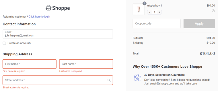
This ensures a smoother and error-free checkout process for your shoppers.
Enhancement 2: Improved Styling of Address Dropdown
Google Address Autocomplete is definitely a powerful feature that provides a seamless checkout experience to your users.
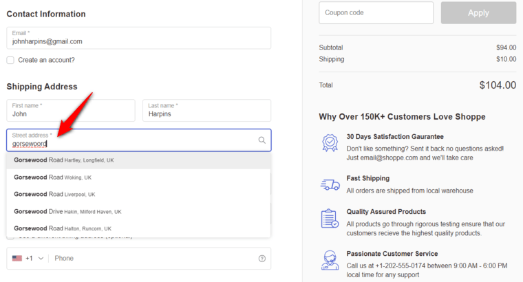
It shows up complete addresses automatically once a user starts typing their addresses. Once they select an address, it automatically fills the street address, city, zip code, state, and country fields.
If you’ve set up and enabled Google Address Autocomplete on your checkout page, it now shows an indication of a search icon.
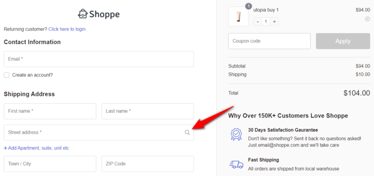
This small indication lets users know they can select the address from a dropdown list once they begin typing their addresses on the checkout page.
You’ll notice an improved styling of address suggestions here:
Enhancement 3: Collapsible Optional Fields on the Checkout
FunnelKit Funnel Builder 2.14 introduces the collapsible optional fields on the checkout.
It provides a user-friendly way to collect additional information from users without overwhelming them with a long and cluttered checkout form.
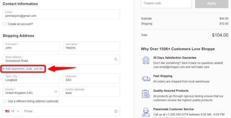
For example, you can provide the collapsible optional field for users to enter their apartment number and floor for a smooth order fulfillment process.
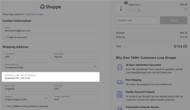
This is a brilliant way for users to add their information, keeping the checkout form concise.
Enhancement 4: New Phone Field Tooltip
A lot of users ask the reason for providing their contact numbers on an optional phone field. That’s where a tooltip can be used to provide the reason for giving them their phone numbers.
Obviously, this text can be configured and changed from the backend.
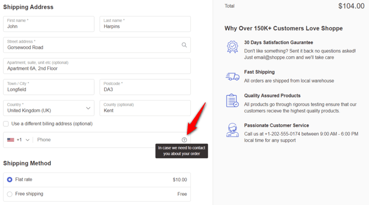
This tooltip helps capture more phone numbers and assists in following up with your users later.
Enhancement 5: Enhanced Templates
FunnelKit is known for creating enhanced checkout templates and optimizing the WooCommerce store for user experience and conversion.
Over the years, we’ve successfully brought intuitive, visually appealing, and efficient designs to our template library.
Let’s look at three templates that got a lot sharper with this update:
- Shoppe template
Your lovable WooCommerce Shopify checkout page has been enhanced to convert better and comes with all the modern elements for a great user experience.
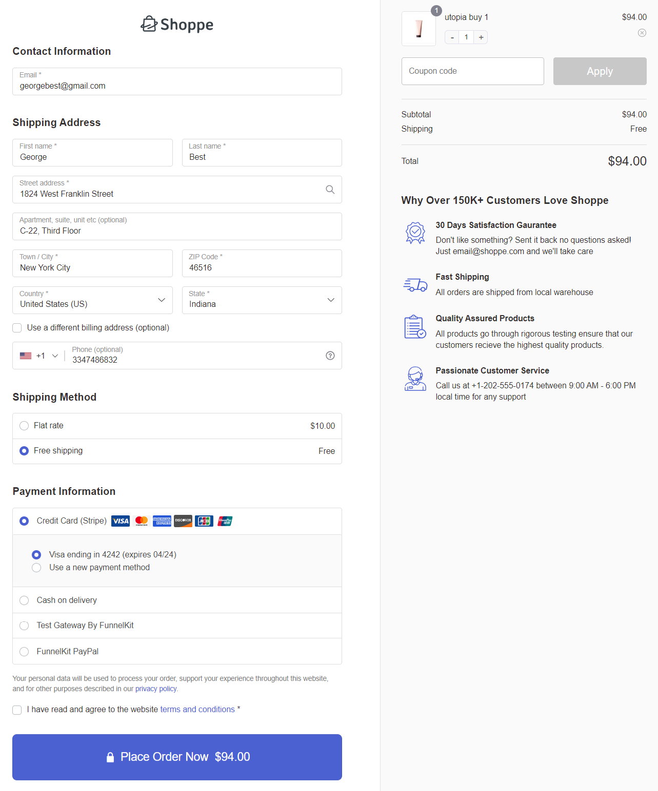
Feel free to customize the mini cart on the checkout page as per your needs.
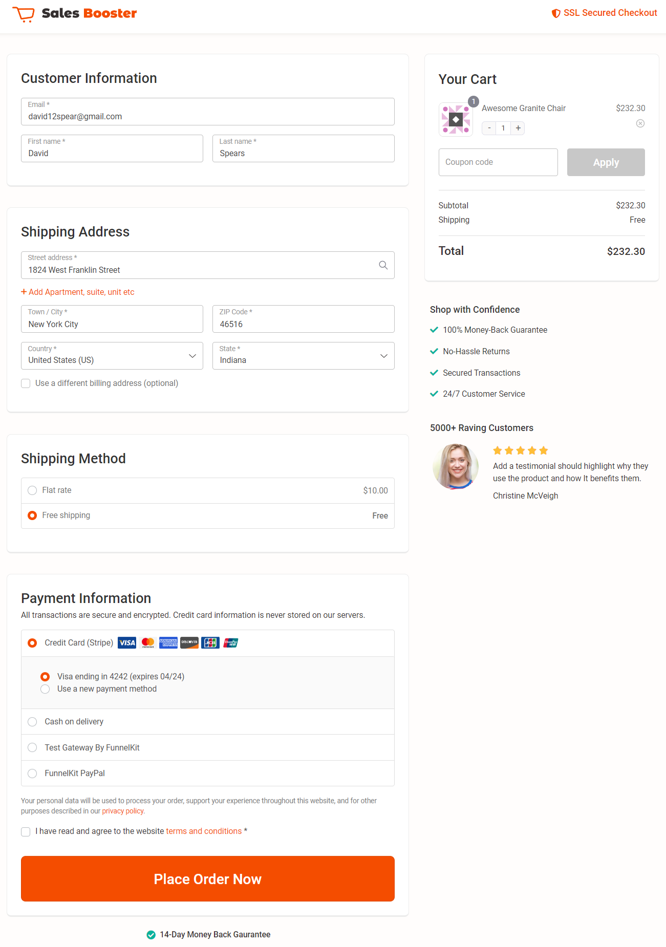
- Minimalist template
The Minimalist template is widely used for global checkouts that replace the default WooCommerce checkout page. Whether you sell physical or digital products, it's suitable for everything!
- Optic template
Optic template is highly suitable for one page checkouts but you can split it into multi-step page as well.
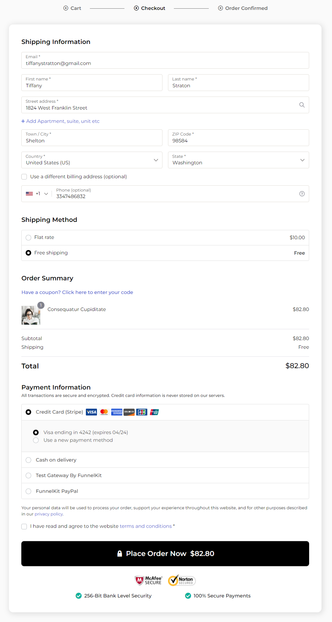
We're also working on improving the rest of our templates and planning to bring some new templates too!
Enhancement 6: Simplified the Checkout Page Styling for a Modern Feel
Here are some of the checkout page styling that we did to provide a modern feel and look:
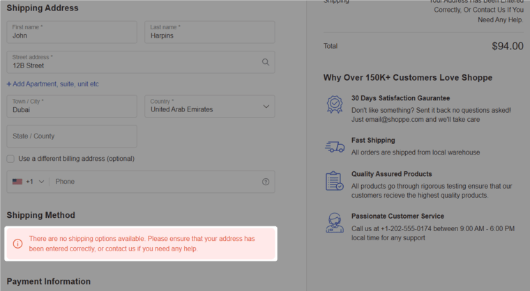
- Shipping method prompt
We’ve added a clear and more prominent prompt to display when a shipping method is unavailable for a shipping address.
That’s where they can select the correct shipping address to get all the shipping methods displayed on their screen.
- Managing sizes and spaces
We’ve made many subtle tweaks and improvements on the checkout page.
For that, we’ve efficiently managed the white spaces and element sizes to make your checkout page look cleaner than before.
There are many other minor improvements and optimizations that are difficult to list here. But you’ll like it once you start setting up your checkout pages with the FunnelKit Funnel Builder.
Let us know which enhancement you liked the most!
Obviously, we’re continuously monitoring thousands of processes to rigorously improve our checkout pages. This is just phase 1 of the release - we’ll make our checkouts even sharper in the coming days.
Are You Ready to Boost Your Store’s Conversions with FunnelKit Funnel Builder 2.14?
These were the four new features we released in the Funnel Builder Version 2.14.
Each of these features has been developed to enhance micro-interactions that drive conversions on the checkout pages, making your selling experience even better.
Your success is our mission and Funnel Builder Version 2.14 is the ultimate tool in your arsenal to achieve it.
So why wait?
Update to the latest version of the Funnel Builder now and get ready to experience skyrocket conversions in your store.
If you’re not a FunnelKit user yet, experience it here >>
Editorial Team
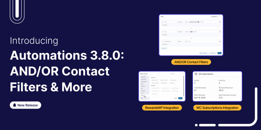
April 9, 2026We're thrilled to announce that FunnelKit Automations 3.8.0 is now live! And this one packs some serious firepower. This release turns FunnelKit Automations into a full-fledged CRM-grade targeting engine. You...
Editorial Team
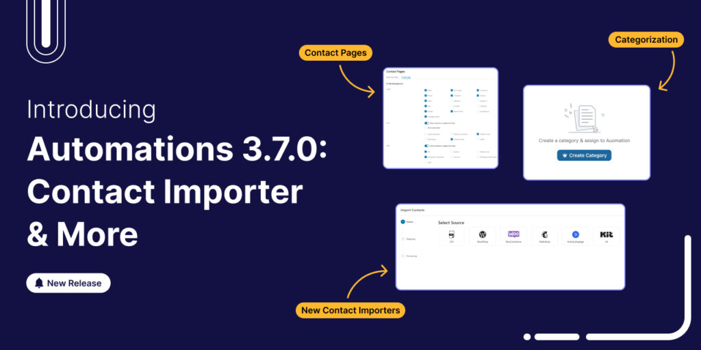
January 22, 2026FunnelKit Automations 3.7.0 is here! 🎉 And it brings meaningful improvements that make building and managing your marketing automation easier than ever. This release is all about giving you more...
Editorial Team
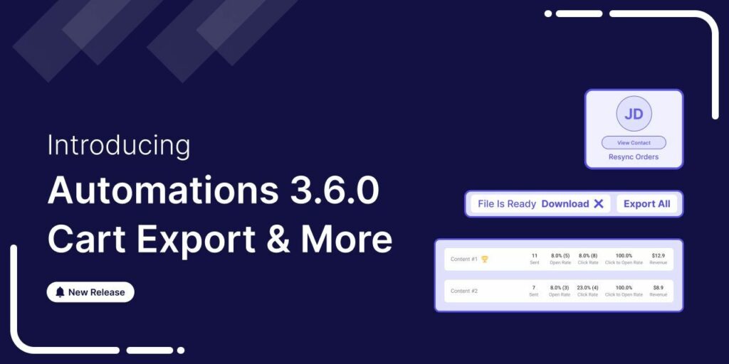
June 9, 2025FunnelKit Automations 3.6 is here, and it’s packed with powerful features to help you grow smarter and faster. With this release, you can: Export abandoned cart data with a click...

