Are you looking for email opt-in ideas that convert visitors into leads?
If you own an online business, chances are your opt-in box still says - "Subscribe now".
The problem is no one's willing to give their email away for something as bland as that.
You need to have a better opt-in email marketing strategy. You need to offer something valuable to users so they give you their email address in return.
Creating email opt-in is an effective way to supercharge your email list growth.
But what should you offer as your opt-in freebies or lead magnet?
Honestly, there are plenty of options depending on your business’s niche.
Here in this blog, we will share 13 email opt-in ideas that will help you grow your email list.
So, keep reading…
Table of Contents
- 1 What is an Opt-In and What are opt-in freebies?
- 2 How to Find Opt-in Freebie Ideas for Your Business?
- 3 13 Email Opt-In Ideas to Boost Your Email List
- 3.1 1. Discounts & Coupon Codes
- 3.2 2. Free Gift With Purchase When They Sign Up
- 3.3 3. Birthday Gift
- 3.4 4. Early Access To Store Promotions
- 3.5 5. How-to Guides or Ebooks to users
- 3.6 6. Free Printables or Downloadables
- 3.7 7. An Early Access To Limited Edition Items & Deals
- 3.8 8. Infographics
- 3.9 9. Email Course
- 3.10 10. Template
- 3.11 11. Checklist
- 3.12 12. Resource Library
- 3.13 13. Webinars
- 4 How to Grow Your Email List With Opt-in Freebies Using a Lead Generation Funnel?
- 5 Boost Your Email List with Multiple Email Opt-in Ideas Using FunnelKit
What is an Opt-In and What are opt-in freebies?
An opt-in refers to a process where individuals willingly give their email addresses and permission to receive certain emails in exchange for something valuable.
And, these valuable incentives offered to potential subscribers or users in exchange for their opt-in or contact information are called opt-in freebies or lead magnets.
These freebies are designed to provide value and attract individuals to sign up for a newsletter, join a mailing list, or become part of a community.
Some of the popular opt-in freebies include:
- E-books guides
- Templates
- Checklists
- Video tutorials
- Exclusive content
- Discounts,
- Access to a resource library and so on.
It is commonly used in marketing and online platforms to build subscriber lists or gather contact information from users who are interested in a particular product, service, or topic.
By offering valuable content or exclusive benefits, businesses and marketers can build a list of engaged subscribers who have expressed interest in their offerings. This list can then be used for future marketing efforts, such as sending newsletters, promotional emails, or updates to subscribers.
How to Find Opt-in Freebie Ideas for Your Business?
Finding opt-in freebie ideas for your business is a process because a lot of things need to be considered before coming up with ideas that will work. Here are some of the steps you can follow:
- Understand your target audience: Start by gaining a deep understanding of your target audience's needs, desires, and pain points. Your best chance of getting that desired email is to help users solve their problems.
Once you know the user’s problem or pain point, you can offer something to solve those issues.
- Conduct market research: What will allure your audience to give out that email address in many ways depends on the industry you belong to and what’s trending as well.
So, do your market competitors' research to identify what types of opt-in freebies are popular and successful. Look at what your competitors are offering as lead magnets and assess the reception and engagement they receive.
- Brainstorm relevant topics: Based on your understanding of your target audience and market research, brainstorm a list of topics that are relevant to your business and resonate with your audience.
Consider what information, resources, or solutions would be most valuable to them. You can assemble ideas using Google, Pinterest, Etsy, etc.
- Utilize customer feedback: Reach out to your existing customers or subscribers and gather feedback on what type of content or resources they would find helpful.
This direct input can provide valuable insights and inspire opt-in freebie ideas that align with their preferences.
- Try out different ideas: Once you have generated a list of opt-in freebie ideas, test them with a small segment of your audience to gauge their interest and effectiveness.
Analyze the results and iterate based on the feedback you receive. It’s always a good idea to trust data rather than your gut feeling.
If you need help with a starting point, let’s look at the email opt-in ideas we shared in the next section.
13 Email Opt-In Ideas to Boost Your Email List
Now let’s look at some opt-in offer ideas or lead magnet ideas that you can use for your physical products store.
Let’s dive in.
1. Discounts & Coupon Codes
Coupon codes pave the shortest path to the sale because people can encash them almost instantly. It’s one of the most effective email opt-in ideas to get contact information from users.
Here’s an example where the subscriber gets a discount of 15% on signing up to the list:
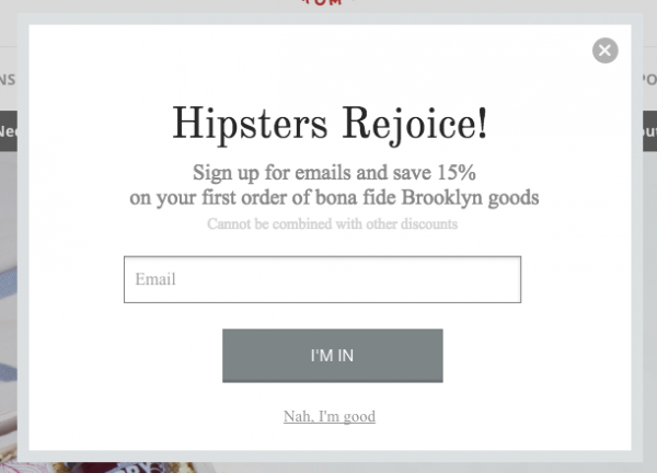
Notice the headline - it’s short, crisp, and attention-grabbing.
Also, the store has something great to offer here - it’s not a 5% or 10% but a 15% discount.
In fact, the call to action button doesn’t feature bland and robotic language like - ‘Sign up’. Instead, they’ve used ‘I’M IN’ which is specific.
2. Free Gift With Purchase When They Sign Up
Who doesn’t like free gifts?
Luring your visitors with a free gift is a good email opt-in idea because people will easily give their email addresses in exchange for a free gift.
Take a look at an example of this:

The colors are quite vivid and the offer is crystal clear. A study published by Sumo.com analyzed over 2 Billion pop-ups and revealed that being unclear with your headline - significantly lowers the conversion rate.
Notice the language is warm and conversational. It’s like how a real store owner would talk to a visitor.
3. Birthday Gift
Using a time-bound time-bound popup is quite effective. You can use it when your store’s birthday/anniversary is coming up. Promise users a gift in exchange for their email.
Let users sign up so that you can send them a special gift during your birthday sale. It also helps generate hype.
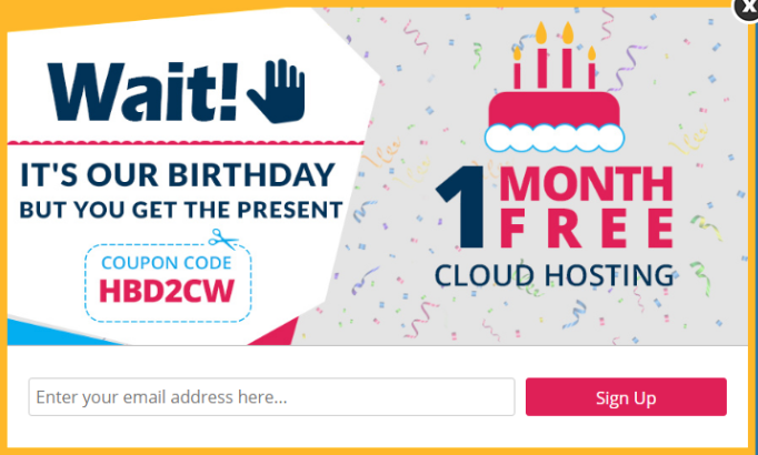
They’ve created a unique offer - a one-month free cloud hosting service.
4. Early Access To Store Promotions
A good way to collect emails for your store is by offering them early access to your upcoming promotions. You can ask users to get on the list to receive early access to your new arrivals, festive discounts, and sales.
Let’s look at an example.
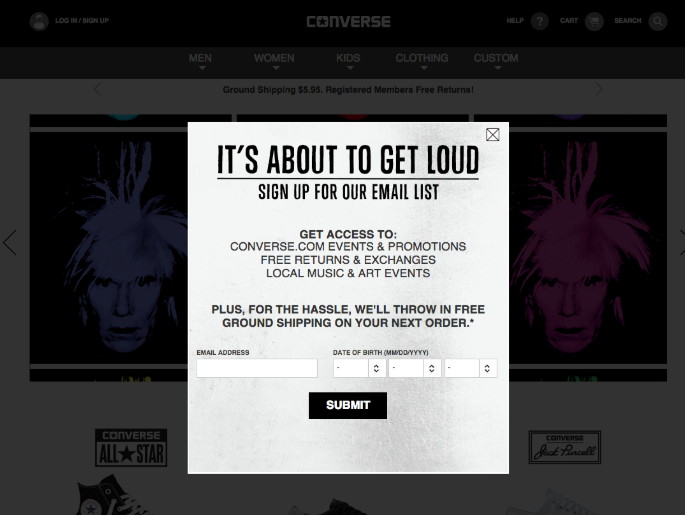
This is an email opt-in offered by Converse and it comes with early access to their events and promotions and even free returns and exchanges. Notice how they’ve highlighted free ground shipping which they’re offering as a bonus for signing up! Quite a genius technique there.
However, the CTA could be more desirable, something like - “Tell me about your promos please”, or "Yes! I wanna save some moolah".
5. How-to Guides or Ebooks to users
Who doesn’t want some useful tips and knowledge related to a product? Everyone does! You can design a short ebook that they can refer to.
Here are the top benefits of this email opt-in offer:
- Easy-peasy to create- You don't need to write scores of pages in a free ebook. 5-10 pages are good enough. Think of how you can offer value to your customers.
- Can be distributed easily - You can simply upload these on your WordPress website or put them in Google Drive and send a private link via email.
- Easy to consume: Ebooks can be downloaded and viewed on most devices quickly and painlessly.
Take a look at an example of an ebook as an opt-in offer:
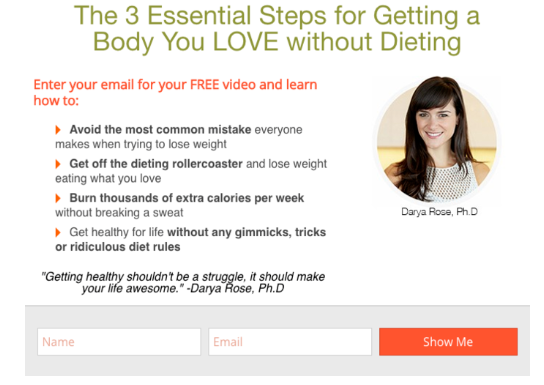
In the research, Sumo.com found that using personality increases pop-up conversion - so if you represent your business, it may be a good idea to use your picture.
Another interesting fact they found was that the more content on your pop-up, the better it will convert.
In this case, Darya lists the benefits of downloading the guide and focuses on what people will learn.
6. Free Printables or Downloadables
The best part about printables is that people can print, personalize, and use them the way they want. This offer works better than an ebook where the interaction is only one way and there’s nothing that you can do to personalize them except print and scribble.
You can offer stickers, notecards, planners, worksheets, print art, etc.
Let’s look at an example:

The visuals are vivid and the colors are popping-out- they stand apart and capture attention.
7. An Early Access To Limited Edition Items & Deals
People love to feel exclusive, so offer them a chance to join your special club or tribe.
Take a look at this pop-up, it stands out not just because of the content but also because of its vivid colors and eye-catching design:
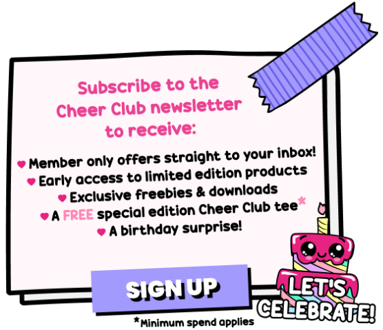
There's so much they're offering prospects in return for signing up to their exclusive club - it's a good idea to call your email list by a name like "Cheer Club" in this case.
However, there’s one catch here with the FREE limited edition tee - minimum spend applies, so you can decide what works best in your case.
8. Infographics
Infographics are a great way to offer a lot of information in a compact and attractive way. Such assets are a great lead magnet, especially for a niche that focuses on visual learning.
Have a look at this example below:
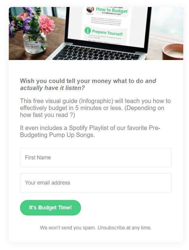
This opt in offers a visual guide with infographics as a freebie in exchange for contact information. It also emphasizes how it will teach them something in just 5 minutes or less. The CTA also stands out because it’s unique and to the point.
9. Email Course
An email course is an excellent opt in idea to offer your users that will explode your email list. Usually, an email course is simply an automated series of educational emails sent after opt in to teach users something. It’s a much easier option than offering a video course.
Here is an example of opt in form that offers a mini email course:
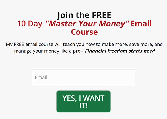
This email beautifully highlights the offer in bold letters. It also describes the benefit of this course in 2 lines in an impactful way.
Mentioning that it’s only a 10-day course will push users to opt for this freebie as it ensures it will be a short mini-course.
🔔 You can easily offer an email mini-course via an email drip campaign using FunnelKit. To learn more, read our blog 👇
“How To Create An Email Course That Gets Subscribers and Sales”.
10. Template
Prebuilt- templates are highly in demand as it saves users time and takes much less effort to do the task. That’s why offering templates is one of the best email opt in ideas.
Let’s have a look at this example:
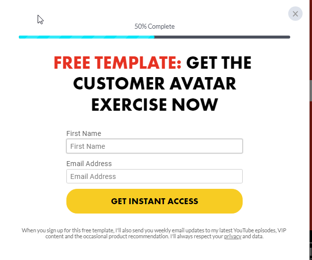
This opt in form pops up after you click on the CTA button expressing your interest in the free templates. The white background with the bold font really makes this form stand out. Also, the progress bar works as a psychosocial motivator for users to give out their contact information and complete the process.
11. Checklist
Checklists are highly valuable because they simplify and consolidate necessary information or items, providing a user-friendly resource. They offer a practical and convenient way to access everything an individual needs or should know.
Here is a checklist opt in example:
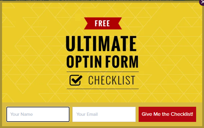
This is a solid opt in form that shows on the blog post about a checklist. We like the color combination of this opt in form as it easily catches users' attention.
12. Resource Library
Resource library access can be highly tempting for users as it gives them the freedom to access a vast amount of resources at any time they need. And as a website owner, you can use this email opt in idea to boost your email list.
Here is an example of an opt-in form that offers access to the resource library:
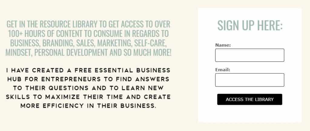
Here it clearly highlights what a user will get if they provide their contact information. It also mentions the variety of niches the free resources cover, so people interested in all the niches will be interested in getting the resource, especially when it costs nothing but a name and email address.
13. Webinars
In recent years, webinars have become a highly popular medium to promote your business and also collect leads. Offering value in your webinar is the key to letting your users want to join. A well-thought-out webinar can turn out to be the email opt in idea you need to use to boost your email list.
Look at this example:

This opt in works because it highlights the benefit of attending the webinar on top with a clear CTA. Another thing that works in favor of this opt in example is the time counter. It will create a sense of urgency or FOMO in users and push them to register for the webinar faster.
These were some of the email opt in ideas that will work for sure to get your email list growing.
Now let’s have a look at how you can use these ideas by creating an opt in form to collect the emails.
How to Grow Your Email List With Opt-in Freebies Using a Lead Generation Funnel?
Here we will show how you can create an opt in funnel from the WordPress dashboard to collect leads in order to grow your email list easily.
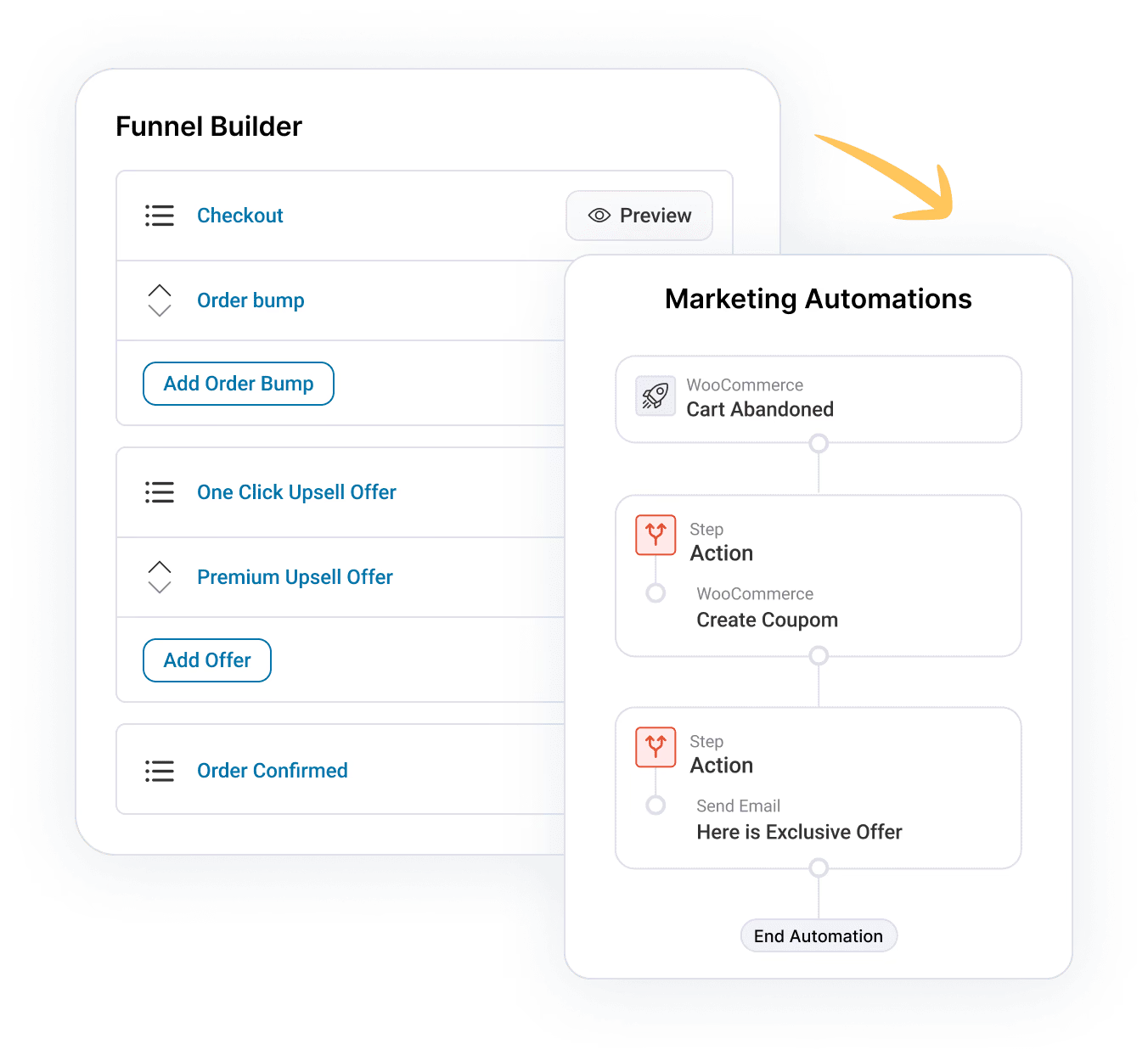
To create a opt in funnel, we will use FunnelKit Funnel Builder. This is the ultimate sales Funnel plugin for WordPress that lets you create high-converting sales funnels with opt-in pages, sales pages, custom checkouts, order bumps, one-click upsells, and Thank you pages.
The best part is it comes with many built templates that you can import with a few clicks and use them without any coding.
Irrespective of the page builder you use, you can go for this opt in funnel builder because it is compatible with all the popular page builders such as Elementor, Divi, Gutenberg, Oxygen, etc. For other page builders, you can use a shortcode.
Let’s install and activate FunnelKit Funnel Builder before we start the main process.
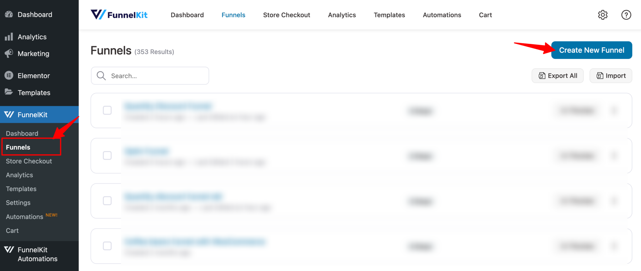
Step 1: Add a new opt in funnel
Firstly, you need to create a opt in funnel. For that Go to FunnelKit ⇒ Funnels and click on “Add New Funnel”
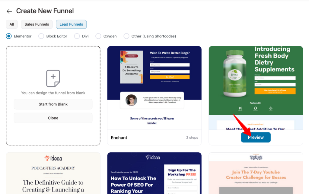
Now choose “Lead Funnels” as type and then your favorite page builder. We are going with Elementor here. After that, hover over the template you like and click on the “Preview” button.
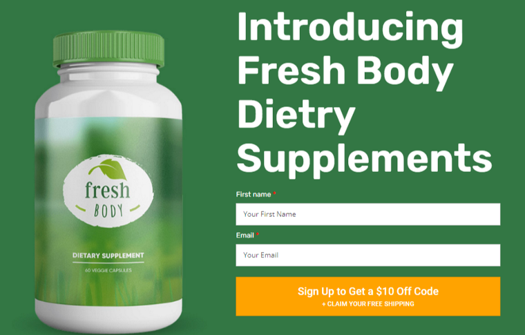
Here we are choosing FunnelKit’s “Incentive” opt-in page template. This template offers some discounts and free shipping in exchange for the contact name and email address.
With every template, FunnelKit offers two types of opt in forms: Inline and Popup.
Here is what the in-line version of the template we chose looks like:
And here is what the popup version looks like:
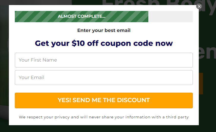
We will choose the inline option. Now to import this funnel click on “Import This Funnel”, provide a name, and click on “Done”.
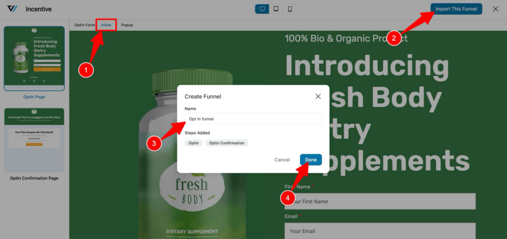
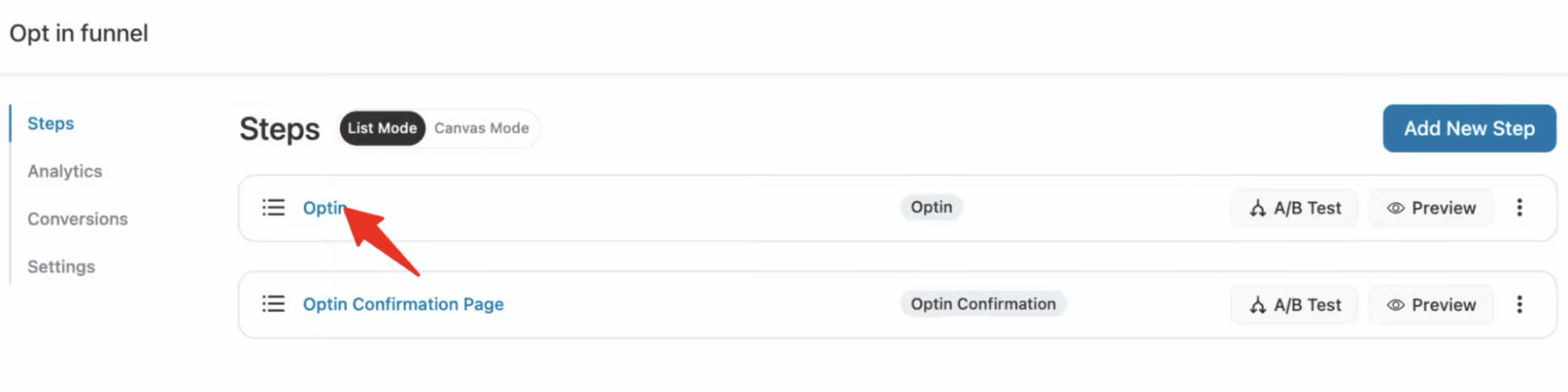
This will import the opt in funnel with two steps: opt in landing page and confirmation page.
Step 2: Customize the opt in landing page
Now it’s time to customize the opt-in page to reflect the offer you want to make. For that click on “Optin” step.
To edit the page with page builder, in our case Elementor, click on “Edit Elementor Template”.
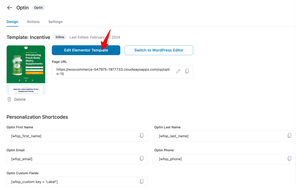
Now you can update each content one by one. For example, to customize the title, click on it, and you can update the content on the left Elementor panel.
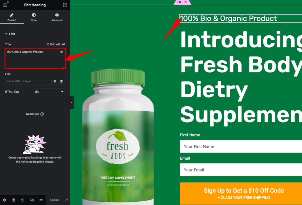
Similarly, you can change the CTA text and subtext.
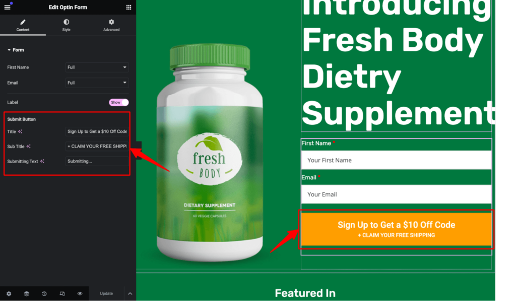
For each item on the Style tab, you will find different options to alter the look of that element.
For example, on the Style Tab for opt in form, you can customize the CTA background color, text color, border type, etc.
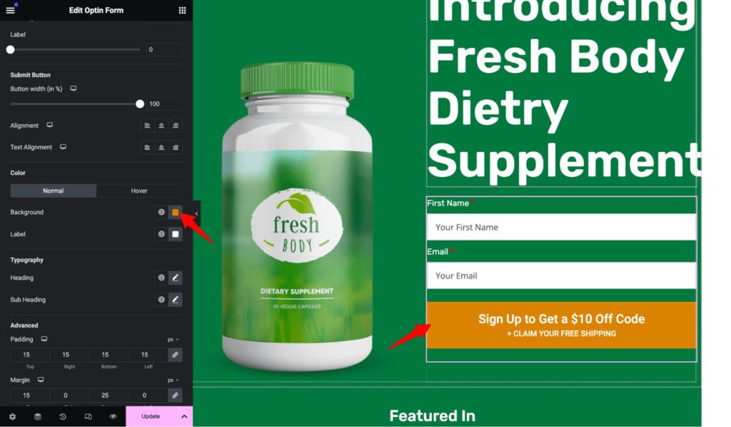
After making all the changes, click “Update” in the bottom left corner to save all the changes.
Step 3: Manage the opt in form fields
With FunnelKit, you can easily manage how many fields you want your opt in form to have. The template we choose currently has two form fields: first name and email.
If you want, you can add another field just by dragging and dropping on the Forms field. For that scroll down to the "Optin Form Fields" section and drag and drop the field you want to add to your form.
If you want, you can also remove any field if you want just by clicking on the “X” icon.
After making the changes based on the information you want to collect from users, click on Save.
Here is how the opt in page look:
Step 4: Enable email notification
You can send a welcome email to your subscriber with FunnelKit (formerly WooFunnels) every time a user subscribes.
For that move to the Actions Tab. Here Select “yes” for the Lead Notification option. After that, you can customize the email subject and body. You can use shortcodes to personalize both the subject and email body.
You can also enable Admin notification if you want.
After making the changes make sure to hit “Save” to update.
🔔 You can also read our blog “How to Turn New Subscribers into Customers in 7 Days ”
Step 5: Customize the opt in confirmation page
Since the opt in page promises a discount coupon code once a user signs up, you need to provide that on the confirmation page.
For that, first click on the Optin confirmation page.
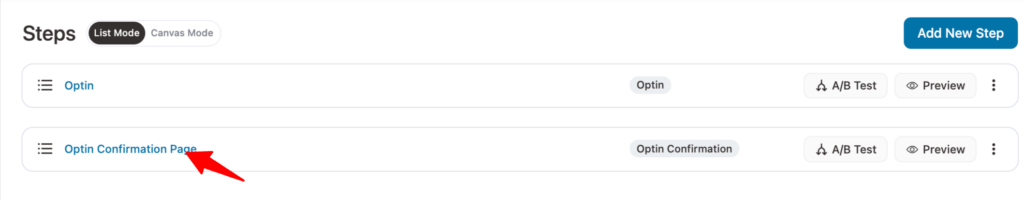
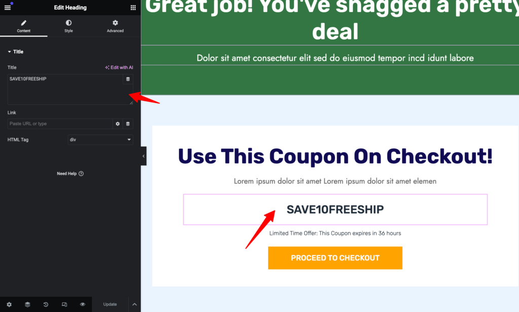
Now you can edit the confirmation page with Elementor as you did with the Opt-in page.
For instance, you can update the coupon code.
🔔 If you need help with how to create a coupon to offer a discount with Free shipping in WooCommerce, you can check our blog “How to Set Up Free Shipping in WooCommerce”
After completing customizing the content, click on update.
And that’s it your opt in page is ready to collect leads.
Boost Your Email List with Multiple Email Opt-in Ideas Using FunnelKit
Implementing effective email opt in ideas is crucial in making sure your email lists grow fast. We have shared ideas that will surely help you to convince users to give out their email.
Remember, the key to successful email opt-in lies in offering valuable freebies. Along with a good freebie, you also need to make sure your audience has a good user experience on the landing page.
And that’s where FunnelKit comes into play. As you have seen, creating an opt-in funnel with FunnelKit Funnel Builder is no less than walking in the park.
The best part about this amazing WordPress plugin is it not only helps you to collect leads with a lead funnel but also helps you to convert them with user-friendly sales funnels.
So, start leveraging email opt in ideas with FunnelKit Funnel Builder to boost your email list today!
Editorial Team
June 25, 2026There are two things most people get wrong about the WooCommerce order confirmation email. First, they don't realize it's the Processing order email they need to switch on and not...
Editorial Team
June 18, 2026WooCommerce automated emails are messages your store sends automatically when a customer triggers a specific event, such as placing an order, abandoning a cart, creating an account, or going 90...

Editorial Team
June 3, 2026Cost is one of the main reasons people start looking for ClickFunnels alternatives, especially once the subscriptions start piling up across funnels, email tools, and add-ons. In a lot of...