A WooCommerce Shopify checkout is a redesigned WooCommerce checkout page built around the design principles that make Shopify's checkout convert.
It includes a clean layout, express payment options at the top, Google address autocomplete, a mobile-first design, and minimal distractions.
Shopify migrated its default checkout from a three-step flow to a single-page checkout, and non-Plus stores will be moved off the legacy multi-step layout entirely by August 26, 2026.
So, in 2026, "Shopify-style" refers to the design language and is not specific to the number of steps.
Most WooCommerce checkout plugins support both one-page and multi-step layouts, so you can pick whichever performs better for your store. We’ll cover how to decide between them below.
If you want the actual Shop Pay or Shopify Checkout to run on WooCommerce, that’s not possible. Both are proprietary to Shopify Plus and aren’t licensed for use on external platforms.
What you can do is replicate the experience on your existing WooCommerce stack, which takes about 10 minutes. No code, no separate account, and no app installation required.
By the end of this guide, you'll have a checkout that looks and feels like Shopify but stays fully on WooCommerce with your data, your server, and your customizations.
Click here to head straight to the step-by-step process
Table of Contents
- 1 One-Page vs. Multi-Step Checkout: Which Should You Build?
- 2 How to Create a WooCommerce Shopify Checkout (Step-by-Step)
- 3 7 Optimization Hacks to Reduce Cart Abandonment
- 3.1 1. Ability to create a multi-page checkout
- 3.2 2. Show trust signals like testimonials and confidence on the checkout page
- 3.3 3. Give cart editing options on the checkout page
- 3.4 4. Display shipping costs and order total on the checkout
- 3.5 5. Add an order bump for a higher average order value
- 3.6 6. Optimize your checkout experience for mobile
- 3.7 7. Recover lost revenue with abandoned cart recovery workflows
- 4 What Makes Shopify's Checkout Convert (The 9 Elements)
- 5 Shopify Checkout vs. WooCommerce Default: Side-by-Side
- 6 5 Best Plugins to Build Shopify-Style WooCommerce Checkout
- 7 Frequently Asked Questions About WooCommerce Shopify Checkout
- 8 Start Converting More Customers With a WooCommerce Shopify Checkout!
One-Page vs. Multi-Step Checkout: Which Should You Build?
Now that Shopify defaults to one-page and WooCommerce plugins support both, the real question for store owners is which actually converts better for your store?
The honest answer depends on the products you sell, your customers, and your average order value.
One-page checkout tends to win for:
- Low-AOV stores that rely on impulse buys, single-product orders
- Mobile-heavy traffic
- Returning customers and digital wallet users
- Simple shipping logic (single rate or free shipping)
- Stores where speed-to-completion is the primary friction
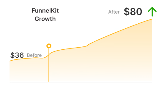
According to Nic Dunn, CEO & Founder of Charle Agency, stores that switched from Shopify’s legacy three-step layout to the new one-page version have reported an average 7-15% increase in conversion rate.
Less typing, fewer page loads, and faster completion are all contributing factors.
Multi-step checkout tends to win for:
- High-AOV stores where buyer reassurance matters
- Complex orders with multiple shipping options or product configurations
- First-time buyers who need progressive trust-building
- Stores where the breadcrumb's psychological progress effect helps shoppers commit
- B2B and account-creation flows
If you have neither historical data nor a strong intuition, default to one page. It matches what your customers experience on every other Shopify store, is faster on mobile, and generally converts better across most use cases.
If your AOV is high or your funnel is complex, A/B test both.
How to Create a WooCommerce Shopify Checkout (Step-by-Step)
To create a Shopify checkout for WooCommerce without writing any code, we will use FunnelKit Funnel Builder.
FunnelKit replaces the default WooCommerce checkout with a modern, conversion-optimized checkout page that supports multi-step layouts, express payment buttons, address autocomplete, and a distraction-free design.
Funnel Builder offers a free version that includes limited checkout page templates you can import and customize.
The Pro plan starts at $99.50/year and adds features such as A/B testing, order bumps, one-click upsells, checkout field customizer, and more.
You can download the plugins from your FunnelKit account and install them on your WordPress website.
Follow the step-by-step instructions below to make your WooCommerce checkout like Shopify:
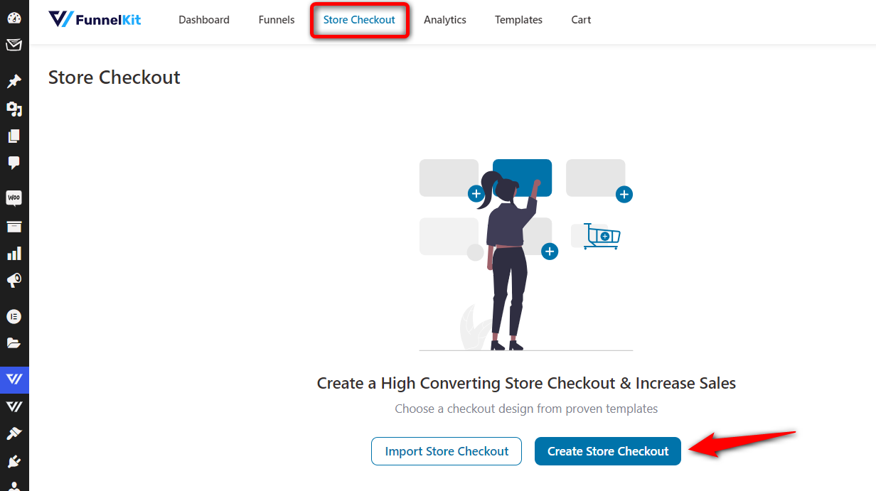
Step 1: Create a store checkout
Go to FunnelKit ⇨ Store Checkout and click on the ‘Create Store Checkout’ button.
It’ll take you to the templates page, where you can browse through the different templates and import one that fits your needs.
These templates serve different purposes. For example, you can build a Shopify-style checkout, embedded order forms, a one-page checkout, a multi-step checkout page, and more.
You can customize your pages with Elementor, Bricks, Divi, Oxygen, and Gutenberg. If you wish to use a different page builder, you can create your checkout page with shortcodes. (Set it up in FunnelKit settings section)
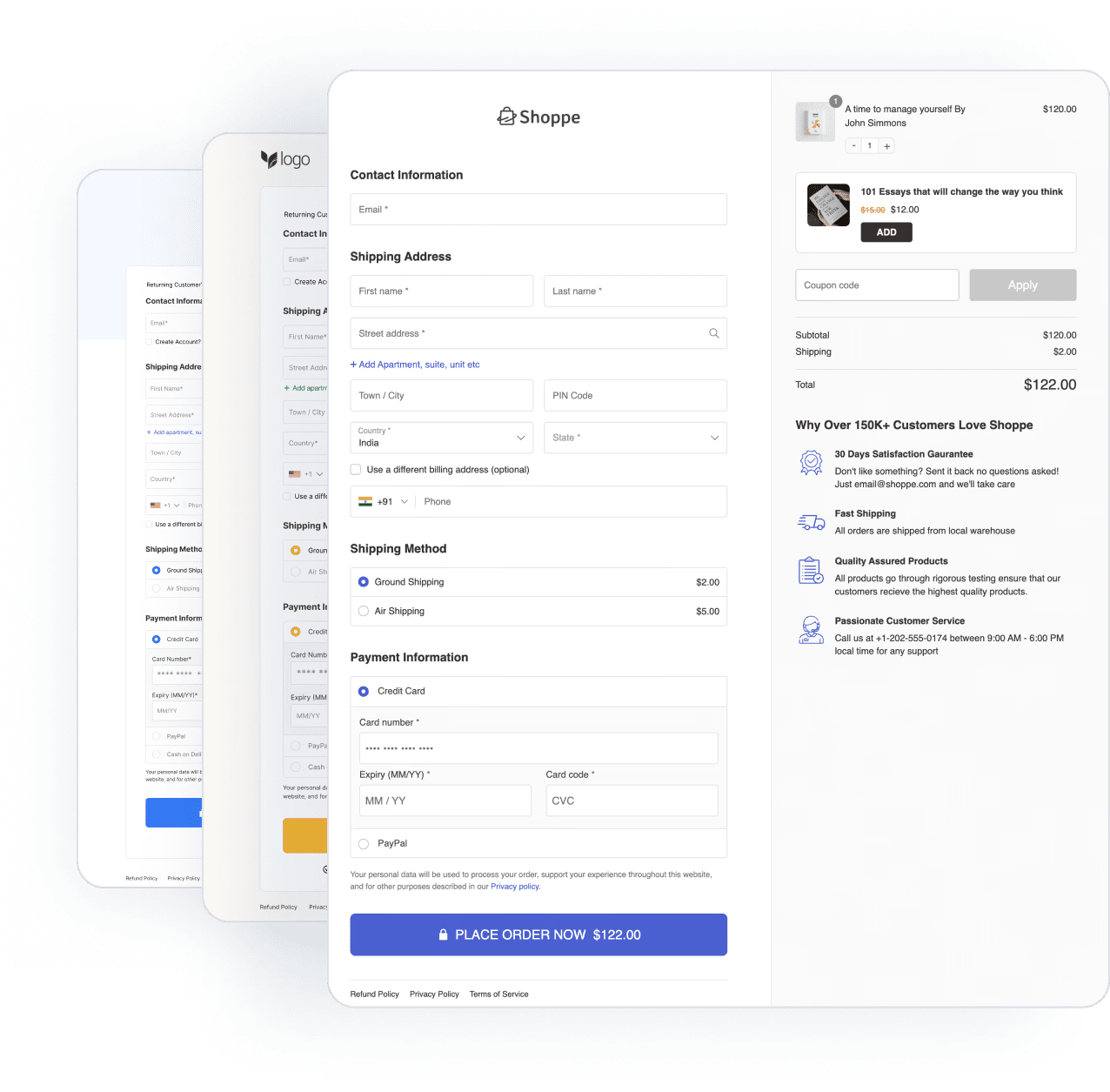
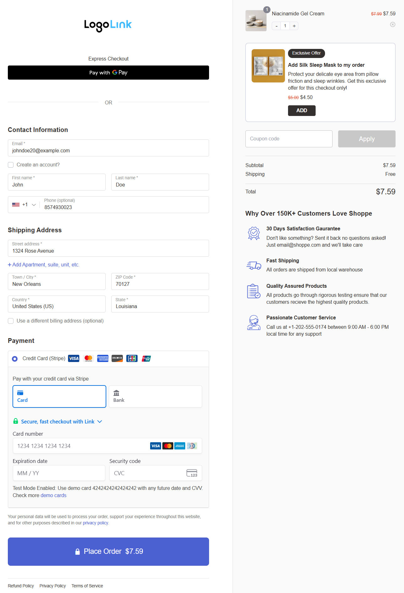
In our case, we've picked the 'Shoppe' template:
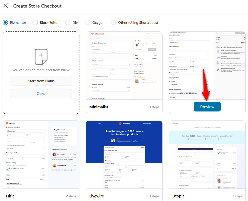
Clicking on the ‘Preview’ button will show you a full preview of the template.
Since Shopify offers a one-step checkout now, let's select the ‘One Step’ option and click ‘Import This Funnel’.
Enter the name of your funnel - WooCommerce Shopify checkout.
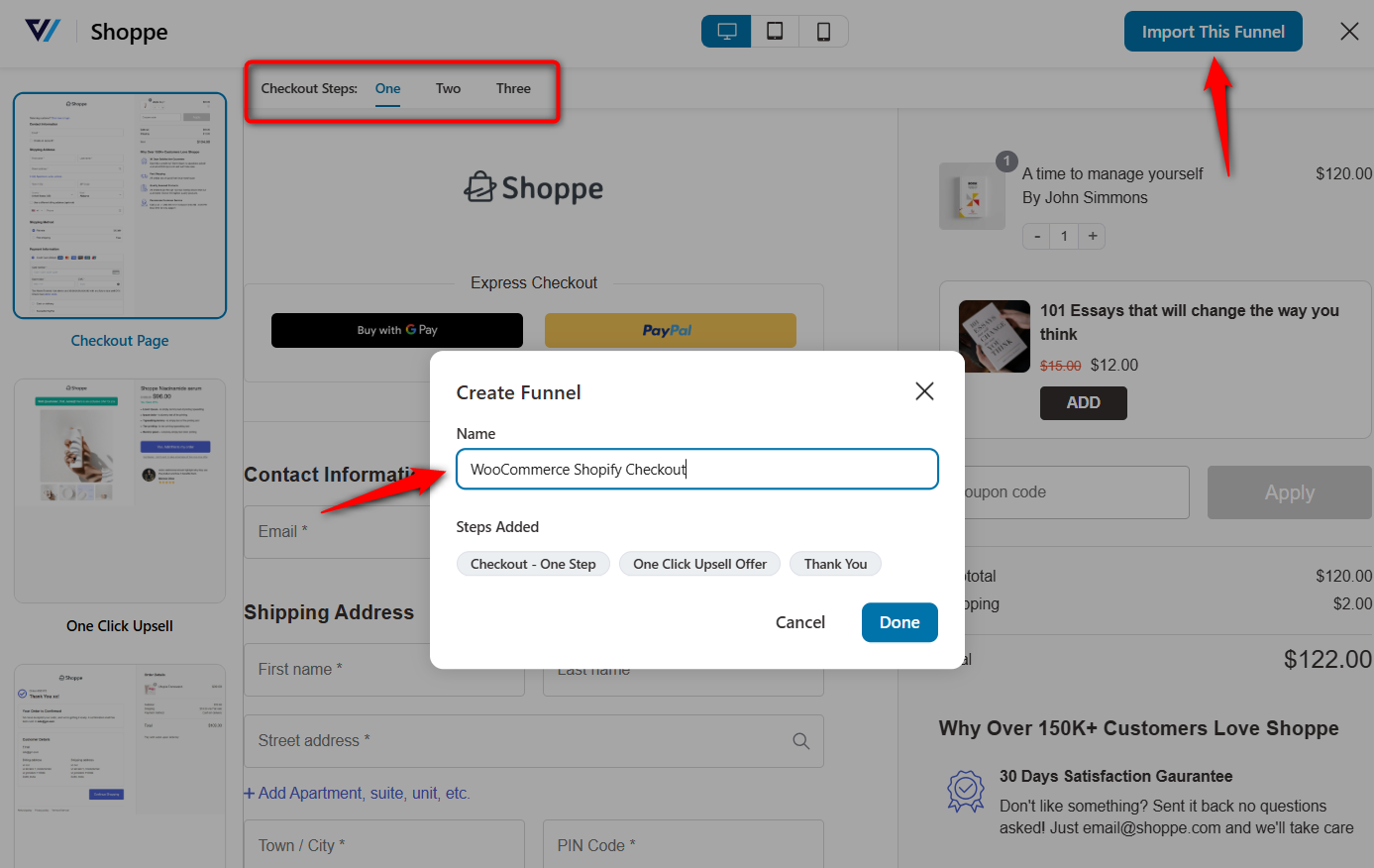
Clicking on ‘Done’ will import your store checkout funnel.
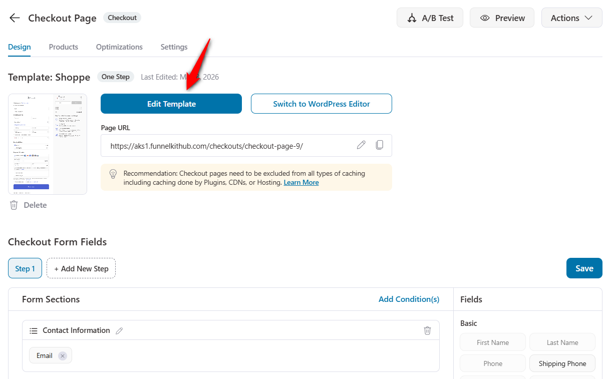
Step 2: Customize your WooCommerce Shopify checkout page
Hit the name of your checkout page to start customizing it.
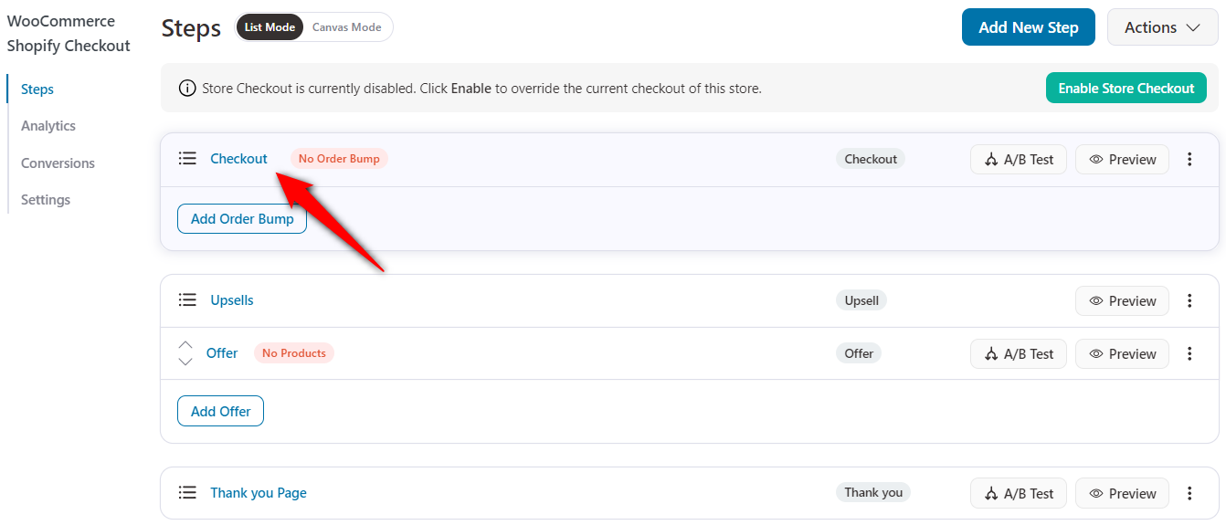
Under the Design tab, click on the ‘Edit Template’ button to start customizing your Shopify checkout page in WooCommerce.
Changing the logo
Branding the template by changing the logo and tagline is pretty easy. You can even add helpline numbers and support-related information.
This will help you make your Shopify checkout page more trustworthy.
To edit, just tap the pencil icon next to the logo, then add the image.
Updating order summary or mini cart
Next, customize the content of your order summary or mini cart section, including the heading, product, and coupon.
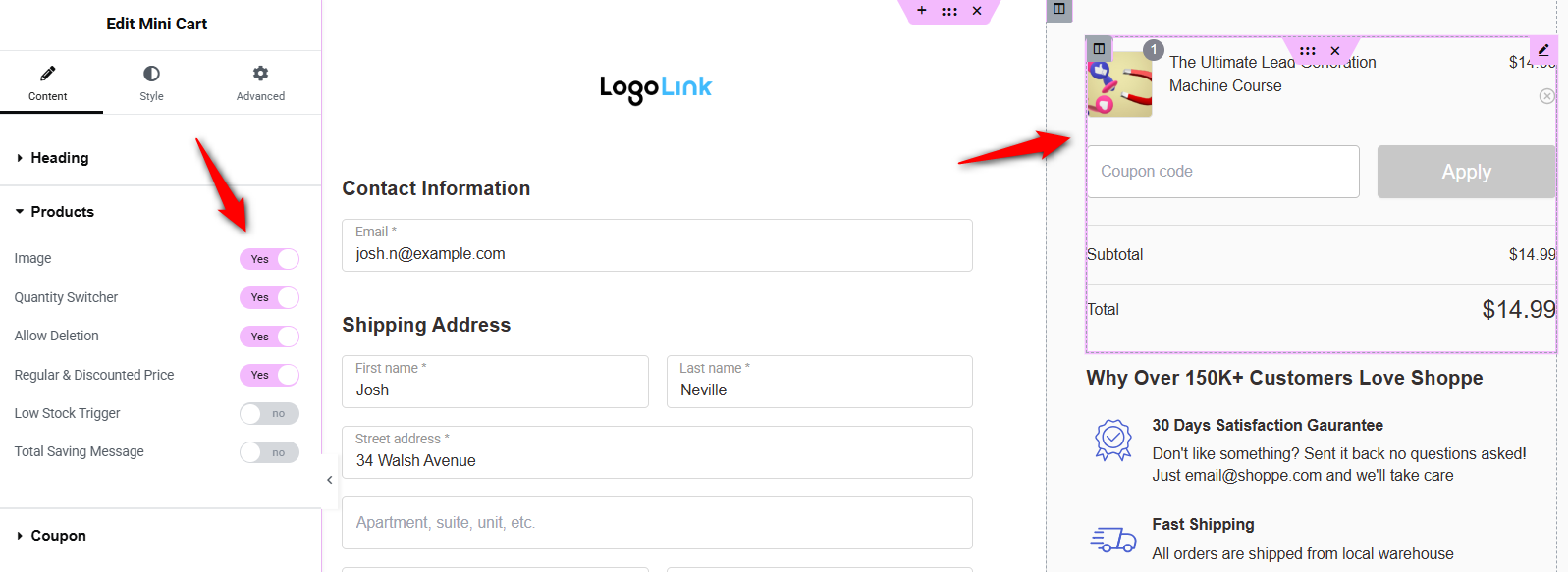
Adjust the visual design to create a distraction-free layout. FunnelKit's Shopify-style templates already remove the site header and footer from the checkout page, giving you a clean canvas.
Under the Style tab, you can customize the typography, headings, colors, border colors, divider, coupon section, settings, and more.
Modifying the checkout or place order button
Click the call to action (CTA) or place order button, and make the necessary changes to your brand.
You can customize the text, add icons, change colors, and more.
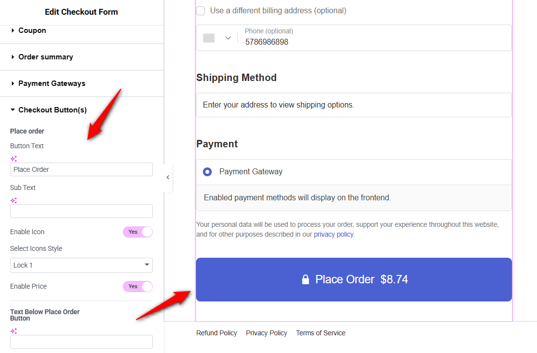
You get the flexibility to add trust seals (Norton, McAfee, Secure Checkout badges), money-back guarantees, and customer testimonials to nudge a hesitant buyer toward making a purchase.
Change the responsive mode to mobile, and you'll be able to set up a collapsible order summary, a call-to-action button, and the overall experience on phones.
Make sure to hit ‘Publish’ when done.
Step 3: Edit your checkout form fields
The built-in drag-and-drop checkout field editor lets you add custom fields and edit, rearrange, or delete unnecessary ones from the checkout form.
Scroll down to the 'Checkout Form Fields' section under the Design tab to witness this functionality in action.
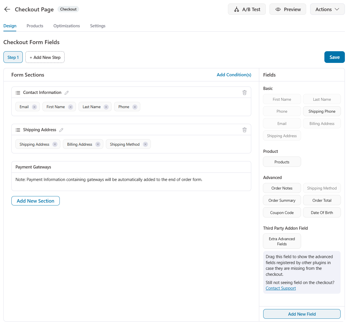
Use the built-in drag-and-drop to group checkout fields like 'First Name' and 'Last Name' onto the same line. This reduces the form's vertical height, making it appear shorter.
Additionally, if you sell digital goods, disable the "Shipping Address" entirely.
A Shopify-style checkout keeps the form minimal, with fields for email, name, address, shipping method, and payment. Remove any fields that are not essential to completing the order.
Step 4: Optimize your WooCommerce checkout for conversions
Under the Optimizations tab, you’ll be able to optimize your WooCommerce Shopify checkout page:
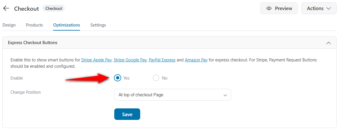
- Enable the express checkout option
FunnelKit Funnel Builder is fully compatible with one-click express payment methods, including Apple Pay, Amazon Pay, Google Pay, and PayPal Express.
You need to ensure the desired payment method is enabled in WooCommerce Settings ⇨ Payments.
Use FunnelKit’s Stripe gateway for WooCommerce to add multiple payment methods.
Here, enable smart buttons for express checkout.
- Auto-apply the coupons on checkout
Offering auto-apply coupons at checkout streamlines the buying process by eliminating the need for customers to manually enter coupons to receive discounts.
This is quite convenient and leads to higher conversion rates, as shoppers are more likely to complete their purchases when discounts are automatically applied.
To do this, enable the 'Auto Apply Coupons' feature under the Optimizations tab.
Enter the coupon you’d like to apply at checkout automatically. Ensure that the coupon is published and valid in your WooCommerce store.
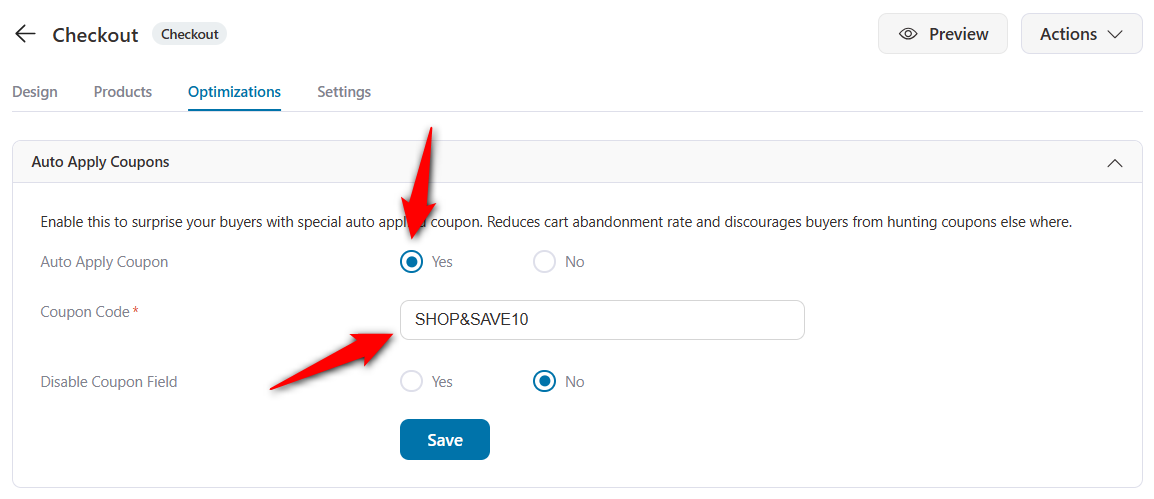
Now, when a shopper reaches the checkout page, this coupon is automatically applied, and the discount is applied to the cart total.
- Enable Google address autocomplete
Integrating Google Address Autocomplete into checkout streamlines address entry by providing real-time suggestions as shoppers begin typing, reducing the time to fill out the shipping fields.
Make sure you’ve enabled the Google Maps API from the Maps Platform.
Under the Optimizations tab, enable the Google Address Autocompletion feature.
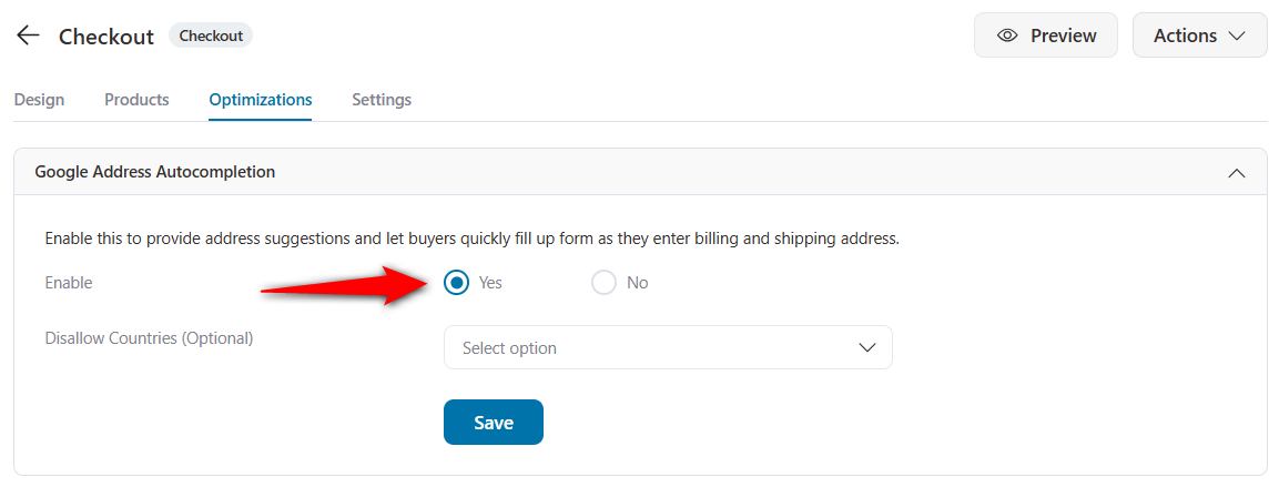
Click on ‘Save’ when done.
The autofill address suggestions appear as soon as you begin typing your shipping or billing address.
Furthermore, you can add enhanced phone fields, smart customer login, guest checkouts, and more to streamline buying in your store.
Step 5: Publish and test your Shopify-style checkout
Next, you need to publish your store checkout to activate it and replace the default WooCommerce checkout page.
All you need to do is go back to the funnel and click on ‘Enable Store Checkout’.
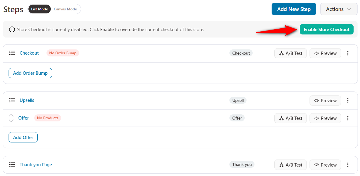
This will activate your store checkout flow.
Well done! This is how you can set up your WooCommerce Shopify checkout page in your store.
To test the new checkout, go to any product page on your store, add the item to your cart, and proceed to checkout.
You should see the new Shopify-style one-page checkout with express checkout buttons at the top, your contact and address fields in the main column, and a sticky order summary on the right.
Walk through each step and place a test order to confirm that shipping options, payment processing, and order confirmation all work correctly.
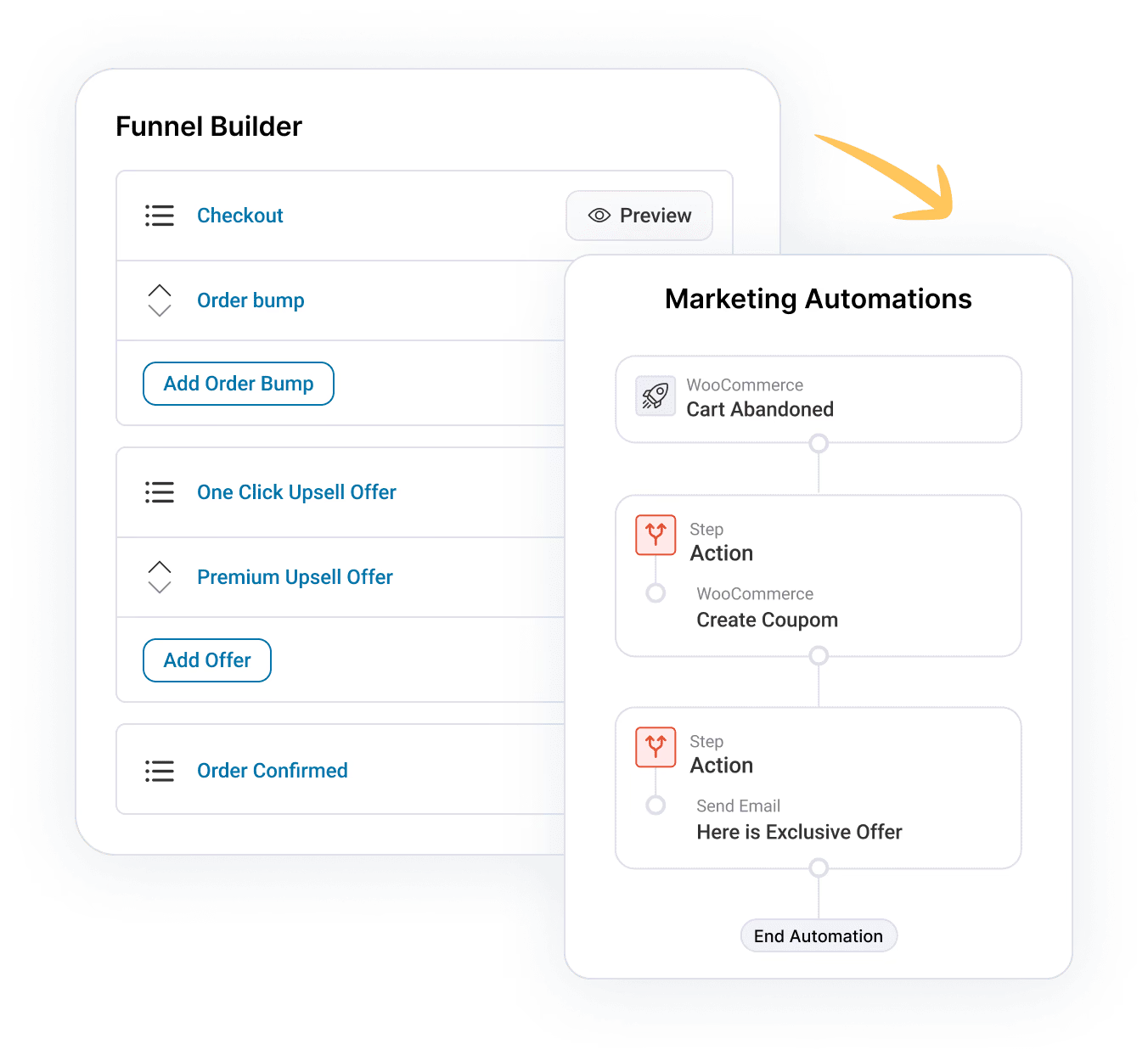
7 Optimization Hacks to Reduce Cart Abandonment
Let's look at some conversion optimization hacks that you can implement in WooCommerce.
1. Ability to create a multi-page checkout
Need a multi-step layout for the Shopify checkout (as it was by default before)? Your checkout page builder should allow you to do that.
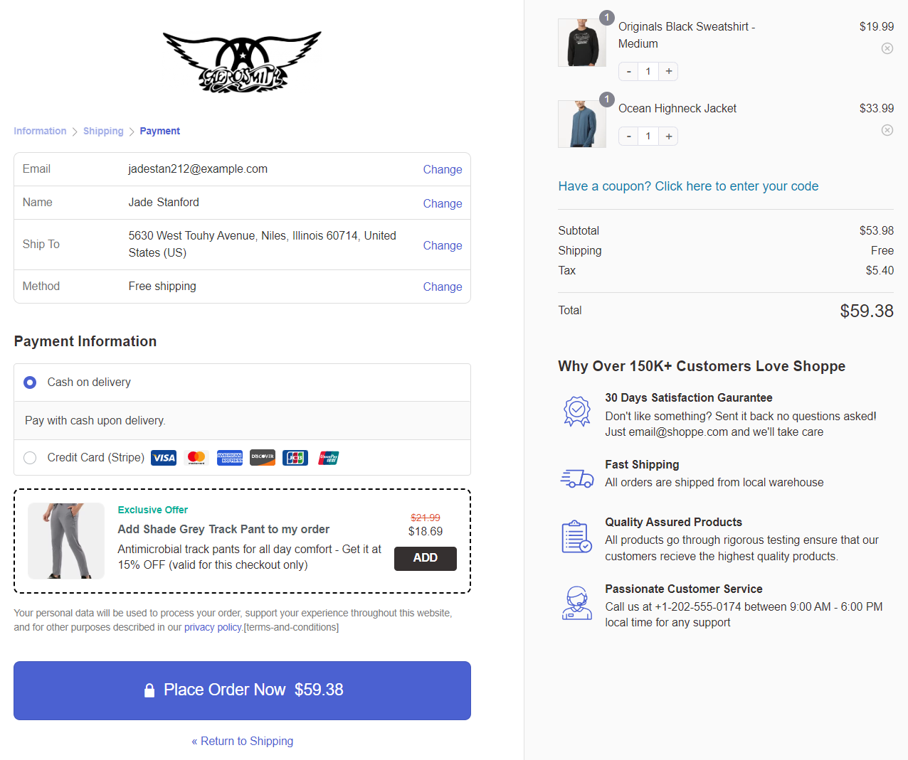
The best part? You can even embed checkout forms on landing pages.
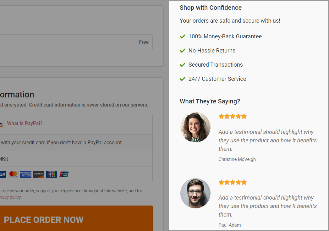
2. Show trust signals like testimonials and confidence on the checkout page
According to a study published on NeilPatel.com, adding testimonials to the checkout increased conversions by 6.34%.
In the built-in customizer, you can add multiple testimonials, including the person's name, designation, message, star rating, and more.
Here's how the testimonial section appears:
3. Give cart editing options on the checkout page
Providing users with the option to edit their cart on the Shopify checkout page is a great hack.
It minimizes the friction involved in the buying process.
After clicking the 'Add to Cart' button on the product page, the user doesn't need to return to that page to make any edits.
This allows them to have complete control over their purchase.
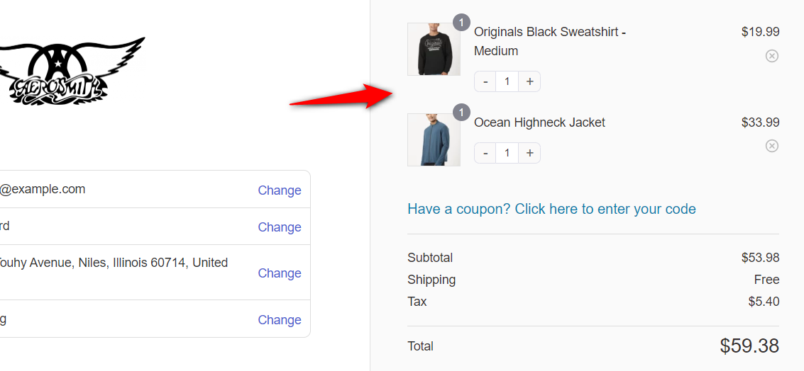
You can use the funnel builder to turn on the quantity switcher and even the delete option.
4. Display shipping costs and order total on the checkout
Unexpected shipping fees are the top reason customers abandon checkout. According to Statista, extra costs, including shipping, are cited by nearly half of all cart abandoners.
Show shipping costs on the shipping step or earlier so there are no surprises at the end.
Furthermore, your order summary should remain visible on desktop throughout the entire checkout process.
On mobile, use a sticky or collapsible summary so customers can check their total without scrolling. Transparency reduces last-minute hesitation.
5. Add an order bump for a higher average order value
An order bump lets you pitch a complimentary item to shoppers at checkout.
The idea is to increase their order value right before they place an order.
Make a compelling offer on your Shopify checkout page that they can't refuse.
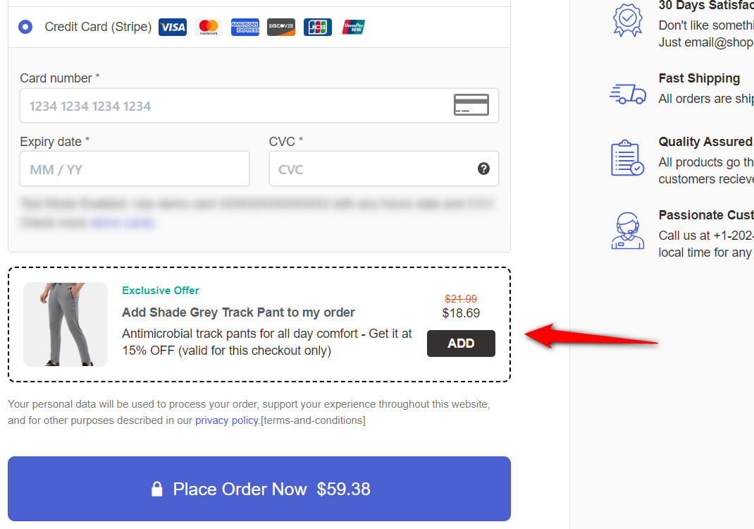
The user can add the related products to their order with a single click on the checkbox.
An order bump is incredibly useful because it eliminates the need to make intrusive cross-sells or show pop-up offers.
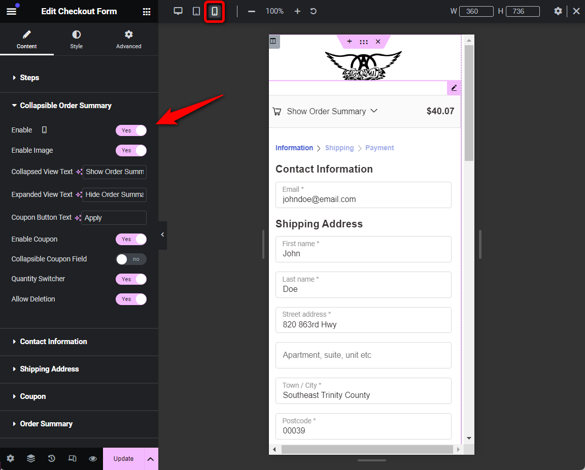
6. Optimize your checkout experience for mobile
This is another brilliant technique. FunnelKit templates, by default, are mobile-optimized.
The form fields line up one below the other, eliminating the need to pinch and zoom, and a collapsible order summary section appears.
The collapsible order summary is exclusively shown on mobile.
You can select the mobile view in responsive mode to optimize the experience for your shoppers.
This is all about some optimization hacks that can make your checkout process seamless.
7. Recover lost revenue with abandoned cart recovery workflows
Even the best checkout design will not capture every customer. Whether it’s a distracting notification or a misplaced card, cart abandonment is an inevitable part of the shopping journey.
However, by leveraging your existing CRM or FunnelKit Automations, you can transform these lost moments into automated win-back opportunities.
You can send tailored reminders that include the specific items left behind, unique recovery links, and dynamic coupons with expiration dates, creating a genuine sense of urgency.
What Makes Shopify's Checkout Convert (The 9 Elements)
Shopify's checkout reliably outperforms most defaults because of its design, not just the number of pages it spans.
These elements are what you’re actually trying to bring into WooCommerce, and most of them apply equally to one-page and multi-step layouts.
It has a clean two-column layout with minimal form fields, helping shoppers complete the checkout process effortlessly.
Here are some high-converting elements of a Shopify checkout page:
- Branded header: A clean logo on top of the checkout page.
- Clean layout: Two-column layout with checkout fields on the left and cart summary on the right.
- Progress cues: In Shopify's old three-step checkout, "Information → Shipping → Payment" was a breadcrumb. The current one-page version has clear section dividers and labels.
- Simple checkout form: Grouped sections for email, shipping address, payment, clearly separated.
- Email field on top: A pro-conversion hack to place the email field on top to capture abandoned carts and recover them.
- Express payments: Google Pay, Apple Pay, PayPal Express, Amazon Pay, and other one-click checkout methods.
- Call to action (CTA): A perfect checkout button that allows users to quickly move from one step to the next and click the place order button at the final step.
- Sticky order summary: Visible on desktop throughout; collapsible on mobile, always one tap away.
- Google address autocomplete: Real-time suggestions as shoppers fill their shipping details.
- Mobile-optimized: Stacked fields, larger tap targets, no pinch-zoom.
- Real-time field validation: Errors surface as users type, not after submit.
- Footer: A branded footer with policy or terms and conditions links.
- Distraction-free: No distracting sidebars, popups, or irrelevant widgets.
Shopify Checkout vs. WooCommerce Default: Side-by-Side
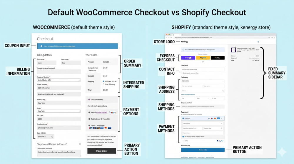
Both platforms can sell and they just default to very different experiences. Here's how they compare in 2026:
| Feature | Shopify Default | WooCommerce Default |
|---|---|---|
| Layout | One-page (sectioned). Legacy multi-step is being phased out by August 2026 | Single page, all fields visible at once |
| Visible form fields | Sectioned and progressive | 12-16 fields stacked together |
| Header and footer navigation | Removed (distraction-free) | Inherits your site theme |
| Express payment | Top of page (Shop Pay, Apple Pay, Google Pay) | Gateway-dependent |
| Address entry | Google autocomplete by default | Manual (requires a plugin) |
| Mobile order summary | Sticky and collapsible at the top | Fixed at the bottom of a long scroll |
| Email capture | First field (abandoners can be recovered) | Mid-form, often after address |
| Cost | Bundled with your Shopify plan | Free, but you own all customization |
| Customization flexibility | Limited (full edit only on Shopify Plus) | Unlimited (use code or plugin) |
| Data ownership | Hosted by Shopify | Your server, your database |
Shopify’s defaults are tuned for conversion. WooCommerce’s defaults are tuned for flexibility. Check out our full comparison of WooCommerce vs Shopify here.
The fastest way to get both is to keep your WooCommerce stack and replace just the checkout layout. This is exactly what the rest of this guide covers.
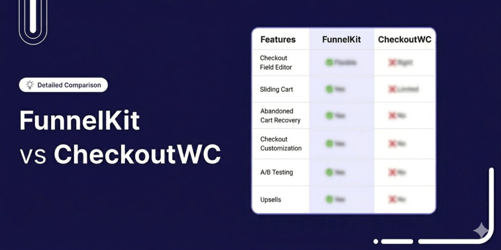
5 Best Plugins to Build Shopify-Style WooCommerce Checkout
Five plugins dominate this category. Each handles the core task of replacing the default WooCommerce checkout with a Shopify-style layout.
But all these plugins differ in customization depth, page builder support, and price.
The prices are updated as of May 8, 2026. We recommend that you verify pricing before confirming any plugin.
| Plugin | Best For | Layouts Supported | Checkout Optimizations | Pricing Plan |
|---|---|---|---|---|
| FunnelKit Funnel Builder | Stores wanting checkout + funnel features such as order bumps, upsells, and A/B testing | One-page and multi-step | Custom checkout fields, express checkout, Google address autocomplete, auto-apply coupons, inline field validation, smart login, trust badges, etc. | Free version available. Pro starts at $99.50/year |
| CheckoutWC | Stores wanting a Shopify-style checkout | One-page and multi-step | Express checkout, Google/Fetchify address autocomplete, address validation, trust badges | Free version. Premium starts at $149/year |
| Fluid Checkout | Stores wanting a simple checkout | One-page and multi-step | Express checkout buttons, instant field validation, account/user matching, trust symbols, and international phone numbers | Free plan. Pro starts at €99/year |
| Divi BodyCommerce | Divi theme users wanting full WooCommerce customization | Shopify Style, Multi-Step, Accordion, One-Page | Custom checkout fields, order bumps, AJAX add-to-cart, custom thank-you pages, variation swatches | Starts at £149/year |
| ShopBuilder | Elementor users wanting to customize the entire WooCommerce store | One-page and multi-step | Real-time shipping/tax, checkout fields editing, smart coupons | Free version. Premium starts at $47/year |
Which to pick:
- If you also want order bumps, upsells, abandoned cart recovery, and A/B testing in one stack, go with FunnelKit. It's the best affordable option with brilliant features.
- If you want just a Shopify-style checkout with the least setup, go for CheckoutWC.
- If you want the Shopify layout, go with Fluid Checkout or FunnelKit’s free templates.
- If you’re already on Divi or Elementor, the page-builder-specific options keep your design workflow consistent.
Frequently Asked Questions About WooCommerce Shopify Checkout
Got questions about using Shopify-style checkout with WooCommerce? Check out some FAQs below with quick answers:
The main differences in 2026 are layout, payment placement, and customization control. Shopify’s default is now a single-page checkout (sectioned but on one screen), with express payments at the top, Google address autocomplete by default, and a sticky order summary on mobile.
WooCommerce’s default puts every field on one long form with payments buried at the bottom, no autocomplete, and an order summary that pushes off-screen on mobile. WooCommerce can match or exceed Shopify’s experience using a checkout plugin, but it doesn’t do so out of the box.
The default WooCommerce checkout page isn't very convincing and hurts conversions because:
- Complex and lengthy layout
The fields are laid out one below the other. You can’t split them into multiple steps, which makes the form look lengthy and complex.
- Lack of customization options
Email or phone fields are not at the top and require custom coding to achieve this. That means you can’t capture contact details as early in the process as you should.
- Not optimized for mobile
Users land on the checkout page from their mobile devices, and the default checkout is not fully optimized for mobile, leading to cart abandonment.
- Poor design
The default WooCommerce checkout page is not convincing and varies across themes. There are no social proofs or high-converting design elements.
It needs improvement on the call-to-action button, order summary, and payment methods.
Clearly, the basic-looking WooCommerce checkout needs an overhaul to appear modern and increase conversions.
Yes. Shopify migrated its default checkout from a three-step flow (Information → Shipping → Payment) to a single-page layout. Stores can currently toggle between the two, but Shopify is phasing out the legacy multi-step option for non-Plus stores by August 26, 2026. After that date, all non-Plus stores will run on one-page checkout by default.
No, Shopify Payments is exclusive to Shopify. WooCommerce requires gateways such as Stripe, PayPal, Square, or other processors.
Yes, you can create a Shopify-style checkout in WooCommerce with custom code, but it requires significant development effort. You would need to override the default WooCommerce checkout template files, write custom PHP to restructure the form into multiple steps, and add JavaScript for step navigation and validation.
For most store owners, using a plugin is faster, more reliable, and easier to maintain than building a custom-coded solution.
Stripe, PayPal, Apple Pay, Google Pay, Amazon Pay, and Square offer the best mix of conversion rate, security, and global reach. Avoid stacking too many gateways. 3 to 4 well-positioned options usually outperform 8+ choices, which can cause decision fatigue at checkout.
No, a well-built multi-step checkout will not affect site speed. There are many plugins that load lightweight templates designed for performance. The multi-step layout actually reduces the amount of content loaded on each screen, which can make each step feel faster than a single-page checkout with all fields visible at once.
Plugins like FunnelKit and Fluid Checkout offer a one-step Shopify-style template for free. However, the multi-step template and field-editing features discussed here are available only on the premium plans.
Start Converting More Customers With a WooCommerce Shopify Checkout!
WooCommerce is quite powerful and flexible, but its default checkout? Not so much. That’s where FunnelKit Funnel Builder changes the game.
FunnelKit Funnel Builder can help you create a Shopify-style checkout in WooCommerce that’s sleek, high-converting, and optimized for sales.
As we explored in the post, you can enable cart-editing options, add testimonials, bump orders, and much more, all designed to boost conversions effortlessly.
You can create more conversion-focused, order-value-boosting checkouts.
What's more? Add one-page checkout to the mix, and you can go beyond just checkout pages.
Embed checkout forms on landing pages, direct traffic to them, and do more - the sky is the limit.
Run A/B tests, measure analytics, and implement optimizations to ensure a seamless, conversion-focused checkout experience for your customers.
Editorial Team
May 25, 2026WooCommerce variable products let you sell different versions of the same item from one product page. Sizes, colors, materials, styles, etc. Instead of a separate listing for each option, customers...
Editorial Team
May 22, 2026If you sell on WooCommerce, the checkout page is what makes or breaks conversions in your store. A clunky checkout leaks revenue. A clean one keeps customers moving from cart...
Editorial Team
May 15, 2026WooCommerce Ajax add to cart lets shoppers add products without reloading the page. This reduces friction, speeds up the buying flow, and lowers cart abandonment. By default, WooCommerce only enables...