A WooCommerce Shopify checkout is a checkout page redesigned to match the clean, multi-step layout that Shopify stores use by default.
It replaces the standard WooCommerce checkout with a streamlined flow that breaks the process into separate steps for contact information, shipping, and payment.
The default WooCommerce checkout is not designed for conversions.
It loads every form field on a single page, includes your full site header, footers and sidebars, and offers little control over field order or layout.
But the good thing about WooCommerce is its open-source flexibility for customization.
Shopify, on the other hand, powers more than 4.4 million websites with its distraction-free, user-friendly, and multi-step checkouts that guide customers through each stage with clear progress indicators. [Source: DemandSage]
In this guide, we will show you the easy, step-by-step process to create a Shopify-style checkout in WooCommerce using a WordPress plugin, without code.
Plus, we will share the proven WooCommerce optimization hacks that even Shopify stores aren’t implementing yet.
Table of Contents
- 1 9 High-Converting Elements of a Shopify Checkout Page
- 2 Why Isn’t the Default WooCommerce Checkout Page Optimized for Conversions?
- 3 How to Create a WooCommerce Shopify Checkout
- 4 7 Optimization Hacks to Reduce Cart Abandonment on Your WooCommerce Shopify Checkout
- 4.1 1. Ability to create a one-page checkout
- 4.2 2. Show trust signals like testimonials and confidence on the checkout page
- 4.3 3. Give cart editing options on the checkout page
- 4.4 4. Display shipping costs and order total on the checkout
- 4.5 5. Add an order bump for a higher average order value
- 4.6 6. Optimize the WooCommerce Shopify checkout experience for mobile
- 4.7 7. Recover lost revenue with abandoned cart recovery workflows
- 5 Frequently Asked Questions About WooCommerce Shopify Checkout
- 6 Start Converting More Customers With a Shopify-Style WooCommerce Checkout!
9 High-Converting Elements of a Shopify Checkout Page
Let’s look at a typical Shopify app store checkout page.
It’s a well-branded three-step checkout page with a clear call-to-action button at the end of each step.
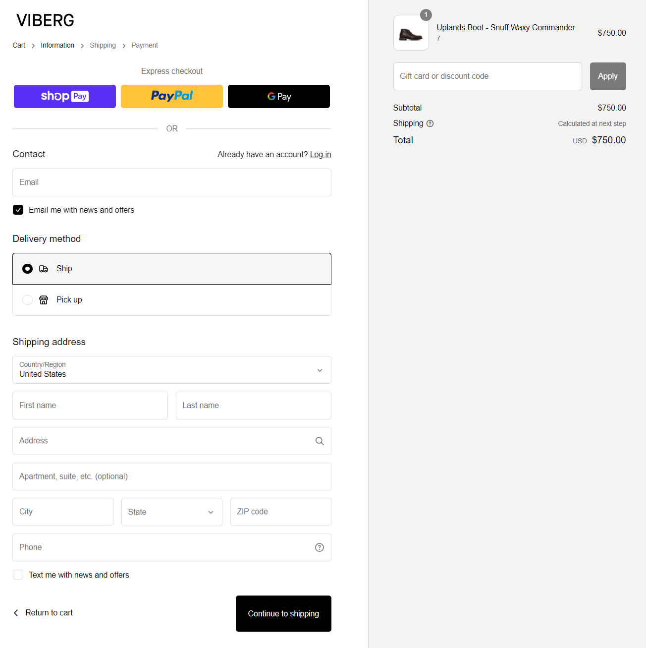
It has a clean two-column layout with minimal form fields to help shoppers effortlessly complete the checkout process.
Here are some high-converting elements of a Shopify checkout page:
1. A clean layout with no distractions
A simple layout makes the Shopify checkout page look so clean.
While the WooCommerce checkout system groups all fields together, one after the other, without proper spacing and padding, Shopify avoids that.
Also, notice that the default two-column layout of the Shopify checkout is free of distractions because there is no navigation menu at the top.
2. Progress indicator
Progress indicators, or breadcrumbs, are great for letting users know where they are in the purchase journey and which step they are at.
This Shopify checkout page is divided into three logical steps: Information, Shipping, and Payment. You can click on any of these steps to navigate between them.
This is significantly better than overwhelming the user by placing all the information on a single cart checkout page.
3. Express checkout options
Conventionally, a user has to fill out 10-15 form fields to complete the purchase on an online store.
That’s why it is no surprise that top online retailers, including Amazon, offer express wallet payment options to help users place orders faster.
Google Pay, Apple Pay, PayPal Express, Amazon Pay, and others are supported gateways that offer one-click payment options.
Shopify lets you easily add multiple payment options to your checkout page for an impressive user experience.
4. Email as the top field
This is a pro-conversion hack. Asking shoppers for their email addresses in the first field lets you follow up with those who abandon their carts.
Most checkout pages, including WooCommerce’s default one, ask for email much later in the process.
This means you’ll capture fewer carts and lose interested prospects to an unoptimized checkout page.
Thankfully, that’s not the case with Shopify checkouts!
5. Clear call to action (CTA) button
The best way to lower shoppers’ anxiety is to show them everything they need at the place they expect it. Shopify has done that incredibly well.
You have the ‘return to cart’ option on the left-hand side and ‘continue shipping’ on the right.
Users can quickly move from one step to the next and click the place order button at the final step.
6. Order total with breakdown of all costs
As per several studies, people abandon the checkout if they cannot see the order total.
However, Shopify lets shoppers see their order total and a breakdown at checkout with the item name and quantity.
This lets users be sure of what they’re buying and double-check the items.
7. Multi-step field preview option
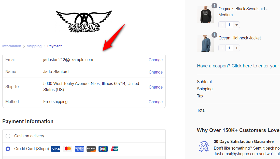
When you proceed to the next step, you can see the important fields you’ve already filled out, laid out in a tabular format.
This lets your shoppers cross-check that they entered the right information. And in case there's a mistake, hit change to be directed back to that field.
8. Google address autocomplete
You'll love this feature! When the user enters the first few characters of their address in the address field, matching options appear.
It's very intuitive and makes the checkout process fast.
When Shopify tested this feature, they found out that Google Address Autocomplete reduces the time spent on the checkout page by 20%.
This increases conversions and reduces address-related errors. You should absolutely have this feature on your WooCommerce Shopify checkout page!
9. Optimized for mobile devices
Did you know mobile phones generated 62.54% of website traffic globally as of Q2 in 2025?
Well, that’s why you should optimize the checkout experience for mobile shoppers. The default Shopify checkout page is perfectly optimized for mobile.
Notice how the fields line up one below the other, taking only as much space as there is a viewing area on mobile.
The collapsible order summary is at the top of this Shopify checkout page. The user can tap on it to view the summary in full mode, which doesn’t take up any space.
Why Isn’t the Default WooCommerce Checkout Page Optimized for Conversions?
The default WooCommerce checkout page isn't very convincing. Take a look at this page:
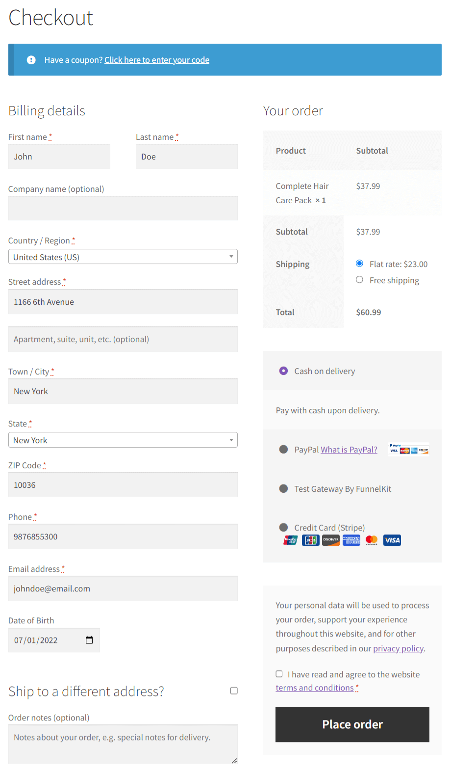
- No multi-step layout
The fields are laid out one below the other. You can’t split them into multiple steps, which makes the form look lengthy and complex.
- Lack of customization option
Email or phone fields are not at the top and require custom coding to achieve this. That means you can’t capture contact details as early in the process as you should.
- Not optimized for mobile
Users land on the checkout page from their mobile devices, and the default checkout is not fully optimized for mobile, leading to cart abandonment.
- Poor design
The default WooCommerce checkout page is not convincing and varies across themes. There are no social proofs or high-converting design elements.
It needs improvement on the call-to-action button, order summary, and payment methods.
Clearly, the basic-looking WooCommerce checkout needs an overhaul to appear modern and increase conversions.
It should guide users from one step to the next without overwhelming them. That’s why a Shopify-style checkout built right into WooCommerce is a perfect answer here.
How to Create a WooCommerce Shopify Checkout
To create a Shopify checkout for WooCommerce without writing any code, we will use FunnelKit Funnel Builder.
FunnelKit replaces the default WooCommerce checkout with a modern, conversion-optimized checkout page that supports multi-step layouts, express payment buttons, address autocomplete, and a distraction-free design.
Funnel Builder offers a free version that includes limited checkout page templates you can import and customize.
The Pro plan starts at $99.50/year and adds features such as A/B testing, order bumps, one-click upsells, checkout field customizer, and more.
You can download the plugins from your FunnelKit account and install them on your WordPress website.
Follow the step-by-step instructions below to make your WooCommerce checkout like Shopify:
Step 1: Create a store checkout
Go to FunnelKit ⇨ Store Checkout and click on the ‘Create Store Checkout’ button.
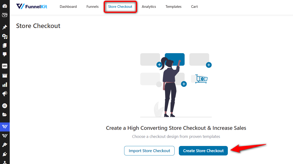
It’ll take you to the templates page, where you can browse through the different templates and import one that fits your needs.
These templates serve different purposes. For example, you can build a Shopify-style checkout, embedded order forms, a one-page checkout, a multi-step checkout page, and more.
FunnelKit Funnel Builder deeply integrates with Elementor, Bricks, Divi, Oxygen, and Gutenberg. If you wish to use any other page builder, you can create your checkout page using shortcodes.
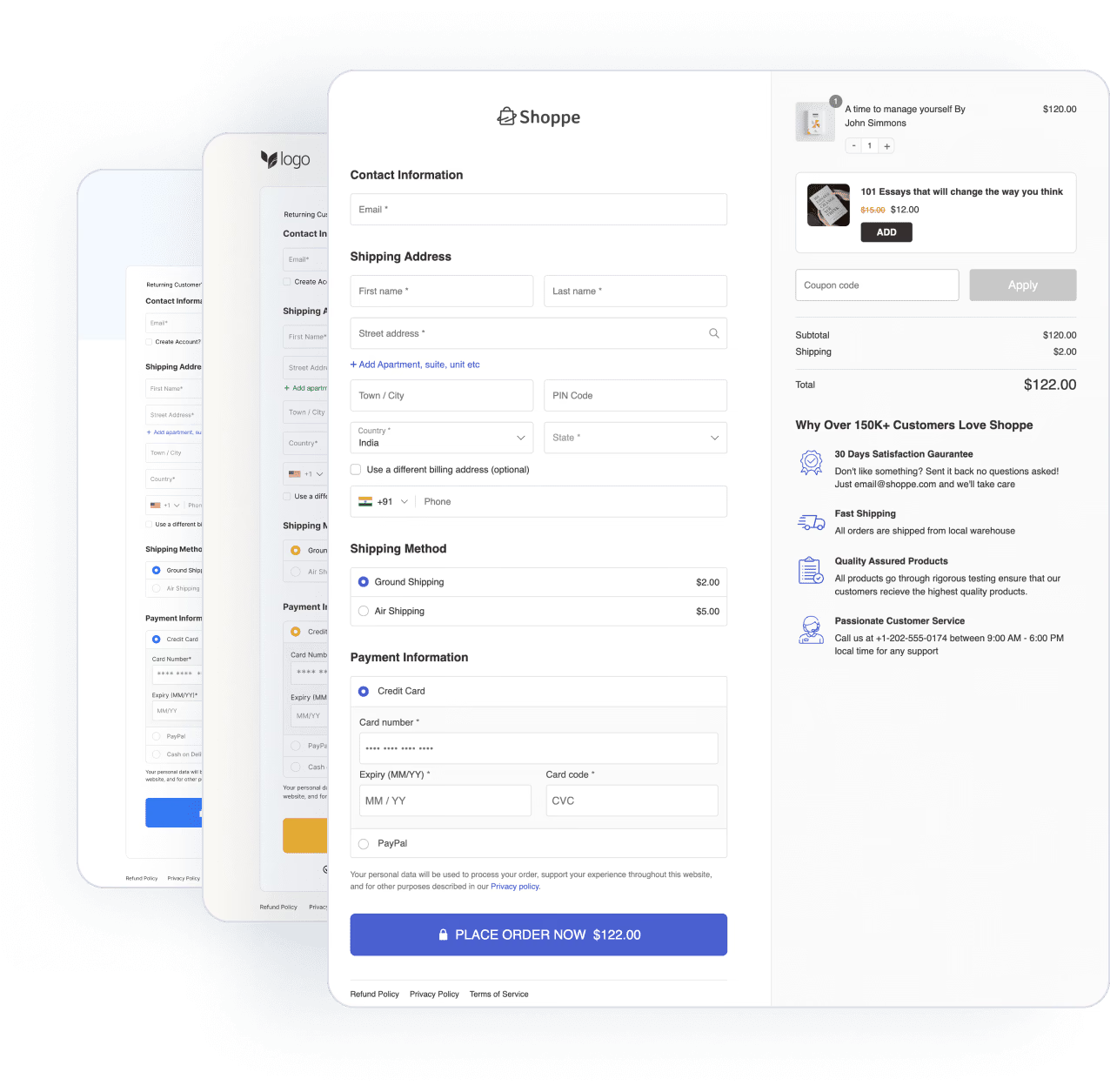
In our case, we've picked the Shoppe template:
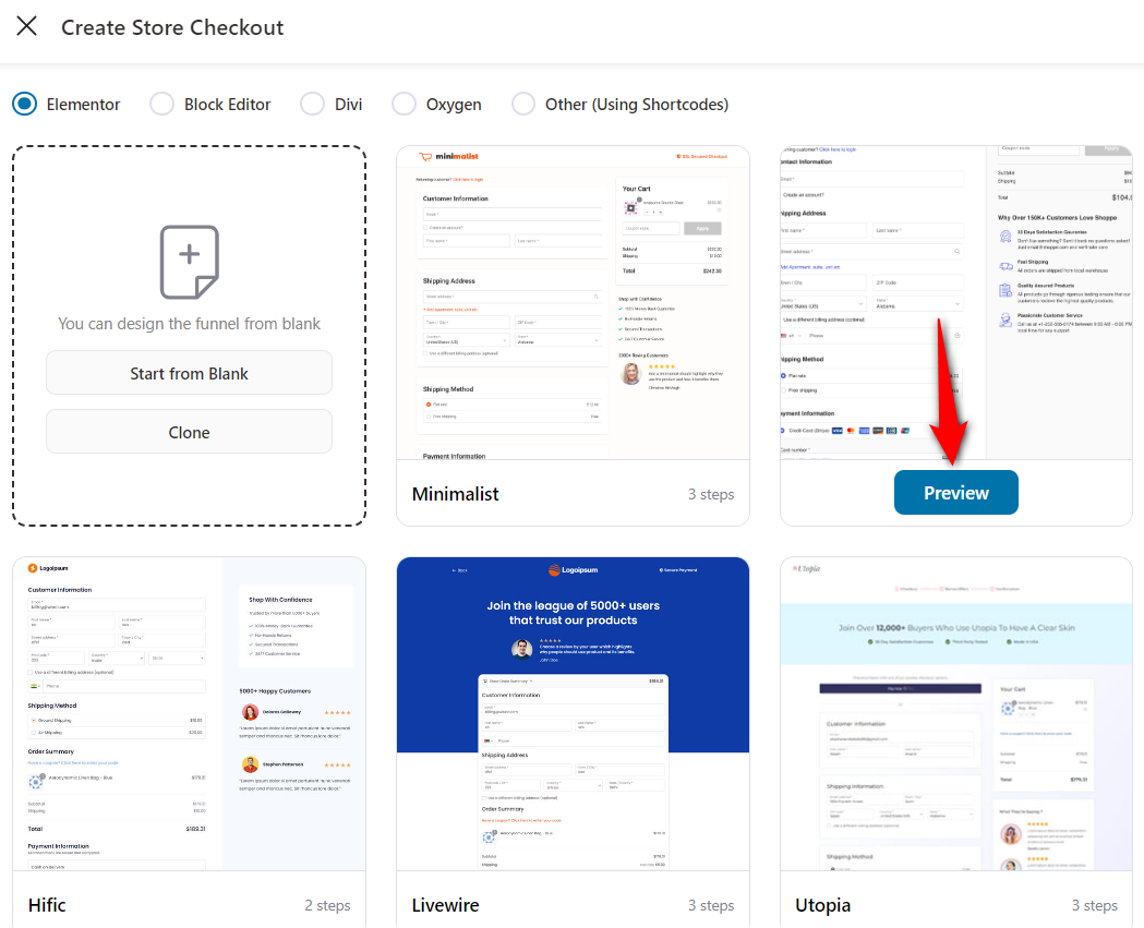
Clicking on the ‘Preview’ button will show you a full preview of the template.
Since Shopify offers a three-step checkout, we’ll select the ‘Three Step’ option and click ‘Import This Funnel’.
Enter the name of your funnel - WooCommerce Shopify checkout.
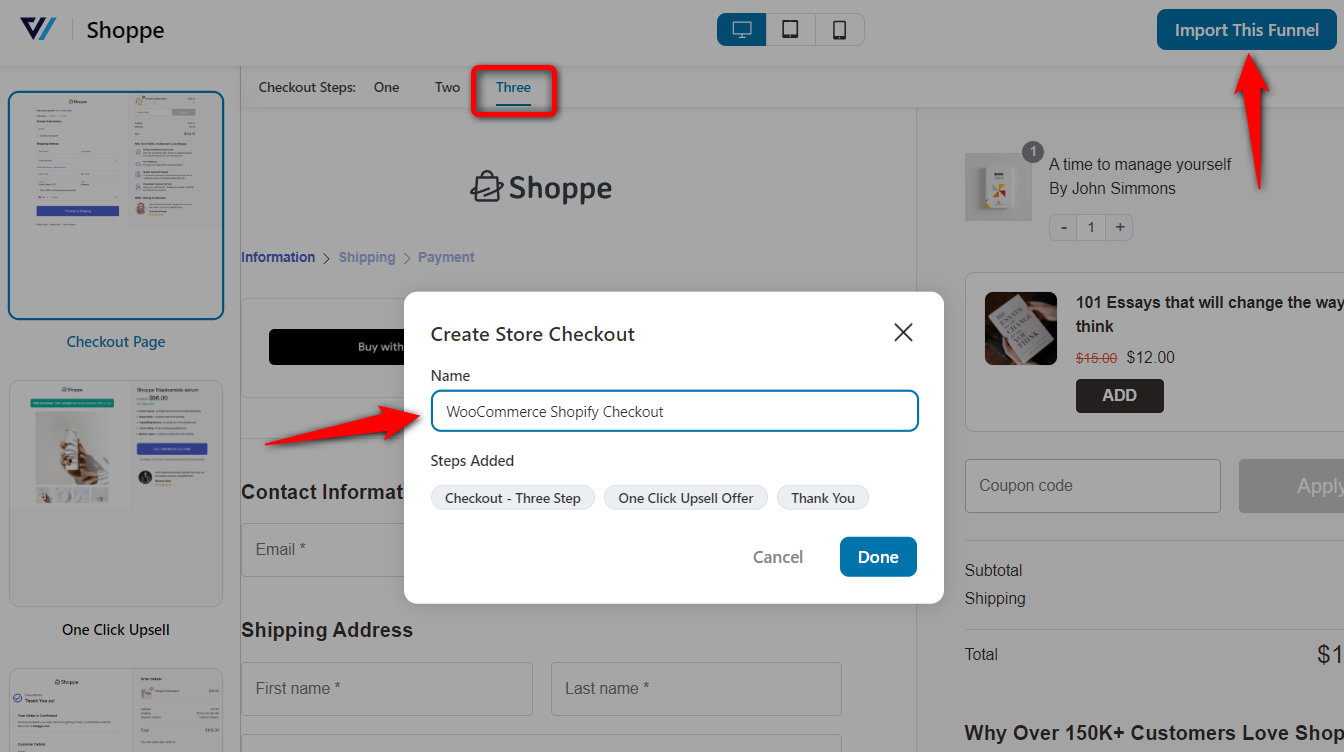
Clicking on ‘Done’ will import your store checkout funnel.
Step 2: Customize your WooCommerce Shopify checkout page
Hit the name of your checkout page to start customizing it.
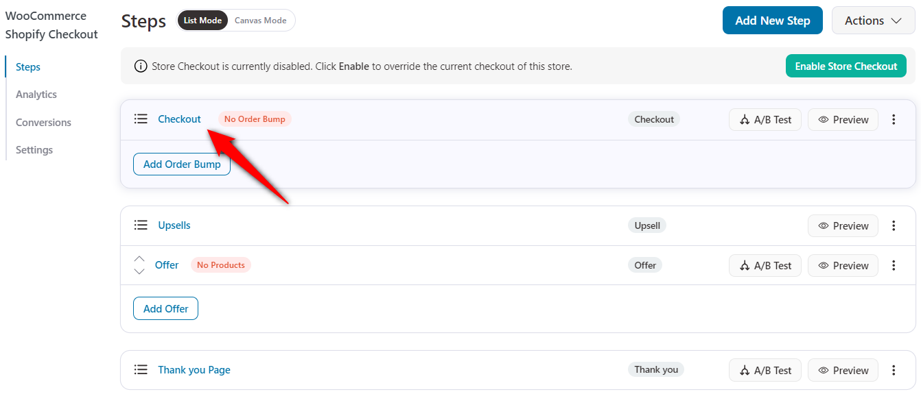
Under the Design tab, click on the ‘Edit Template’ button to start customizing your Shopify checkout page in WooCommerce.
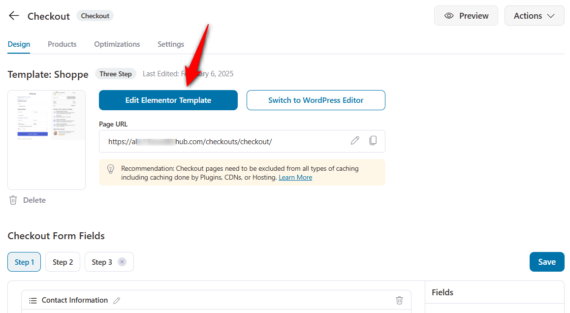
Changing the logo
Branding the template by changing the logo and tagline is pretty easy. You can even add helpline numbers and support-related information.
This will help you make your Shopify checkout page more trustworthy.
To do that, just tap the pencil icon next to the logo, then add the image.
Adding progress indicators
You can edit the checkout form and customize it to your liking.
Enable the steps in the ‘Breadcrumb’ format, and the progress indicator will look exactly like Shopify.
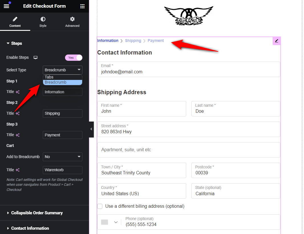
Review the step order and make sure it follows the standard Shopify pattern of customer information first, then shipping options, then payment.
Updating order summary or mini cart
Next, customize the content of your order summary or mini cart section, including the heading, product, and coupon.
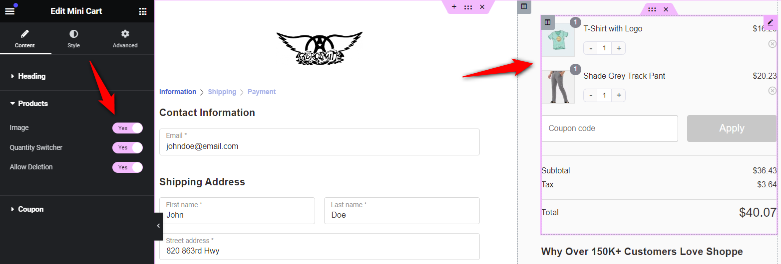
Adjust the visual design to create a distraction-free layout. FunnelKit's Shopify-style templates already remove the site header and footer from the checkout page, giving you a clean canvas.
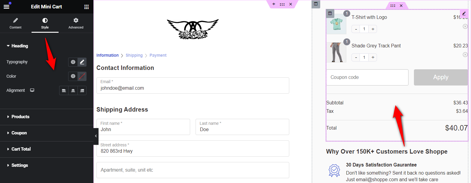
Under the Style tab, you can customize the typography, headings, colors, border colors, divider, coupon section, settings, and more.
You can make Shopify checkout customizations the way you want.
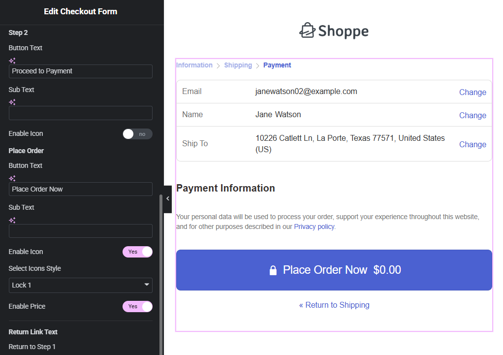
Modifying the checkout or place order button
Click the call to action (CTA) or place order button, and make the necessary changes to your brand.
You can customize the text, add icons, change colors, and more.
You get the flexibility to add trust seals (Norton, McAfee, Secure Checkout badges), money-back guarantees, and customer testimonials to nudge a hesitant buyer's needs.
Change the responsive mode to mobile, and you'll be able to set up a collapsible order summary, a call-to-action button, and the overall experience on phones.
Make sure to hit ‘Publish’ when done.
Step 3: Edit your WooCommerce Shopify checkout form fields
FunnelKit's built-in drag-and-drop checkout field editor lets you add custom fields, edit, rearrange, or delete unnecessary fields from the checkout form.
Scroll down to the 'Checkout Form Fields' section under the Design tab to witness this functionality in action.
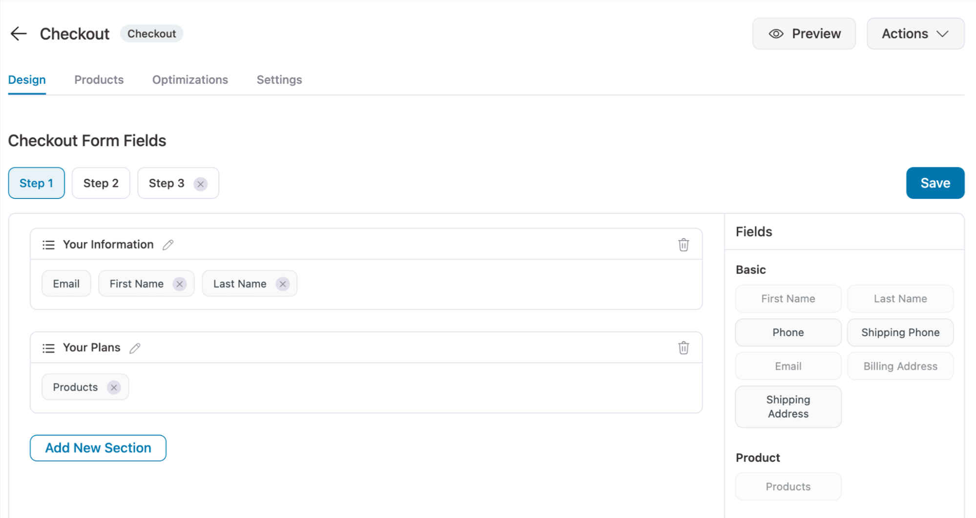
Use the built-in drag-and-drop to group checkout fields like 'First Name' and 'Last Name' onto the same line. This reduces the form's vertical height, making it appear shorter.
Additionally, if you sell digital goods, disable the "Shipping Address" entirely.
A Shopify-style checkout keeps the form minimal, with fields for email, name, address, shipping method, and payment. Remove any fields that are not essential to completing the order.
Step 4: Optimize your WooCommerce checkout for conversions
Under the Optimizations tab, you’ll be able to optimize your WooCommerce Shopify checkout page:
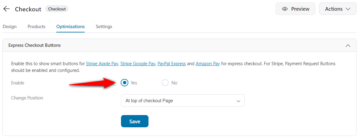
- Enable the express checkout option
FunnelKit Funnel Builder is fully compatible with one-click express payment methods, including Apple Pay, Amazon Pay, Google Pay, and PayPal Express.
You need to make sure the desired payment method is activated in the WooCommerce Settings ⇨ Payments section.
Use FunnelKit’s Stripe gateway for WooCommerce to add multiple payment methods.
Here, enable smart buttons for express checkout.
- Activate multi-step field preview
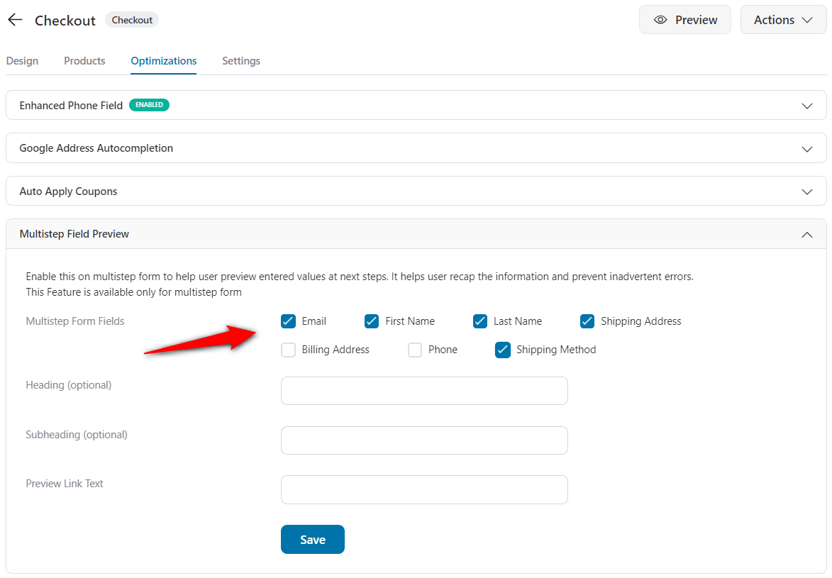
As we discussed above, a multi-step field preview feature lets users see the information entered in the previous step.
Enabling it in WooCommerce is as easy as checking the box next to the fields you'd like to show.
Here's how it will show up on your WooCommerce Shopify checkout page:
- Auto-apply the coupons on checkout
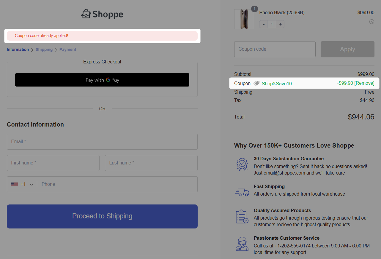
Offering auto-apply coupons at checkout streamlines the buying process by eliminating the need for customers to manually enter coupons to receive discounts.
This is quite convenient and leads to higher conversion rates, as shoppers are more likely to complete their purchases when discounts are automatically applied.
To do this, enable the 'Auto Apply Coupons' feature under the Optimizations tab.
Enter the coupon you’d like to apply at checkout automatically. Ensure that the coupon is published and valid in your WooCommerce store.
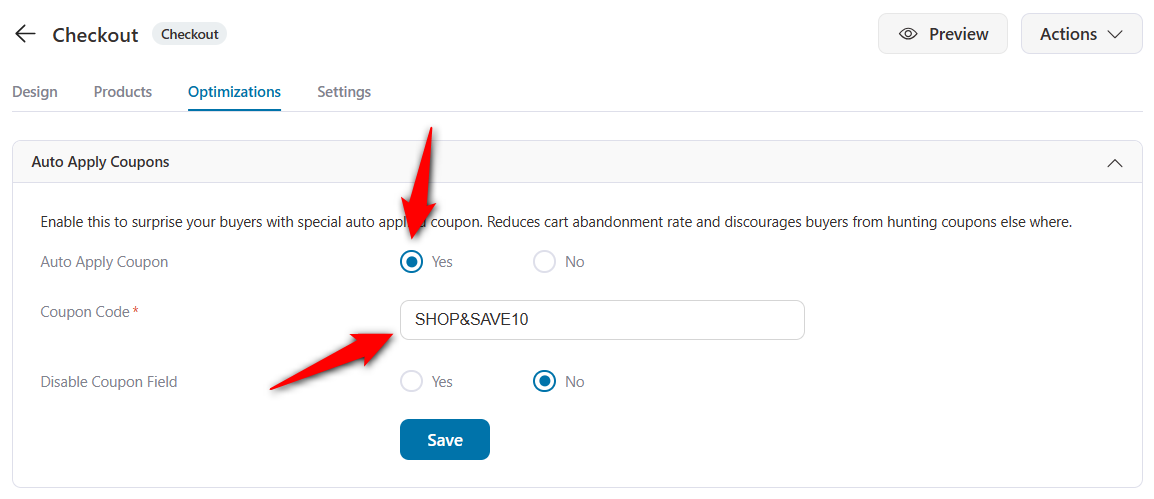
Now, when a shopper reaches the checkout page, this coupon is automatically applied, and the discounted price is deducted from the cart total.
- Enable Google address autocomplete
Integrating Google Address Autocomplete into checkout streamlines address entry by providing real-time suggestions as shoppers begin typing, reducing the time to fill out the shipping fields.
Make sure you’ve enabled the Google Maps API from the Maps Platform.
Once done, go to the Optimizations tab and enable the Google Address Autocompletion feature.
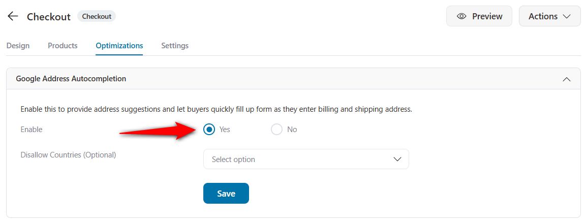
Click on ‘Save’ when done.
This is how autofill address suggestions appear as soon as you begin typing your shipping or billing address.
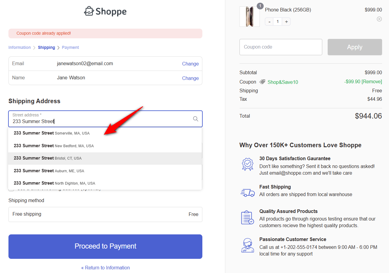
Furthermore, you can add enhanced phone fields, smart customer login, guest checkouts, and more to streamline buying in your store.
Step 5: Publish and test your Shopify-style checkout
Next, you need to publish your store checkout to activate it and replace the default WooCommerce checkout page.
All you need to do is go back to the funnel and click on ‘Enable Store Checkout’.
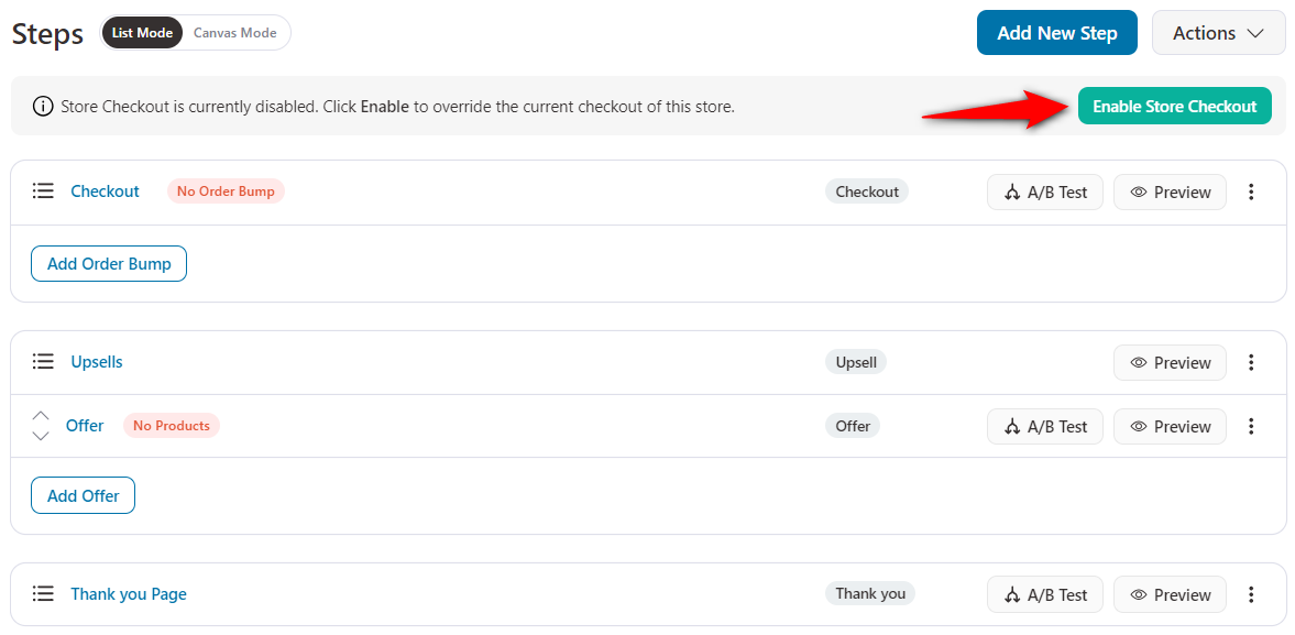
This will activate your store checkout flow.
Well done! This is how you can set up your WooCommerce Shopify checkout page in your store.
To test the new checkout, go to any product page on your store, add the item to your cart, and proceed to checkout. You should see the multi-step layout with express checkout buttons at the top, followed by the contact information step.
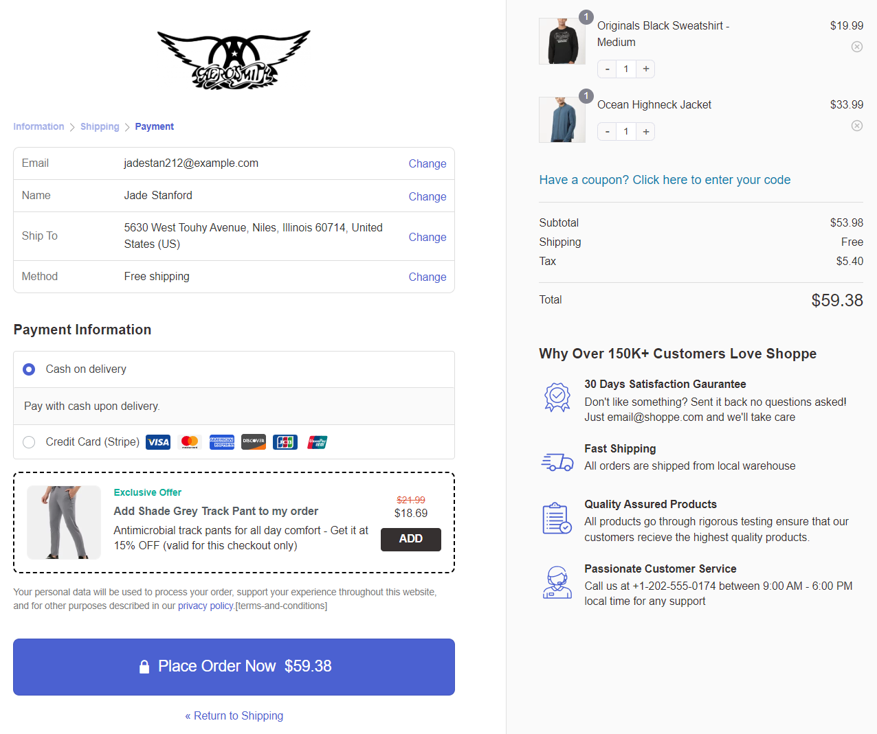
Walk through each step and place a test order to confirm that shipping options, payment processing, and order confirmation all work correctly.
7 Optimization Hacks to Reduce Cart Abandonment on Your WooCommerce Shopify Checkout
Let's look at some conversion optimization hacks that you can implement in WooCommerce.
1. Ability to create a one-page checkout
What if you want to put all the fields into a single step and create a single-step Shopify checkout?
Or, even better, create a dedicated one-page checkout for specific products. Your checkout page builder should allow you to do that.
But Shopify doesn't allow you to. Don't worry; FunnelKit does.
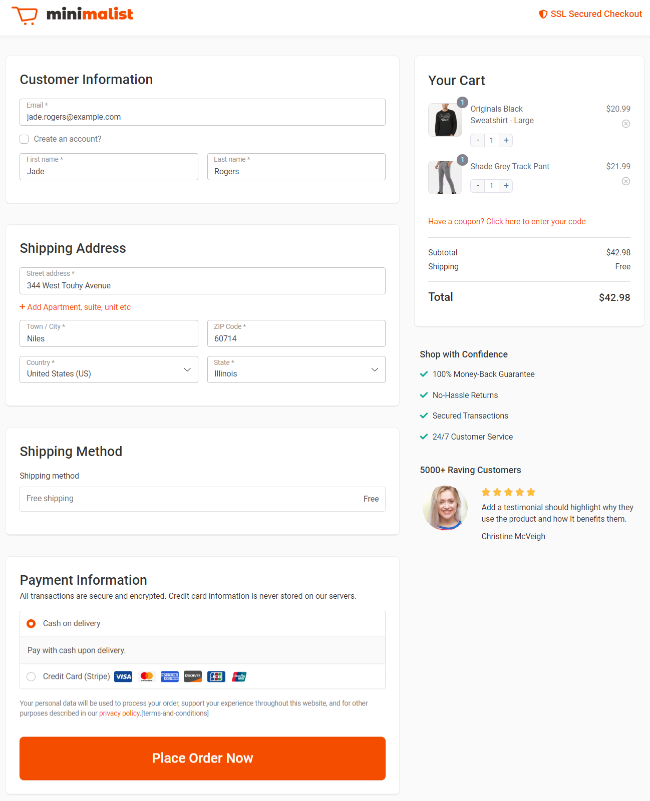
This is our very popular Minimalist template built using Elementor. The best part? You can even embed checkout forms on landing pages.
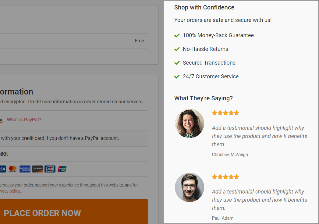
2. Show trust signals like testimonials and confidence on the checkout page
According to a study published on NeilPatel.com, adding testimonials to the checkout increased conversions by 6.34%.
In the built-in customizer, you can add multiple testimonials, including the person's name, designation, message, star rating, and more.
Here's how the testimonial section appears:
3. Give cart editing options on the checkout page
Providing users with the option to edit their cart on the Shopify checkout page is a great hack.
It minimizes the friction involved in the buying process.
After clicking the 'Add to Cart' button on the product page, the user doesn't need to return to that page to make any edits.
This allows them to have complete control over their purchase.
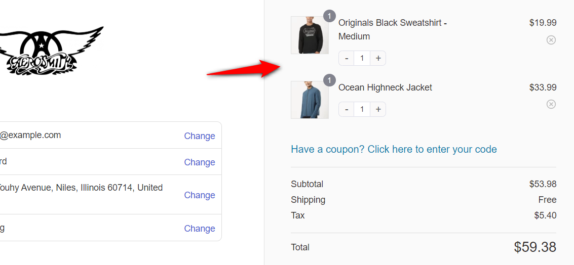
You can use the funnel builder to turn on the quantity switcher and even the delete option.
4. Display shipping costs and order total on the checkout
Unexpected shipping fees are the top reason customers abandon checkout. According to Statista, extra costs, including shipping, are cited by nearly half of all cart abandoners.
Show shipping costs on the shipping step or earlier so there are no surprises at the end.
Furthermore, your order summary should remain visible on desktop throughout the entire checkout process.
On mobile, use a sticky or collapsible summary so customers can check their total without scrolling. Transparency reduces last-minute hesitation.
5. Add an order bump for a higher average order value
An order bump lets you pitch a complimentary item to shoppers at checkout.
The idea is to increase their order value right before they place an order.
Make a compelling offer on your Shopify checkout page that they can't refuse.
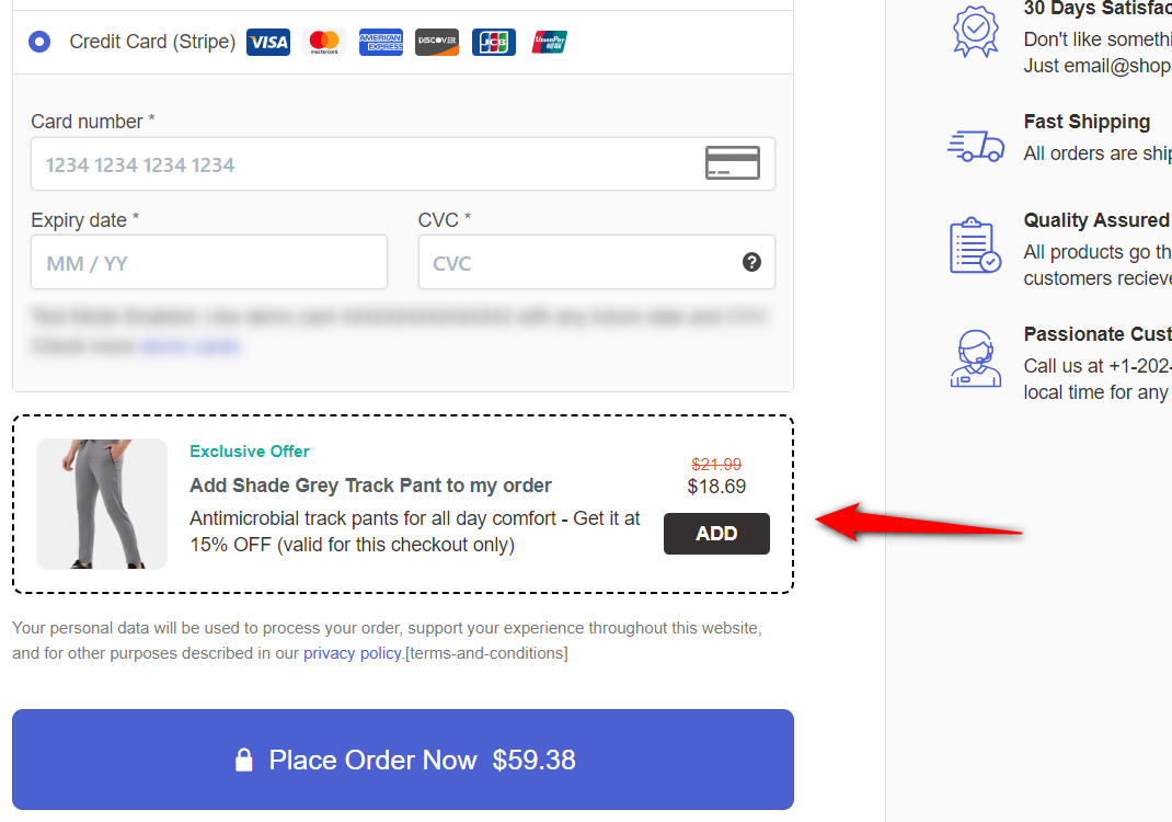
The user can add the related products to their order with a single click on the checkbox.
An order bump is incredibly useful because it eliminates the need to make intrusive cross-sells or show pop-up offers.
6. Optimize the WooCommerce Shopify checkout experience for mobile
This is another brilliant technique. FunnelKit Checkouts, by default, optimizes the checkout experience for mobile.
The form fields line up one below the other, eliminating the need to pinch and zoom, and a collapsible order summary section appears.
The collapsible order summary is exclusively shown on mobile.
You can select the mobile view in responsive mode to optimize the experience for your shoppers.
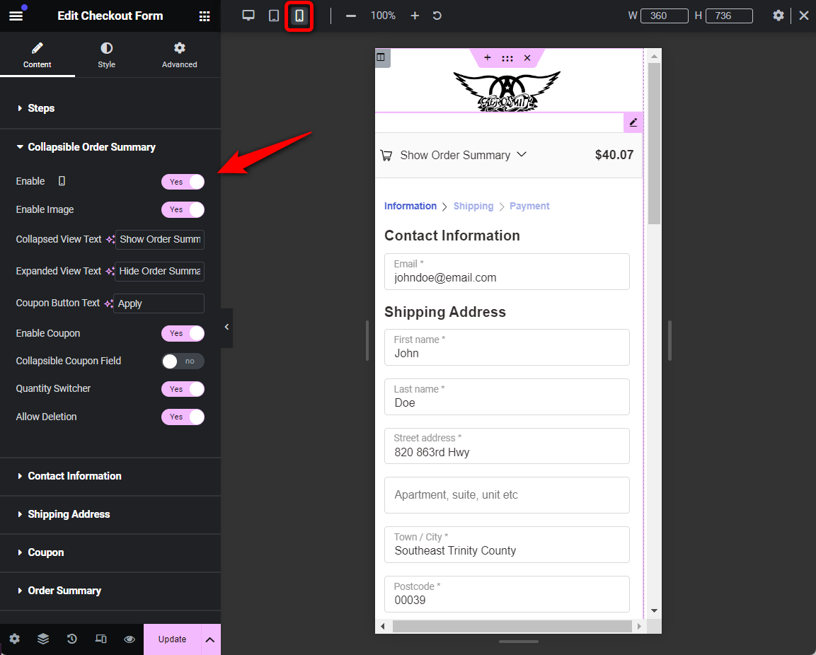
This is all about some optimization hacks that can make your checkout process seamless.
7. Recover lost revenue with abandoned cart recovery workflows
Even the best checkout design will not capture every customer. Whether it’s a distracting notification or a misplaced card, cart abandonment is an inevitable part of the shopping journey.
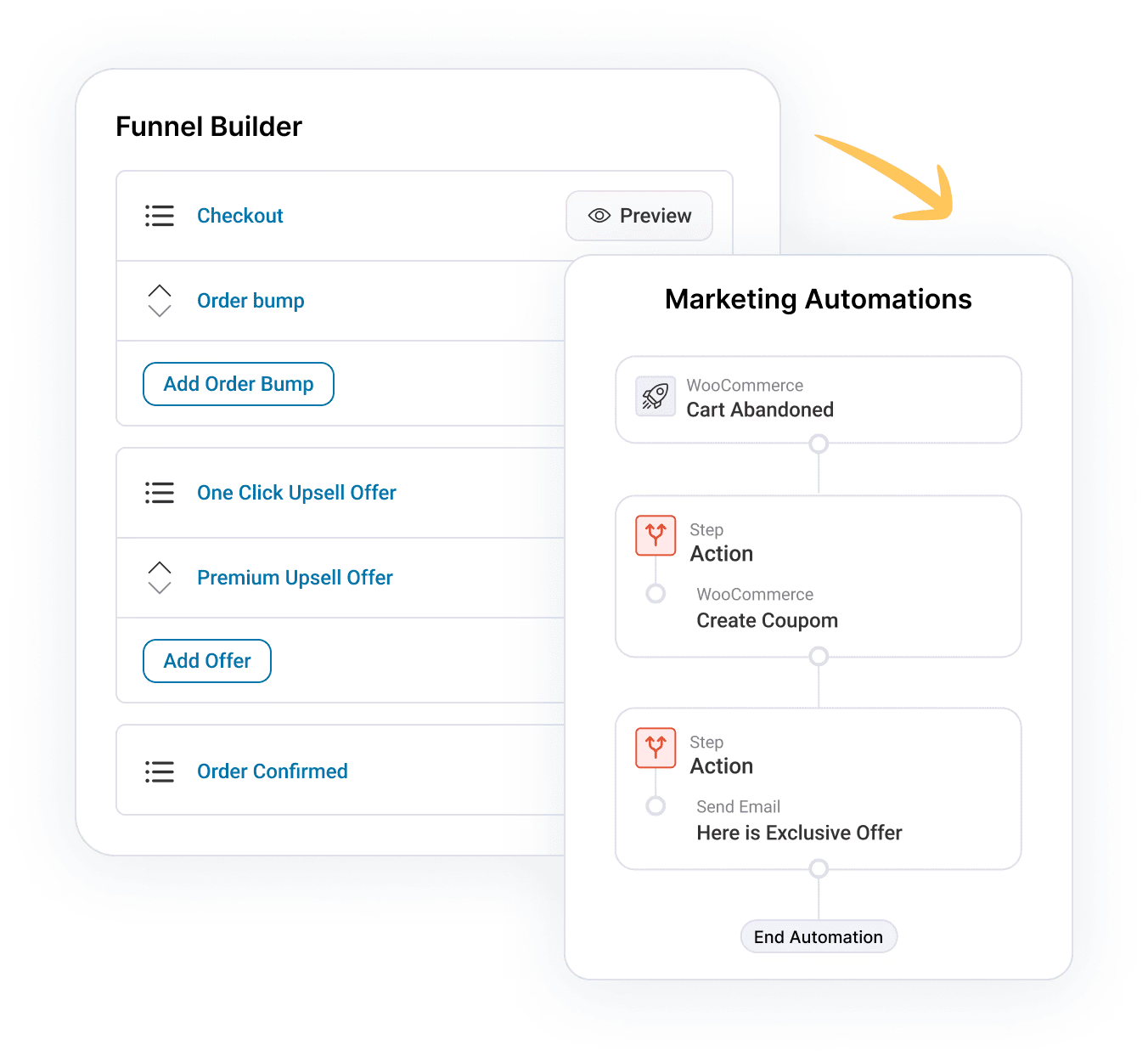
However, by leveraging FunnelKit Automations, you can transform these lost moments into automated win-back opportunities.
You can send tailored reminders that include the specific items left behind, unique recovery links, and dynamic coupons that expire to create a genuine sense of urgency.
Frequently Asked Questions About WooCommerce Shopify Checkout
Got questions about using Shopify-style checkout with WooCommerce? Check out some FAQs below with quick answers:
The primary difference lies in conversion-focused friction reduction. While WooCommerce uses a standard functional form, Shopify uses a highly engineered sequence designed to minimize "buyer's remorse" and cognitive load. Here are the four essential distinctions:
- WooCommerce defaults to a single, long page with 15+ visible fields that can feel overwhelming. Shopify utilizes a multi-step breadcrumb navigation (Information > Shipping > Payment), which makes the process feel faster and reduces mobile scrolling.
- A standard WooCommerce checkout often retains your site’s header, footer, and sidebar. Shopify employs a distraction-free checkout that strips away all navigation links, keeping the user hyper-focused on completing the purchase.
- Shopify prioritizes express Apple Pay and Google Pay methods at the very top and uses Google-powered address autocomplete to prevent typing errors. By default, WooCommerce payment options are buried at the bottom, and all address data must be entered manually.
- Shopify uses a sticky, collapsible order summary at the top of the screen. In WooCommerce, customers must scroll to the very end of the page just to see their total or verify the items in their cart.
Using Shopify’s checkout with WooCommerce gives you a faster, more trusted, and conversion-optimized checkout experience. It combines WooCommerce’s flexibility with Shopify’s secure, mobile-friendly, and streamlined payment process.
No, Shopify Payments is exclusive to Shopify. WooCommerce requires gateways such as Stripe, PayPal, Square, or other processors.
Yes, you can create a Shopify-style checkout in WooCommerce with custom code, but it requires significant development effort. You would need to override the default WooCommerce checkout template files, write custom PHP to restructure the form into multiple steps, and add JavaScript for step navigation and validation.
For most store owners, using a plugin is faster, more reliable, and easier to maintain than building a custom-coded solution.
The best payment gateways for WooCommerce and Shopify checkout integration include Stripe, PayPal, Apple Pay, Google Pay, and Square, as they ensure secure payments and higher conversion rates.
No, a well-built multi-step checkout will not affect site speed. There are many plugins that load lightweight templates designed for performance. The multi-step layout actually reduces the amount of content loaded on each screen, which can make each step feel faster than a single-page checkout with all fields visible at once.
WooCommerce Shopify checkout plugins like FunnelKit offer a free version, but the advanced "Shoppe" multi-step template and field-editing features discussed here are available only on the Pro/Plus plans. The same is with other plugins too.
Start Converting More Customers With a Shopify-Style WooCommerce Checkout!
WooCommerce is quite powerful and flexible, but its default checkout? Not so much. That’s where FunnelKit Funnel Builder changes the game.
FunnelKit Funnel Builder can help you create a Shopify-style checkout in WooCommerce that’s sleek, high-converting, and optimized for sales.
As we explored in the post, you can enable cart editing options, add testimonials, bump orders, and do so much more, all designed to boost conversions effortlessly.
You can create more conversion-focused, order-value-boosting checkouts.
What's more? Add one-page checkout to the mix, and you can go beyond just checkout pages.
Embed checkout forms on landing pages, direct traffic to them, and do more - the sky is the limit.
Run A/B tests, measure analytics, and implement optimizations to ensure a seamless, conversion-focused checkout experience for your customers.
Editorial Team
April 9, 2026WooCommerce transactional emails are the automated messages your store sends after a customer takes an action. This includes shipping updates, password resets, and welcome notices. Open rates for these alerts...
Editorial Team
April 6, 2026Almost every store owner needs to export WooCOmmerce orders sooner or later. Maybe you need to send order data to your accountant, move records to a new site, or pull...
Editorial Team
April 6, 2026Want to turn one-time buyers into customers who keep coming back using WooCommerce? Then you need to find a WooCommerce subscription plugin. These plugins will help you automate billing, manage...

