FunnelKit Documentation
Get unstuck with our helpful reference material

Checkout Pages

How to Switch Between Desktop, Tablet and Mobile View for Better Customization

You can switch between different device views to give you an understanding of how your checkout page would look on that particular screen.

Follow these step to choose your desired view:

Step 1: Click on the ‘Actions’ button

Click on the actions button situated at the bottom of the page.

Divi actions button

Step 2: Click on the View

On the panel (bottom left), there are options to view your screen in Desktop, Tablet, or Mobile mode.

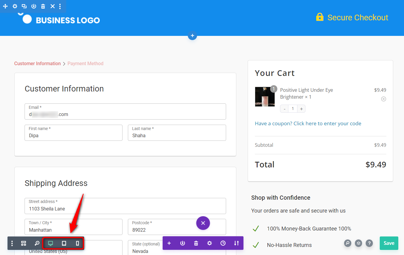
It is that simple! Switch among the three to get the most optimized checkout page.

Ready to Transform Your Store?

Join 38,315+ successful store owners who trust FunnelKit to power their businesses.
Conversion Optimized Checkout Pages
Increase Revenue with Smart Upsells
Capture Emails & Recover Abandoned Carts
Automate Winbacks & Repeat Sales
868+ 5 star reviews on WordPress.org
Transform your store to power your business with FunnelKit
868+
 Reviews
4.9
chevron-downarrow-right